This was an essay I wrote in 2008 for a University class.

A Comparative Study of Corporate Identity Design between the 1970’s and the 1990’s.
Corporate Identity in the modern world is a critical part in the success of any business and comparing the complex marketing and branding strategies used by corporations throughout the 70s and 90s, will illustrate how to achieve corporate identity success, and why it is important. To define ‘corporate identity’ is a controversial task, however, for the purpose of this discussion, corporate identity will be defined as ‘the group of pieces, aspects, ideas, methods and techniques that your brand needs to be identifiable. Your company’s corporate identity can be formed by many of the pieces that form a communicational style: logo, letterhead, business cards, folder, inserts, envelope, etc.” (Corporate Identity Designer, 2007)
Without doubt or debate, the most crucial and critical part of any corporate identity is the face of their company – their logo. As online source (Magnetik, 2007) reveals – “How your business presents itself to the world can be the difference between success and failure. Your logo is the central piece of identity that communicates the character of your business. Its main function is to create and reinforce your brand identity.” An annual study by brand consultants, Interbrand and JP Morgan ranked Coca Cola’s brand in its own right, as the world’s most valuable at $69.6 billion. (Interbrand, 2005) thus proving how meaningful a brand can be.
Exploring and evaluating logo designs from the 70’s and the 90’s, and the evolution of different logo designs from these time periods will give a better understanding of what factors contribute to a successful design. But first, what makes a good logo design and how can this effect the way logos are designed? A Sydney graphic design company by the name of Magnetik(2007) claims that there are 6 main factors in producing a quality corporate identity logo, as summarized below. After reviewing these factors, an analysis and comparison of images produced throughout the 70s and 90s will be undertaken, as well as a case study into particular logo designs.
In short, as suggested by Magnetik (2007) there are six main factors that can contribute to a logo’s design success which have been interpreted below.
1. A logo should identify your business:
A logo should convey something essential about a business’ identity. The design should reflect a business’ personality, its attitude, its sense of style, professionalism or fun, or whatever it the business is about. A well thought out logo will promote those qualities and ultimately people will associate this with the business.
2. A logo should be recognisable.
A logo must be distinct enough to make it recognizable, however unique enough to avoid confusion with other logos. To do this, the logo must be easy to read and comprehend and customers must be able to recognize that logo, as that particular business’ every time they see it.
3. A logo should be memorable.
A logo design must make a strong impression and be interesting while at the same time, being simple enough to deliver a clear message. It should leave a positive feeling in customers long after they have seen the logo.
4. A logo should be adaptable.
A logo must be able to be used across a variety of media, from business cards and letterheads to presentations and packaging. A good logo must be adaptable enough to work in any situation one encounters. To meet these needs, a logo should look good in black and white as well as in colour. In terms of size a logo should be simple enough to look good quite small on a business card, yet interesting enough to be by itself on a poster or billboard.
5. A logo should be cost effective.
Business’ logos are printed on all sorts of printed matter; (unless they are an online business) so remember to consider the cost of colour printing. A logo with a maximum of two colours will keep printing budgets manageable. Avoid gradients where possible.
6. A logo should stand the test of time.
A logo should be able to run with your business as your business grows which also contributes to the cost effectiveness. A logo should not be changed too regularly as this dilutes the hard work the designer has put into branding. A well-designed professional logo will continue to be representative of a business for years to come.
Analysis and Comparison
One could easily argue that the success of a logo design varies according to the above points as well as a range of other issues. Some factors that could influence the logo design include: the type of business, the size and financial capability of the business, the culture and perception of different cultures and communities at that particular time, the context in which it is used in, the semiotics (Chapner, 2007) and connotations (Connotations and Denotations, 2007) of the logo as well as the epistemology (Epistemology, Introduction, 2007) behind the design.
![]() Consider a well established brand such as ‘Apple’ of Apple Inc, which is a perfect example of a successful corporate identity. However, this was not always the case, as the company image, brand positioning and logo design has changed quite dramatically between the 70s and 90s. Initially Apple Computer was a small business run out of a garage, and originally had quite an unsuccessful logo as seen to the left (Apple Inc, 1976). Steve Jobs (1976, online), co-founder of Apple Computer Inc. considered the 1976 logo design “too intellectual to represent a brand, too detailed and intricate as a logo and, therefore, also unsuitable for reproduction in small sizes.” Apple Computer needed a logo that would be representative of their brand and one that could be reproduced in small sizes.
Consider a well established brand such as ‘Apple’ of Apple Inc, which is a perfect example of a successful corporate identity. However, this was not always the case, as the company image, brand positioning and logo design has changed quite dramatically between the 70s and 90s. Initially Apple Computer was a small business run out of a garage, and originally had quite an unsuccessful logo as seen to the left (Apple Inc, 1976). Steve Jobs (1976, online), co-founder of Apple Computer Inc. considered the 1976 logo design “too intellectual to represent a brand, too detailed and intricate as a logo and, therefore, also unsuitable for reproduction in small sizes.” Apple Computer needed a logo that would be representative of their brand and one that could be reproduced in small sizes.
If an analysis of this logo is compared with the earlier points offered by Magnetik (2007), one could say that the 1976 design did identify the business quite well; however the text on the logo is quite illegible which ultimately would make the whole corporate identity forgettable due to the sophistication of the design. The original logo from 1976 is also, far from adaptable, as one can only see the details when the logo is blown up to a large size. Also, when the image is reduced to a small size, ie. when placed onto a business card, the whole logo becomes totally illegible, which in itself indicates that the 1976 logo was not a success. Consequently, the opportunity for an enduring brand identity through a cost effective design capable of standing the test of time was lost.
![]() In comparison to this ineffective 1976 design is the ‘new’ Apple logo which was designed in 1977, only one year after the original logo was made. Steve Jobs recruited the talents of Regis McKenna Advertising agency of Palo Alto, to design a new logo for Apple Computer and in 1977 the new logo was unveiled. By comparing this design to the 1976 design one can see how much more effective this logo design is.
In comparison to this ineffective 1976 design is the ‘new’ Apple logo which was designed in 1977, only one year after the original logo was made. Steve Jobs recruited the talents of Regis McKenna Advertising agency of Palo Alto, to design a new logo for Apple Computer and in 1977 the new logo was unveiled. By comparing this design to the 1976 design one can see how much more effective this logo design is.
Rob Janoff (1979), creator of the new logo, comments on the design saying “I think that people responded to the colours and the joke of the shape. There’s a little bit of a pun in the way that the shape is designed. The bite that is taken out of it: it’s not only the silhouette of an apple you could not take a bite like that out of any other piece of fruit shaped that way but byte is also a computer term.”
One can effectively summarise the 1977 logo proving that
- The logo makes the business recognisable.
- The logo identifies the business
- The logo is memorable
- The logo is adaptive
- The logo is cost effective
- The logo has definitely stood the test of time
![]() If the logo is then compared to the revamped Apple logo released in 1998 to the one in 1977, one can see that it has not changed shape nor has anything been added, rather – it has been simplified. The 1998 logo has had the colours removed and a new ‘shine’ glazed over the top of the logo. By analyzing the new logo design one can see that the 1998 logo also adheres to the 6 factors of successful logo design outlined previously however it has been modernized to continue making the logo stand the test of time.
If the logo is then compared to the revamped Apple logo released in 1998 to the one in 1977, one can see that it has not changed shape nor has anything been added, rather – it has been simplified. The 1998 logo has had the colours removed and a new ‘shine’ glazed over the top of the logo. By analyzing the new logo design one can see that the 1998 logo also adheres to the 6 factors of successful logo design outlined previously however it has been modernized to continue making the logo stand the test of time.
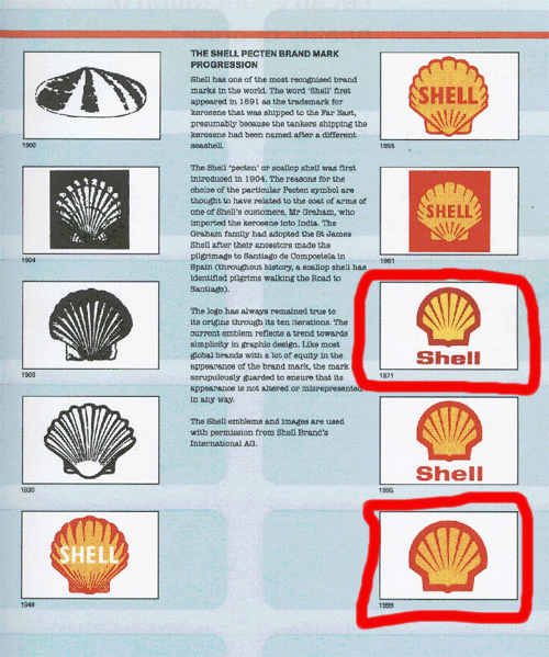
Shell Logo
Another great example of a successful corporate identity is the red and yellow face of Shell, and similar to the Apple logo, it is clean and simple a logo that represents the company making it identifiable. Its strong communicational style leaves the responder with a clear image of the company in their head. Shell has based their whole brand upon just their one red and yellow logo proving just how crucial an effective logo is to any business. Shell’s logo has virtually been unchanged for over 100 years which is why when one analyses this particular logo can conclude that it, like the Apple logo is a perfect example of effective corporate identity branding.
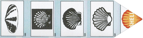
Shell Logo Evolution
By exploring an evolution of a logo one can compare the differences between each stage of a logos evolution and become aware of how a logo should change alongside the company’s corporate identity branding strategy as well as keeping up with the technologies available at any given time.
As seen in the figure above, the shell logo has undergone a number of periodical changes throughout the last century. Since appearing in the early 1900’s, the Shell logo has become increasingly stylized, reflecting the trend towards simplicity in graphic design. (Hames, 2006). The logo designed in 1999, with its bold shape and distinctive colours is still in use today as it easily recognized, memorable, adaptable and cost effective. The shell logo which was produced in 1971 was used throughout the 70s, 80s and 90’s and was only changed in 1999 when it lost the text all together, thus proving how effective the brand has become. The simplistic nature of the 1999 design proves that by adhering to the changing nature of the environment and technology around oneself, one can create and maintain a successful corporate identity.
However, one also must remember that it is not just the logo of a business that makes up a business’ corporate identity; in fact all things that are attached to a business should be directly related to the business’s branding strategy. For example, letterheads, business cards, reports, etc should match the business’ style and ultimately their brand.
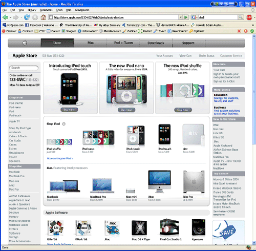
A further example as seen in the screenshot above shows how Apple Inc. has effectively branded all their products with their infamous Apple logo. Furthermore, all of their products have a similar ‘sleek and techy’ style which is also matched by the style of their website. All businesses should employ this simple, consistent method, along with a successful logo design to ensure that their corporate identity branding strategy is a success.
Bluntly put, to effectively present a business to the world in the most efficient and simple manner, a business should ensure that their corporate identity strategy has a solid and communicative style across the whole face of the business. Examples of quality business identities have been shown to demonstrate what a successful identity may look like as well as proving that by having a strong and identifiable business branding identity or logo a business can flourish and relish the rewards.
Bibliography
Apple Computer. (1976). Figure 1, newton.jpg. Retrieved August 25, 2007, from Fizbang: http://www.fizbang.com/i/apple/newton.jpg
Apple Computer. (1980). Figure 2, apple_2.gif. Retrieved August 24, 2007, from Fizbang: http://www.fizbang.com/i/apple/apple_2.gif
Apple.com.au. (2007). The Apple Store (Australia) – home. Retrieved September 8, 2007, from Apple.com.au: http://store.apple.com/133-622/WebObjects/australiastore
Chapner, D. (2007). Semiotics for Beginners. Retrieved September 14, 2007, from Aber: http://www.aber.ac.uk/media/Documents/S4B/sem02.html
Connotations and Denotations. (2007). Retrieved September 14, 2007, from University of Ottawa: http://www.arts.uottawa.ca/writcent/hypergrammar/conndeno.html
Corporate Identity Designer. (2007). Corporate Identity, What is Corporate Identity? Retrieved August 12, 2007, from Corporate Identity Designer: http://www.corporateidentitydesigner.com/WhatIsCorporateIdentity.html
Epistemology, introduction. (2007). Epistemology, introduction. Retrieved September 14, 2007, from Principia Cybernetica Web: http://pespmc1.vub.ac.be/EPISTEMI.html
(2006). In L. Hames, Graphic Design That Works (p. 22). Massachusetts: Rockport Publishers.
Interbrand, J. M. (2005). Defining Branding. In M. Davis, More Than Branding (p. 28). London: AVA Publishing.
Jobs, S. (1976). Fizbang Widget Workshop. Retrieved August 25, 2007, from Fizbang: http://www.fizbang.com/1-3-06.php#5
Loewy, R. (2005). Shell Logo. In M. Davis, More Than A Name (p. 27). London: AVA Publishing.
Magnetik. (2007). What makes a great logo design? Retrieved August 12, 2007, from What makes a great logo design?: http://www.magnetik.com.au/web-marketing-resources/great-logo-design.html


Will certainly come back to this when I’ve a little more time on my hands. Looks like a great read.
David Airey’s last blog post..A few logo designs not yet featured
Jacob, very cool post, I have it on my list of “Must read” this weekend!
Also, thank very much for the answer to my question on the uni project…about the feedback you receive and your current high performance there….very cool.
I remember you asked David Airey about how he did the mockup for the die cut business card, so I made a quick video tutorial for anyone interested! Check it out
Brian Yerkes’s last blog post..David Airey: How He Did It – Die Cut Card Mockup
JACOB!
I promise to come back and say something relevant later, this looks like a good one but I’m off to work. I just wanted to raise a glass to you for being mentioned in the final verdict at Logo Design Love!!!
Congratulations, Jacob, I hope it brings you a zillion more readers.
All the best,
Kelly
Jacob,
Apple is one of my favorite companies that “gets it.” The way they take the brand from concept (bytes, Apples for teachers-originally, and Newton’s apple), through printed and online graphics, products, and into their physical spaces as well, seamlessly, is pure genius.
Great topic and well-researched. The Shell evolution I had seen before, it’s neat. I’ve seen a couple of painfully early Apple ads with no logo, but I don’t think I’d ever seen that earliest logo.
Until later,
Kelly
Kelly’s last blog post..Happy 100th Birthday!
Hi jacob
A very well researched article. i would definitely remember the points you mentioned above.
What do you think about designing logos for technical festivals or stuff like that? I mean for temporary occasions. Recently we designed a logo for our tech-fest, and it doesn’t follow any of our suggestions.
check out the logo here http://iccotdis.blogspot.com/2008/03/final-preparation-for-shristi-2008.html
Sid
Hi Sid,
When you say a technical festival, what exactly is that? The logo looks very techy however where is it going to be used? What is the purpose of it? I can get back to you after I know these things.
Hi Jacob,
Tech-fest is sort of a science fair where people from different universities come together to show-off their designs, softwares, hardwares etc. Apart from that many quizzes and stuff like that are also organized.
the important thing is that the tech-fests are generally short term events (2-3 days max).The title “Shristi” in the logo means creation in Sanskrit. Also the tag line for the fest is “creation, innovation, erudition”. so the purpose of the logo is to symbolize the entire event.
for use see the posters and the pamphlets here
http://iccotdis.blogspot.com/2008/03/shristi-posters.html
Ah ok cool, I wish our Uni had something like that it sounds great! So how are you trying to show innovation and creation in the Shristi logo? What is the main concept behind it? I think I am missing somethng. I also see that your initial poster design was refused, what was the reasoning behind this?
Wow sorry David, Brian and Kelly.
I just noticed for some reason my reply (from 2 days back) didn’t post on here.
David,
let me know once you read it.
Kelly,
thanks re the logo design love comment. I agree about Apple even though I am a PC user, they just get it. I came across a few early Apple ads as well during my research, very retro / vintage looking. Yeah the early logo wasn’t too flash.
Brian,
let me know once you read it and your thoughts. Yeah that tutorial should come in useful this year at university. I am still amazed we haven’t done a branding exercise for a company yet (ie, stationary, business cards, etc) so I will come back to the video then. Does it have sound? I just had a quick look then but it was loading pretty slow.
Great Comparative – Shell logo surprised me… amazing how much the mind can take in and not see changes until juxtaposed with one another… Apple was surprising too…
The Apple logo you show breaks the rule of “avoid gradients where possible.” However, the philosophy now seems to be the the actual logo is flat and single-colored, but the presentation of the logo can have a different color, gradients, or shiny bits if it fits in with the rest of the design of the product or ad. The only rule seems to be that in any given presentation the logo must, overall, be a single color. On business cards I believe they still use a single-color flat design, for example. That’s part of the genius of this logo; it is still recognizably the same brand even in all these different presentations.
Hi Jerry,
Apple have got such a strict style guide with their logo that laymen would never even notice the difference in each type of logo as it is strong either way, with or without gradients so guess I’ll have to agree with you! Genius.
Ah this was written some time ago, when I was first starting to get an interest in logo design. Glad you enjoyed it and yeah IBM would be a good case study, especially since Paul Rand was the designer.
Nice post. I doubt you’ll find the need to do another comparative study like this again, but if you do I think you should also look at some company logos that HAVEN’T changed hardly at all; for instance IBM and even GE to some extent. But again, nice post. : )
Great article, thank you! ‘Shell’ example is clear and concise.
Hi, this is a wonderful article.
I was wondering if I could translate it and publish it in a Persian magazine, with a link reference, of course.
Yes, that is ok Anahita.