
Music shares many common ideas and themes with the visual arts. For example, repetition, rhythm, harmony, tone, shape, space, scale, line, texture and colour are terms common to both the musical and visual language and this project was focused around these points.

In this University Project we had to listen to music, draw an abstract response then create 2 CD covers from what we heard and below is how I went about doing it… This is how to design a CD cover just by listening to music. I would advise to scroll down and look at the final designs before reading the article.
Oh and before you correct me, I actually did 3 CD covers because I enjoyed it so much instead of the 2 requested. You may have even noticed me putting them up in my portfolio last week.
Part One
The project was divided into two parts and in the first part we had to listen to 4 contrasting pieces of music. We had to take an A4 page and draw a simple visual language of what we heard. We could do this only by using the basic elements of line, shape and colour and it had to be a non representational, abstract design and we could only use the 6 spectrum colours (red orange yellow green blue purple).
We had to aim for a contrast between the drawings and let your subconscious tell you what shapes and colours represent each type of music. Kinda cool in a creepy kind of way.
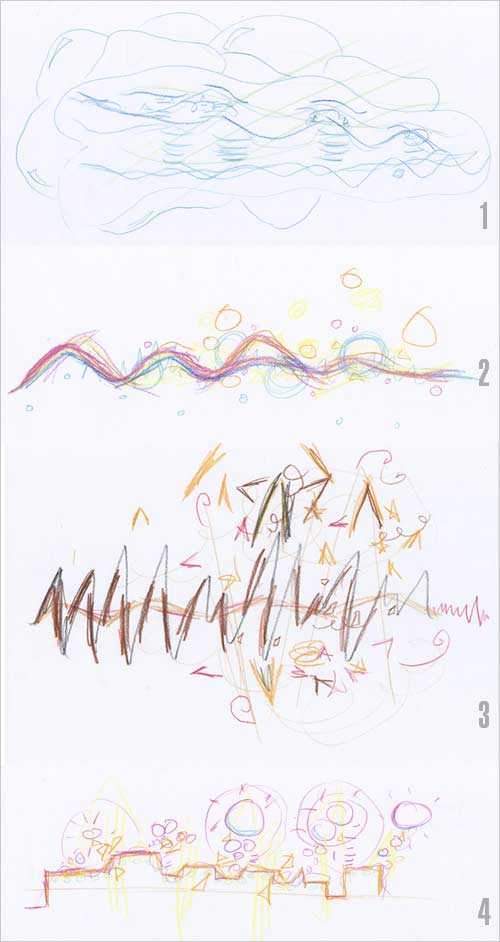
Below you can see my 4 visual responses after listening to the music.
- The first was a slow, smooth, soft, calm watery type song.
- The second was a upbeat funky song.
- The third was a hard rough death metal rock song and the
- Fourth was an electronic digital sounding song.
Part Two
We then had to discuss our results with our peers… All 120 responses from 30 students were pinned to a board and compared. We then had to choose which of our own drawings provided the most contrast and you can see number 1 and number 3 had the most contrast so I used these two (I later chose to do number 4 as well). We then had to use these drawings above to develop them into CD covers and the final designs had to strongly reflect the initial graphic responses.
After brainstorming many different ideas, I decided that whatever I was going to do, it was going to be in 3D probably due to the fact that I enjoyed my Vodka Bottle project in Cinema 4D so much – that is the beauty of University, you get so much creative freedom!
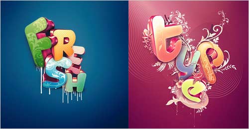
I then came across this post called 50 Essential Photoshop Text Tutorials and I saw in there a tutorial link to design in 3D (Nik Ainley style). I knew that I wanted to do something like that and I got inspiration from his two pieces that are shown below.
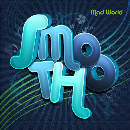
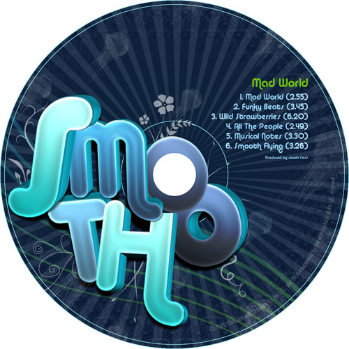
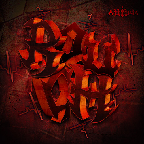
After a bit more brainstorming I came to the concept of using one word to describe the type of music that the band played. I would then use that word as the main piece on the front cover. I chose the word Smooth for the calm music and the word Rough for the heavy metal music and the word Digital for the electronic music.
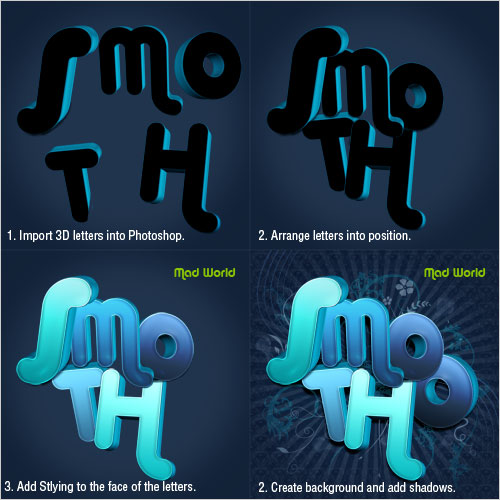
I then went out and got myself a copy of Xara3D (USD$45) which I tell you is VERY easy to use for a 3D program. It took a total of 10 minutes to figure out without any tutorials, just playing with the buttons.
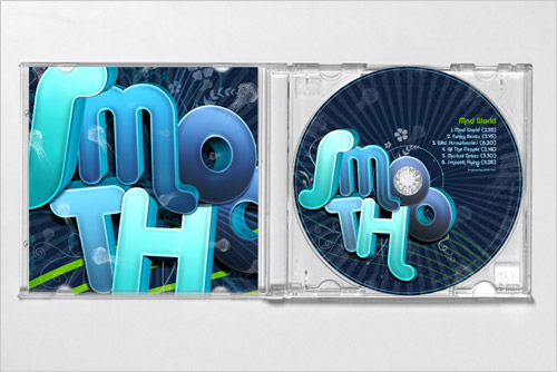
I then pumped out the 3D letters into Photoshop and then did about 80% of the designing in Photoshop and 20% in illustrator for the vectorised pieces. Below you can see the design process I used to create the first CD cover.
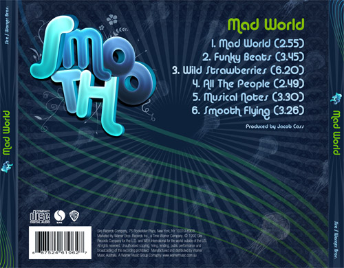
You will notice the visual consistency between the three CD covers as we were required to have this between both designs, there were meant to be all from the same publisher. We also had to have all legal requirements on the CD jackets.
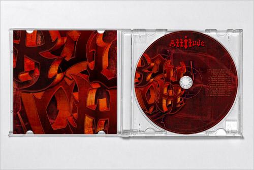
The album title was given to us and for the smooth song it was called Mad World, the rock one was called Attitude and the electronic one was called Equinoxe. The first Smooth cover took a day to complete and the attitude one took about half as long as I was more familiar with what to do and the digital one took about 3 hours.
Below are the final designs, try to compare them to my visual responses up above.
You will notice in the Smooth design, I have used the colours blue and green with an ocean type feel (check out the Jellyfish).
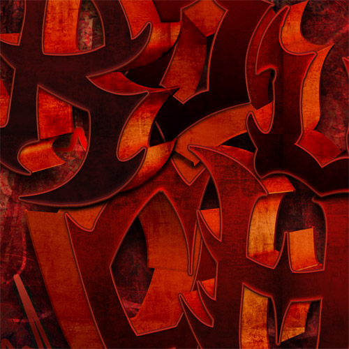
In the Rough design you will notice I have used angry red colours in a grungy chaotic mess that reflects my original musical response. The text was purposely made hard to read to reflect the chaotic nature of the music.
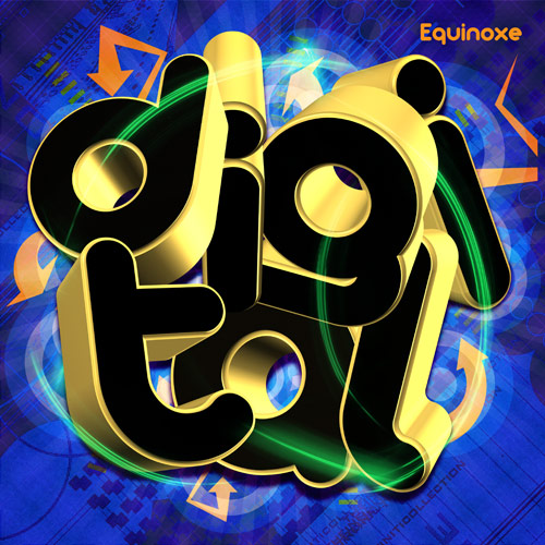
In the Digital one I have used an in-your-face, high energy, bright coloured design which reflects my original music response. You will notice the circles on the back cover, kind of popping as like in my original drawing.
Front Cover
CD
Back Cover
Inside Cover

CD Mock Up
Front Cover
CD

Back Cover

Inside Cover
Mock Up
Front Cover
CD Cover

Back Cover

Inside Cover

MockUp

Constructive criticism is welcome as always, please be as harsh as possible. I won’t hate you, I am here to learn! What is your favourite? You can read more of about my University work by visiting the university category page.
Brief credit goes to Lydnal McGovern from Newcastle University.


Wow! I’ve been a silent reader of your blog for a while now, but I just had to comment on this one! Amazing work! I especially loved the ‘smooth’ and the ‘rough’ cd covers. They really bring out the visual contrast as well as the contrast between the music they represent! Superb work! 🙂
Great looking end product there Jacob. It’s great being able to utilise 3D software when producing work, even for simple letterforms. I prefer the first two to the last, but they all have a good balance to them.
Daniel,
Thank You Daniel, at least my computer and bedroom have been unpacked so it is ok however I still hate having boxes everywhere else.
Did you not like the other two? If not, the reasons?
Soumya,
Well welcome to the commenting field. Is there something in particular you don’t like about the digital CD cover or you just prefer the others? I am just asking as I love to hear feedback.
Rafie,
Thanks Rafie.
Stevo,
At first 3D sounds very daunting but if you do a little bit of research and play around with it a bit, it can bring great results and it stands out in the crowd too because not everyone can do 3D. Is there something not working with the digital cover that is working with the other two? Just curious.
I like both the “Smooth” and “Digital” CD covers because of their legibility, and because they both capture the essence of their respective styles of music. Aesthetically speaking, both these covers have eye-catching graphics and color — very important in grabbing the consumer’s attention even if they aren’t music fans per se.
As for the “Rough” CD cover, I had trouble reading the title itself, especially from a distance (just imagine yourself walking into a music store and this CD was placed on a rack at the far-end corner). I’m a fan of hard rock/metal and I personally like your choice of “angry red” but, again, I couldn’t make out the words “Rough” — the letters are stacked too closely together and you may want to use a different font/color (maybe something Gothic and Metallica-like, just as long as there’s contrast from the background).
If the whole purpose of this project was to capture the essence of the music you were given, then I will say that you’ve succeeded — with the exception of the “Rough” CD.
Hope my comments are helpful.
Jacob,
I like the colour combination and the overall look and feel of the first two more than the last one. 🙂
Wonderful! Thanks fo this guide.
Hey Jacob,
I’ve also been a silent reader for just over a month. Love your work. These designs are awesome. You have an amazing ability to create simple yet effective designs in all your work. This project made me question for a minute why I dropped out of Visual Communication Design but then I remembered I completely sucked and hated the drawing.
For curiousity, what subject/course was this project for?
Anyway, love all three designs, keep up the good work!
It came to my attention when I saw your CD covers on your portfolio, the three with the same overall style. Now it all makes sense.
I generally use this same creative process, but in a more messy way, heh. I should be more organized.
I like the first two. I somehow can’t seem to perceibe the DIGITAL one as a “whole product”. However, I can’t see why. May be the type colors. Yet, I think the three of them look great. =)
Good luck with your housemoving.
Congrats in moving to a new house! New environment and lets expect newer and fresher inspirations for your design work.
I liked the Smooth cd cover. It’s sleek! Coolness 🙂
Daniel Richards last blog post..Happiness Fridays: Hosting a Call of Duty 4 LAN Party with Friends!
Cool! Simply gorgeous. I like Smooth CD cover as well. Swirly and funky design 😀
Rafies last blog post..Swirl
The first lines of your article made a really good point about all the similarities between graphic design and music composition. I never thought of it that way! You could also throw space in there, too.
And what a cool creative exercise of doodling on paper what you hear in the music. You could add that to your list of things to do to be creative! (or did you already?
$45 for a 3D program is really reasonable and obviously you had great results! Haha, and I love how you incorporated the hole in the CD into your design. I like seeing people take the medium/canvas into account when designing. Have you seen those Nail Biter bags before?
As for my harsh criticism, I think a better font could’ve been chosen for the Digital cover. It looks to be the same one you have for smooth (which I think fits that cover better).
LaurenMarie – Creative Curios last blog post..Using Texture: Real World Examples
good copy.
feel like “part 1” is somewhat detached from “part 2”.
More like: you knew the style you wanted, then did the exercise for the sake of it, and then went on to do what you set out to do in the first place.
cheers,
k.
Jacob,
On Lauren comment, yeah, that may be it. Now that I see, the typeface kinda breaks with some of the background art, and maybe if it was a sharp edged (but not that much)type, it would create a little more cohesion and balance with the less visually strong elements on the background.
And I also think you made a great point on your music/design comparison. You put to quotable words what I think. =P
Later.
Kelly,
Bit of a contradiction there Kelly 😛 One of those thing where you like it but you hate it too? Maybe I did make it just a bit hard to read. I am thinking (once I get feedback from the Uni) to add some orange around or inside the letters and to open it up a tad.
I guess I will try another font for digital, the digital one didn’t have any styling applied to the text outside of Xara3D so it should be easy (ie. not very time consuming) enough.
Thanks for the feedback and the move itself went well… yet boxes are still everywhere. I really love the new place, very fresh, open and modern. I think nearly every single room has a door to go outside which is pretty cool.
James,
Wow this post really did bring out some of our silent readers, glad to have another commentator and also glad you enjoyed the process. I think I will be experimenting more with the type face for digital so thanks for your opinion.
I would highly recommend you give Xara3D another go even if is just the trial.
Kontur,
How did you come to the conclusion that I designed part 2 before part 1? I would never have done the exercise just for the sake of it, that voids the purpose of the whole exercise and all creativity. We actually only knew that we were going to be designing CD’s about 5 minutes before we heard the first song so there was an element of surprise in it too.
But it is interesting that you say that, maybe I made the CD’s too much like the original musical responses? What do you think?
AdnEric,
I will try to blend the letters more into the background so it does not look so plonked onto the design. Alex Trochet incorporates his backgrounds into his designs very well! His work is amazing.
I did not mean to say that you actually designed the cds before the exercise, which would be rather obscure.
But I meant to say, that they both have this distinct, well, you said it yourself, Nik Ainley tutorial look, and the elements that they actually have inherited, so to say, from the exercise aka part I, are limited.
I would imagine that from sketch to execution, your process was not evolving from your initial thoughts and impressions to a manifestation of those into a unique design, but instead, you took your ideas, checked out what’s in and hot, and then pasted your good initial impressions onto a specific style, with the end result being, that your good work comes to show less than the overwhelmingly popular visual style you choose to adapt. (You did adapt it rather well, though, no question about that)
Maybe that clarified it. And hey, you asked for tough crits 😉
k.
Thanks for clarfying that Kontur. In fact you are correct in some respect however I did try to relate as much as I could the elements from part one, I wasn’t exactly going to make a cover of just scribbles (yet it can and has been done).
As touched on in the article, my process was actually coming up with the actual concept and the concept I chose to use was words to describe each music style (aka Smooth, Rough, Digital). After gathering this concept I scoured the web for text tutorials and that was when I came across Nik Ainley’s 3D tutorial which I adapted in my own way to make 3 original pieces.
I think you should always try to adapt tutorials in your own unique way otherwise your work will not stand out. What I am really trying to say is that anyone can follow a tutorial but it is the way you use what you learnt and adapt it to your own work that is important. What is your opinion on this? Do you think maybe the CDs were too similar to the style of Nik Ainley? And what is your opinion about using ‘overwhelmingly popular visual styles’? I think we have a good discussion going here. And yup, tough crits are welcome.
Rifki,
You are right about the Smooth and Digital covers being legible, I actually tried to make the Rough CD not so legible to reflect the chaotic nature of the music but maybe this was not a wise decision as you have pointed out. Maybe separating the letters more and adding orange around the letters would make it a more effective CD jacket. I will wait till I get feedback from the university as well and then I will experiment more. I appreciate your honest input. Thank you.
Lauren,
Silly me, I should link up all the words to the articles you have written about them, I will do that after commenting here. Thanks for the reminder and coming here to comment otherwise I would have forgotten! I haven’t really had time (due to moving) to comment on many articles lately but I have breezed through many.
I haven’t added it to the list of creative things to do. Maybe I will now.
Yeah, $45 is quite good especially because you don’t need a masters degree to work the program out.
Thanks regarding the font choice, I can see the digital and rough cough covers still need some work so once I get feedback from the Uni I will experiment more.
Soumya,
Thanks for your feedback, it is appreciated. I am thinking if I made the digital text a bit smaller and I added colour to the face of the letters that would make it work better. I will have to wait till I get feedback from the Uni then I will experiment more.
Vincenzo,
You are welcome. You should really check out Zara3D if you liked the guide, it is really useful and easy to use too.
Jess,
I am glad that this post brought out some silent readers and thanks for the compliments. To be honest in the first semester of when I started Vis. Com I wanted to drop out as well, I couldn’t believe what they were “Teaching” us, it made me feel like I was in Kindergarten again. The drawing class was the absolute worst class, who in their right mind would make someone draw a self portrait of them self 50 times? Anyway enough of my rant.
This project was for the 2nd year course, Vis. Com Principles which is a pretty fun course. So far we have made an abstract cube, these cd covers and next we are doing a contemporary 1970’s themed Disco Club Logo + Web Banner + Tshirt + Brand so that should be pretty cool. Reminds me that I better start on it soon.
AdnEric,
Yes, all the CD covers had to be in a similar style and yeah everyone has there own creative process… my sketches are pretty messy as well but it is what works best for you that matters most.
Possibly the digital cover doesn’t have enough contrast within the letters, and maybe the font choice as Lauren mentioned earlier. What do you think?
Think we are definitely on the same line here concerning tutorials. Inspiration at most, but surely not fit for a copy-paste kind of approach.
Words or font describing a music style is a good approach, and the 3D aspect, I find, ties them together indeed. Your sketches gave the color palettes and form language to the final designs, and I think they fit as such.
If you are asking, are they too much looking like the tutorial examples, I personally have to say: yes. The designs in a whole seem obvious, meaning that everything fits together just a little bit too well.
What I mean is, if you think about good cover designs, or any graphic design all together, which are the ones that stick to your mind? (As in concrete examples?)
Naturally, when designing for a target audience and not given any concrete instructions (unlike in a real world experience, where a band would throw all kinds of crazy stuff at you), it is hard to come up with distinctive features that could serve as an inspiration.
I myself (I study digital arts myself) find this effect of actually reproducing “this certain look” very tempting and enchanting, also. Like an “aha” effect, that you are really capable of make stuff, that looks like what you see other successful designers do. This is indeed a step to getting better, finding own styles and expanding the own repertoire (speaking of learning, not copying, tutorials, for example), so in that way, well done. “Good, now, what’s next?” is what I am seeing when I look at the designs in the article.
Cheers,
k.
Jacob – I used to train product designers in 2D and 3D software. Although they used it for product creation, I used it to create stuff for print & illustration. A little rusty now but I just got C4D again to reacquaint myself.
The only problem I have with the digital cover is that it reminds me of the ‘Now’ music compilations we have in the UK – I’m not a great fan of their content. No slight to you!
One thing I forgot to ask:
For this particular project, was there any mention in the design brief as for whom these CDs are targeted to? I could go on and on about the aesthetics of your covers till I’m blue in the face, but I’m a bit more curious as to whether the consumer (i.e. the music fan of each respective genres) had any influence during the design process. In other words, did you have to do any research on the various styles of music, the latest trends, billboard charts, etc.?
Or was this project simply an exercise of sort just to see how you could translate music visually onto a CD cover?
Jacob,
It’s funny. The one that appeals to me most in terms of color and feel is Rough, though it’s also the one I don’t like typographically because I think it’s too far toward unreadable.
Digital seems closest to something I’d expect to see on a shelf. The typeface doesn’t work for me but the colors and design are very nice. The jellyfish on Smooth are sweet.
I love the consistent feel among the three. You did that really well.
Hope your move was happy!
Regards,
Kelly
Kellys last blog post..You Definitely Don’t Want to Know These 8 Random Things About Me
Great work on these! I really like the results, thanks for sharing your work process.
As for a favourite, the smooth one is definitely mine but that is no disrespect to the others. I cannot offer any quantifiable reason why, sorry! I think the digital one is my least favourite, not sure why maybe because it is the same font as the smooth one and I like that one so much.
I have previously tried Xara3d (the trial version) and not really gotten on with it but you have convinced me to give it another try.
James Abney-Hastingss last blog post..Ashthorpe Magna
Well, it was fun discussing these covers. I initially looked at the post because I am writing up a (small) research report on 3D usage in recent illustration and graphic design, so you see, you definitely hit the/a nerve of current design.
Glad to read that you are going to explore more into that direction. Going to follow up on your posts a bit in the future.
I initially didn’t post a link to my website, because I am currently redesigning it (yeah, I am so tired of saying this myself, no need to point it out :D). However, you can find some of my work of until about half a year ago at http://www.konturart.net/, comments always welcome.
Cheers,
k.
Oh wow, thank you for the links, Jacob! That was very kind of you 🙂 I hope your readers find them useful.
LaurenMarie – Creative Curios last blog post..Using Texture: Real World Examples
Wow , amazing yet again Jacob. I design album art but i do it in a form of a dvd style and its good to learn the more professional way of how designers do it nowadays.
ooh ooh love the attitude! Hot
modemloopers last blog post..Why Computers Are Important To Designers
kontur
Usually good covers that stick in my mind are the CD’s that I have bought and not all of them have been well designed but is that the aim of a CD Cover design? To make it stick in your mind?
When you say that “when designing for a target audience and not given any concrete instructions” that is exactly what we were given, however the inspiration I guess were the four original music responses.
You hit it spot on with your “aha” effect comment and 3D really does have that aha effect. What I can see coming from this project is more work with 3D and with Xara3D and C4D… something that I wouldn’t had learnt if I didn’t follow the tutorial. And I would have to guess that is what is next.’
I would be interested to see some of your work if you have it online seeing though you do digital arts too.
Steve O,
Once you get a grip on how 3D works it is a very powerful tool but it is the first learning steps that is the struggle, I suppose much alike the pen tool.
I just had a check up on the Now CD Covers and yeah they are also 3D and I can see the resemblance. Not often you see ALL the artists names on the front cover.
Lauren,
Your welcome, I guess now you have to do the rest of the words there 😛
Anthony,
You really only need to look at the chart topper album covers to see professional album covers, some great artwork there. For example I loved Powderfinger’s album cover designed by the design studio “Debaser”. (An Aussie Band)
Rifki,
The target was not mentioned but rather stated to reflect the style / category of music. It had to reflect the music at hand, so people could instantly recognise the type of music inside the box. We did not have to do research on the latest trends or billboard charts but we should have, as you would in a real world project which I would have liked to have done but yes this exercise was just to see how we could translate music onto a CD cover to reflect the actual style of the music.
Ryan,
Cheers for that, what is your favourite one and why?
Yeah actualy Psiplex I listen to music whenever I am designing, usually techno / dance as it gets me into a better mood. It was a bit of a change to listen to these songs however because of their nature of music but I still enjoyed it, except maybe the heavy metal band which was a bit much for my tastes.
Verry cool. I like the way you took us through the design process. Thanks!
D.A.T.s last blog post..Free vector parking meter
Really nice insight into your creative process. Really liked your work flow, creativity and ability to envision the final products. Listening to your favorite music does create a more open channel for ideas to flow. Just something about rhythms and melodies that put your spirit on a higher vibe – good stuff!
Psiplexs last blog post..A Private War: Ready Like a Soldier
Great end results, I particularly like the first and second one. And I can see how they would relate to the style of the music. Great post.
Jacob, we’ve been following your blog for some time and now it’s a nice surprise to see you use one of our fonts in your project! Arista looks wonderful in you 3d treatment. But, apart from that, i think we’ve got here a wonderful piece on process driven design that leads to a coherent result. Naturally then, aesthetic taste takes over – i feel myself more attracted by the “Rough” design even if i see it’s legibility problems.
Nonetheless, another informative guide for a brilliant site. We’re also using your “30 best fonts” guide for our design students – and it’s quite useful. Keep up the good work!
Liam,
Glad that you can see the relation, they are just going to get better after my revisions!
Cosimo,
Yeah it is a great font! The rough cd cover is my favourite actually, it does just draw you in. My lease favourite is the digital (not because of the font but the execution, I just think it needs more …or less.
Glad to hear that the 30 fonts page is a resource, it is the most visited page on JCD from search engines and the most revisited page on my whole site. Cheers for the font too!
Nice CD cover design.
you1r sharing so much and “deep” information not like many, do this do that, use this layer style or you die in 30 minutes 🙂
Nice work. I luv your cd designs and stuff. You obviously took a lot of time and effort to do it
HI,
You are very talented. I am in a bind right now and wonder if you could help me. I am releasing a cd soon and have a rough idea of what I want to see in one of those eco friendly cd jacket. My question is “what program should I use to design it? I have the Macromedia (now owned by adobe) fireworks.
An suggestions. I like your cd designs! I use to be into art, before getting into music. I want to get into watercolours now. Just because you do one, doesn’t mean you can’t do the other. It isn’t mutually exclusive right!!!
Thanksk and God bless,
Steve
U r a pro
so talented
I’m having a project on noble prize winners and i wish u could help me in designing
the cover
tnx
M a student of A levels n i love graphic designing!
was just browsing the net wen came accross ur website….i found it really very interesting and am inspired a lot by ur designs 🙂
every design shows tht theres a v creative mind behind it!
loved ur portfolio!
Hi there Jacob,
Great to see that you enjoyed the assignment so much and you have done it great justice by presenting your design process very professionally. Just a small request, it might be a good idea to acknowledge the University and the author of the brief.
Cheers
Lyndal
Lyndal,
Thanks for stopping by, I have accredited you and the University (see bottom of article).
As a graphic designer who makes heavy use of PhotoShop, Adobe Illustrator and InDesign, I can truly appreciate your design process on these cd covers. Thanks for the tutorial, it’s fabulous! Keep up the good work.
Hey, do you know how to make that with something free? Because me and my friend want to make a CD, but all we have is paper covers and stuff. So thanks!
Hello Gracie, check out the free program Gimp and then search for some tutorials. That should cover your needs. You can also trial Adobe Photoshop from their website for 30 days however it is against their terms for you to sell your designs using a trial version.
my god the “attitude” design is one of the dopest things Ive seen!!! awesome work!!!!!!
Unreal Jakey is L McGovern the same L McGovern we all could pull an A for a lay off for our efforts a few years back? – pj
how would i get a program to start making my own cd cover. i make my own music and would like to place my picture in the center with demons on one sid and angels on the other
Eddie,
The industry standard would be Adobe Photoshop, InDesign or Illustrator though there are free alternatives out there, such as GIMP.
These are all great.
But they all seem the same
i mean theres no problem
i just think they all look too similar
Hi Jacob, I know im dropping in on an old blog here, but what the heck, felt I better give you my opinion anyway as ive found myself reading your project and comments for the last half hour. Definetely the one which caught my eye instantly was the smooth design, it comes across as simple easy to read,great use of colour and plenty of depth which gives it soul as a design which is important when buying music. Rough wasnt clear enough for me to read and didnt catch my eye,but when you actually look at the art work its fantastic,but again if it was on the shelf? Digital came across to me as very cold with no soul and to much happening in the design,personally the colour scheme didnt cut it for me. Keep to mind that Im coming at this from a customer point of view if I walked into music shop and started looking through the a-z, which essentially cd cover design could make or break a music artist in this situation.Im researching cd trends and what works in cd cover design as Im currently recording an album at the minute and am looking for ideas.Also just to let you know, this page ranked 6th on google when i searched ‘what people want in cd cover design’. Great project though. kh.
Really very nice cover.
I read your blog and I realized that you never wrote where/how you printed these designs, or how to create these designs on the computer. Would you please explain because I would like to create something like this as well.
hi im 14 and i really admire you’re designs. and one day i hope to be a pro at graphics and design just like u 😀
Hi~ I was so interested in this kind of project. I am going to do thins kind of project in school. I want to design a CD cover for singer. I love the way you do the final design. Can you tell me how you draw the design and what program did you use?
Love it
this was very helpful and cool to look at…
Amazing.
wow… creative!
hey there im doing a assignment in the intermedia and have to create a cd cover was wondering if i could get sent out any information at all that could help thanks your website is awesome by the way
it’s really attractive your work 🙂
EXCELLENT, CREATIVE WORK, CONTINUITY IN THE DESIGN THEME (FRONT BACK COVERS BEAUTIFUL PEACE OF WORK,OVERALL DESIGNING VERY PLEASENT
I found this very helpful. It prorated, a few of the elements of design as well as the principals of design. Very well done. My personal favorite would have to be Smooth. Although I liked digital as well. The colors and the backgrounds were very vibrant and really reflect, the main idea and type of music. The terms rough and smooth, not only remind me of art and music it reminds me of dance. Sharp line, sharp moves, B sharp…..etc. I’m glad I got to check this out.
Another thing, (after you get the results from Uni) you might want to change the back ground of attitude, to a lighter color so it’s easier to read. I would say green but I don’t think it would go well, maybe a pale yellow or a very light oragne. Good luck.
how did you print the design onto the CD itself.
hey awsome peices! i particularly liked the rought cover as the others didnt seem so original or bold, and i think you should try and get out of the habit of using the same technipue for all your works… (although they all look great! i just think u need a little originality, andf the rough cover has that…)
Love the smooth………how much do you charge to design a cd?
I liked the smooth one but that rough thing, what was that all about it looked like something out of the ledgend of Zelda
Hi,
You did really a good job. All your post will help new designer to do better. love to be here and hook up with your post. Keep posting.
I liked the smooth one but that rough thing, what was that all about it looked like something out of the legend of Zelda..
Thanks for it ..
Wow! Thank you for this post, it’s very helpful. I’m currently designing a CD cover for a digital graphics course and this post will be very useful.
Can I ask, how do I become more creative?
see, i failed art, then i went to study graphic design.
i can’t seem to find a creative and unique style!
which really sucks because i cant even understand why the famous designers are so famous (their work is kinda boring to me)
tldr, college doesn’t teach me anything- just gives projects, how do I become a fantastic designer?
Ah, it’s really inspiring you are getting ideas through music. Sounds interesting. No doubt, your designed covers are awesome, fantabulous…… no words to explain also the detailed writing is magnificent.