
In this University project we had to learn how to design a movie poster. We had to consider the role of imaging in a graphic design context and the task involved the conceptualisation, design and production of an original cinematic film poster.

The Brief
In this fictional example our brief was to create a poster for a film that is being re released for a contemporary audience. eg. recreate King Kong for a modern audience in a refreshed manner.
We were given a list of 8 famous movie directors and we could choose any of them to base our poster on. Once we had chosen the director we then had to choose a movie that they had directed and then we had to create a modern day poster for the movie.
We had to use photography as the prominent piece of the design and we could not base the design on existing movie posters.
Research
When you first encounter a brief the first thing you should do is research. I researched the eight directors to find a style and a movie that I wanted to create a poster for.
I ended up coming down to Alfred Hitchcock’s classic movie “Suspicion“. A very short synopsis of this romantic physiological thriller is below.
Johnny Aysgarth is a handsome playboy who lives by borrrowing money from his friends. He meets and marries shy Lina Mclaidlaw, but after their honeymoon, the girl finds out Johnny’s true character and becomes suspicious of his behavior. Lina starts believing her husband is a murderer and she fears that she could be his next victim.
I then researched into the film category which in this case was film noir. I read through the plot on Wikipedia highlighting important facts / figures / items as I went along and I gathered the frames below from the original trailer for the movie on YouTube as well as the original posters released for the movie which I found on imdb. You can see all of this in the image below.
I also researched on what current movie posters looked like today and this site was a huge resource for me. Be careful clicking on the link because it is a big load.

Brainstorming
After a lot of research it was now time to start brainstorming up different concepts and poster designs for the movie. You can see some of my sketches and brainstorming below. Scratch that, not even worth scanning, I didn’t realise how bad they were.
Anyway this is a good time to get creative. I actually have written two articles on how to be creative and how to boost your creativity so you may want to check them out.
Remember the key poster design points that I outlined in this poster design tips post.
A poster should be:
- Aesthetic – It should get attention so the message is delivered.
- Focused – It should focus and communicate on a single message.
- Ordered – The sequence should be well-ordered and obvious.
You should also remember a poster is going to printed in a relatively large format so anything you do should be done using a high resolution. ie. Use a high resolution setting on your camera or scanner when digitising your concepts. A good starting point is at least 150ppi.
You should also consider other factors of the poster design such as the film title, classification, leading cast, distributors, directors, producers etc. The best way to find out what should be on a poster is by looking at other poster designs.
Creation
After you believe you have an idea of where you want to go then this is the time to bring it to life. Go out and take the photos you need, get the material you need and begin creating the poster.
Remember to experiment and play around with your original ideas as you can always improve on your original ideas.
Concept Behind My Poster
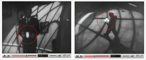
For my poster, the idea I came down to was using the “infamous glowing cup” that was featured in the movie (illuminated by a hidden light to make it seem surreal) as seen above. There is a story behind this cup which I will tell you know…
The movie as you guessed is based around suspicion and Lina, the wife of Johnny gets so suspicious of him that quoted from the plot synopsis “She cannot even stay in the same room at night with him, and when he brings a simple glass of milk to her before bed, Lina is filled with dread. She fears that Johnnie now plots to poison her, and collect the money from her life insurance.” – In simple terms, she is so suspicious she can’t even trust a glass of milk from her husband.
It is actually quite interesting because in the original novel she knows the milk is poisoned (and it was) and she gulps it down knowingly however in the 1941 movie, the milk is left untouched and there is an alternate ending (a car chase) which leaves viewers thinking whether or not Johhny was innocent or not proving how important this glass of milk is to the central theme of the movie.
Anyway, after reading about this glowing milk I just had to incorporate it into the poster some how so I focused around this point in my brainstorming and came up with the idea of showing Johnny just about to walk up the stairs to give her the poisoned milk – I wonder what he would be thinking?
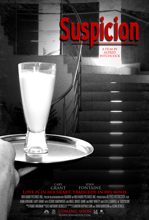
I purposely made the glass of milk very white and even gave it a slight glow. I made the actual scene black and white and grainy to depict the original black and white film noir style and to give a mysterious look. The red colour was to used to portray murder which is a constant theme throughout the movie.
Resources Used
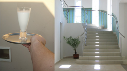
Above you can see the original shots that I used for creation of the poster, one featuring my lovely hand that was flipped for the poster and the other pic, a nice staircase. The rest was up to Photoshop. It was shot with a 7.1mp Olympus 720SW Handycam on the Macro setting. The staircase is actually curling around like in the original 1941 movie which is another small detail that you might have picked up on?
The fonts I used were Blue Highway Condensed for the title, the oh-so-famous movie font (Trajan), for the cast titles and the classic Steeltongs for the condensed type at the bottom.
The edges of the border were done using Photoshop brushes and masking. The movie logos seen at the very bottom of the poster were grabbed from Brands Of The World.
Final Poster
Let’s see how my poster sums up to the tips I mentioned above.
- A poster should be Aesthetic – It should get attention so the message is delivered.
The bright contrasting red and unusual white glass figure draws attention into the poster. - A poster should be Focused – It should focus and communicate on a single message.
The black and white style portrays the film noir style of the film as well as portraying a mysterious feel to the poster overall – the image leaves you wondering what is going to happen. - A poster should be Ordered – The sequence should be well-ordered and obvious.
A large heading and a large image draw your eye into the image and there is a clear hierarchy of information. There is a balance between the word suspicion and the glass of milk which makes you think they are related, ie. What is suspicious about the milk? The next thing you would probably read would be either the “A film by Alfred Hitchcock” or the bottom tag line which both are red. The key parts of the poster are all in red which helps help give the reader a hierarchy of information.
And there we have it, that is how to make a movie poster. As always, harsh constructive criticism is welcome, it is due in 2 weeks so I have time to improve things. Oh and the movie is due to release early 2009. (Just kidding, but I wish it was.)
Update: Top 100 Posters of all time. A great resource. I am thinking maybe the Casablanca (#12) font could work for my poster. My favourite is #77 the A.I Cover and #7 just because it is so cheeky.
Revision
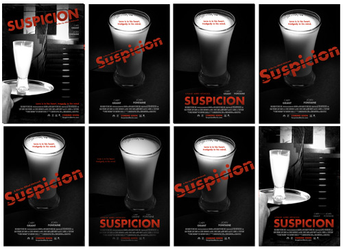
After receiving some great feedback from the comments below, here are some revised versions.
Milk Photo above is All Rights Reserved of OhSillyMonkey.
Below you can see the revisions from the original.
- Changed typefaces to Futura.
- Darkened the whole poster, removing more of the greyscale.
- Moved stairs further up in the poster
- Added glow to milk
- Moved title to bottom of poster
- Added suit sleeve + white shirt onto the arm.
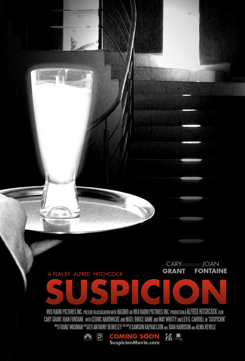
2nd Revision
After receiving some more great feedback from the comments below, here are some revised versions and a mock up.
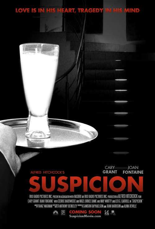
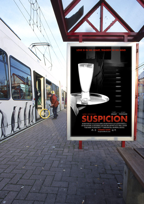
Quick Mock Up
Another Version

Final Poster
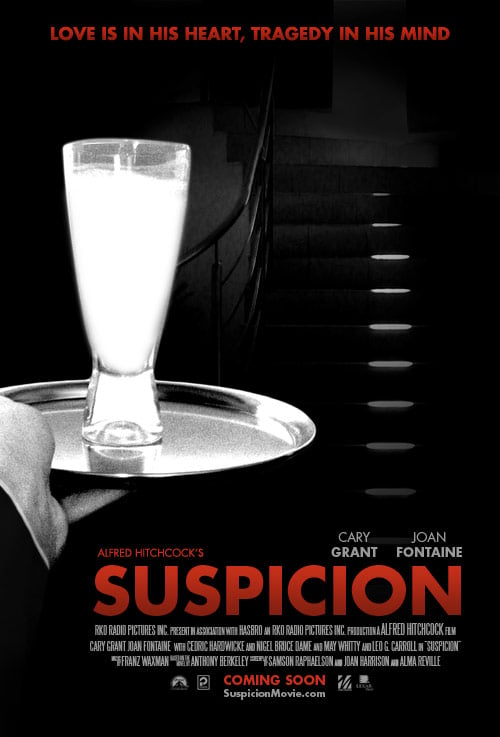
What do you think of the revised versions?

Nice composition. But the title is too small and it’s “tragedy” and not “tradgedy”.
Interesting you say that because I had actually done that however I found it gave it a too old / horror look as it is meant to be contemporary but I will experiment with more typefaces to see if I can find the right one. The only thing really (kind of) bugging me right now is the actual type face so if anyone does have a good suggestion fire away.
Oh my Jean, what a horrible and amateurish mistake, just as well it wasn’t a finished product and 2 more weeks till deadline. I will fix that up after the other rounds of feedback. Appreciate the feedback, thanks.
cool..!! nice use of the glass there.. i like it..
At the bottom of the poster, you have Cary Grant listed first above the movie tag line, but in the “credits field”, you have him listed after Joan Fontaine. Is this by design, or should it be switched (one would assume Cary Grant would be listed first)?
Second, while I think it’s a fine attempt, the “idea” that came to me is this (though may be hard to visualize): show the shadow of a man accending a stairwell cast upon the side of the wall. Within the shadow of the glass, could you illuminate it, or have it white instead of black? Or if not a shadow, could it be a dark figure shown climbing the stairs?
You maybe too far along to try a new concept, but I’m not getting a sense of the impending doom and mistrust the female character is supposed to have. And I also agree with the above comment, I think the title is a bit lost/too small.
The compositing is really good though.
Hi Twocifer,
Very good spotting with the credits field, another small detail that I will fix, you were absolutely correct and it really is the small details that is what makes a professional finish,
That is a pretty good idea regarding the shadow, I still have 2 more weeks to go so I will try that I guess, see how it works out. I will also change the text. Thanks!
The greyscale is too neutral; no pure black. You can be far more evocative (and bring out the white in the cup) by setting the black point far higher up in the histogram.
The drop shadow on the title is superfluous and cheesy, which is a shame. I’m also inclined to think the inner glow tends to look a little filter-whorish. It’s certainly not “noir” feeling. Stark and broad, I’d say would be the typographic attributes I’d go for.
The other thing is that Trajan is a total crutch for movie posters. Each typeface has unique character and tone, and Trajan is used as a neutral, epic sort of font (feels a bit ancient Roman). It depends on the brief, but I’d be inclined to use fonts a bit more evocative of the era as supporting fonts.
As for the title, you’ve already presented the Scrabble item as an item of visual interest; why not use that and play with the visual a bit? Look at Saul Bass’ titles work for period examples of integrating the supporting art with the film.
Also, retake the photo of holding the glass with a suit jacket on. Cary Grant isn’t exactly a short sleeves sort of actor. He’s cufflinks.
But I’m sold on the milk as evocative representation of the plot.
good. my only suspicion…I mean suggestion would be to make the title larger across the top or give it a curve or slant all those old movie posters always had that. If it were a slant it would play off the elevation of steps
modemloopers last blog post..Why Computers Are Important To Designers
I’ll throw my agreement in with Twocifer. You have a good concept so far but the film noir genre give you some excellent excuses to use shadow to your full advantage.
As he mentioned the shadow ascending the stairs or possibly a shadow of Johnny cast forward onto the stairs.
The direction is good but my only thought is that there isn’t much tension in the poster.
Hi Jacob,
I really like your approach to the project and showing your thinking. I might not like execution itself, but the process is great. Thank you.
Wow, I am so glad that I have this blog, this is more than I could ever learn in University so thank you all for your honest and very valuable feedback! And all from new commentators too – please stick around!
Kit,
Ok now that you have pointed out all the design faults, I agree with you completely. Have you ever heard of the Joshua tree story? – the moral pretty much is once you spot ‘it’, you will see ‘it’ everywhere.
So in summary after reading your feedback I should…
1) Make it more film noir like, ie more contrast and mysteriousness in colour.
2) Remove some of the effects on the text. Regarding your suggestion of a stark and broad typeface, I was thinking something like Casablanca? Or would you have another suggestion.
3) Remove Trajan, find a font evocative to the era.
4) I liked the scrabble idea and I actually looked for a scrabble board at home but all I found was scrabble dice, whatever that was. I will have to borrow a board to play around with that idea, possibly having ‘Suspicion’ played out in scrabble pieces or Murder. I also found a site with Saul Bass Title Sequences which I will at more closely.
5)Good spotting with the jacket, I will have to do that. Man, all these things that I have overlooked but that is how you learn!
At least you were sold with the representation of the plot, ha! Thanks Kit, you have been very helpful and eye opening. I hope you comment more often on here!
H,
You are right, it does need some more action in the poster, it is a bit boring now that I look at it and compare to your suggestion.
Regarding the choice of red black and white and the ‘competing with a lot of other material’ could you clarify those statements please.
Although your suggestion with the two figures is a good example (and thanks for doing it), we were not allowed to use photos from the film – we had to have our own photography as the central piece in the design.
Thanks for the comments, and like Kit, I would like you to comment more often, your feedback is great!
NTLemon,
Thanks for that, I will be experimenting more with the shadows and actually will be doing a lot of the poster all over again, now that I have received such valuable feedback.
I am thinking Johnny’s shadow cast forward onto the stairs would work quite well. Hopefully more tension will be added once the contrast and text has been adjusted.
Pixelspectrum,
I always try to show my design process in my posts, I think it adds value to the post. What parts in the execution did you not like?
Lovely work, the contrast between black and white is nicely balanced, it’s clear you spent some time making the black and white colours work together, and it’s paid off. & I love the idea with the POV shot, very nice piece.
I’ve just read the comments by Kit, and although I think the colours look fine, I do agree with the comment about wearing a suit, that would be a great touch. Although It’d have to be worked with so that it’s actually noticeable; It’s very dark in that bottom corner where your arm is, and if your wearing a dark suit it might just blend in with the floor, so make sure your the lighting / colour of the suit works in your favour.
Hi Jacob, great feedback on here so far. My biggest thing with the poster is the flatness of the greyscale. The overall feel is too weak…it needs to be more contrasting and stark to give that feeling of immense anxiety and fear about what is about to happen.
I think some tweaking after the comments above it will be great however. best of luck
Brian Yerkess last blog post..5 Ways To Work Faster in Photoshop
i’m sorry, while i think that all the elements are composited effectively, the overall composition is to my eyes boring. it might be that the main lines across it are very vertical or horizontal (stairs) which ends up in a grid… hitchcocks poster puts the titles in diagonal… also, if you make a film poster, you are competing with a lot of other material. how does the classic film look help? iti am referring to the choice of black and white with red as your main colors. it’s more of a retro tribute than an attempt at film marketing, and i think oyur design suffers for it.
hs last blog post..ericka
i did this simple idea layout in 20 minutes but i think it’s better simply because of the diagonals… what do you think of it? i used your credits and didn’t clean them too much
i even left the tradgedy in there…
hs last blog post..ericka
That’s a pretty good start Jacob (and a great walk through of the process), but it does need to be taken further. Saul Bass’ posters are iconic, but I don’t think they’d help here as they are illustrative whereas yours is photo based. I don’t think his typographical style would suit here either.
Definatley more contrast to make the milk stand out more as it doesn’t quite get the focus I think you’re aiming for. The shadow idea mentioned is good. You could have the shadow cast in front so that it frames the glass of milk? Maybe add a very faint glow to the glass – barely visible but enough to have an affect on the minds eye.
The fonts need to be kept simple I think. Futura Bold would work fine, maybe the condensed version. Neutraface is similar and works well.
Look forward to your next revision!
Very good lesson:) Be sure to try today:)
Movies last blog post..Perfect Hideout (2008) [Action, Thriller]
Great work, keep on doing it more you’re already there…. 🙂
Your core idea is solid, but you’re overcomplicating it. Use a simple, stark glass of milk on a dark background with great typography and you’ll have it.
Maybe a photo like this: http://www.flickr.com/photos/15202064@N03/2493626006/
Nothing could be more innocent than a glass of milk, right? But the glass of milk is sitting there, in the dark, out of context, with the word “Suspicion” over it… suddenly the safe, wholesome milk is threatening. What’s wrong with it? Why is it dangerous? Who would make milk that could hurt you?
That would be direct and powerful. Boil your idea down to the core.
Well a great composition. The poster is given a very well balanced look, it truly matches up with the title and the composition. And the use of colors are also fine
Liam,
The advice given has been of so great it has actually even given me the idea of writing the post “What they do & don’t teach in design school.”
I photoshopped a suit into the new revised one.
Brian,
In the new revised edition see above, I made it more contrasting with more black and not so much grey.
Steve O,
Your suggestion of Futura was great, it worked very well for the poster I belive. What do you think of the revised poster?
I haven’t tried the shadow yet but will do. I have also added a faint glow to the glass.
Paintworkz,
What do you think of the revised poster?
Jeffrey,
Each person has their own opinion of what movies to see and not what to see. I personally am more influenced by trailers. What do you think of the revised poster?
Mchilly,
What do you think of the revised poster?
J. Jeffryes,
I have simplified the poster more like you suggested as you can see in the examples with the image you suggested. Do you think they are stronger?
Hey Jacob. I think the revised posters look MUCH better. I think my favorites are the ones with just the milk and a black background. Looks great!
Sooooo much better!! Adding the sleeve definitely helps. The font is also more fitting.
Wow Jacob, the revision is MUCH better. I especially like the new font choice.
Just goes to show that the revision process is just as important as all others when it comes to design. Nice work.
Great revisions, loving the typeface. Great update.
I somewhat agree with the others. I think that you did a great job of putting everything together. However, if I put myself in the shoes of a person going to a movie theatre. If I saw that poster, would it make me want to see the movie? I’d have to say no. You’re extremely talented though.
Hi Jacob, revision is much better! Well done.
I really like how the stairs look now with that level of contract on the overall image. Also, the suit sleeve was a good addition.
Im not sure about the glow around the glass though..perhaps because I can see the edges of it…fade that out with some spread and it should look better.
Brian Yerkess last blog post..Client Focus | Advanced Software Products Group
Checkmark for you! This new version looks way better. I believe that the typeface gives that modern look you were trying to achieve, while giving the whole composition much more strength.
Would I be off the line if I ask for yet more darkness? =P (I’m acting like an annoying client)
The suit sleeve observation was very clever and apropiate too! I don’t personally love the milk glow, but I can live with that. 🙂
Definitely better. Darkening the stairs helps, and the poster overall has better balance now.
Though I think you should still explore just the glass. Make it more uncomfortable by shrinking the glass, so there is more darkness around it. It’s too big in the glass only posters you posted.
Try a narrow or compact typeface to give it a more eerie feel. Maybe something serifed and elegant.
i’d see that movie! I like the second one on the bottom row as an alternative.
modemloopers last blog post..Why Computers Are Important To Designers
Well I arrived late to the party so it seems everyone has already made great suggestions that have been taken into consideration into the revised version. Great job. I do have to agree with Steve about the glow tho…
Looks like the font is going down well! It does look much better. The glow looks too obvious though and a little hard. Try this technique using two different glows.
Hmm, I seem to be a little behind the times as well… Anyways, I love your poster, Jacob! The revisions are excellent; you have certainly made quite a bit of progress. I do, however, have another suggestion for you: I can’t really tell without seeing it, but I was thinking it might look good if you were to add the tag line at the top of the poster. Also (and this is really just a personal preference) I don’t like that it says “A film by Alfred Hitchcock” directly above the title. I think it would be better if it were moved or if it just said “Afred Hitchcock’s.” But again, that’s just me. Good luck finishing your poster!
=]
Your typography is vastly, vastly improved. Much more subtle and intriguing. Futura uppercase is a beautiful sight to behold. I had somewhat expected you’d put together the word “Suspicion” in the scrabble text, which I still think would work very well (Photoshopped and shown at the same angle as the shot you’ve highlighted in the movie), particularly with the glass on its own.
I think the suit makes a massive, massive difference (but it’s clearly Photoshopped in; the cuff is too blurry and there’s zero noise on it compared to the hand or tray).
The stairs look far, far more interesting now. You could maybe consider vignetting away some of the detail at the top of the stairs; it really only needs to *suggest* stairs (which the highlight on the rail and risers does); you needn’t be able to discern the tiles on each step. Remember; the less the user thinks about the stairs, the more they’re thinking about the glass, which is what you want to encourage.
I agree with other comments suggesting you remove the glow on the milk glass. It’s too literal and obvious. The very fact that there’s a milk glass occupying a large portion of a movie poster should be intriguing enough. Otherwise it might be taken as a sort of superhero movie/Hulk thing where the drink isn’t milk; it’s something radioactive. Play with the minds of the viewer; don’t feel that you need to spell it all out for them. I’m sure you’ve heard the old adage: good design isn’t having nothing else to put in, but having nothing else to remove.
But a massive, massive improvement. Congratulations.
I really like the third little thumbnail poster you did for this revision too (using the glass as a platform for the pull quote is very effective). If you were going to go with the glass on its own, I’d be inclined to reduce its size pretty significantly. Remember that movie posters get reproduced at very large format. It might help to mock up your poster in situ at a cinema to see how the elements interact with the space and people in it (I imagine that it’d look best if the glass was close to the size of a regular glass of milk at full-size reproduction if you went with that design; more seemingly innocuous, and therefore more interesting to be used as the sole design element of a multi-million dollar movie).
But that’s just general feedback. The improvement here is palpable and I’m sure you’ll slaughter your assessment.
Hi All,
I have revised the poster again after even more great feedback (I secretly wish Kit was our university teacher.)
Thank you everyone for the tips and advice. What do you think now?
Your second design (small glass on black background) has the word “tragedy” spelled wrong again. Worth fixing up before presenting it. I’d also look at darkening the ground/shadow that’s cast; draw more attention toward the glass. I really like that poster (but I’m a minimalist at heart, so it’s the sort of thing that appeals to me).
You can see how mocking the poster up in situ shows off the relative size of that milk glass. Large format is very, very difficult to get right, because you’re laying out on (likely) a 20″ screen for use at (sometimes) around 2 metres diagonally.
The revisions you made to the main concept are a marked improvement. It’s something I hadn’t noticed until now, but it really looks like you have a baseline shift between the “CARY GRANT” and “JOAN FONTAINE” names (that is, they’re not both aligned to the same baseline).
The new suit is an incredible improvement. Kudos!
I might consider increasing the vignette effect across the top of the stairs; even out the background behind the tagline for contrast reasons and because it doesn’t add anything to the scene. Have the vignette (very subtly) follow the stair rail, perhaps?
I’m really impressed by your ability to disseminate the crowd’s opinion and apply it effectively to your work. It’s difficult to avoid the potential for failure when you allow your work to be designed by committee but you’ve clearly let your personality as a designer come out.
I don’t know how you’re expected to display the outcome of this project, but I can say right now that mocking it up in situ (in perspective at a cinema, in press advertising like you’ve shown, etc., etc.) is a very effective way to show you’ve considered things like eye-height and visual interest.
Great work!
Oh, and you don’t want me as a teacher. I’ve only been out of Uni myself for three years! I just loved the practical element of my design course.
Nice work Jacob! The poster is looking a lot stronger now. I’ve been trying to decide which version I like, but I can’t seem to come to a conclusion.
The glass of milk alone works well, but the casual viewer might find a poster of a glass of milk a little bizarre, especially with the title ‘Suspicion’. Documentary about the adverse effects of to much milk? I also think it needs lowering – it’s closer to the tag line than the title and looks a little off balance to me.
The ‘stairs’ version works better as a glimpse into a story for me. I agree with Kit about darkening the upper floor details – just so they’re barely visible. And yeah, sort the baseline between Cary and Joan 😉
Kit and Steve O,
Damn spelling! I will fix that up.
I kind of have to agree with Steve O on the actual just milk poster – it is a little bizarre.
The stairs version I believe works better as it gives more into the story as it’s not so ‘minimal’.
The baseline shift is something that has happened when I scaled it down for the web but it is perfect once I rechecked it.
About disseminating the comments, if I think a suggestion could even slightly improve the design I will always give it a shot, there is nothing to lose from trying it out.
About presenting, we are required to present it on a A3 Mount board with an A4 printout, stock is up to us but I will show the mockup of the poster outside, in my lead up work.
Well compared to my current teacher, I have received a lot more feedback than she ever has given – she is quite under qualified in my opinion.
I am at Uni now however I will darken the stairs at the top and try the following the stairs approach once at home. Thanks for the continued feedback.
Jacob Casss last blog post..FREE Month of Advertising for All
I love the one with just the milk.
I suggest moving it off center to increase the tension. Having it in the middle kills the feeling of menace.
Hi Doug,
It’s Jacob but no worries, everyone makes mistakes… if you do it again, I’ll kill you 🙂
I did play around with the shadow idea however it never really worked with the project as a whole however I am sure that with a lot more effort it could be pulled off but I am getting quite happy with this poster, it is nearly there.
The blood doesn’t go with the film as there is no blood at all in the film and is based around suspicion as a theme in itself but it definitely could work in most other thrillers.
The movie poster you designed has a great concept and it is fairly well executed except I think the typography needs a bit of fixing in the credits or did you purposely make it more easy to read?
J Jeffryes,
I’ll try the off centre milk but I still think the post is too minimalist as Steve pointed out. If I saw that poster I wouldn’t know what to think? Is it a documentary? Thriller? Mystery?
Hi Justin. You have the atmosphere, but you need some more dramatic elements – like a long shadow up the wall, or even better, a drop of red blood in the milk.
I followed this same process when developing a movie poster of my own for a design contest a while back> http://dougcloud.net/show/brushwithdeath.jpg
Oh yeah, I just started my own blog and I added a link to your site. Hope you have a safe trip.
Jacob….my apologies. They say the mind is the first thing to go, but in my case it’s the memory. Mine is like one of those dartboards that you throw those little velcro balls at; sometimes they stick, sometimes they don’t (lol).
No blood? Bummer. I just thought a drop of red in that white glass would be quite dramatic. Or maybe a door at the top of the stairs open just a crack…
For the text in my poster I studied a lot of movie posters and used the same type style in mine. As for readability I guess that’s a good thing, isn’t it?
Is there a final version yet Jacob?
Yes you can see what I handed in on the last picture.
Hey – great post! I recently created a movie poster for an independent film and I shared my process as well. It’s fun to get feedback and give people that “behind the scenes” taste. good work
hello Jacob.. my name is daisy, and im from greece.. im studying ”graphic design” in university of central lancashire (uclan) here, in Thessaloniki ( a city of greece ) . This is my first year n this university and last monday,they gave me a similar project with this one.. i discover your page by accident and im really happy ,cause you helped me a lot! and not only with this project.. i just want to say to you,congratulations for all this work.. its really helpful !! im sure that i’ll visit your page for lots of things that i may need help.. thanks again! ohhh and i loved your poster! 😉
Sucks, Can tell your a genious.-_-
Great info man! Awesome poster! I like the lighting on the stairs, it leads me to the title. What if you put a swirly drop of blood in the milk, like on the top. Make it bright red to make it stand out. I think that would give it a nice twist. Anyways, awesome stuff!
hello
i wanted to know what program you used?
John,
Mostly Photoshop, however if it were to be printed, it would be wise to lay out the text in InDesign.
6/10.. but for amateurs.. this should be marked 10/10 🙂 THanks a lot for sharing. 🙂
hello this is amazing! but i just wondered how did you get the type face for the credits at the bottom? and where you found all the company symbols as im creating a poster campaign for media!
so nice poster. ilove da way u designed it.
i like your film poster alot:) i have to design my own film poster in media studies at school and i was wondering what information goes on the small print at the bottom because i haven’t really payed much attention to that before. if you could let me know asap thank you.
1 hope and lifetime learning scholarship online christian psychology degree accredited online courses for estimating online colleges medical coding transcriptionist
9 purchase isotretinoin no prescription metronidazole overnight delivery cheap celadrin no prescription online purchase diflucan
8 prednisone no prescription estrace online no prescription coreg no prescription purchase metoprolol
8 cheap buy rx provera purchase disulfiram online clomid online order pyridostigmine
i really like the posters with the hand i think they do a better job at communicating the message and intriguing.
Hi. I’m working on my 1st poster for latest short film comedy. I might have someone do it professionally. But I want to give it a shot.
As far as your poster. Its always good to take advice, and criticism from others.
At the end of the day. You have to go with your gut feeling. If you think the poster fits the emotion and dramatic feeling that you are trying to reach. Then go with it. I think it looks good. Sure you can make changes, here and there. In hindsight, you spot alot of things that you could’ve done differently. We live by the moment. How you feel now.
If an artist, changed his work every day based on critiques. In my opinion. He’s not an artist, but a puppet.
I’m a writer. When I write a script. Not everyone likes my comedy. But I’m not going to change my whole script based on a few people, that didn’t understand my comedy.
I saw, that you had a lot of good advice. Don’t mess you head up. You already have a good poster, with the exception of the misspelled word.
Your design process is so great!! it benefits me a lot since I am doing my personal portfolio to apply Graphic Design master programme:)
Teaching action/adventure to GCSE Media class and currently getting them to design and produce their own posters. This was a MASSIVE help to me in preparing some of the material – really made me think about their use of photography and the editing process. So a really big thanks!
COLUMBIA PICTURES presents a HAPPY MADISON/SCOTT FREE production “THE MYSTERIES OF ALFRED HEDGEHOG” MARK STRONG costume disinger PENNY ROSE music by HANS ZIMMER editor JOHN DOE production disinger JANE DOE director of photography JESS HALL executive producers STEVEN SPIELBERG GUY RICHIE based on the characters created by ALPHAIN PRODUCTIONS produced by JOHNATHAN NOLAN SUSAN DOWNY written & directed by GUY RICHIE
hello your poster was ace! I am doing a project at the moment where i have to produce a poster for a film called “Prisoner Of A Promise”. The plot is pretty basic at the moment giving just enough detail to create a poster from – Angelina Jolie is an assassin on a mission to kill a man whom has started a war on a coast in africa where he is using people over there. Sam Worthington is in the army helping protect the area in Africa and sees this man behind most of it move away. Sam follows untill he ends up in America. This is where he meets up with the assassin ect. In the end it turns out his dad was the prob;em and Sam has to disobay a promise in order to save the world. Not much of that is really important though. I just need an effective poster! If you have any ideas please reply ASAP and i would be extremely gratefull!!! Thankyou!
ITS SUCH A MOTIVATION TO ME…I love designing..great energy from your work.
Nassour,
Dar es Salaam, Tanzania.
me and my friend are making a play and we want a poster for it cuz we are going to perform it at skool, so this is going to really help thx!!!!!
Great poster, and great article.
Thanks a lot for sharing knowledge with other designers.
I think moving the stairs further up in the poster was a great advise/tip. I think it gives more tension, because you cannot see what´s after the stairs.. Would there be somebody? i dont know, i cannot see! 😀
This is a great poster! well done. I’m currently designing a poster for Media Studies at school. This helped me greatly
Many thanks
I find the movie poster very effective in a variety of ways. willy
Very interesting post, cataloguing your steps throughout the process. It inspired me to create my own version of the poster, albeit a different creative execution.
http://houseofwook.com/suspicion-hitchcock-and-poster-design/
loved this article and your poster.
how nice it’s to see the creative process of other designers. this really helps me to improve my own creative process. I think that research is the most important step when you have to design something.
thanks for sharing!