Want to learn about the fonts used by professionals? This article contains the best fonts used by professionals in graphic design.
Designing a form of communication with visuals in a combination of artistic elements and typography conveys the right message. For this, font style is important as it can alter the viewers’ feelings.

If you have ever wondered what fonts mean, they are important in communication and design. They play an essential role in displaying the message. Fonts can make or break a graphic design project, so using a professional font is paramount to its success.
As said, typography is crucial, regardless of the font used. Professionals have an eye for detail. They know which font to use to convey the message in the right way.
Fonts are used in beautifying a design. For that matter, they can be a document, a website, for promotion, branding, logos, marketing, and more. These fonts in the list are perfect for branding, logos, and packaging and are always on hand for graphic designers.
In our journey, we’ve seen many other most used font posts. However, most of them outline fonts used by untrained ‘designers.’ In this post, we have outlined the fonts that professional designers often use.
Top 10 Professionals Fonts for Graphic Design
Every designer needs a solid set of professional fonts in their collection but with the thousands available on the market, what are the must-haves? These are the top 10 most used fonts used by professionals in graphic design:
Also see timeless fonts, best font combinations and the best fonts of all time.

Download all the Fonts you need and many other design elements, available for a monthly subscription by subscribing to Envato Elements.
Get unlimited access to a massive and growing library of 14 Million+ items.
How to Choose The Right Professional Font
But first, how can you choose the right font for your graphic design project?
- Choose a category of type (ie. Oldstyle, Modern, Slab Serif, Sans Serif, Script, Decorative). Unsure of your type classifications?
- Are you combining type? Use complementary fonts for a more professional look. See our top font combinations here.
- How much text is there to read? What is its purpose? Are you designing for a poster, a book, a report? What is more important – readability or aesthetics? What is the purpose of the text? A serious look, a casual look, a decorative look?
- Consider the quality of printer & paper. Where are you getting your piece printed?
- How much space do you need to fill? Or leave unfilled? Different typefaces take up different amounts of space, even at the same point size. Try comparing two fonts next to each other and see how much space they occupy.
- Is the project to be skimmed or be actually read? Choose a typeface and layout that suits its purpose.
UNLIMITED DOWNLOADS: 50 Million+ Fonts & Design Assets

Download all the Professional Fonts you need plus many other design elements, available for a monthly subscription by subscribing to Envato Elements. The subscription costs $16.50 per month and gives you unlimited access to a massive and growing library of over 50 million items that can be downloaded as often as you need (stock photos too)!
10 Best Professional Fonts
Are you looking for a professional font for your next graphic design project? See our list of the top 10 professional fonts for designers.
1. Helvetica / Helvetica Neue / Helvetica Now
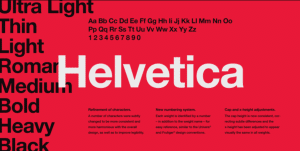
Undoubtedly, Helvetica is the most heavily used font by professionals in graphic design. Although some praise the font, many believe it is spaced too tightly.
Helvetica, which comes in various weights, widths, and sizes, is appropriate for most designs. We’ve used this typeface a lot in designs that call for a classic touch because we adore it for its professionalism and simplicity.
We use this sans-serif font for a variety of tasks, including logo designs, business card headlines, and more. This font is used by numerous reputable companies in their wordmarks and company logos, including Jeep, Panasonic, American Apparel, Target, Skype, JCPenney, and many others.
And as Vivien pleads in her most overused fonts article, “Understand that you can’t always rely on Helvetica to illustrate and deliver your every message. Helvetica is not perfect for everyone and every occasion.”
You may also want to consider the new 2019 Helvetica version, Helvetica Now.
2. Trajan Pro
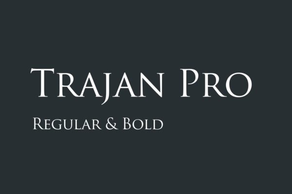
Many Hollywood movie posters feature Trajan, whether related to religion, law, marriage, class, or history. Our research shows that this elegant font will give your designs better technical adherence and a longer-lasting aesthetic appeal.
Trajan is an old-style serif typeface designed in 1989 by Carol Twombly for Adobe. The design is based on Roman square capitals for the inscription at the base of Trajan’s Column. Trajan Pro
We adore its elegant appearance. It is a good option for titles and headlines because it is sufficiently readable. You can check out the Flickr pool for more uses of Trajan.
3. Garamond Pro
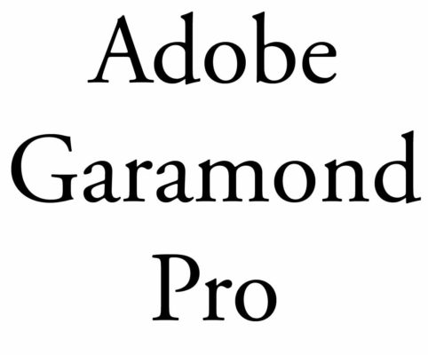
Although there are many versions of Garamond, the most used version today is the Adobe Garamond Pro, released in 1989. Garamond is a great font for magazines, textbooks, websites, and long bodies of text and was recently named the second-best font (after Helvetica) by a German publication.
This font strikes the perfect equilibrium between beauty and uniqueness by giving it an authoritative and authentic look, making it an excellent option for books, novels, and short stories. The older iteration of this typeface is still used by a few companies, including Apple, Google, Dior, Abercrombie & Fitch, and a few others.
It is worth considering because it effectively combines its modern digital feel with OpenType’s sophisticated typographic capabilities.
4. Futura

Futura is a font often used in large displays, logos, corporate typefaces, and books where small text is needed. It is based on geometric shapes (near-perfect circles, triangles, and squares), representing the Bauhaus design style of 1933. Futura has an appearance of efficiency and forwardness. Some do hate the font, though.
We appreciate the font, though, for its conceptual simplicity, elegance, and boldness. Your designs will feel more futuristic if you use this typeface in contemporary designs.
This futuristic font’s adaptability makes it suitable for designs like company logos, taglines, and novels. You can find this iconic typeface on well-known companies’ products, including Supreme, Nike, Gillette, Red Bull, PayPal, and more.
5. Bodoni
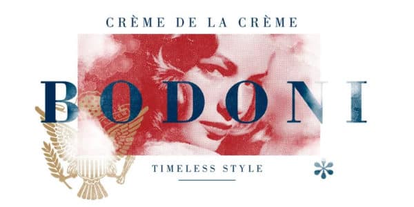
Bodoni is a great font for headlines, decorative text, and logos. Bodoni has a narrow underlying structure with flat, unbracketed serifs. The face has extreme contrast between thick and thin strokes and overall geometric construction, making it a very aesthetically pleasing font.
According to our research, this bold typeface has become very popular in the fashion industry due to its aesthetic attractiveness. This juxtaposition of thick and thin lines creates a distinctive appearance when used on posters, package designs, cover page designs, fashion logos, and other items.
This formal typeface is on renowned labels like Gucci, Vogue, Calvin, and more.
6. Bickham Script Pro
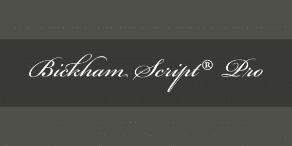
Bickham Script Pro is a font that does the job well and is used mainly for formal occasions. Cameron Moll even recommended it in his article “Typefaces no one will get fired for Using.” The ‘not-so-trained’ designer usually vouch for Vivaldi instead, one of America’s most hated fonts. Another great alternative would be Sloop.
This distinctive cursive typeface is an excellent option for pictures, letters, printable, events, etc. They appear flawlessly imaginative, appealing, loving, and elegant despite their apparent simplicity.
7. Frutiger
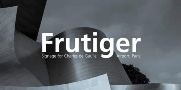
The Frutiger font family is neither strictly geometric nor humanistic in construction; its forms are designed to quickly and effortlessly recognize each character. Such distinctness makes it suitable for signage and display work, and it is often used in Web 2.0 Logos.
The full family has a warmth and subtlety that have, in recent years, made it popular for the smaller scale of the body text in magazines and booklets.
We also discovered that this humanist font was frequently used for signs at airports, pharmacies, highway signage, hospitals, educational posters, and other establishments.
This makes it appear distinct and readable at all sizes, including from a distance. In our study, we also learned that designers have long preferred this due to its clarity and legibility.
8. Sabon

Sabon is the perfect font for book text and elegant design due to its smooth nature, and it has long been a favorite of typographers and professional designers.
With its gentle curves, smooth textures, and attractive serifs, this traditional Roman typeface succeeds in being readable. With a few minor alterations, we discovered that well-known companies like Vogue and Esquire use this italic font.
See here for more great book fonts.
9. RockWell
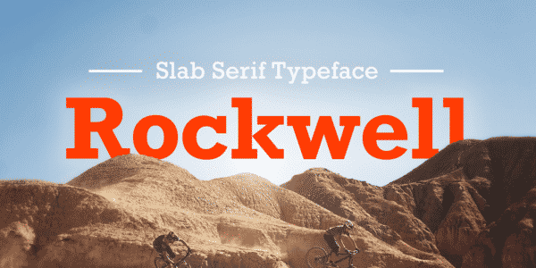
Slab serif fonts (square serif or Egyptian) are sturdy, straight-edged, and have a no-nonsense attitude. A font like Rockwell is robust and adaptable, which is why it’s always in a professional designer’s toolkit.
This Monotype font is legible and bold, just like all the other fonts mentioned above. This slab serif typeface works best for titles and headlines rather than the main body of text. You can use this professional, geometric-shaped typeface for posters, movie titles, advertising, and branding.
We discovered that this strong, robust typeface comes in light, standard, bold, and condensed variations and is widely used in advertisements and business documents. Look in periodicals like Tall Lighthouse and Guinness World Records if you want examples.
Also, check out our blogs on the best business fonts, and the best commercial fonts.
10. Proxima Nova

Proxima Nova font is an all-purpose modern sans that can give graphic design projects a very minimal and professional look.
We adore using this contemporary typeface in media because it is easy to read on screens of all sizes and has a basic, elegant appearance.
We found three widths to choose from: Proxima Nova, Proxima Nova Condensed, and Proxima Nova Extra Condensed. Each width consists of 16 fonts—seven weights with matching italics.
JUST Creative, the site itself, uses this font for it’s brand.
More Top Professional Fonts
Here are some other fonts many professional designers use quite often;
Gills Sans
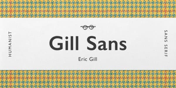
This font is widely used by professional graphic designers as it has a classic tone and concept.
For headlines, this humanist font is one of the best options available. The versatile style of Gill Sans font makes it a must-have for your graphic designer toolkit.
FF DIN
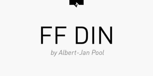
The FontFont DIN font is thin and extra lightweight. You will get a range of old-style and lining figures with italicized options.
Professional graphic designers love creating logos, billboard headings, web and screen designs with this sophisticated font.
Franklin Gothic
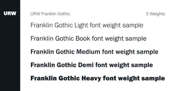
Franklin Gothic comes in 23 different styles, as well as family bundle options to create awesome text-based images and logos. This sturdy font is popular and recognisable among graphic designers.
Bembo

Bembo font has 18 styles that include lightweight fonts, bold, italicized and many more. This serif typeface old-style font is majorly used for printing and digital work. When there is more readable content, use this font.
Avenir

The Avenir font is a stylistic version of sans serif typeface. This font will give graphic design a very harmonious and sensible appearance.
ITC Avant Garde Gothic
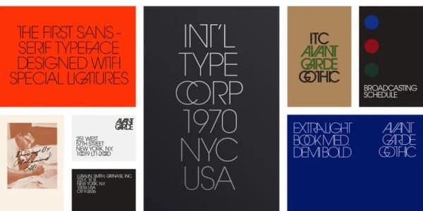
If you want to create a simple yet classy graphic design, give a shot to ITC Avant Garde Gothic font family. A geometric sans-serif typeface that’s perfect for graphic display. Original 33 variant characters, ligatures and extra characters are included in the OpenType version of this font.
MrsEaves
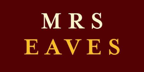
For years, Mrs Eaves has been one of the most popular fonts, alongside Helvetica, Univers, Bodoni, and Franklin Gothic. It has come to define the Emigre type foundry due to its commercial and popular success.
When utilized in the correct situation, it gives off a distinct vibe that distinguishes it apart from many other similar varieties. It has an undefined quality that people respond to. Give it a whirl!
Gotham
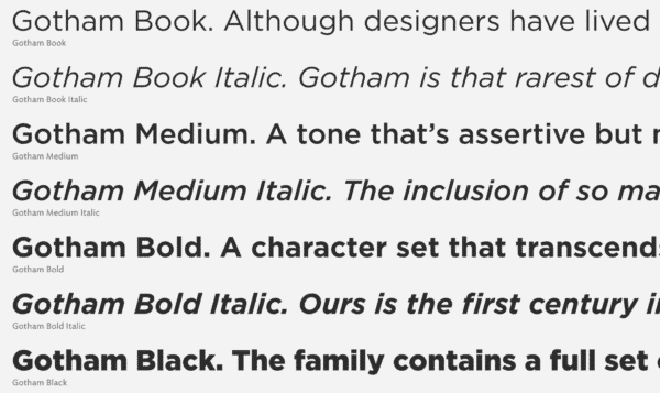
Gotham Bundle, as the name suggests, it is a combination of various Goham fonts. The letters are straightforward, although it has been used for half a century. Its architectural style makes it highly legible for graphic designing.
Baskerville
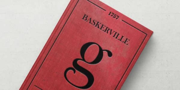
Serif typefaces, such as Baskerville, are popular with elite firms because they represent sophistication and timeless luxury. The Baskerville is an everlasting font. You are free to use them in your products and projects, whether print or digital, commercial or display ads.
Warnock Pro
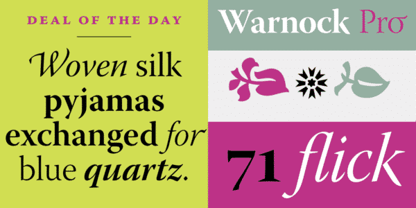
John Warnock’s innovative spirit has led to substantial breakthroughs in desktop publishing and graphic arts software. This adobe original font is named after him. Warnock Pro is a classic yet modern composition family that adds grace to a wide range of typographic chores. Use this font family in your next graphic project to add a modern touch.
Notice that none of these are fonts are downloadable for free? These are premium fonts used by professional graphic designers.
Editor’s Choice: Top Professional Fonts for Design
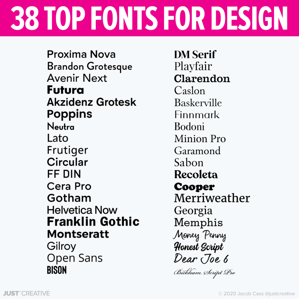
When we are choosing a font, there is a certain handful that is always top of mind. We listed them all out and came up with this list featuring 38 of our favorite fonts for professional graphic design.
Sans Serif
- Proxima Nova (Our brand’s font)
- Brandon Grotesque
- Avenir Next
- Futura
- Akzidenz Grotesk
- Poppins (Free)
- Nexa
- Lato (Free)
- Frutiger
- Circular
- FF DIN
- Cera Pro
- Gotham
- Helvetica Now
- Franklin Gothic
- Montseratt (Free)
- Gilroy
- Open Sans (Free)
- Bison (Get for 50% off)
Serif / Script / Hand
- DM Serif (Free)
- Playfair (Free)
- Clarendon
- Caslon
- Baskerville
- Finnmark (get for 50% off)
- Bodoni
- Minion Pro
- Garamond
- Sabon
- Recoleta
- Cooper
- Merriweather (Free)
- Georgia
- Memphis
- Money Penny
- Honest Script
- Dear Joe 6
- Bickham Script Pro
More Best Professional Fonts
Glenn Sans 
Glenn Sans is a good alternative to the ever-popular Open Sans and Helvetica. If you’re looking to explore a catchy typeface for your paragraphs, this Scandinavian-made font family with 16 different variants is a pretty good pick.
Mitga

Masterline

Looking to add a faux signature to something? Masterline has been picking up traction recently because of its utility as a signature font. There’s a childish flow to the momentum and angle of the type.
Biograph Signature Font 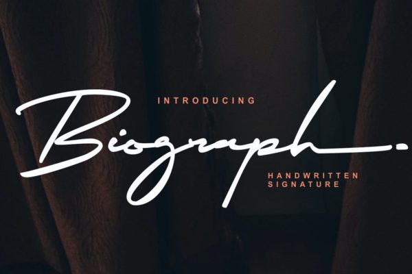
Another striking handwritten signature font is this contender. Dubbed a stylish homage to classic calligraphy, this font is beautifully intimate and stunning. From postcards to social media art materials, this font will succeed everywhere!
Ricfuser
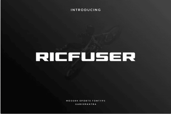
The Ricfuser is a modern display font. This font is great to use on professional designs such as on business cards, PowerPoint presentations, branding, logos, and more. You can also use this font on sports banners and sports accessories. Ricfuser is a serif display font. You can customize this font according to your designs.
With this font, your designs look more professional. This font contains numbers, uppercase letters, punctuation, symbols, and special characters. Ricfuser contains normal spacing. You can optimize this font the way you want for your designs. This font is easily accessible on Adobe Photoshop, Illustrator, InDesign, and also on Microsoft Word. This font also supports multiple languages.
Olivia Sans Italic Family
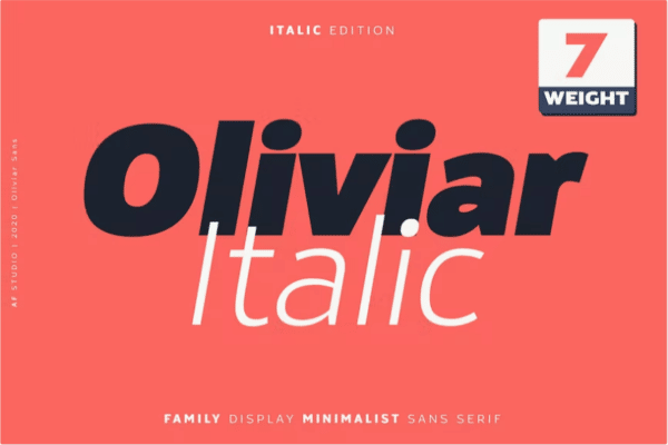
The Olivia Sans Italic Family is a modern font with a grotesque touch. This font draws inspiration from geometrical fonts and humanist sans serif. This font family includes seven types of fonts such as thin italic, ultra light italic, light italic, regular italic, semi bold italic, bold italic, and black italic. This font family is perfect to use on business magazines, cards, branding, advertisements, presentations, and more.
This font contains special characters, stylistic alternates, numbers, punctuation, and symbols. The Olivia Sans Italic Font Family also supports multiple languages such as English, Latin, Albanian, Irish, Italian, and more.
JUST Sans® – Clean Modern Minimal Font

If you’re after a clean, minimal, and professional font, check out JUST Sans.
JUST Sans is a highly versatile typeface with endearing, modernist warmth, geometric legibility, and a distinctive friendly bite.
Designed as a professional modern geometric sans serif, JUST Sans is both serious and friendly, neutral but warmly expressive, technical but not overt, and familiar but unique enough to stand on its own.
Our Favorite Professional Fonts
Still undecided? Here are our favorite professional fonts of all time.
Frequently Asked Questions
What are professional fonts?
Professional fonts are a category of fonts that work well in business communication and designs. While there are several types of fonts under this category, professional fonts are typically more minimalist in nature.
What are some of the best professional Serif fonts?
Some excellent professional Serif font choices include Bodoni, Sabon, Trajan Pro, and Garamond Pro. Typically, serif fonts are used to convey a more classy or elegant tone
What are some of the best professional Sans-Serif fonts?
What are some of the best professional Slab Serif fonts?
Rockwell is of the best professional Slab Serif fonts to work with on your brand messaging.
What is a good professional script font?
The Bickham Script Pro is an excellent professional script font to work with. For a versatile font family that has a script font, Warnock Pro is also a good one to work with.
What are complementary fonts?
Complimentary fonts or font pairings are two fonts that balance each other out and go well together. Typically, two different font types are paired together ie. Serif with Sans-Serif, or Sans-Serif with a script font. If you’d like to know more about this, you should check out our article Best Complimentary Fonts’.
Fonts Used By Professionals
Choosing the right font for your designs helps you enhance and align them perfectly to match the tone and seamlessly convey the right message to the audience. In this article, we have consolidated the list of the best fonts used by professionals.
What other professional fonts would you add to the list? or If you have chosen one of the best professional fonts mentioned above, let us know in the comments.
Happy Designing!


Hey JC. Liked this post. Although I must say that overused has a bit of a negative feel to it. Cause half of the fonts you mention in your list happen to be the “classics” and well nowadays some of the most readable too.. I do agree that creativity is key and it would be TEDIOUS to have all design accompanied by these same old fonts over and over again.
But still I’d rather see these than some of the “Zap Zoink, Kaboom” ones I have seen elsewhere…
Wow was I really the first to comment on this one? Woohoo a new record! hahaha
You clearly weren’t, and you’re doing quite possibly the most annoying thing one could possibly do in the comments. Congrats.
I agree that it can be annoying, but in this case they were actually the first, so please check your facts before bashing people 🙂
Zahira,
I never mentioned overused however it was easy to get it mixed up as the others in the series are based on over used design / trends.
ok, 3’s a charm, I mistakenly read OVERused where it clearly says USED. My fault. Discard above comment….gosh…really need glasses…
As an identity designer I feel lucky to have much more flexibility in project font selection. I certainly avoid using Trajan these days due to its overexposure – and I don’t think I’ve ever used Bickham Script for anything. I suppose I am guilty of using Palatino as my own most heavily used font due to its adaptability to a variety of purposes.
Jeff Fisher LogoMotives’s last blog post..Toot! Toot!*: NAILS Magazine features Jeff Fisher LogoMotives in "Graphic Design 101" article
I see, that articles about fonts and different typefaces are very popular this week! 🙂 Nice fonts I already use helvetica and trojan pretty often!
I know this doesn’t necessarily hold true for typography used by designers outside of the USA, but in America the most overused font/typeface is currently a toss up between Helvetica and AvantGarde, per my experiences living in NYC and Los Angeles over the past few years … not to mention, AvantGarde seems to slowly being overtaking Helvetica in appearing in everything from banking and mobile phone adverts, all the way down being the typeface used for nappies’ brand name logos!!
Good old Frutiger, this is still one of the best signage fonts ever! I’m using it in many wayfinding designs. For Garamond my personal fav at the moment is Arnhem from Fred Smeijers, also Minion Pro is superb. Thanks for sharing your list.
Sander’s last blog post..Airport Signage: Photo inspiration
Great post! Good old Trajan Pro, forgot about that one. It’s starting to irk me a bit.
Marnie B’s last blog post..Online and Offline Marketing: The Best of Both Worlds
nice list! I like the Trajan font and just used it on my last project. Thanks for the little bit of history as well. Keep up the good work here.
Tim Mercer’s last blog post..Artist Interview: Jens Sjobergh
I haven’t really read too many font posts before, No real big surprises on this list.
Found it amusing the Trojan font is the movie font as I was subconsciously thinking the other day when I was watching the previews that there was a lot of Trojan in a row.
Just discovered this blog the other day also, I’m also a Novocastrian living down in Sydney doing, graphic design 😮 Keep up the good work +1 rss feed
Hey Jacob,
great list – most of them have been tried by me (some with more succession than others!) Havn’t yet gotten the chance to try Trajan on an actual project (not sure if i want to!)
When you originally asked on twitter about most used fonts, HELVETICA really was the first thing that jumped to mind! hehe
Great list – great post. Keep it up! o)
-Jay
I like Helvetica. But i usually use Tohoma for design.
Great list for me. Thanks for share
Easy mistake Zahira, as this is one of a six part series and the other five posts are all “overused” items.
I have another to add: bembo
Do you think many of these fonts are used over and over again because we have had to buy them and want our money’s worth? (garamond, frutiger)
Kerri Jessep’s last blog post..Pingping takes a peek
Does it not seem that Papyrus is everywhere? I see it on everything– calendars, ads, and more. I don’t think I’ve gone a day without seeing that font in at least three different things.
It is a good font, but seriously overused
Certainly those are all very familiar faces on the list, though I’m starting to see a trend where designers are being more experimental with their font choices.
Thanks for the quote and link to my post on 16 most overused fonts 😉
That’s interesting. I would have definitely expected Helvetica at no.1 but half of the others I never use. I actually don’t think they even look particularly nice but we have been blessed with such an enormous range of free fonts online, we’re so totally spoiled for choice nowadays.
Nathan Beck’s last blog post..New Holiday Extras Viral!
Hmmmm. I too am guilty of using the same fonts over and over, just as when I find a meal I like I use it until I can’t stand it any longer!
I wonder if it is partially that– comfort in these fonts… we know how to kern them, we know that our clients will like them and we’ve done and seen some great stuff using them before.
Like Jacob said, these fonts are not free, but most of us will acquire them because we KNOW we will use them. The free fonts often do not contain the whole range of characters and weights you want to use, and I personally will not spend £200 on a font I’m not sure I’m going to use all the time. I wish there was a way for me to use the beautiful new fonts the founderies are putting out, so I can fall in love with them before I purchase them.
Saying that, most of my work has been on the web recently, so I’m stuck with frickin arial and georgia. 🙁
kat neville’s last blog post..Safetygoat up to his old tricks again!
Thanks for the fonts, helvetica is deffinately up there.
Conrad Gorny
Freelance Graphic Designer
http://www.conradgorny.com
good post man.
I don’t have anything against helvetica, I use it pretty often. But man it really gets my goat when I see people using it for everything. A lot of people in my class seem to think its the one size fits all typeface.
Another thing, I was going to print these articles out to put them in my design journal for TAFE. But I was just wondering if you were going to publish them as a whole at any point? Just since there’s a series of them, it’d be cool if they were published similar to your type classification book, which I also use quite a lot by the way.
I never knew web design companies used a certain kind of font. This was really interesting and informative. I went to the movies this weekend and I noticed some of the fonts you listed above. This is really cool, thanks for the info!
I think you need to know what kind of font suits your design. I love this post thanks!
Roe´s last blog post..T-shirt silkscreening materials
Ugh, much hate for Trajan. Just because it’s used a lot (yes, I know you didn’t say “overused”) doesn’t mean it’s a good choice. Small caps are nice, but this font is a little wide (and therefore less legible) for my tastes. To me, it’s “the dramatic font” because of how much it’s used in movie posters to add that feeling. It seems to be finding its way into every piece my coworker is designing atm too.
Do you really think Bickham is used a lot? Maybe I just haven’t noticed. It has some really nice ornaments. Personally I prefer a lovely italic face to script for formal occasions (at least for the body copy); it’s usually easier to read.
(did you remove the Subscribe to Comments plugin? I don’t see the checkbox…)
LaurenMarie – Creative Curio’s last blog post..Parent Sheets, Paper Grain and Saving Money
I love the Gill font family. I see it got a mention but didn’t make the list.
Beats futura in my mind. M in Gill is a treat.
I love the font Trajan it can be used as great contrasting type. Another very popular type that I see used frequently is century gothic. Thanks for the list of other fonts.
JC, I totally agree with you. Those fonts are all very nice and classy. Most of the “real” designers tend not to use fonts that are too much “strange”. Helvetica forever!
I must add a font that in our company keeps getting used again and again: Interstate.
It is based on the font on traffic signs I think. Blue Highway is a free interpretation, but the difference is easy to see.
I must agree with the idea that fonts that REALLY look good are not available for free. There is a craftmanship to fonts that lots of people (i.e. non-professionals) will miss when using whatever looks good (i.e. Comic Sans).
Thanks for another great post!
Ruud van Wijngaarden’s last blog post..Zemanta is the future of blogging
Futura and Frutiger are really nice!
Michael Garmahis’s last blog post..Dynamic logo – new trend in logo design
This is a great series Jacob, we will be advising our customers to take a look at some of your posts, you cannot go wrong with these fonts you have listed. I love that designers get so wound up about certain fonts (I dare not mention any) it seems to me designers are having a genuine emotional attachment to certain typefaces. As T shirt printers we see so many font crimes we have become desensitised.
Steve’s last blog post..Back to screen printing hoodies
I guess the question is: Why? Why do we, as designers, keep these fonts on the top shelves of our toolbox? Why do we use them to the point that just looking at them makes us feel queasy?
I agree with Kat that there is a certain comfort with these fonts. These are the ones that have been used so many times before and appeared in numerous instances that we could probably draw them freehand or kern them properly while pinning fifty items on our mood-boards.
But isn’t it ironic that we, as designers, still use them even though we know of the bad reputation they’re slowly pilling under their characters? Are we getting too comfortable with our craft that we find it almost unnecessary to browse through the catalogues of foundries to find the hot new thing?
Not necessarily. How many designers do go online for each and every project they have just to get the right typeface? Maybe a few, but certainly not all. While some of us do have the budget and the time to peruse through the nifty websites of foundries to find custom fonts, most of us work with projects that have tight budgets and clients that own tight wallets. And most of us (well, those of us who actually have a long list of projects in the pipe anyway) just don’t have the time to hunt down the perfect typeface for the job. So what do we do? Being the practical people that we are, we use what we have.
This is where these “genericized” typefaces come in. These are the ones that each designer has in their arsenal because in one point of their careers, they’ll be forced to use them.
And it isn’t just about being practical. We can hate them, we can call them bad names, we can even create documentaries that taunt them. But admit it, most of these typefaces are good at what they do. Nothing beats simplicity like a simple poster with screaming Helvetica or a carefully laid-out report in Garamond. And Frutiger! I’d marry Frutiger if it’s legal here in Manila.
Some may ask, “So how do we solve this?” Solve what? There’s no problem. These typefaces are here because we need. They’re the lifesavers in our work–the names we can trust.
Still, as designers, we shouldn’t be lazy. It’s forgivable to come up with a design with these fonts should you be constrained by budget or time–like that pro-bono programme you made with Myriad that was needed the next morning. But if you have a three-digit budget for a set of brochures scheduled to be finished in three months, don’t even think about showing up with something in Caslon and Univers. That’s just not acceptable.
Then again, we could all just be better designers and find ways to be creative with our limited budgets and time by spending our free time looking at the fantastic and free typefaces made by other great designers. But who wants to be that guy who actually does that?.. 🙂
Hmmm…these fonts are all so…basic. There are tons of other fonts which aren’t so standard that are much better. Sure, these are all classics but also generic.
Here are some fonts which aren’t so widely used and it will look like you spent some quality time choosing your font:
Serif:
Sovereign, Freight, Lino Letter
Sans:
Benton, Freight Sans, Proxima Nova
Just a few but I really think you should be out there trying fonts which aren’t so basic.
-D
They don’t make a movie titled “Helvetica” because it’s unpopular. How many years did we put up with Courier, Times New Roman, and even Arial before other fonts came on the scene. If you equate it with cooking, there are staples in the pantry that every kitchen should have. Are there colors that are consistently used? You betcha…
Good post. Thanks.
Interesting list. Helvetica is tough since it does have a tendency to come in and out of vogue. It’s the context and the handling that makes it either conventional or fresh. The iPhone’s interface uses Helvetica effectively.
Trajan is very nice, though it seems mandated by Hollywood law to be used for all horror-thriller movie one-sheets under penalty of death for non-compliance.
Trajan was used extensively in credits for ‘The West Wing’ (makes sense) and then in Aaron Sorkin’s follow-up ‘Studio 60′ (makes less sense).
Futura is used in J.J.Abrams’ drama ‘Lost’ and also as the animated title card for the new ‘Fringe’ TV series.
These typefaces seem to follow certain producers around, lending a kind of subconscious branding.
Don’t know about you all, but I’ve seen a surge of Gotham and Avenir as of late. Interstate is popular, but I think it’s already peaked and beginning to wane a little.
Because Minion Pro and Myriad Pro are included in new versions of Adobe’s creative suite, I’m surprised they’re not used more often as they are very complete with four weights and corresponding italics and condensed alternates for tons of flexibility. And they’re very clean alternatives to the old Helvetica and Times stand-by’s.
@Gary: Minion is nice, although the Condensed style is a bit too, uh, I don’t know.. ugly.
And Myriad is as ubiquitous as Lucida Grande, which is proven by a quick visit to Apple’s website or any other websites related to Apple products or technologies. It’s the new Apple font–amd of course Adobe’s default typeface.
Nice post, although you should include Gill Sans and Univers. I’d also question including Trajan—really? I’ve never used it and rarely see it used. It comes across as rather specialized and gimmicky.
I consider the fonts you listed (and a few others) classic. Fonts you can’t go wrong with. They’re a great starting point to get a good understanding of typography. Once you have that understanding go ahead and play with new fonts, but keep in mind that not every font you can buy or download online is well designed. Good typography is an essential part of design and unfortunately some designers seem to put it second to using a fun new font.
Jeff,
Do you ever use Trajan though? I always see Bickham Pro in formal publications, I put it in this list so as to include a script font also.
Tim,
I also used Trajan on one of my lastest logo designs.
James,
Trajan not Trojan, easy mistake! Ah cool about being Novocastrian. I live both in Newcastle and Sydney. Where bouts in Sydney are you from?
Jay,
When I asked on Twitter, most of the responses were straight away Helvetica, but that was expected.
Kerri,
A very valid reason for their use.
Dainis,
I haven’t really noticed, suppose it is where you are subscribed though.
Vivien,
You’re welcome!
Ciera,
AvantGarde was a close contender as well and is used a lot here in Australia too.
Nathan,
I think the font choices above are quite safe choices however it depends on the job of course. I would be interested in your usual font choices.
Kat,
Well some people stick with just 1 to 3 fonts their whole career. I think it was someone from Pentagram that does that. I also think that spending so much on a font is not a wise choice, especially for freelancers. The day will come when we can use any font we wish on the web.
Sander,
Frutiger was actually designed originally for an airport I believe. Minion Pro is a great font too, love the ligatures in that font.
Lauren,
Yeah I agree with the dramatic nature of Trajan, like the Hollywood video says it used to mean EPIC MOVIE now it just means movie.
I added Bickham as a script typeface as to differentiate the mix but I do see it quite a lot.
Arian,
I don’t think many, if not, any professional designer would make the choice of Papyrus in their work due to the overused nature of it. It is mainly overused because it comes shipped with computers in my opinion.
Ruud,
Ah yeah, interstate I see quite a bit also, I like that font quite a bit actually though can’t recall ever using it.
Steve,
Thank you for the pass on and yeah, some typofiles out there get quite attached to some fonts.
David,
Yeah as a student myself, I also see Helvetica being used for everything. I think I will post the other articles in one post but probably not this post as it is not an ‘overused’ post.
Katie, Roe,
You’re welcome.
K E R N IN G?
Yeah, like Christine, I’ve never heard of Trajan…so It’s not just me. However, I AM guilty of using Myriad Pro on many occasions.
I agree with Arian, Papyrus is really overused.
I think I have a grudge against it though, because I used it for all my graphics work in Secondary School (such a school boy error). It’s very popular on wine boxes I find.
I tried to spot a trend in the use of Trajan in film posters… but I couldn’t find one. Only that it is compulsive that horror movies, including Sex and the City, must have it.
Good list – but is Verdana not cool anymore?
Justin,
I am a design student, first year, and I wanted to let you know about a typography movie we watched in class. I think you might be interested in this film. The movie is called “Helvetica.” You may have already seen it but it you haven’t, add it to your netflix list and get it. I don’t think you will be disappointed. The film is about how the helvetica typeface became so popular.
Great articles, I follow them closely. Your article on how to get work while your still in school has helped me land my first project.
Many thanks!
-John-
There are lots of interesting comments here, but I’d like to point out that this list is “faces frequently used by trained designers” While I don’t believe there’s anything wrong with learning design concepts on your own or switching industries, there is a specific understanding that comes from typography classes taught by professional typographers.
This understanding of history and use is the reason that many “trained” designers use the same hand full of type faces. In fact I remember one of my typography classes where we were only allowed to Use Gill Sans, Bodoni, Garamond, or Frutiger. Of course being budding creatives we all complained about this restraint, but the response really surprised me. The instructor said “If you can learn to convey an idea through the weights, variants and spacing available in a tried and tested type face, you’ll be able to wield any face in the future.” Strangely using only those 4 fonts wasn’t as hard as we all expected. In fact it taught us to actually work with type instead of just taking the easy way out by finding a free font that didn’t really help our project.
I find that even today, years later I still use the tried and true type families because of their many weights, variants and ligatures. In fact it drives me insane when someone asks me to use a free font that isn’t well proportioned or only has a few weights. Many of the faces we call “over used” today were created long before computers or Microsoft by typographers who understood the variety of ways type can be used to communicate.
All to often we accuse design of not adhering to our specific aesthetic (I don’t like that type face because I see it everywhere) when instead we should ask if the idea is communicated effectively. Next time you see Helvetica remember that you were able to read the message…
Bickham Script Pro looks good for signature purposes. Park Avenue is also good but not included here & can be freely downloaded like that from http://tools.khrido.com/webtools/fonts-collection.aspx
I’m really glad to Futura on this list. It’s a great font but it is quickly becoming overused in every application.
What….Arial Rounded not on the list?!!
Just kidding 😉
Great list of solid fonts. Recently, I’ve found myself using Avenir a lot and would add it to your list.
I like “Bickham Script Pro” . thanks
Your title graphic reminded me of the world’s shortest English pangram, which also happens to be 7 words long: “Sphinx of black quartz, judge my vow.”
I guess even the quick brown fox needs a little rest every now and then, eh?
I’m a shocker with fonts naming, I still frequently call Verdana, veranda :< I’m rather close to syd uni, at ultimo sorta near the UTS. Then Charlestown when im ‘home’
Ok… i personally go with Helvetica if i’m using them in images. but i mostly using Tahoma for text based designing.
Gotham people. Gotham. Its everywhere and for good reason. Love it- modern clean simple.
MYRIAD is ubiqitous, but at least its FRUTIGERs stepson!
The only couple I use out of these seven are Bodoni and helvetica.. i believe there are many fonts better suited for design than frutiger and futura..
just my two cents, nice post
Hiya!
I am a budding freelance graphic designer. I would just want to ask about the system about font copyrights.
Suppose I have the font Frutiger, and a client asks me to do a logo. Then I decide to use that font. Do I let the client pay for the font (aka, buy that font from the foundry/font’s weabsite)? Or am I just free to use any font in my hard drive and let them use as the client logo’s typeface? I really know nothing about font licensing.
thank you very much! Great article btw. This is my first visit to your website, and I am definitely adding you to my reader.
Btw, I would just want to add that I live somewhere in Asia; in a country where piracy is abundant and copyright infringement is quite non-existent.
But then, as a dedicated designer I want to know the real deal when it comes to these legal things. Of course I don’t want to get in to trouble!
join NAPP (National Association of Photshop Professional)
Join to enjoy all the NAPP Member benefits:
* Photoshop User magazine
* Members-only online community
* Discounts on just about everything
* Photoshop tech support
* And more!
use promotion code PLANET when you sign up online to receive this great DVD.
Special Membership Gift!
Adobe® Photoshop® CS3 Layers Essentials
In this DVD you’ll start at square one with “what is a Layer,” and work your way up to Layer techniques that the professionals use to create outstanding images.
http://www.photoshopuser.com/?aid=itvlgk
Helvetica- Yes, or Univers
Trajan- Occasionally or Perpetua, Sabon
Should be on this list- Gotham, DIN, Trade Gothic, Caslon, Minion, Kroeger (for web peeps), and Averir rather than Futura.
Dude, great webpage you’ve here. I most add, that here (my country) Designers are (also) used to type with Clarendon, aaaaaaandddd, I dunno why they’ got to use them always in Bold weight… Greetings!
I’m surprised Trade Gothic and Requiem were left out of this list. I see them a LOT on book cover designs. I suppose different industries tend to use certain fonts over others. (Just like different industries tend to (over)use certain imagery.)
Awesome series. Nice to know a student already know of such simple things when a lot of professional designers seem to have forgotten them.
Univers is also a fantstic font, if not the closest to perfection ever created.
Hello,
I appreciate your information regarding design and fonts. I have a question. How does a font designer register and patent their new font? If it turns out to be successful, how would one make money from their design?
Thank you everyone for your input on this article, I have just come back to this article and reaslised my latest reply never got published which is a shame as I had replied to everyone individually.
Lis,
I am not entirely sure, but I would recommend emailing some type designers to find out. That should work.
I feel myraid pro also a good font. And some common fonts like futura, swiss, also look professional.
hi, Its really great Series Jacob, totally inspire with the whole ideas.
Best of Luck
I’m late to the game, but I noticed you have two 4’s and no 5… I’m dying to know what five is! =)
It’s a secret! Just fixed it up, thanks Max!
My favourtite font is Century Gothic. Looks alot like Futura.
Extremely clean and powerful font.
http://www.matus.it
I wanted to find out which font is used in CASHMERE MAFIA tv programme. Its really nice.
Hey JC
Thanks for those helpful article. It was really instructive. Just last week I didn’t know the difference between Serif and sans Serif…
you the man!
Most of the time I am just useing Helvetica. There are some designers who won’t do for anything else. There’s a movie called Helvetica at Netflix. It was kind of cool. HIGHLY RECOMMENDED FOR ALL DESIGNERS. Thank you. 🙂 (Not to many graphic designer movies so enjoy that one – or not if you hate Helvetica.)
Great resource. I frequenty use the Trajan Pro font. It has that corporate, slick professional look. I enjoyed reading this article.
you got a good site, I enjoy reading all of your articles, I like this series too.
My favorites fonts are AvantGarde Bk BT & Geometr231 Lt BT I think those two go well together
Yes, Myriad Pro is a font that might/should make this list one day. I used to ignore it outright, because it seems to be the default selection in Adobe’s character pallet. (I hate defaults!) But over time it has started to grow on me. The Myriad Pro font family as a whole is a nicely rounded set.
Firstly Love your logo for JCD looks well cool! You are right about Trajan, deffo seen that around (i think Jumanji used it). I also use a sight called dafonts which normally gives a good selection of fonts, im sure there are others out there.
Once again loved your logo!
Trajan rocks all the way! Such a powerful font, brings images of Elephants in Africa to mind! Also like Bodoni for different reasons, just adds class to anything that is written using this font!
many many thanks for providing the information about a great logo designing ……….
Thanks
Ankit Raghav
Most of the time I am just useing Helvetica. There are some designers who won’t do for anything else. There’s a movie called Helvetica at Netflix. It was kind of cool. HIGHLY RECOMMENDED FOR ALL DESIGNERS. Thank you. (Not to many graphic designer movies so enjoy that one – or not if you hate Helvetica.)
Great article! Thanks to author.
well thats great but i fee in Enterprise level
it may go like that
1) Arial
2) Timesnew Roman
3) Aristocrat
4) Courier
5) Helvetica
6) Bodoni
7) Garamound
8 Benguit BKBT
9) Lucida Console
and so on.
Hello,
I need to use the font Trade Gothic and all its variants in flash file but somehow some of the fonts are not showing in flash and photoshop. It is coming as font missing. I have the licensed version of this font. I have no idea why this is happening. I tried re-installing the font but in vain 🙁
Can anybody help. Need it soon as I need to deliver my project next week.
Thank you
D
I personally love Trajan. Nice list though
hi……jacob cass…..this is really wonderful site …iam learning many things………really iam enjoying lot………..
navaneeth
Excellent list. I think Helvetica is the best for the designer. As a designer i feel that. 🙂
thanks for sharing…^^
Hi I’m a friend of yours on Facebook.
….
I love this article.
I needed some fonts in a hurry for a Postcard Design Project.
So I needed some quick font-thoughts.
Some of these fonts are my favorite and easy to use.
I love it that I can come to this blog and find the best print fonts for graphic design work.
Cara Deptula
Just wanted to comment on your logo… great design. Is that a font or hand drawn?
Wow was I really the first to comment on this one? Woohoo a new record! hahaha
Nice selection…
Love the simplicity and elegance of fruitiger and the bold statement of Bodini!
Great share you have here buddy! Thanks for giving me ideas on choosing a font to use on my designs.
Great job!
.Rainvale
i mostly use futura, but i really liked trajan…any idea where can i download it from?
Beautiful fonts — some of my favorite.
Great articles, I follow them closely. Your article on how to get work while your still in school has helped me land my first project.
Hey Jocob,
What is The font used in the logo of your website and the Headings?
Please Tell Me Fast
Hi Atish,
Proxima Nova is the typeface used.
I was trying to publish a document for my business when I started messing around with fonts. Couldn’t find one that seemed quite right. Then I stumbled across this post and I must have went back and forth between 3 different fonts multiple times because so many just felt right. Great post, really helped me out.
I really like the Bickham, gonna try it for my website. Thank you very much for sharing this!
Not really…… you just guessed 2 out of 7: Trajan and Helvetica
I’d like to add Comic Sans MS to that list. It’s such an epic font.
Just kidding.
I actually like the chopinscript font.. And best of all.. its free!
still using Helvetica 😀
Futura font is looking very good and i used for an poster designing its looking very professional
than Q
I like the fonts! Very clean. Tried some on my own website but chose another one from google
Nice to see some classics in there. Great list
Found your blog. Its really nice on Stylish fonts. I appreciate your article. Its important to get stylish fonts for design the graphics. So thanks for sharing all that important information.
I really like that Garamond. Thanks for the list.
Best,
Olivia at http://www.ampronix.com/
Hi Jocob,
Wow, this is very well written post. Thanks for Sharing Top 7 Fonts Used By Professionals In Graphic Design. Even I have my own business and I also provide the Sign Shop, Professional Signs And Banners, Sign Printing Services, Banners Printing Service and etc. I know you can go anywhere for banners printing services. Banners are the perfect way to get your audience’s attention and let them know that you mean business. The premier banner printing services at AlphaGraphics 737 in Southlake, TX are ideal for creating big, bold displays that will impress your customers and leave them wanting to know more. Our professional designers will keep your messaging relevant and up to date while our printing services save you time and money.