
Over the past 14 weeks I have been developing a corporate identity for a new fictional beer label called Gruen. I am going to outline the process and decisions made while creating this identity by documenting the process over three articles. This is part one.

Below are the briefs of the three projects that we completed at University.
PART 1. Beer Label & Bottle Design
Pitch two beer label designs to the class > the class will vote on the best design for you to pursue > create mock ups of the chosen design.
PART 2. Creative Billboard Design
Pitch two creative billboard designs to the class based on the chosen beer from project one > the class will vote on best billboard design.
Pitch two concepts to the class for the Gruen Brewery annual report design > the class will vote on the best annual report design.
Project 1: Create Two Beer Label Designs
The Design Brief
Produce two unique graphic identities for a new beer product – Gruen Beer. Present artwork for a front and back label, cap and optional neck label to suit a 375ml beer bottle. Below are the specifics.
- Gruen Beer is produced in Australia for export use.
- The beer is Double Hopped. (ie. how a beer can be an Ale, Bitter, Lager, etc.)
- The design must target the 25 years+ age group (boutique beer market) in the British or US markets.
- The designs should convey a sense of quality and tradition which is also comfortable in a contemporary environment.
- The labels must include all legal requirements.
My Process
Research
As soon as I was given this brief I went out to the library and borrowed books on bottle design and packaging design and I also went down to the local liquor store with a camera and took photos of the beer packaging (after asking security) – you can see a few of the pictures below.
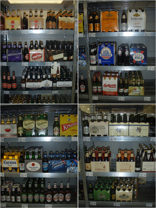
I also bought some beers (for ahem… research) and asked the bottle shop to keep some packages of beer for me to come back and collect the following week… this was so I could have some beer packages for first hand reference. I also researched the legal requirements of what had to be on the labels.
My Design Decisions
Based on the research I came to the conclusion that I wanted to do two totally different designs. I decided to do a traditional beer label and a contemporary beer label, both of which would adhere to the brief of being comfortable in a contemporary environment.
The next stage was to come up with an icon / name / style for the beer. After some brainstorming and sketching I ended up punning on the ‘Double Hopped’ name of the beer. I made the brand have two kangaroos to emphasise hopping (ie. two hops) and to emphasise the Aussieness of the beer – the kangaroo is on our national symbol after all. I got the inspiration for the design from our well known road signs, as seen in the picture below.

Now the name and ‘logo’ was set I could begin designing the other parts of the beer such as the bottle shape and the label itself.
The Traditional Beer Label Concept
After the initial research I found that most traditional beer labels had serif and / or script typefaces, were roundish in shape and had dark colours with very fine details, only visible on close inspection. I also found from surveys with class members, the most ‘i-want-to-drink-that-beer’ colour was green.
I used this knowledge for my traditional beer label design which you will find evident in the pictures below. The final result was an Australian green and gold colour scheme (our national colours) and a traditional round label with seriffed and scripted typefaces. Below you can see the traditional beer label mockup that I used for the first pitch to the class.
If this label was to be printed professionally the yellow coloured parts would be made into gold metallic foil – I tried to emulate this with slight gradients however it is extremely difficult (impossible?) to emulate gold metallic foil on the screen.
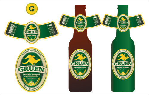
Below is a close up of the labels with all legal requirements.
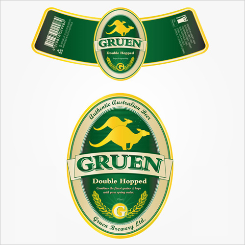
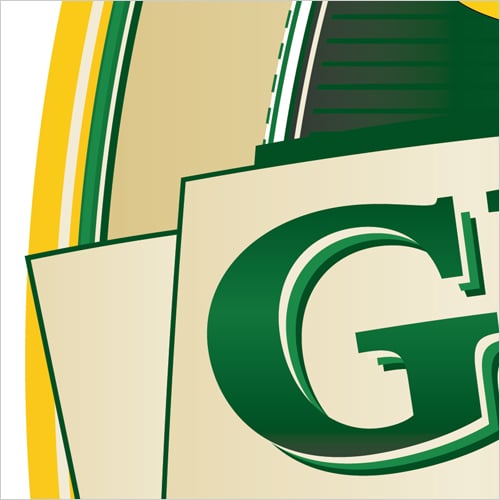
Below I have shown you a closer close up which shows the real detail of the label… it really is this detail that makes the design look ‘real’. Notice the slight gradients and how many lines / shadows there are? Next time you have a beer, take a closer look!
Below you can see the final render done in Cinema 4D and Photoshop. The final composition creates a strong brand, one that reflects Australia in a traditional, yet contemporary manner. What do you think? Thirsty?

The Contemporary Beer Label Design
For the next label I wanted to go for something a little more contemporary, modern, yet still Australian… I went for the dusty Australian outback feeling this time. Below you can get an idea of the outback I was envisioning (the picture is from my roadtrip out to Uluru in early October).
.jpg)
Below is my original mockup for the pitch done to my class. Originally I had gold (as seen on the left) but found that the creme colour worked better.
I should also mention that if this design was to be printed professionally, the label would be printed onto a clear sticker so that only the coloured parts showed through onto the bottle.
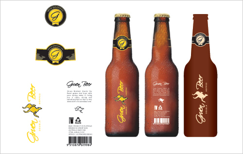
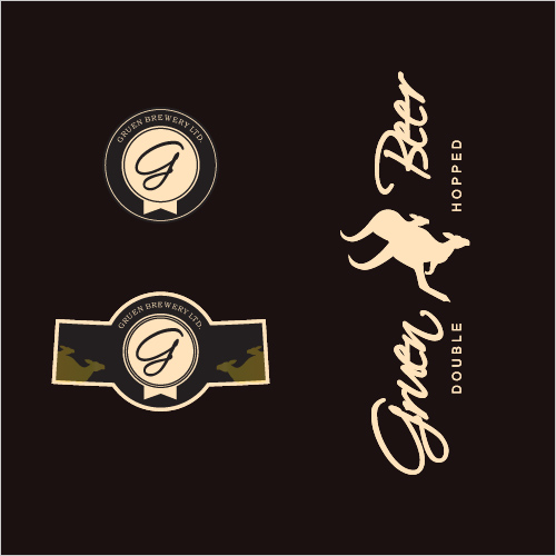
Below you can see a closeup of the label design. The circle is the cap.
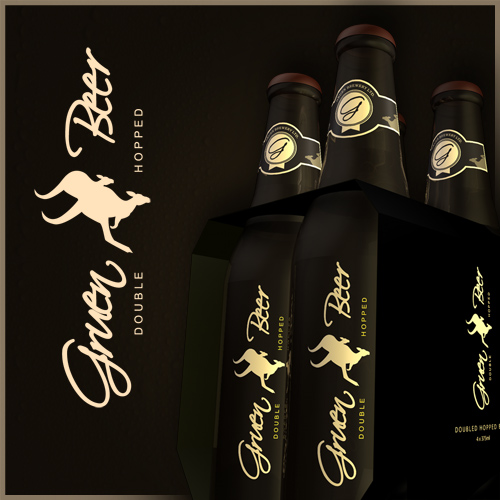
Below is a mockup of a four pack of Gruen ‘Double Hopped’ Beer done in Cinema 4D and Photoshop. Ensure that your screen brightness is up otherwise the design may seem a bit too dark.
The Verdict
So what do you think is the best beer? Green or brown? 10 of the 15 in my class voted for the brown design and when I held a poll on Twitter, 82% voted for brown.
Personally, I think the brown design suited the brief better, as the beer looks premium… like a small batch boutique beer. I should also mention that doubled hopped beer is usually more on the darker side and that is another reason why I pursued with this design.
Although the green traditional label had it perks, it was not entirely suited to the market as well as the brown design.
Poll:
[poll id=”4″]
In the next post I will outline the design process behind creating two creative billboards. And then finally in the third post I will outline the process and design decisions of creating an annual report design. Subscribe to my article feed so you don’t miss out.
As always, constructive criticism and comments are welcome. Would you be interested in seeing a tutorial on how to create a beer label?

It’s good to see your process through this! I still reckon the brown’s a winner… The neck sticker looks like a wax seal, adding to the sophistication of the design.
Fantastic man – utterly fantastic.
Hey the brown is great but I have a little trouble reading “Gruen Beer”. The G doesn’t feel right. Also, I think some may mistake it for “Given Beer”. Maybe my eyes are weird. I don’t know.
MMmmmm… the brown looks yummy, and I don’t even drink beer.
I voted for the brown bottle i think the green wouldn’t stand out along side a lot of the other beers in the market but when i saw the brown it jumped out at me because it was different and trendy yet a mature looking design. I really like your website im a graphic design student just about to finish my masters degree and looking at your blog is extremely helpful as im english but i live in spain (hence my degree is in spanish) so the things i miss out on or dont quite get in class i search for on the net and your site has provided a lot of useful information so thank you. I would also be very interested in seeing a tutorial on this as you suggested.
Thanks,
Luke
I love the process and the results.
I recently came across a new corporate identity for a Slovenian beer called Laško from Luks Studio.
http://www.luksstudio.com/ (Click on the green rabbit.)
Just wanted to share.
I think the brown one is a winner. It looks delicious, and I think people are ready for the new “official beer colours.” 🙂
I like the creativity, it’s awesome. Put a slightly thick dark red line on one side of the bottle, what do you think…?
i bet the green would sell more. its traditional. Good for the larger markets. The kangaroos alone make it pop out in that yellow color to help it stand out in that grouping… Though i like the brown cool hip design more. Not sure i love the word gruen in that font, looked like green at quick glance. Hands down the brown look is cooler and hipper. Problem is what happens to all those cool hip boutique beers after the novelty wears off? I think perception says cool hip design, can’t afford the beer. You just hope the beer inside is as good. I’d love to know what a focus group would say.
Incredible work J. Are you interested in packaging and branding because this project in your portfolio would guarantee your way into any company. BTW, A tutorial going a little deeper into the nuts and of the design process of the labels would be great.
hi Jacob,
Awesome article. I was finding these kind of articles on internet. I found very few on this subject. From last month i am following ur blog and twitts they help really !
thanks for sharing mate !
I like seeing the thought process behind this. How long did that process take you??
Great to see the process. I too prefer the Brown colour scheme… I think it makes it look more like a premium beer. The colour scheme reminds me of Guinness.
Agree with an earlier comment that the type makes the word ‘Gruen’ a little difficult to read because the lettering is tight.
They’re both great. I like brown more but I’d still go for the traditional, though. In beer, traditional’s good.
The contemporary look could be used for a premium variety. Or for European exports :b
This is rediculous! I got almost the exact same brief yesterday and I’m beginning my research today. Thank you! 😀
Rob,
Wax seal do you think? That is an interesting observation… I still can not see it.
Pat,
Cheers 🙂
David,
It seems a few people has said that so it’s not your eyes! I believe the G isn’t the problem, but maybe the tracking is the problem.
Bjorn,
Thanks, I’ll see how the tutorial goes. I could write one for VectorTuts.
Phillipe,
It would be accurate to say that it does not look like a beer, but then again, it is an export boutique beer and they usually differ from the norm.
Tommy,
I wouldn’t mind bringing it into production if there is any takers.
DesignNerd,
The beer was actually named after the Gruen Transfer 😛 Victor Gruen was the man who first made the ‘shopping center’.
Luke,
Thanks for your feedback re the beers and the site. The tutorial may come on this site or vectortuts.
Vida,
Thanks for the link Vida!
Engin,
Were you referring to the brown bottle design? Not so sure about the red line… it would take away from the minimalistic nature of the design.
Jojo,
Thanks for the feedback in regards to the Green word. The beer design is for the boutique market so it is a premium beer which obviously attracts a higher price tag.
Codie,
That is true, I think I only found one or two designs that incorporated sideways type.
Udoka,
Yeah I love branding and packaging but not sure where I would like to work at the moment… I am liking the freedom of freelancing. Tutorial may be coming soon.
Veerendra,
Well there you go! You’re welcome.
Danny,
The process for the beer label and mockup took about 4 weeks all up from start to finish.
Hanabi,
Some others on Twitter said it reminded them of Guinness, I can see that.
Lasse,
As stated in the brief, the beer was for the premium boutique market and for export. Does that change your opinion?
Axwell,
Funny coincidence, I hope it helps you out.
The green logo reminds me of [yellow tail] wine. so, i vote brown.
nah, I prefer the green one… the brown is defiantly a nice design but it seems too poncy for a beer. But that’s just my taste I guess if you were targeting people who like poncy beer…
Definitely the brown one, it’s a very cool design! The only suggestion I would make is to make a distinction between the two kangaroos instead of having them blend together, maybe having a brown line following curve of the lower kangaroos back and separating? That way they would still have the “iconic” feel to them but they would obviously be two different animals as opposed to someone possibly thinking they were one two headed animal something like the Pushmepullyou. (j/k about the pushmepullyou, I think it’s obvious that they are two kangaroos, just looking at it from a design perspective, for whatever it’s worth)
Very nice work, I’m excited to see the billboard design!
Brown bottles protect the beer from spoilage from light, so I like that idea.
AFAIK, they screenprint bottles (or some similar process) when there is not a glued on paper label. Take that into consideration with the design of the “clear” labels. Not that it changes the design, but the process.
Overall, I like the design of the green bottles better, as I think it’s more traditional. The brown design is nice, but seems more trendy or like it should be on a wine bottle.
Great work and very inspiring! Nice of you to let us know the whole process, from A to Z. A tutorial would be just pure awesomeness 😉
It is nice to see the entire process.
About the two designs, the first one definitely says “beer”, considering that it is kind of similar to the Heineken label. 😛
The second one looks great but, at least for me, does not look too much like a beer, but like another kind of drink. But since i do not drink too much beer, maybe i do not know too many. 😛
Also, as David K said, it looks like “Given Beer” at first. 😐
Regards.
I like the green!
Great Design Process!
PS. Are you doing this for “the gruen transfer” ?
I love that show 😉
Nice process, but i’ll stick with the green label, i know is a boutique beer but the brown does not say beer to me, here in mexico we have a huge beer tradition and in my experience the brown one just will end up going off the market,as for the green beer ad i guess it lacks some refreshment and its kinda static, anyway great job!!
I like them both! But if you were making this in the real world you’d only just be starting, my friend.
First, the managers won’t like either. Perhaps they’ll want to see the green label done in brown instead. Then, they’ll change the bottle wording six times, then legal would change that wording again, then another manager would suggest some sort of tweak to the kangaroos, but then they won’t like that so they’ll ask to see a version with koalas instead. Then you wouldn’t hear from them for two months. Then they’ll ask you to do a different layout to suit the koalas and also please make the logo bigger–don’t argue! They already know they want that. Then they would have you change the ingredient list because they changed the formula already and then kick it back because you spelled a twenty letter scientific name wrong and remind you that they’re on a deadline. Then maybe, MAYBE, it will go to print. 🙂
Designing is easy. Designing for someone else is hard.
Both are great designs and suit different markets, however for your brief, as you said, the brown beer just suits the target audience. It’s simplicity is also new to beer labels and doesn’t conform to the typical beer label, not many, if any, use sideways type (not in New Zealand anyway, except for Speights Summit)
mmmmmm…..beeeeeer.
i like the Gruen….how are they?
Got to agree with Brian, i worked for Casa Cuervo here in mexico several times, and what Brian said pretty much describes the real desing process, bottom line: the client’s always right!
Cheers!
I voted for the Contemporary.
Nicely done Jacob, and I hope you’ll post a tutorial for this. I love reading your articles and it helps a lo, now I think I have to subcribe!
Thanks.
Excellent article, just to imagine you going through the process that allowed you to arrive at these two amazing design concepts is inspiring. I am a fan of both but in the end I favor the traditional style so I had to vote for the green, great work!
Lovely work and always interesting to read through your process. Should be proud of that work, it’s beautiful!
Nice work and thanks for sharing the process – the green looks more refreshing to me – so I voted for it, however – I wonder what type of beer this would be – as in lager, stout, etc.
If it’s going to be a dark beer – I’d go for the brown bottles – if it’s a ligther beer (pale ale or something like that) – I’d go for the green bottles. I just personally like the green better, though. Nice work!
Nice article, I’m actually doing a similar project for my degree, just for a different beer, here in the UK. It’s good to know I’ve been going about it in the right way. Can’t wait to see the subsequent posts.
I preferred the green one. It makes me think of “Heineken” a bit. And One swiss beer called “Feldschlösschen”. Those are the beers I like most, so the green one makes me feel comfortable and like home.
For me the brown one is a bit too “designy”. Looks pretty nice, but most of the drinks that come to market that look too modern or too designed will not stay for a long time, I guess.
Nevertheless again a well done job.
I think the classic traditionnal one is just… boring. You achieved to use all the elements seen and re-seen that make 99% of the beer packs looks crappy.
Your contemporary one is beautiful ^__^
Mekie,
Had a look at yellow tail wine, I couldn’t see the resemblance except the fact that it had a kangaroo on the label?
Pienose,
Hehe well the market for the beer design was the boutique beer market so depends if you classify them as poncy?
Jeremy,
Thanks for your kind words and for your vote. It is interesting to see who votes for what and why.
Liam,
Thanks mate.
George,
I actually do have a small distinction between the two kangaroos in the green label however I thought it was stronger without the breakup in the brown design and nice Pushmepullyou pic. Billboard coming soon 🙂
Pinheadx,
That’s if the beer is around long enough! I love the screenprinted beer designs (tooheys extra dry comes to mind) and it is another option for the brown design, I do agree. The brown design is definitely a contemporary / trendy design.
Ryan,
Thanks for your vote and feedback. When I was researching double hopped beers lager was the one that came up the most so I presume that. Also most double hopped beers are usually darker in colour though not all. Thanks again.
Lalo,
Yes the brown beer is more an exclusive boutique style beer. The green as does look a bit static now that you mention it, but still refreshing none the less.
Brian,
Just as well I am at University then heh – for this particular project anyway… I know what clients can be like as I do also do freelancing too! Everyone can design, but not everyone can design for someone else.
Kerry,
The traditional label required more attention to detail and research so I probably preferred designing that however I preferred the end result of the brown beer.
Eric,
Not sure, but I am sure they would be tasty!
Chris,
You are welcome. The tutorial may come in a few weeks. I have only found one other beer tutorial so far on the net and it was pretty vague.
Becky,
Hope you share with us your beer design!
Andris,
I suppose sometimes it does just come down to personal taste. The brown one is pretty “designy” as you say, but it is for the boutique market. Thanks for your feedback.
Olivier,
It is true, even just by looking at the pictures at the start of this post, you can tell that nearly all beers follow the traditional style. Glad you like the brown one!
They look great Jacob!
Which one did you have the most fun designing?
Wow Jacob, those look awesome! 🙂 I am not a beer drinker myself but still feel like cracking open a cold one right about now thanks to the the above designs!
What is Cinema 4D? Is it hard to use? If you can do such things in it then I gotta me that program!
I have to agree with a few other commentors that the script on the brown bottle is too hard to read. Branding for this new product would absolutely necessitate readability here.
But beyond that, you might be surprised at what a focus group would say about these two bottles. 25+ beerdrinkers in the US and the UK may favor the green because it looks traditional. the fact that it’s imported from Australia makes it special. The brown bottle may attract more graphic artists and wine cooler drinkers.
(Great post.)
That is a very extensive process, I never knew all that goes into designing a logo campaign.
Great to see your thought process on this. I like the approach on the Brown one though I think the end result is disappointing. It does not really work as a brand.
The traditional one looks a lot more complete, but again would get lost in ths store display photo which you took, don’t you think? The name is a differentiating factor to an extent though.
Truly great design – I liked the brown better, because it’s not traditional and stands out a little bit 🙂 nice work!
When I began reading your article, I had exactly the same idea as you ! Two kangaroos for double hops !
Anyway I have voted for the brown. That’s smart !
Peter,
Thank you, glad I have inspired you to take up drinking 😛
Cinema4D is a 3D program… it is pretty tricky at first but after some tutorials and playing around with it, you can do some amazing stuff. It is only $20 too. Blender is also another option… it is free and some say it is better.
Coryanne,
Thanks for your feedback re readability and it would be interesting to see a focus group… Most of my readers are from the US and most are the votes are for the brown design… and most, I presume, are designers / creatives also.
Debo,
Yes, it is amazing how much work goes into something especially when all you usually see is the end result.
Beaulys,
Haha nice one. You know what they say…
Woke,
Why do you believe it does not work as a brand? The green and gold I believe is quite a striking colour combination and it reflects Australia also so I believe it would stand out too.
Daninis,
Thanks for the positive feedback and vote!
I prefer the brown like most people– I will agree with you that the contemporary suits the brief better, and I also think that the green one looks too much like every other beer bottle on the market. The brown really sticks out and looks premium, upscale, and contemporary.
wrt Nov 2 comment –
For a start the logo is not readable. ‘Gruen’ as a name stands by itself and personally I think that advantage (and the idea of using the two kangaroos as a symbol)is being lost by using a fancy font with improper kerning.
The packaging design works really well though.
Charles, Woke,
Thank you for your feedback.
Lindsay,
That is correct… however beer usually doesn’t last that long anyway if you know what I mean 😛
according to my colleague – a homebrewer – he says that brown bottles for beer make the beer last longer and helps to maintain its original taste… and yes, i do like the brown packaging more than the green.
Hi, I’d just like to thank you for this website. Your tutorials and blog posts are really inspiring to me. I’m currently 17 and at college – My last project was a bit off, so with my next one (designing a fictional restaurant from scratch) I hope to perfect it. Just a quick question With the kangaroo image, did you draw it? My teacher is always saying to make our own designs from the beginning.
Thanks!
Hi L,
The kangaroo image I based off the road signs found here in Australia. You’re welcome!
Impressive article. I like to see the design process of other peoples/”pros”.
And to be true, i voted for green…
In my mind the brown bottle suggests me a new/different/with a different taste of beer, and when i want to drink a bottle of beer i want a really traditional/customary beer with the unique and strong taste of hop.
🙂
regards, zoli
Whoa, great research and execution.
I would love to work on a home brew identity, and I appreciate the wit of your “double hopped” imagery. However conventionally speaking, a green bottle is more susceptible to UV rays, whereas a brown bottle can protect the flavor deterioration of beer. Some parts of isohumulones (fun little hop-derived molecules) may fall apart and then form a compound with sulfur atoms, thus giving beer a “skunked” flavor. Besides, I think the brown bottle design is a much more refreshing and elegant approach to the look of a brewski!
Nonetheless, as long as it’s not sitting in a fridge under fluorescent lights either glass will do!
Hey really good website. Love the design showing the full steps. I came here as i’m currently brewing some homebrew for a BBQ in 2 months time. I’m looking at designing my own labels and printing them for a limited run of about 20-25 bottles for people to take home afterwards.
Its ironic to read some of the steps as i’ve already been to my local shop to “check out the beers on sale” 🙂 Nice website, gave me plenty of food for thourght.
The font on “Gruen” makes it look like it says “Given” and it confused me on the billboard… “Given? Beer? You were given a beer? What?” Maybe if you defined the individual letters better…
I don’t think Australia when I think Green, and I do think Australia when I think kangaroo, so the brown suited the logo better.
Wow, I just found your article and you don’t even know how helpful this is.
I’m currently taking a “Polishing Center” course that teaches us the finer points of the branding/advertising industry through quality facetime with some local Michigan Marketing Gurus. Part of our assignment is to develop creative thank-yous for the advisers that come in to talk with us.
As a brewer (and big fan of the stuff I make) I decided to craft a homemade brew, complete with liquid and label. However, I’m running into writer blocks when it comes to naming the stuff.
I want to have some type of double entendre using the word “brews” but referring to my budding talent. As in: “Gumption Brews,” “Something Brewing,” etc. However, I haven’t found one that I’ve really loved yet.
Any suggestions come to mind?
Thanks a lot Jacob, and great, great article!!
Joseph,
How about Brew Brothers? Brew Bros?
Jacob, truly speechless. The quality of your work speaks everything.
With this, I see that your answer everyone who comments. That’s such a rare thing, am sure you will go long way. I am betting safe! 🙂
Thanks Logo Reviews (have a name?)
Thanks so much for sharing your design processes.
Too much to say regarding how much I appreciated it; but you may have heard a ‘Hallelujah’ yesterday when I found this link.
Best,
Martha~
@Jacbob – My name is Adnan, nick is Addies. Whichever you prefer 🙂
I preferably vote the contemporary. Designs are pretty good for me. Brown bottles for beer make the beer last longer :-). Thankful for sharing your design process.
301 Moved Permanently I’m impressed, I have to say. Really hardly ever do I encounter a blog that’s each educative and entertaining, and let me inform you, you’ve got hit the nail on the head. Your idea is excellent; the problem is one thing that not enough people are speaking intelligently about. I am very completely satisfied that I stumbled across this in my search for one thing regarding this. Regards, Teak Furniture Manufacturers