There was a time when you only had to choose between Arial or Times New Roman. Now that there are thousands of fonts, it can be daunting choosing the perfect one for your project.
To inspire you, 8 designers share their most loved and hated fonts.

At the end of the day, it comes down to context, overuse or misuse. Select a typeface based on the message it communicates.
More font resources:
Designers’ Most Hated Fonts
Most hated font: Papyrus
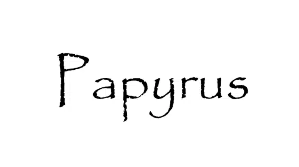
A font that, in my opinion, is used far too often — perhaps some find the rough, unbalanced look of the letterforms appealing. Or, perhaps designers appreciate its accessibility, yet still find it “edgy” compared to generic fonts like Times or Arial. Whatever the case, I think we all could do with a little less Papyrus in our lives. (See Papyrus alternatives)
– Dustin Coulson, Senior Graphic Designer at FREE Branding & Digital.
Most hated font: Comic Sans
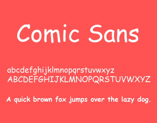
I think hate is too strong of a word, but a font I’d never personally use would be Comic Sans. It’s corny, no one takes it seriously, and it isn’t even comically appealing. Yes, fonts are supposed to convey meaning and intention, but I can think of so many other typefaces that can do what Comic Sans does but better. (See Comic Sans alternatives)
— Kellie Illustrizimo, Creative Director at Studio Illustrizimo
Most hated font: Bleeding Cowboys

My least favorite font, besides Comic Sans, obviously, is Bleeding Cowboys. I worked in a t-shirt printing business a few summers ago, and trying to set that font up for print on myriad rodeo-themed bachelorette parties. It just ruined it for me. It’s tacky and unpredictable, and it needs to go away forever.
– Lianna Potrikus, Illustrator & Graphic Designer at Pretty Polite Print Boutique.
Most hated font: Monotype Corsiva and Brush Script
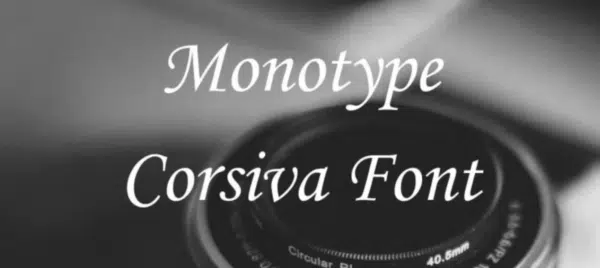

I hate handwritten-wannabe fonts. The italicized ones that are overly used in award certificates and wedding invitations. There are a lot of people using Monotype Corsiva and Brush Script because they look “formal” or “fancy”. Neither of those two descriptions make sense to me. (See Brush Script alternatives)
– Sam Hayes, Website Designer at Avanti.
Most hated font: Times New Roman
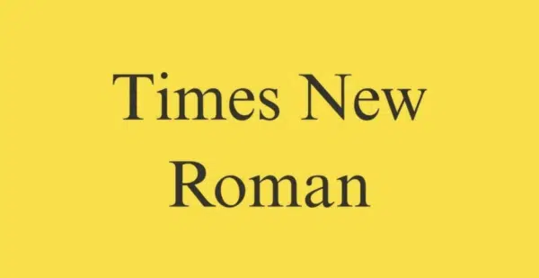
Opposite to Klavika, the sharp points and overall unreadability of Times New Roman makes it my most hated font. It makes me feel uneasy by the near sight of it. (See Times New Roman alternatives)
– Hannah Grant, Designer & Photographer at Royal Essence
Most overused font: Gotham

Don’t get me wrong, Gotham is a well-made font. It reads well and lays out effortlessly but it’s become a design crutch and overused. (See Gotham alternatives)
– Lance McIlhany, UI/UX & Data Visualization Designer at The Factory Kids.
Least favorite font: Arial

What about bad ones? Definitely this big ’lazy family’ that suffers from overuse. All silly posters, texts, logos made by someone being too lazy to choose something different than standard fonts like Calibri (sorry bro!), Arial, Times… etc. Also, whenever you look for a handwritten font, I’ve got a tip for you, try with your own hands! (See Arial alternatives)
– Arkadiusz Bączyk, Senior Designer / Art Director at SYZYGY Warsaw.
Most hated font: BlackOak
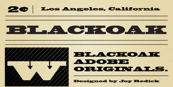
The font I hate the most is Blackoak. I can’t look at it more than a minute. Extremely wide which limits its application and creates readability issues at certain sizes.
– Jake Gaviola, Website Designer at Coalition Technologies
Most hated font: Triple Condensed Gothic
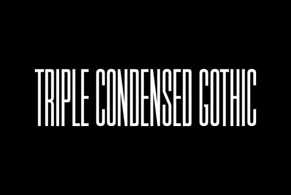
Triple Condensed Gothic is used on movie credits and you can’t even read it. The only one who does unreadable fonts well (and with purpose) is David Carson, the rest of us should make our words understandable.
– David Langton, Branding & Website Designer at Langton Cherubino Group.
Designer’s Favorite Fonts
Well, now we know the most hated fonts of designers, now we can look at the most liked fonts.
Favorite font: Gotham
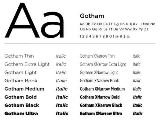
Inspired by 20th century architectural signage, Gotham’s assertive and geometric appearance makes it a favorite font for many designers, myself included. Though some have criticized the typeface’s overuse, I think it’s safe to say Gotham has an intriguing, timeless appeal that will outlast any trends.
Favorite font: Poppins

My favorite font is Poppins. It matches up well to the saying “Good design is as little design as possible” by Dieter Rams. The geometric shape of the letter form is near equal in terms of height and the spacing between characters is perfect. It looks great as a heading font and as body text.
Favorite Font: Exo 2
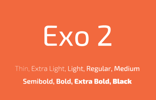
My favorite font is Exo 2. Why? When you ask Paul McCarney what’s his favorite record, he always says, “The one I’m working on.” We are using Exo 2 for our new corporate font for our own communication and web because it’s got a nice range of styles and weights and seems crisp, distinctive yet readable.
Favorite Font: Futura
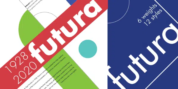
The classic, timeless lines and perfect circulars of Futura is probably the reason why it’s my top choice. It’s my failsafe font, well, I can’t even think of anything that it doesn’t go well with. Big companies like Airbnb, Best Buy, and Avon are using this. Its relevancy keeps going and it will continue to appeal and be relevant for years to come. (See Futura alternatives)
Favorite Font: Brandon Grotesque
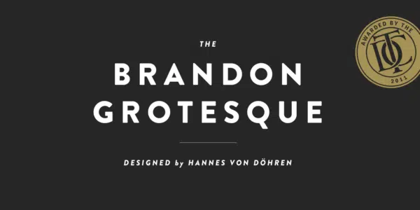
I love Brandon Grotesque because of its versatility. I can use it for a vintage design, way pointing sign, interactive display, even a wedding invite. It is at home anywhere you take it.
Favorite Font: Adele
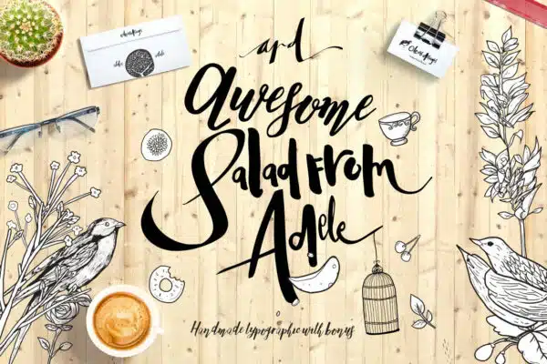
I’m a sucker for anything bouncy and cheerful; I’ve recently been loving Adele by Celcius Design. It’s very bright and unexpected. A lot of my designs for my job work in my own hand-drawn illustrations, and I find that this font compliments my style really nicely.
Favorite font: Klavika
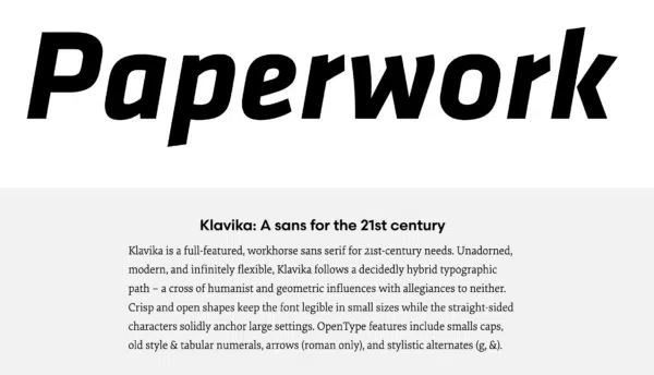
Klavika has got to be my favorite font. Every time I use it I’m just mesmerized how well it looks. I give it to the G’s, be it the upper or lower cases, both are notable and head turners. Klavika has a soft, welcoming vibe to it, yet it’s so classy and striking. (See Klavika alternatives)
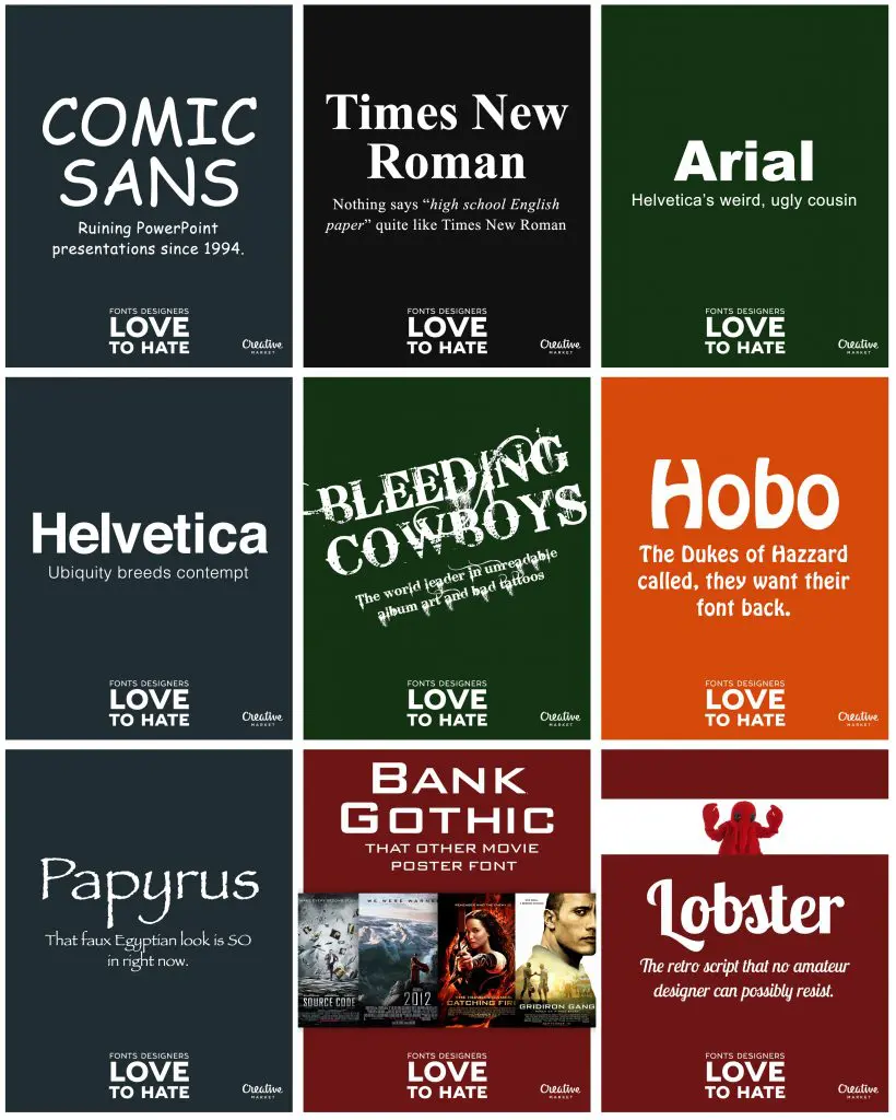
More Fonts Designers Love to Hate
How about you, what are your most hated fonts? Tell us on the comments section below.






Don’t know why people rag on Calibri. I love it. It has great default line spacing and I like the x-height. When I try other fonts to replace it, 9 times out of 10, I like the original Calibri better. Very readable. The only problem is the small size of the family. Saw someone call it “the worst font ever designed by man” and compared it to Comic Sans (truly the worst font ever designed by man). Really? It’s SO bad? Why? To my eye, it’s really quite lovely, especially compared to that horse, Arial, whose only saving grace is that everyone has it, so font substitutions don’t happen.
Favs for video: Helvetica & Times New Roman (esp. TNR Bold w/ Italics). These are great for their legibility in video& just about any mood can be created between one of these two. Yes, I’ll arrow key through all the typefaces in the list, but these two are always there to save the day.
Worst has got to be ComicSans.
But, as with anything, it’s in the way the typeface is used as part of the mise en scene setting that counts.
Hi Jacob,
Thanks for sharing. I found it very useful. I have selected this Exo-2 font for the logo of my website.
Out of these, ‘Bleeding Cowboy’ is my favourite. I had used this during my college times.Really very intresting fonts.
Thanks for sharing such a beautiful list of fonts.
Great post Jacob, I found this really interesting. Although I must say, I expected Comic Sans to feature as a most hated. Love the way Arial was descried as Helvetica’s weird, ugly cousin!
Rockwell and Eurostile are my 2 current faves for personal projects. Most hated has to be Algerian, I can’t think of anything it would ever look good on!
I’m a teacher and writer by profession and in past I had written some blogs. I mostly used Roboto font for my blogs. I just love Roboto font very much.
I see some of these fonts used all over the place, like Monotype Corsiva and Brush Script. I’ve seen quite a few flyers recently that used Corsiva. I think with even with a balanced design these fonts look awful!
Great post Jacob, I found this really interesting. Although I must say, I expected Comic Sans to feature as a most hated. Love the way Arial was descried as Helvetica’s weird, ugly cousin!