
VideoGamer.com approached me in early May after finding my work on Dribbble (see how to get jobs using Dribbble). They had been through a number of designers trying to update & refine their logo for their new site redesign but unfortunately, they were not satisfied with the results. Sadly, this is a very common story, with many experiencing the problems of design contests (spec work) first hand. Anyway with this behind me, I got down to business.

About VideoGamer.com
VideoGamer.com is a UK-based video game media outlet, publishing content including news, reviews, HD videos and previews for the latest games on all platforms. The primary target market of the site is 16-35 males and the site has been online for 6 years made possible by 13 passionate employees.
The Brief
VideoGamer.com filled out my online logo questionnaire and also provided me with their own brief, which is outlined below.
Overall Brief
To create an updated / ‘spruced’ up version of the VideoGamer.com logo and icon (see below). The logo should look modern but not very playful or too futuristic looking.
The logo will be used on all branded company items – digital and print, including the website.
The VideoGamer.com brand solely focuses on video games, gamers, and gaming culture.
The logo will be used on the launch of a completely redesigned version of the site. Note the colour palette below (black and yellow). We are not adverse to ideas involving colours other than the current yellow.
We would like to keep some of the visual identity of the current logo – to use a pad to the left of the text.
We also need a logo that can fit both in vertical and horizontal displays as well as in square formats such as in social avatars.
Old VideoGamer.com logo
Below you can see the old VideoGamer.com logo, the four dot mark referring to the joy-pad controllers of video games. Although these dots were relevant to the video gaming industry, they didn’t reflect all the gaming genres the site covered and it lacked originality, making it hard to remember and identify in the wild. The lowercase letters also made the logo quite awkward when stacking the logo.

Logo Explorations
As the four dot mark had been in use for six years, I wanted to keep these four yellow marks in one way or another so I started sketching to come up with ideas involving four marks.
The sketching wasn’t working for me in this particular project, so I jumped onto Adobe Illustrator, which proved much more efficient as it allowed me to come up with ideas much more rapidly.
Below you can see a small sample of the many logo explorations I went through. Below that you can see my whole art board, exploring many concepts and type treatments. Although hard to believe, there is order to the chaos.


Final Logo Design
I eventually settled on what I believed was the strongest concept, with the brackets on the outside of the four dots. The brackets around the dots suggest a screen and the dots inside could be seen as gamers or a joy-pad. Not only this but it could also be viewed as hands, a controller, a crosshair, etc. Everyone will view it differently which makes it quite personal and very versatile. The mark also maintains the brand recognition that VideoGamer.com has built up over the past six years.
I explored this idea further and combined the mark with different font pairings and finally came down to one polished logo (seen below) which I sent to VideoGamer.com. After sending it to them I got this reply, which I always love to hear:
“Perfect.”

Alternate Versions
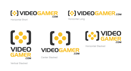
After approval of the above logo I created alternate versions of the logo for use in different applications, as seen below.

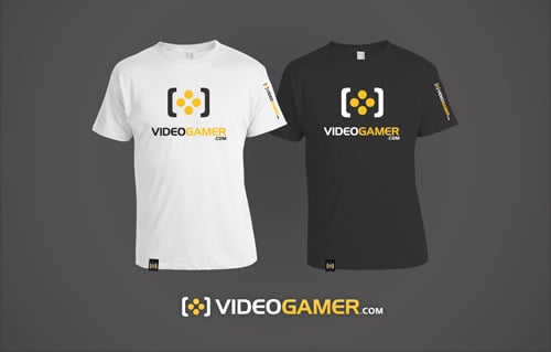
T-Shirt Design
This t-shirt design shows the center stacked logo in use.
The Logo Animated
To go along with the new site launch, VideoGamer.com created a new video highlighting the site’s new features and at the start of the video they animate the logo, quite cleverly I might add. The logo goes on a journey from the early days of video gaming, starting at Pong and makes it way through to a Mario like landscape, then into a first person shooter and then finishes with a mighty spin.
Click the image below to watch the video on their site. There is a 15 second ad before the actual video starts, just so you know.
I really love seeing designers take work further than originally intended, and my hat is tipped to Lee Wignall (and Joey & Adam) who did a brilliant job creating this motion piece. The ident music was created by David Pencil of Penny Arcade fame.
What do you think of the new logo? What about the animation? Questions / Comments?

Liking it man!
I think this is a great example of how sometimes an update/refresh, rather than a remake-from-scratch, is enough. By adding the brackets around the four dots, you immediately make them more recognizable. The typography has received a welcome update, and the balance between the symbol and type work better.
Taking an idea and simply trying to make it ‘better’ can be a daunting task, as it’s easy to get carried away and go in a new direction, and I think you’ve done quite well here Jacob :).
Great logo and great article. Love reading up on how logo’s (or in this case a remake) came to be. Thanks for sharing!
When I first looked at the dots, I thought I was looking at a joy-pad. After reading your case study, now I see it as a cross hair and a screen giving it a memorable perception in my opinion. I like it 🙂 especially the contrast, typography (I assume that is the Newtown font?), and the variation of their brand colors giving the logo balance. Nice work on the kerning and great show on the versatility. And of course, I thought the animation was fun to watch!
Amazing walkthrough, love the final concept, simple and unique and iconic, Well Done Jacob 🙂
Nice work Jacob, simple and effective.
I love how you were able to tweak the original (boring) logo just enough to make it fresh and memorable. Well done!
Nice Job,great font selection 🙂
Another great logo from you Jacob.
I like the image shots taken from illustrator, where you mentioned there was order the chaos of your designs. Like yourself, I also work like this in illustrator; normally making the art board very large – about 1 metre square, so I can zoom right in at the latter stages of the design process.
Very nice Jacob, but I have a question .. Do you use Illustrator for drawing on a sketchbook?
Interesting! I love to read about the process a designer goes through when working on a project. Never thought of dribbble as of self-promotion tool.
Thanks for sharing.
Nice work, a very effective and much needed update!
Oh man, I can picture it now.
They musta gotten a bunch of colorful, sloppily strewed video game controller icons and excessively literal renditions of anything related to gaming from those spec sites.
Great to see your transparency about your projects. It’s super interesting to hear other designers’ processes.
Thanks and when’s your next trip to Japan?
What font did you use? Very nice logo design.
Hi Kevin,
Yes, it was a fairly simple change but it took a fair amount of exploration to come up with the idea and then execute it. I also agree whole heartedly about how difficult it is to make an idea ‘better’.
Jamie,
Great to hear that you see the crosshair and screen. As for the font, it is actually Handel Gothic but Newtown was a close guess.
Andrew,
I don’t find I need to make the board that big, I personally just use A4 and then turn off the artboard. It performs better in my opinion.
Sardia,
I’m not sure if I understand your question, but I do sketches in my sketchbook and then transfer them to Illustrator.
Irina,
Yeah Dribbble has got few 2-3 jobs surprisingly. Just another place to share your talent.
Nathan,
I would love to go back to Japan for a ski trip one day, but there are many more countries left to explore.
Martin,
The font is Handel Gothic.
You’re really have great logo there Jacob. The concept is simple but it has a lot of feel on it, it’s just fun for you to share this.
It’s really interesting to see the process you’ve gone through to get to the final outcome. Though very similar to the original, the way you’ve reworked the dots, encapsulated them in the brackets and modernised the typeface highlights the way you don’t have to completed destroy and restart a brand when having a redesign.
Personally, I really like the work you’ve done here and think that the logo injects new life into the company. Perhaps the most striking image of the logo is of it in use on the T-Shirts. This allows the clients to gauge how it would look in the real world and is a fantastic idea to promote the logo.
Well done Jacob!
Nice to see a good walk-through. Again, to echo some of the comments – nice move on keeping the key elements and just raising them up a notch. The stronger colour palette also has worked wonders. Good case study!
Congratulation Jacob. Get something simple is always the most dificult job to do.
Thanks for sharing your work!
(sorry if I don´t write so well in english)
Are you sure it was necessary to do all those concepts????
David,
Showing the logo in context is always a good way to communicate the versatility of the logo. Thanks for the feedback!
Mark, VA, Andrea,
Thank you.
Ashraf,
If it gets to the right solution, the process shouldn’t matter, whether that be with 1 or 1000 concepts. Though with more concepts conceived, it usually helps solidify that the final result is the ‘best’ result.
Awesome! Love the new logo.
Thank you for showing the conceptual ideas and how that lead right back to a more polished version.
I am always struggling with trying to condense my ideas down to their essence.
I always try to keep in mind that the most successful people and businesses out there have simple, easy to relate to logos.
I appreciate the dichotomy between a design that is both simple and complex at the same time.
Its really amazing to see Jacob that you are so dedicated to every customers needs, giving complete attention to the work you do. From mind mapping to making sketches and taking it come live to design. Really nice process, love the logo. Quite a good one 🙂