
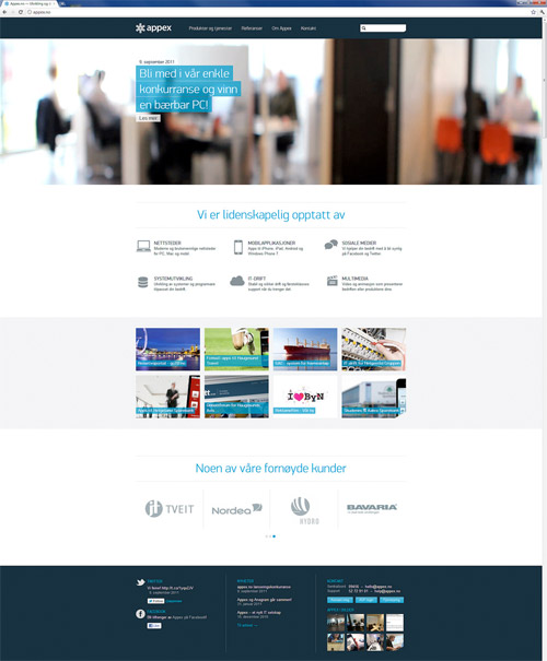
Last year I created the brand identity for Appex.no and just recently had the pleasure to meet the client for the first time here in NYC. They showed me what they had done with the brand identity I created for them and was very impressed, especially with the responsive website.

Appex (Application Exchange) does mobile development & multimedia as well as supports, operates and hosts applications for small and medium sized businesses, both on premises and from the cloud. Based in Haugesund, Norway.
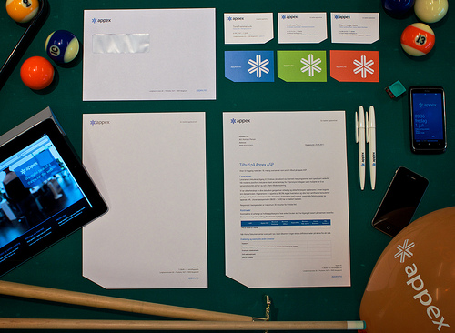
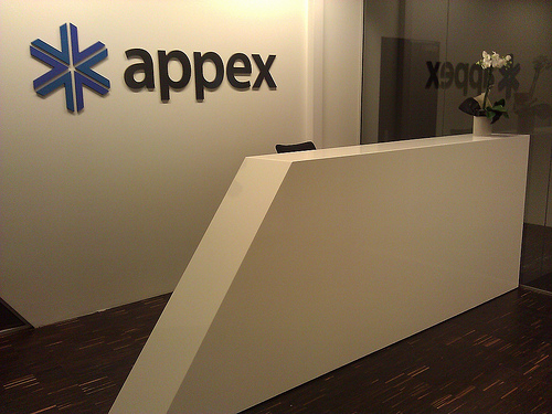
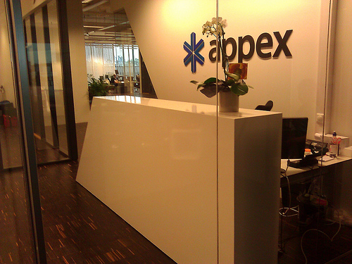
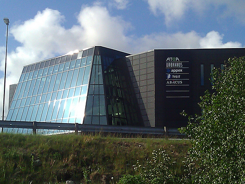
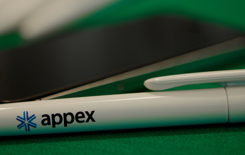
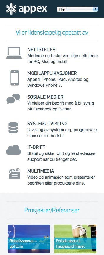
Below you can see the stationery, office, building & website of Appex.no. Also be sure to check out the logo animation video at the bottom.
Comments, questions & thoughts always welcome.

Logo Animation Video
If you can’t see the video below, click through to view on Vimeo.

Hi Jacob, really nice work. I was wondering whether you had any involvement with the animation and whether you think it compromises the purity of the design with 3d tricks etc?
Hi Richard,
The animation was done elsewhere, however I think it adds a great dimension to the work if done appropriately. Have you seen any of the Chase bank logo animations? Is Chase in the UK?
Very impressive and it sure does look good.
All I thought when I saw what the client did with your work was thinking about the article that Jessica Hische wrote about the dark arts of pricing.
I hope you did get an *excellent* deal on this!
Thanks Sven. I’m not sure if I am following you… why did you think about that article?
I wish all of the ‘arrows’ except for the bottom-left one, were all the same color and that the bottom-left one was treated a little differently: another color? another shade (or hue) of blue? So that it gave a little bit of the impression of an ‘A’. Or maybe even turn the asterisk so that the bottom ‘arrow’ points up. Though, maybe you already tried those and they didn’t work…
Hi Jacob thanks for the reply, good to read your opinion. I googled Chase Bank as I haven’t seen it about, I do think it has a very glossy corporate feel which was probably right for the 90’s but a little insincere now which is why I asked about the animation in this instance. I think the application across the business cards has a real timeless simplicity which, in my opinion is lost in the animation.
Hi Richard,
Well aren’t we glad that business cards can’t be animated, well to that extent. 😛 As for the 3D of Chase, for something like this, I think the 3D aspect adds a bit more visual interest to the advertisement. There is always the timeless logo to fall back on as needed.
Hi Jacob,
Excellent work, I always enjoy your fantastic work examples and documents that you write. I am a 3rd year industrial designer at Brunel University in London and I am currently on a study exchange in San Francisco. I look forward to your reviews and thoughts each week, and find your site a great resource of information and inspiration for a new designer looking to work his way into a graphic design company.
Thank You and keep up the great blog!
Michael
wow love the fluency between the building design and print design, awesome!
I love the business card designs and the logo.
Hopefully we will see a movement away from the perfectly rectangle and boring business cards as well!
Fantastic work Jacob. I love your case studies. May I present them to my logo design class? Cheers!
Very beautiful. I love this logo design and how it looks in various branding applications! It looks very impressive on the business cards and on the office wall above all else.
Thank you all and yes of course Brent.
Excellent work 🙂
Hey Jacob. It’s a really good logo. I like it. Thanks for uploading your great works.
Hey Jacob,
Nice logo but it looks like the logo of Microsoft Genuine Advantage http://bit.ly/ruDxJu
nicely done, but it seems very similar to one I saw time ago
http://www.vstarrinteriors.com/