This article has been contributed by Ian Loew.
If you want a chance at having a successful brand, an effective website is absolutely essential.

But what makes a website effective? It’s not enough to just be user-friendly and communicate useful information about your products. Your brand website also needs to
Websites are like online billboards with the functionality of a brochure. They serve to tell your brand’s story and show your target audience what you have to offer.
In other words, your website is, well, you. That’s why you need to make sure it does everything it needs to. It should look good, be genuinely useful and convey the personality and feel of your brand for your intended audience to understand what you represent and connect with you.
But how can you make your website user-friendly and convey your brand values effectively?
Here are six website branding examples that lived up to their names so you can take inspiration from them.
6 Examples of Successful Website Branding
1. Trustworthy Brand: PayPal
It’s easy to see why PayPal is on this list of successful website branding examples. The household name for online payments has a super user-friendly website.
Upon landing on the page, visitors are greeted with a slideshow featuring the business and consumer benefits of the service. Next, the website plays a video demonstrating how PayPal works.

PayPal’s primary color, blue, is everywhere on the website — from the “Sign Up” CTA button to the section above the fold. The color conveys credibility and inspires trust.
The website’s overall appearance is relaxed and minimal, with familiar imagery — in this case, an espresso on a wooden table and a pair of earphones.
The typography is sleek and modern, reflecting PayPal’s modern, streamlined user experience and processes.
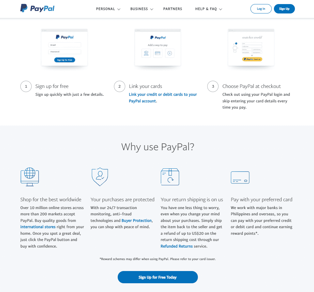
On the other hand, the content is informative, not too formal. PayPal takes the time to explain to visitors what’s in it for them if they use the product. It assures site visitors that their data and finances are safe with it.
Consider PayPal’s website branding as an example if you’re a brand that generally caters to businesses and professionals and are selling a product that’s, in a way, technical. Give as much information as you can about your product and the benefits the audience can derive from it.
Since you want your audience to understand how your product works and what they can get from it, you can’t use too technical language. Use simple words and break down complex concepts with images if you have to.
2. Playful & Lively Brand: Discord
Discord is a very versatile chat app that connects people. Students use Discord for after-class banter, gamers use it to coordinate their next moves, and enthusiasts use it to talk about their hobbies. Not surprisingly, the app’s branding emphasizes its users’ spontaneous and freewheeling nature.

The name of the app, for starters, seems to connote organized chaos. Its website uses a more conversational style compared to other chat apps. Some of the words used as copy and in the CTA include:
- “Hang out,” instead of “meet with”
- “Imagine a place…” instead of “a platform that.…”
- “Ready to start your journey?” instead of “Sign In Now.”
These elements make the site inviting for its intended niche: students, gamers, and fandoms.
The Discord website is also much more saturated than corporate websites in terms of color, making it seem more playful and lively. The website uses quirky animated characters instead of stock photos of meetings, coffee, and laptops.
Imagery familiar to Discord’s intended niche, such as shoes, video game controllers, and board game pieces, also features prominently on the site. Discord purposely avoids using typical corporate imagery like neckties, documents, or briefcases.
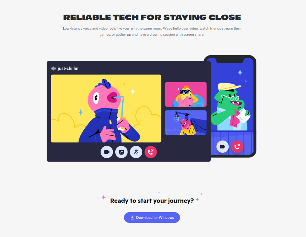
The font used for the heading is wide, making it more cheerful and inviting than thin-stroke fonts. Where thin-stroke fonts are refined, huge stout ones are more fun and bouncy.
The brand personality is evident. In a nutshell, Discord’s website says that it’s an app where everybody, regardless of their hobbies or passion, is welcome. Discord offers a safe space where people can take a break from real life and connect with others looking for the same thing.
Take notes from Discord’s website branding. Make sure your language tone is something your intended audience will relate to.
For instance, if a relatively young segment uses your products or services, use colloquial language like “dude” and “bro.” Don’t overdo it, though. Although you want your relatively young audience to connect with you, you wouldn’t want them to dismiss you as unimportant. You still want to be taken seriously.
3. Smooth Flowing Brand: Qualio
Qualio is a quality management system (QMS) that helps businesses keep track of tasks and processes. It caters to businesses in the medical and life science fields.
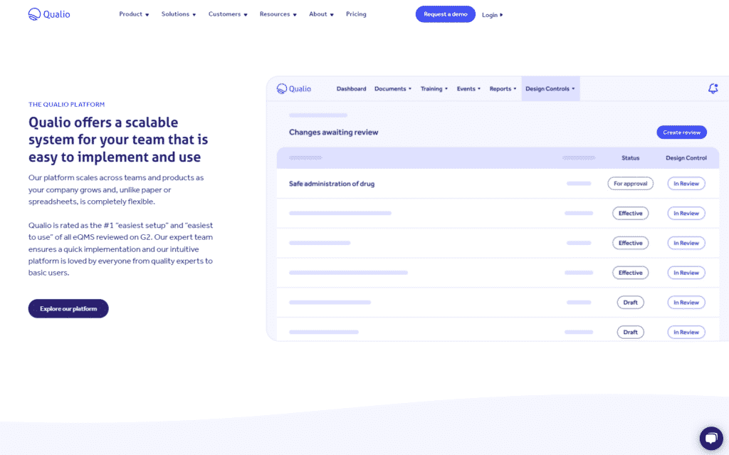
Qualio uses light colors on their homepage, relaxing visitors’ eyes as they scroll through. The homepage has a light pastel color which gives it an accommodating feel. In addition, the webpage has curved borders to separate sections.
The primary accent color is the brand’s primary color, purple. The website uses an analogous color palette with its use of navy blue and royal blue. This palette is complemented by an occasional peach, a complementary color of purple, providing a warm touch to what would otherwise be a cold, monotonous website.
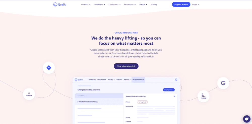
The “flowing look” can be seen to represent Qualio’s smooth relationships with their clients. The pastel colors indicate Qualio’s bright values — trusted, scalable, manageable, optimistic, and playful at the same time.
Combining the circular shapes and colorful scheme, one can conclude Qualio’s UX/UI conveys that the brand is easy to deal with and easy-going.
Take notes on Qualio’s website branding. As they’ve used wavy shapes to communicate their smooth relationships with clients, you too may use shapes to signify a critical company value. Perhaps you’d want to use diagonal lines to reflect your company’s value on immediate action or zig-zags to communicate company creativity.
4. eCommerce Brand: Protest Sportswear
Founded by snowboarders, Protest Sportswear is a winter apparel company that creates performance suits, outdoor clothing, and indoor loungewear. They also have an eCommerce website, where shoppers may browse a catalog.

The layout isn’t optimized for showcasing a single product or service as an eCommerce site. The website instead highlights the various items visitors can buy. When creating these sites, branding is still essential.
The Protest navigation bar and footer contain the brand’s color — navy blue. The rest of the page, on the other hand, visually shows website visitors what Protest actual products look like and the different activities you can use these products with.
Protest’s branding revolves around their high-quality items. It’s the same strategy Apple uses to get you to buy their iPhones and MacBooks.
As a result, there’s not a lot of copy apart from the labeling text. Protest has a seasonal header that changes depending on what apparel line they’d like to showcase. In this case, it’s their new winter jackets.
The font is another branding element. The labeling fonts are not only readable, but they’re the exact font as the one seen on Protest’s logo. The sans serif basic font also adds to the minimalistic look of the website, allowing visitors to focus on the products themselves.
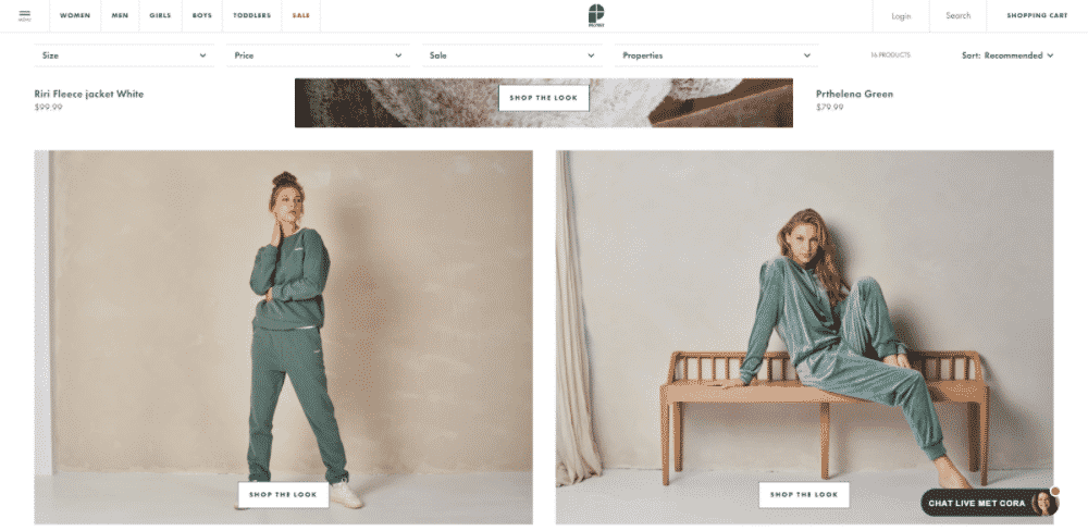
Protest’s website also showcases various clothing designs and a wide selection of clothing. That’s a good strategy. People, after all, also typically buy products if they happen to like how the product looks.
Make your website simple like Protest’s if you’re an online store. Using whitespace to call attention to your wares can work, too. Just make sure the images of the products you use on your website are high-quality. It’s best to shoot them with good photography equipment to ensure each product detail is clear and highlighted.
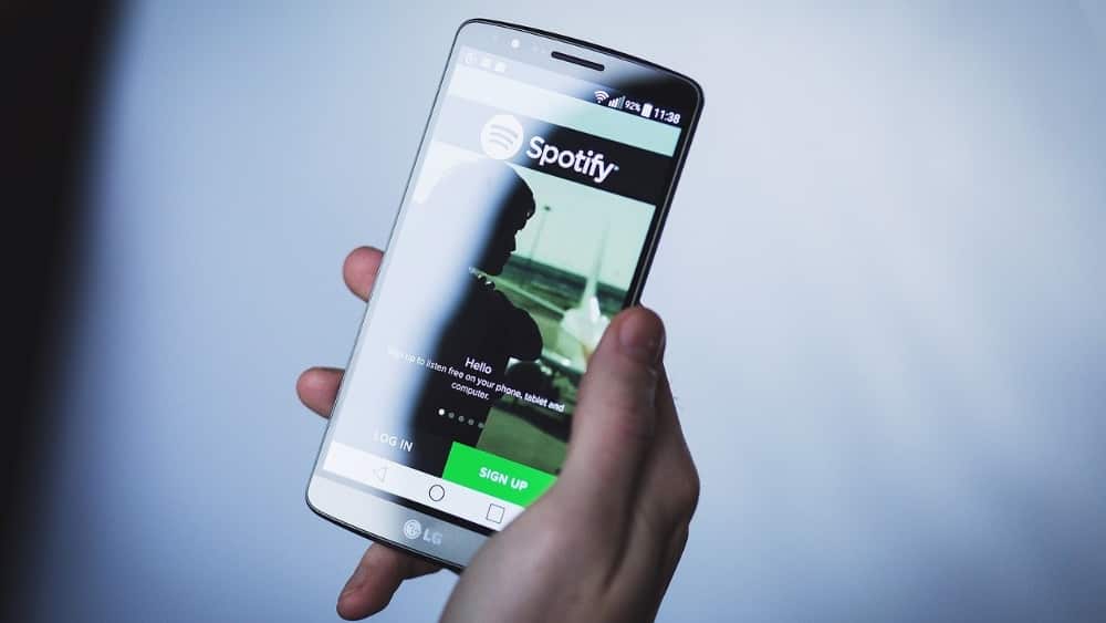
5. Diversified Brand: Spotify Design
Spotify is the world’s leading music streaming service. Its name has become synonymous with music and is a household name for the industry.
If you go to the Spotify website or its other online platforms, you’ll see that all Spotify marketing collateral is in sync with the iconic brand’s personality.
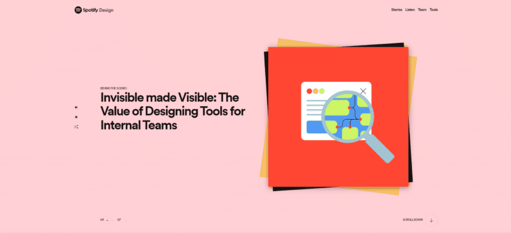
Spotify Design is Spotify’s arm in charge of the audio streaming service’s design.
If you look at Spotify Design’s website, you’ll see it looks like it was built by a website design agency and not in-house. Upon landing on the page, visitors are greeted with a full-screen slideshow of Spotify’s latest stories in the creative industry.
The layout is directly taken from the Spotify app’s playback screen, including its iconic Next, Previous, and Shuffle buttons. The popping colors also capture the app’s rich UI.
The rest of the website also boasts different splashes of colors, consistent with Spotify’s branding.

The font is a basic sans serif font that makes the website look clean. However, little splashes of color spread throughout the site keep things interesting.
As informal as this all seems, the content of Spotify Design is rather formal. Consisting primarily of business and creator blog posts, Spotify Design is oriented more towards design professionals. Its content reserves a different tone for creators and business readers despite being a service used by jamming music lovers.
You may be a candy shop, toy store, or theme park. But if you decide to create a different product under your brand that caters to a different audience, you can’t approach your new audience the same way you approach your original audience.
You can, however, infuse some original branding elements to ensure that when your audience sees your new product, they’ll still conclude it’s yours.
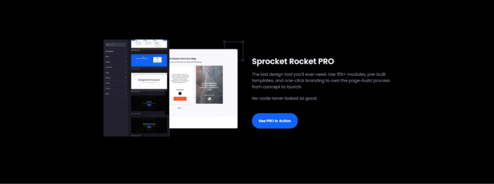
6. Audience-Centric Brand: Sprocket Rocket
Sprocket Rocket is a user-friendly website builder that’s accommodating even for beginners. One of their projects, Qualio, is an example on this list. Because it’s a solution targeted to marketers, Sprocket Rocket boasts an inviting UI to communicate its ease of use.
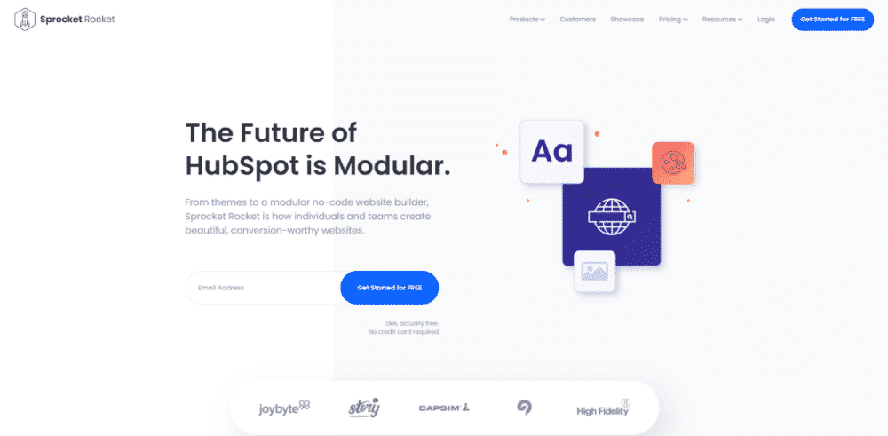
Immediately upon visiting the site, the visitor is greeted with the industry-known Hubspot. Hubspot is the most commonly used CRM that boasts various marketing functions such as building landing pages and email marketing campaigns.
Sprocket Rocket positions itself as an alternative to Hubspot’s content management system, saying that they’re more marketer-friendly with their modules and building blocks. Their USP is simple: you can build websites with blocks rather than with individual pieces, and that users don’t even need to learn to code if they don’t want to.
So, how does Sprocket Rocket emphasize this message with their website?
The website builder’s site is clean and modern, with analogous cold colors and complementary orange accents. This minimal interface and white space call attention to the key copy on the website.
The webpage also highlights the Sprocket Rocket software in action, along with some projects that have been built using the developed software. There are elements there the intended audience (people who build websites) are familiar with, too. Note the icon that represents images and the typography icon.
So, what’s the key takeaway?
Like Sprocket Rocket, use design elements and imagery familiar to the industry you’re catering to when building your website. So, if you’re catering to journalists, for instance, you can use the inverted pyramid as a design element. If you’re talking to gardeners, then pots and plants are good elements to include.
Remember, your goal is to get your audience to connect with you. If you use elements your intended audience isn’t familiar with on your website, how else can you expect them to feel that connection in the first place?
Bottom Line
A website’s color palette, imagery, fonts, overall UI, and copy are critical to shaping the user experience. Each brand should strive for a good website user experience. That’s the only way visitors will stay on your website and, hopefully, take your desired action.
However, the need for a good user experience isn’t the only reason you need to pay attention to your website design. Your website is a representation of your brand. It’s you.
So, if it doesn’t meet the minimum quality standards, then expect the audience to think that your brand, in general, doesn’t meet the minimum quality standards either. Besides, your website is one way to convey your personality to your audience so they can relate to you.
With all that said, how exactly should your website look? Well, that would depend on your target audience, the products and services you sell, and your values, of course.
If you’re selling expensive shoes, use refined design elements such as thin strokes and serif fonts that convey sophistication. If you’re selling backpacks and shoes for hiking, then use elements with sharp edges such as italicized headers.
The website branding examples shown above have nailed all these. So, take inspiration from them. If you dedicate time to creating a website that looks good, reflects your branding, and ensures a great user experience, you’ll see those visitors sticking around.
_
About the author: Ian Loew is a web entrepreneur and inbound marketing expert, and the Owner & Head of Business Development of Lform Design. After four years of helping Fortune 500 companies with MGT Design, Ian embarked on his freelance career before establishing Lform Design in 2005.