This article was contributed by Mike Wallagher.
Psychology is everywhere in design. It’s because of psychology that we understand that red is a choice color for restaurant logos—because it stimulates appetite—or that calls-to-action above the fold tend to convert better.


That said, you can’t ignore psychology as a designer since principles of the human mind will influence how people react and interact with your designs. Start by reviewing these seven psychology principles & laws that you can incorporate into your practice.
1. The Von Restorff Effect

The Von Restorff effect tells us that the more absurd an element is, the more it will stand out and be remembered.
This theory was tested by Hedwig von Restorff in 1933. She had subjects look at a list of similar items. If an item was isolated, such as if it was highlighted, it was much easier for the individual to recall the item over others on the list.
This principle can be applied to design in several ways. The obvious is that if you want to draw attention to one item, you isolate it, such as through color, size, spacing, etc.
However, because people focus more attention on the isolated item, they remember less about the entire group. Keep the inverse in mind when considering whether or not to highlight an item. Do you want people to remember that one thing and only that one thing, or are the other elements equally important? Don’t highlight an item if the others are equally important and you want everything remembered.
2. Psychology of Color

Seasoned designers will have a firm understanding of color and how it relates to design. However, new designers tend to ignore how colors affect the mind, instead choosing to design with colors they themselves like. Even if you’re well versed in the color wheel and how to pair complementary or analogous colors, are you considering how your design influences your audience?
Yes, colors can influence emotions. Adobe lists colors and their corresponding emotions, the positive ones as follows:
- Black: sophistication and power (example site)
- White: cleanliness, sophistication, virtue
- Red: courage, power, strength; can also stimulate appetite
- Blue: calmness, peace, trust, safety (example site)
- Yellow: optimism, happiness
- Green: balance, sustainability growth
- Purple: royalty, spiritual awareness, luxury
- Orange: friendliness, comfort, and food
- Pink: tranquility, femininity, sexuality
Remember that the emotions people associate with color can change depending on their cultural or religious backgrounds. The above list refers to Western Culture perceptions.
3. Maslow’s Hierarchy of Needs
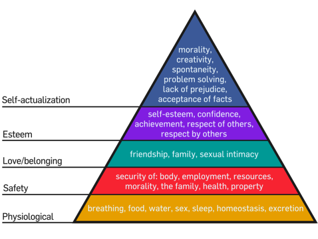
Chances are you studied Maslow’s Hierarchy of Needs in high school or college. In case you need a refresher, here’s what it looks like:

The pyramid is designed to show the steps one must take to reach self-actualization. Before someone can feel loved, for example, they must have their physiological and safety needs met.
So how does this apply outside the psychology classroom? Marketers and designers can use Maslow’s Hierarchy of Needs in advertising and public relations.
When designing marketing material, use this theory when developing a buyer persona. Think about where your client’s target audience is in the pyramid. How can your design motivate them to the next stage of the pyramid?
You can also use it to play off people’s emotions and needs to pull them into your design. These Salvation Army posters, for example, play off love and belongingness.
4. Hick’s Law

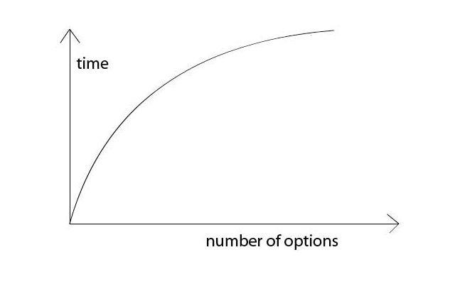
Hick’s Law relates to how long it takes someone to make a decision. If people have more choices to choose from, it will take them longer to decide. In some cases, it will take them so long that they’ll opt to make no decision at all because the burden of deciding has become too large. This is why you’ll often see short menus in restaurants—they don’t want to overwhelm their customers.
You can incorporate this idea into design as well. For example, if you’re designing a website, you want to keep your navigation panel as clean as possible with just a few options to choose from. If you have to, group pages into drop-down menus so it’s easier for web visitors to categorize their options and make a quicker decision.
This is also true of calls-to-action. When designing a poster, you don’t want to tell users to do six different things. You want to call attention to one or two choices. For example, your design may focus mainly on gathering donations with a primary call-to-action of “Donate Today – Call (888) 888-8888.” A secondary call-to-action may be “Follow us on Facebook” with a QR code that leads to your client’s Facebook page.
5. Facial Recognition

Incorporating faces into your design is one of the most effective design techniques that pulls someone into your poster, web page, or book cover. People are inherently drawn to faces—so much that we see faces where there aren’t any, like on the surface of the moon or on Mars. What’s more, case studies show that when faces are added to websites, it boosts conversions.
This idea can be applied in several ways.
First, you can use faces to connect with your audience. Simply by putting a face on your design, you’re more likely to catch a viewer’s eye—even if it’s not a real face but something that can be perceived as one.
You can also direct their attention based on which way your model’s face and eyes are facing. Eye-tracking studies show that people follow other people’s gazes much like they follow arrows.
You can also use faces to convey emotion. There are six universally recognized facial expressions:
- Happiness
- Sadness
- Surprise
- Fear
- Disgust
- Anger
Utilizing this principle, you can immediately set the tone for your design as well as communicate across language boundaries.
6. Fitt’s Law

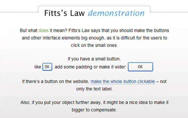
Fitt’s Law is a scientific law that’s often used to describe computer-human interaction. It states that “the time required to move to a target is a function of the target size and distance to the target.”
You can use this principle in web design. Essentially, the larger a clickable area is, the more likely it is to get clicked on.
Let’s take an example. When you design a web page, you’ll obviously make the navigation menu items clickable. But what is the area of the clickable link? Will only the words link to the target URL, or will the tabs themselves be clickable?
Likewise, you can design with the opposite in mind. Links that you don’t want clicked on often—such as delete or cancel buttons—should have small clickable areas.
7. Occam’s Razor

Occam’s Razor tells us that the simplest solutions are almost always the best. Although this is more of a philosophical idea than a law of design, it can easily be applied to design. Beginning design students tend to create complicated designs with unnecessary elements in an attempt to show their creativity. However, you’ll often find that these designs are not user-friendly.
This concept relates back to Hick’s law. If you’re trying to cram too much into a web page instead of opting for the simplest solution, people will have too many choices. Then, the design becomes overwhelming and people will quickly abandon it. If you can’t decide where to take your design, you’re typically safe leaning toward the simplest solution.
Psychology plays a huge role in how we go about our day-to-day lives, but if you’re a designer, it’s important to pay extra attention to psychology principles to create artwork that speaks to your audience and converts for your clients. How will you apply these principles to your next design?
See more laws and principles you can apply to your graphic designs, such as the more well known Fibonnaci sequence, the rule of thirds, golden ratio, pareto principle (80/20) and more.

Hi,
Amazing post by you. The way of describing of every principle is awesome.It’s the best way to explain each technic by picture and principle.
Keep it up……………