Looking for Negative Space Logo Design Inspiration? Check out these 48 ingenious logos and fuel your inspiration!
Have you ever observed a logo design minutely, to find out its hidden meaning?

A negative space logo is a design which utilizes the background of an image to create another image.
This negative space designing is a unique and ingenious way to convey multiple thoughts and visions. It’s also one of the best graphic design tips in 2023 any tenured creative can give!
See here for Jacob’s feature story on how to use negative space.
48 Clever & Inspirational Negative Space Logo Designs
Fuel your inspiration with these ingenious negative space logo designs!
1. Spartan Golf Club
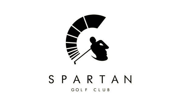
Designed by Richard Fonteneau, the helmet of the Spartan warrior is indicated by an arc, made by the swing of the golfer. OH and wait! Did you notice the face of a Spartan in the logo?
2. ED (ElettroDomestici)
An excellent and mind-boggling example of using negative space can be seen in this marvelous creation by Gianni Bortolotti. Designed for an electric supply company, the designer uses the first two initials side by side. This creative design envisages the unusual combination of form and function. What do you observe first? The plug or the initials?
3. FedEx Logo
The classic example of negative space… The FedEx logo. Consistently titled as the “best logo design” and also the winner of ample design awards, this logo hides an arrow between the E and the X. Designed in 1994 by the famous designer Lindon Leader, this logo clearly broadcasts the dynamic attributes of the delivery company.
4. Mister Cooper
When it comes to designing a logo for an adults only ice-cream company, Johnson Banks is who you call!
For this alcoholic ice-cream brand, Mr. Cooper, the designer used a distinctive typographic lipstick mark and as you can clearly see, the brand name is written inside!
5. WWF
The most adorable example of negative and positive space is the logo for the World Wildlife Fund.
This negative space version of the panda was created in 1986, and has since become the emblematic sign not only for the WWF but for the conservation movement as a whole.
6. Fiat
When have we the power to influence then why not influence? Fiat takes this initiative for safe driving advice in its new logo. Although there are three in this series, we only discuss one of them. The logo is consisting of the letter N and a silhouette of a dog. The tagline of the logo states that “You either see the letter or the dog. Don’t text and drive.”
A driver’s vehicle choice is like choosing your phone case, there are pros and cons, so a brand stressing safety is nothing new. Fiat wants you to know their cars protect you, but that they can only do so much. BodyGuardz, a case manufacturer is quite similar in approach. Someone can make the perfect case but if it isn’t used or applied properly, why does it matter.
7. NBC
Ever observe the peacock in the logo of NBC? If yes, then you are the witness of one of the earliest negative space logos.
8. Alexander Johnson
What could be more admirably said about the book cover of Moby Dick? By the way, have you read it? If not, then must buy a copy and remember to admire the creative logo design of Alexander Johnson. Just have a glance at the stylish design given above; the Letter M contains both the tail of the whale and also the Harpoon.
40 More Negative Space Logos

What’s your favorite negative space logo design?
Daniel Shane is a creative branding expert at Logo Orbit. Beside his full time job, he loves to explore the creative industry and blog about topics of his interests.


These must have been the most creative logos I have seen. yet, it’s not my first time to see them. I am now challenged to think more creatively before designing a logo for anyone.
When the Coca Cola logo is displayed like this, red on white/light background, there’s no Danish flag in the negative space between the o and the l…. it’s the English flag. When displayed white on red background, however, the Danish flag appears. Just sayin’ 😉
Apart from that, a nice collection of logos using negative space. A fan of the concept.
Hello Esther,
Ya you are correct. I am also facing the same problem! Indeed here is great information!
very very good ♥
Hey Jacob,
These are the most creative logos with negative space I have ever seen. Thanks for the awesome post.
Regards,
Joseph Symons
Great article Jacob! one of my favourite negative space logos is FEDEX and it surprises me how may designers have never noticed the arrow.