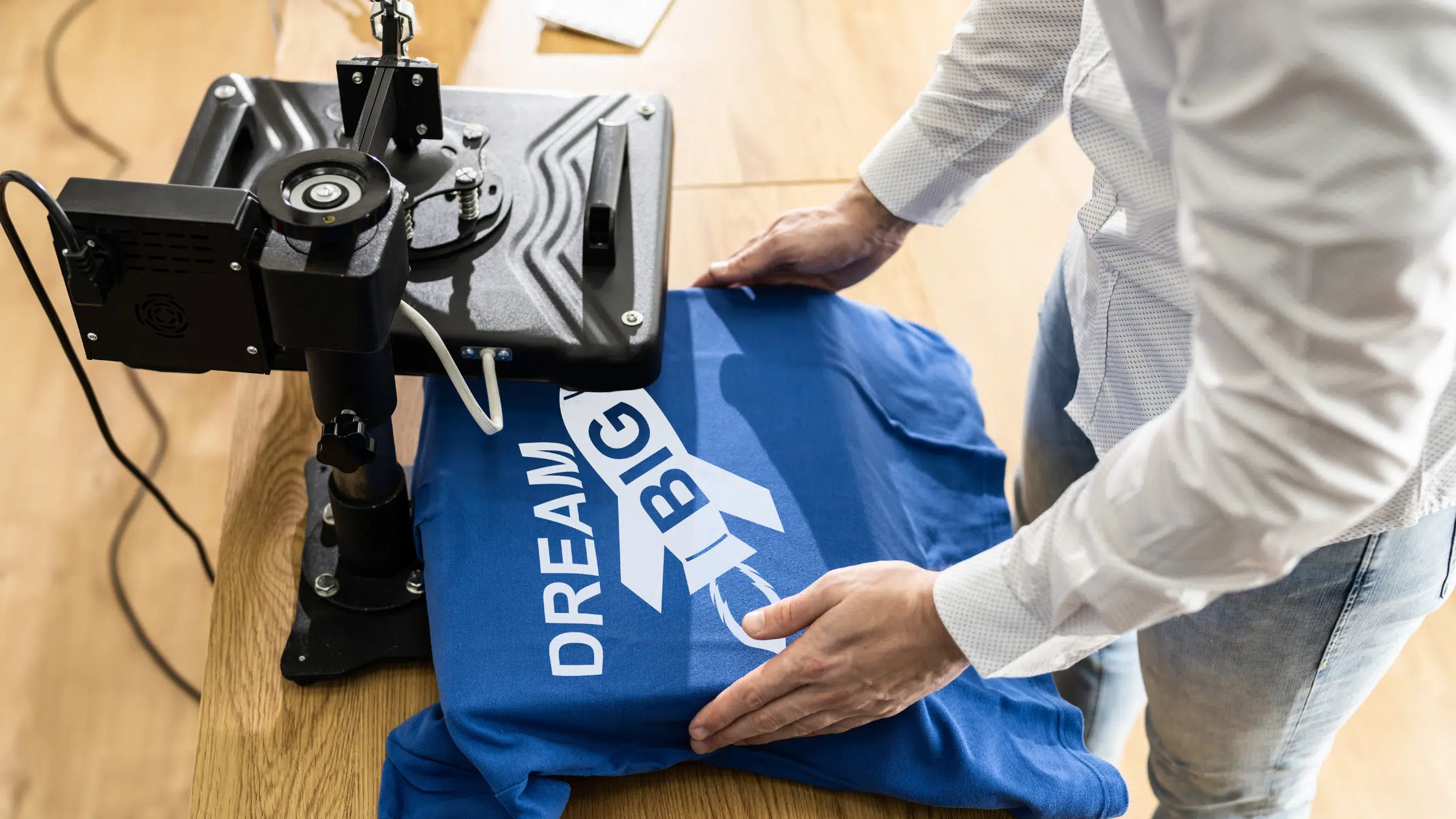
If you incorporate your designs on custom t-shirts, you don’t need to worry. This article will give six great tips on preparing print-ready digital artwork.
As many of you probably know, graphic design and graphic design specifically for t-shirt printing can be two different beasts. That’s why our team will show ways to retain the quality of your designs.

Preparing artwork for t-shirt printing involves ensuring the design is in the correct format, resolution, and color space. This ensures you can print it on a t-shirt with your desired printing area.
It usually involves specialized software to create or edit artwork. Also, exporting the design in a specific file format compatible with the t-shirt printing process.
But sometimes you must work hard for hours on a t-shirt design for yourself or a client. Sadly, the printer tells you the design won’t work for t-shirt printing. This problem is not uncommon. Below are a few easy tips on preparing your artwork for printing.
Also see guide to the best screen printers and the best T-Shirt fonts.
How To Prepare Artwork for T-Shirt Printing (6 Pro Tips)
1. Use PMS Colors in Your Artwork
You may typically do artwork in RGB and CMYK color modes, but to ensure you get the most accurate colors with a silk screener, definitely use PMS colors.
Pantone Matching System (PMS) is a standardized color system that ensures color consistency.
Using PMS colors in your design guarantees that your chosen colors will be the exact shades you intend, regardless of the printing method or substrate used. It also means your t-shirts will have a more professional, polished look.
Additionally, using PMS colors in your artwork can simplify printing and reduce costs.
By using a pre-defined PMS color, you eliminate the need for color matching and mixing, which can save time and resources.
This can be especially beneficial if you print large quantities of t-shirts, resulting in faster turnaround times and more efficient production.
Here is a link on how to work with Pantone in Illustrator.

2. Convert All of Your Text to Outlines
Sometimes, your artwork may call for a very obscure or custom font.
When sending your artwork off for print, the last thing you want to see is a substituted font in your design.
By converting the text to outlines, any computer that opens the artwork will view the text as an image. Therefore, no substitutions will be made.
Without converting text to outlines, there is a risk that the text may not appear correctly on the final printed product.
This is especially important for custom t-shirts created in limited quantities. These mistakes can be costly and may result in unsatisfied customers.
By remembering this tip, you can create crisp and clean lines that are easier to print. It can help avoid blurring or smudging.
It is vital for small or intricate details. Any blurring or smudging can compromise the overall quality of your artwork.
Begin Adobe Illustrator and select the text you want to convert. Go to “Type” in the top menu and select “Create Outlines.”
This will convert your text into a vector shape and allow it to be easily manipulated without altering the original font.
Make sure to save a copy of your original file with editable text in case you need to make changes later.
3. Create Your Artwork at Actual Size
Do not trust the printer’s judgment without discussing it with them first. Your vision of the end product may be very different than what the printer has assumed is your vision.
It’s essential to consider the size and placement of your design. If it is too small or large, it can impact the overall look of the t-shirt. The details may be lost or distorted.
By creating the artwork at its actual size, you can accurately gauge the placement and size. This will ensure that it will be printed as intended on the shirt.
The safest way is to create the artwork in its final size. Don’t know what size you want to use? Slap a ruler on the shirt you are wearing. Sounds simple, but it works.
You can set the artwork size in Adobe Illustrator or Photoshop. Create a new document and set the dimensions of the document to match the size of the t-shirt design.
Using the tools in your software, create your t-shirt design at your preferred size. If your design is 10 inches wide and 12 inches tall on the t-shirt, you should make it 10 inches wide and 12 inches tall in your software.
Save the file in the appropriate format, such as PNG, PDF, or EPS. Make sure to name the file clearly, indicating the size and placement of the design.
4. Use Vector Artwork As Much As Possible
This is not an argument of raster versus vector. Instead, it is a suggestion to use vector artwork when possible.
Vector graphics are digital images that are created using mathematical formulas. They are composed of paths rather than pixels. You can scale up your vector artwork without diminishing quality.
When using vector graphics, your design remains sharp and clear regardless of size. This eliminates the problem of pixelation when they are enlarged.
Vector artwork allows for more flexibility in color and design options. They can be adjusted easily without affecting the overall image. It allows for more precise color matching and customization options.
Furthermore, it will enable complex designs with multiple layers and shapes. It is easier to create unique and intricate designs for t-shirt printing without sacrificing the look of your final product.
5. Expand Your Strokes
If you have correctly set all your colors to PMS swatches, then the color separations software will have no problem.
This is more of a human error because strokes are sometimes overlooked.
Expanding your strokes is essential in t-shirt printing. Especially when using a digital printing method such as direct-to-garment (DTG) printing.
When designing a t-shirt, your target is to have artwork with clear and crisp lines that you can easily print onto the fabric. Expanding your strokes increases the thickness of the lines, which are visible and easy to print.
This tip is at #5 because it can save you from a small mistake ruining an otherwise great project.
By ensuring your design is easily printable, you can reduce the number of test prints needed. This can help to save both time and money. Fewer test prints mean less ink, fabric, and labor required.
To expand your strokes, follow these steps:
- Select the object or shape you want to expand.
- In the toolbar at the screen’s top, click “Stroke” to bring up the stroke options.
- Increase the stroke weight by typing in a higher number or using the up arrow next to the weight value.
- Click “OK” to apply the new stroke weight to your object.
- If your design has multiple objects or shapes, repeat steps 2-5 for each one.
- Save your updated design file.
6. Set Your Half-Tones with PMS Colors
This one goes along with Tip #1. Sometimes your design and budget call for half-tones to save on the number of colors printed.
Half-tones are small dots that create the illusion of shades and gradients in a design.
When half-tones are printed using CMYK (Cyan, Magenta, Yellow, Black), the resulting shades can be inconsistent and unpredictable, especially on different-colored shirts or with other printers.
PMS provides a standardized set of colors. The printer can achieve consistent shades using PMS colors to set the half-tones.
Your final print will look more vibrant and professional and closely match the original design.
You must convert your design to grayscale to set your halftones with PMS. You can adjust the size, shape, and density of the half-tone dots to achieve the desired effect.
Next, assign the PMS colors to your design’s shades and gradients. Save your design as a high-resolution file, and include bleed and trim areas to match your design.
Don’t forget to provide the PMS color codes to your printer. These steps can set your half-tones to achieve more consistent shades and gradients in your t-shirt printing.
Frequently Asked Questions
What file format should my artwork be in for t-shirt printing?
It's best to have your artwork in a vector format, such as AI or EPS. It allows for easy scaling without losing resolution. If your artwork is in JPG or PNG, make sure it's at least 300 DPI (dots per inch) and in the correct size for the print area.
Should I include a white background in my artwork?
If you want your artwork printed on a colored t-shirt, including a white background is best. This will ensure that the colors are true to their intended shade. However, you can omit it if you're printing on a white t-shirt.
What should I do if my artwork includes text?
Ensure your text is in a legible font and large enough to be read when printed. Avoid using small or intricate fonts. They may translate poorly in the printing process. Also, convert your text to outlines or curves.
How To Prepare Artwork for T-Shirt Printing Summary
These six great tips on preparing your t-shirt design for printing should cover most of your problems. This preparation should ensure a faster turnaround time and a more accurate print. You can create high-quality, stunning t-shirts that will surely be a hit with your customers.
Do you have any more t-shirt printing tips or questions? Share them below.


Great tips, I have one too…
Tip #7
GROUP YOUR VECTOR OBJECTS TOGETHER
You wouldn’t believe the amount of times either myself or the printer (yeah) have mistakenly moved a vector element in a native Illustrator file, so alwaYs group the elements together and lock the layer(s)
That makes no sense at all!
I can tell from your foolish comment that you are either new at graphic design, or you are just a lazy person that loves to piss and moan.
So because you are to incompetent to know, before you handle any graphic, that you should always group your image?
You think that its the responsibility of the artist that created it?!?! As an artist YOU should know better.
You always group before you touch any set of objects. That is like hearing a doctor complain how they wish that their patients would check their own blood pressure prior to coming to their office as it takes up to much of their nurses time! WTF! ITS THEIR JOB!!! Its YOUR JOB TOO!
If you are not the artist, and therefore you don’t feel that this is your job, then wtf are you doing handling the graphics at all. GTFOTW and let the real professional have the seat, and stop pissing and moaning!
That is the most babbling incoherent rant I’ve read in a while on the internet. For that, I salute you! Cheers, from Italy!
How ironic, James is telling Andrew to be professional in an unprofessional manner.
a good article you got here jacob.. thanks for the tips. I happened to stumble on your site.. its cool mahn. A lot of great resources for people starting out..
a big vinaka(thanks) from Fiji.. keep up the awesome work..
Great tips Jacob! I have quite a bit of shirt design lined up so i am gonna keep these handy!
We always ask our customers to learn how to use the layers palette in Adobe Illustrator. Most people dont even know it exists like in Photoshop. This helps us when it comes to graphics organization and color separation.
Thanks for the post.
These are VERY helpful tips. They are things that I usually think of, but it is nice to see the list…I also think the tips about the PMS colors & halftones are brilliant and well explained.
THANKS a million!
wow, now that what make me want to make my on tees.
thanks for the tips!
this is right up my alley thanks so much!!
Thanks so much Jacob. We’re planning to do t-shirts at Dead Wings and I’m still in the learning process for print design so this was extremely helpful!
Very well explained and easy to understand.
Along with what Preston Lee mentioned about using the layers palette of Illustrator, whenever possible assign your spot colors to their own layers.
Fantastic tutorial. I am working on building my own t-shirt website and have had a lot of problems with my graphics and tshirt quality. I had no idea about most of this stuff, so thanks.
Do you have any suggestions on designs that work well on t-shirts? How fine of detail can we get into with our designs?
Definitely agree with Ollie J – always split your separations on to separate layers!
I am not so sure about the PMS thing on clothing. In our experience pantone colours can come out looking VERY different when printed on fabric (the worst we have found is trying to achieve a stone / ecru like colour from pantones!). The best way we have found (although it is more expensive) is to provide the manufacturer with actual swatches of fabric and prints for them to match the colour to. We have a whole library of t-shirts that we buy when we see a certain colour we like. They all have squares cut in to them now as we take swatches to send out to the manufacturers but we find providing a physical sample is much easier to show them what we are trying to achieve, the PMS in clothing really has not worked for us!
I’m planning to do some t-shirt-design for my singer-/songwriter-project. so this comes just at the right time. thanx for that.
thanks for the rockin tips 😀
Might be a dumb question but here goes.
If I want to use a service like http://www.wordans.com/ and want my shirt to be of a photographic nature, what resolution should my graphics be to match the final output resolution?
I know that my image will be something around 11″X11″ but what’s the typical resolution?
And since I’m going with a photographic look instead of a logo type design, I’m assuming there will use some sort of an iron-on type of deal right?
Thank you for your time,
Shane
Shane, personally I am not entirely sure but my recommedation is to contact the printer you are going to be using. They will give you their advice and needs.
Cool article! Just tweeted it; quite sure our designers at Inkfruit would love these tips!
Just ran across your article. I’m actually a designer and screen printer. On your question about the photographic type design, sending elements as bitmaps in your design should be possible, although you would want to check with the actual printer you’re using to deterimine the resolution. I think 150 to 200 dpi should be good though. One other thing to think about is that if it’s a full color type photo, process or simulated process may be an option. Again, I would visit with the printer you’re using to be sure they offer it, but most can actually screen print instead of doing a transfer (iron on).
One thing I did notice though. You mention that printer’s shouldn’t charge extra for PMS color matching. This isn’t always the case. In my case, we stock a variety of stock colors that we use on a daily basis, but don’t have an in house PMS color matching system which can be expensive. When we order a quart of a specific PMS ink from our supplier, it is the price of a standard quart plus $20 for the color matching. So if a client orders a specific color that needs to be PMS matched, it costs me around $50 just to get that quart mixed and shipped to the shop.
Just some addl info. Hope it’s helpful.
Thank you Jacob for these great tips! And Marco, thank you for your added insight. Hopefully replying 3 years after your post won’t diminish my chances of a response too much! I’ve been trying to find out more information on simulated process design and how to set up files in Illustrator and Photoshop properly for that. If you know of any online resources or have any tips, that would be great! Thanks!
Hi Jason,
To be honest I can’t help you personally but have a look through these links:
http://www.delicious.com/justcreative/tshirt
Marco,
Thank you very much for the tips. Based on my experience dealing with online printing to apparel, most places do ask for 150dpi or more so you’re correct there. Thanks again.
Well this is very interesting indeed.Would love to read a little more of this. Great post. Thanks for the heads-up…This blog was very informative and knowledgeable
Wow…nice tips jacob!
thanks for sharing this post…and i m looking forward you can post more articles like these..
for helping to make cool design on t shirts.!!
Great tips, don’t forget to design in organic shapes rather than square or rectangle blocks.
Don’t know what size you want to use? Slap a ruler to the shirt you are wearing. Sounds simple, but it works.
wow nice post………….
http://www.longbeachflowers.info/
When sending your artwork off for print, the last thing you want to to see,
http://www.honoluluhawaiiflowers.com/
you that your design won’t work for t-shirt printing? This problem is not that uncommon and I would like to provide you with a few easy tips on how to prepare your artwork for printing on t-shirts.
Hi Jacob, just came across your post.
Excellent suggestions. Thank-you.
I myself print with DTG and I must say that tips no. 2 and 4 are particularly relevant, especially when resizing. Although in my case I would prefer the original art work at 300dpi. (Again for resizing).
Thanks again for a great post.
Take care.
This problem is not that uncommon and I would like to provide you with a few easy tips on how to prepare your artwork for printing on t-shirts.
On a side note, the printer should not charge you extra for PMS color matching. That is an old fashion way to get more money because you are actually doing them a favour by being more particular for accuracy.
This problem is not that uncommon and I would like to provide you with a few easy tips on how to prepare your artwork for printing on t-shirts.
Great article! I had a GT541, perfect for making TShirts.
This problem is not that uncommon and I would like to provide you with a few easy tips on how to prepare your artwork for printing on t-shirts.
This problem is not that uncommon and I would like to provide you with a few easy tips on how to prepare your artwork for printing on t-shirts.
Really great tips. We at “LetterNote” follows the same while designing custom Tshirts. Have a look http://www.letternote.com/tshirts.html
where i can buy all these materials? machine, printing stickers for tshirts, i want to start designing but i don’t have all this things. please guide to complete my needs..
regards,
rommel buenaventura
Wow thanks a lot for all the tips jacob!! Really helpful!! 😀
Thanks for great tips! I like the way you control the colors. It will make good effect on T-shirt.
I am no longer positive the place you’re getting your info, but good topic. I needs to spend some time studying more or understanding more. Thank you for fantastic information I was looking for this information for my mission.
I just learned the hardway, that this is NOT the correct way to make halftones. A tint is not a true halftone. Here’s a good tutorial: http://joshnh.com/2012/01/29/how-to-make-a-halftone-effect-in-illustrator/
Nice tips!!..now i have an idea how to deal with my T-shirt 🙂
I’m a graphic artist for a T-shirt company.
A few more tidbits that I’d add.
Keep in mind that whatever you are designing is being printed on a T-shirt and not paper.
These are two separate worlds. Paper is ALWAYS white and ALWAYS flat. Dot gain and Total Ink limit are totally different. Also for halftone stuff, the dots are MUCH smaller. Shirts are RARELY white and NEVER flat. Get down to the micro level of a t-shirt and you have repeating “grand canyons” of woven yarn for halftone dots to get lost on. Even the best screen printer, for everyday printing is going to lose dots in the 0-5% range. There is a bunch of physics and math in this that I won’t get into. If it were a competition print, I could use a higher mesh, use different mesh tensions and screen angles and make magic happen. For your ever day print, sorry, it’s not worth the money or headache.
Additionally, that 40% halftone really doesn’t mean much of anything. for me, because of dot gain from screen printing, that we’ve got pretty dialed in, I’ll curve it back 18% or so. Give or take. Dot gain for average Automatic Printing is around 38% @ the 80 and upwards of 45 @ the 80 for manual printing, depending on the strength of the printer, tension of the frames, type of ink.
A few notes:
1) NEVER HALFTONE SPOT COLOR AREAS OF TEXT. This looks bad, it won’t turn out good, and is just plain CHEAP. Yes, it looks solid with great area definition on your screen, but an ordered array of dots will cause missing dots on straight edges, etc… that don’t look good.
2) NEVER use UNCOATED colors thinking they’ll look the same. Most screen printers reference the Solid Coated book.
3) Avoid fine lines under 1.5pts, especially for small imprints.
4) Keep in mind the color of the shirt you’re having something printed on. Colors shift, although, where I work, we are pretty vigilant with making sure that we underbase (White/Grey/Tan under print) things correctly and adjust (darken or lighten) colors so they print appropriately. This will ONLY be approximate. Getting it perfect is almost impossible. Ask any graphic artist, all color is relative, especially when it comes to monitors.
Example of above: Black shirts. Red 186C Print. This will turn out 185C 99.9% of the time. In fact, I don’t even know what the 0.1% of the time would be, but there is the whole Schroedinger’s Cat Philosophy thing, so I can’t be 100% certain. However, I digress.
5) Keep it simple. I’ve printed some super intricate simulated process prints. I’ve done lots of those separations and they’re really cool imprints. But keep your audience in mind. If you’re advertising, advertise on the back, but don’t do too much. Average T-shirt viewing distance is 6-10ft. Your website and phone number don’t mean a darn thing…. No one will write it down.
6) Don’t have straight lines of text printed on a t-shirt. Shirts, contrary to popular belief, are round. Also, they’re sewn by humans, so getting that imprint to be visibly straight, while off of a person, is virtually impossible. This is just My .02 here.
Hope these things help too. Otherwise, a very well written article.
I truly loved reading this post and all these tips are worth taking before printing on t-shirts. You have endowed the best advice that can be helpful for aspiring designers. I would love to experiment this method. Thank you so much, I really appreciate it!
Hey would you mind letting me know which webhost you’re working with? I’ve loaded your blog in 3 different browsers and I must say this blog loads a lot faster then most. Can you suggest a good hosting provider at a honest price? Thank you, I appreciate it!
north face http://www.rrimadiun.net
Thanks for these tips. My friends and I have been wanting to get some shirts printed so we’ll use these tips.
Pretty usual tips though, better implement those one up with my printing business. 🙂
The problem I’m running into is that all the websites I’ve tried will only upload photos in a rectangle. Sorry for my lack of knowledge/terminology… but I’m trying to crop out the background so only the face shows up. Instead… the proofs show that white background in a rectangle even though it’s properly been removed via photoshop. This is probably elementary or maybe I just need to find the right website… but any poke in the right direction would be much appreciated!