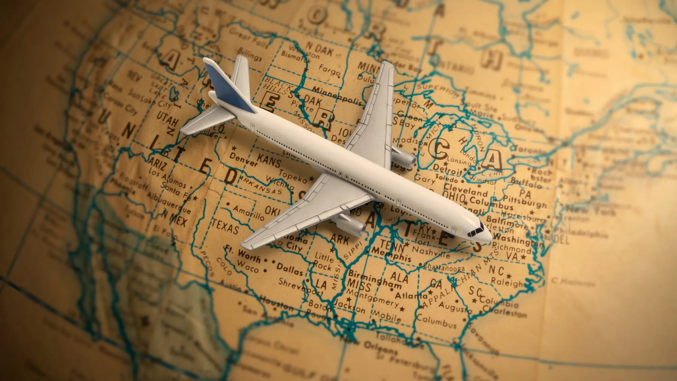
A boarding card can take you to limitless locations but have you wondered how these airline brands became so memorable? If yes, then you will know that best airline logos contribute to a great extent to their popularity.
The logos are often created with great care to really stick in a consumer’s mind – airlines are very expensive entities and it’s important that they have a logo that is meaningful and long-lasting, but also easy to hold in the mind. If you’re among those who are ready to create your airline logo but want to make sure there are no mistakes in creating a logo then this article is for you.

Customers must trust your brand to trust your airline with their travel arrangements. When developing airline logos, you must ensure the customers that their travel will be safe and enjoyable in your hands. This article will assist you in designing an airline logo that will help you grab customers’ attention
This article is for you if you’re trying to figure out how to inspire confidence in your company’s brand.
Yes, you will learn about the best airline logos in this post. With some tips on what to consider when designing an airline logo, this article will show you the elements that constitute great logo design for the ultimate brand awareness.
Check out our blog on the best logo design software to create amazing logos for your brand.
10+ Best Airline Logo Designs
- Lufthansa
- Virgin Atlantic
- Qantas Airways
- Thai Airways
- Emirates
- Swiss Air
- Singapore Airlines
- Malaysia Airlines
- United Airlines
- Delta
What to Consider Before Creating an Airline Logo
The sole element of a company’s brand strategy, the company logo, is how consumers recognize that entity. Such logos through the use of symbolism, color, and typography ought to have a deeper meaning than how it might appear on the surface.
Humans respond at a primitive level to symbols, colors, and types, such that a well-designed logo is triggering deeper meaning than may first appear on the surface. Before creating your airline’s logo, keep the following in mind.
Color palette
There is no doubt that colors are a key component of any logo design. Bright and warm colors bring to appeal to airline customers more and they inspire confidence and trust in their customers and convey a safe journey.
Color palettes, when applied effectively, serve as the visual foundation of your brand, support consistency, and improve the aesthetics and usability of your user interface.
Symbol
When you employ significant symbols in logos, they stand out and become appealing. Use symbols that complement other design components while creating an airline logo.
An airline logo could have a plane, but other popular choices include wings, birds, and feathers.
Whatever symbol you decide on, your airline’s logo should accurately reflect the services it provides and make it easy for consumers and travelers to recognize your brand.
Typography
Typography is one of the most important aspects of an airline logo. Airline logos use Sans-serif fonts since they are usually legible and easy to read. You can also try bold, all-caps wordmarks to bring confidence and trust to your clients.
10+ Examples of Airline Logos
1. Lufthansa
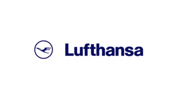
This esteemed German airline has a logo that was created in 1918 and was formally adopted in 1954 that makes up its distinctive and easily identifiable visual identity. The renowned airline’s logo was created by German artist Otto Firle.
The Lufthansa logo portrays a bird in flight and has the name of the company which is presented next to the encircled bird in simple, clear type. The wordmark for Lufthansa is written in Helvetica font.
The Lufthansa logo’s primary colors are a deep shade of blue and a rich shade of yellow. White is further used in some renditions of the logo.
The Lufthansa logo comes with a bird that is unrelated to a circle, but this circle represents a bird in flight over the entire earth making it a fantastic example of the surrealist idea that strong conceptions may be created by juxtaposing ordinary, unrelated objects.
2. Virgin Atlantic
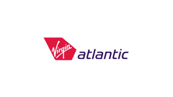
One of the most recognizable logos is that of Virgin Atlantic, and the airline has always maintained a strong visual identity with its simple logo design. The logo, which consists of a red symbol in the shape of the rear wing of a plane and a logotype, followed by a lowercase italic in the Gotham font only underwent a significant color change once, in 1999, and all later iterations were merely minor adjustments.
The Virgin Atlantic logo was refreshed and altered three times before being improved upon once more in 2010. The Virgin Atlantic logo’s lowercase lettering is done in a very light, clean sans-serif typeface that looks elegant and light. But, the fully rounded curves give the whole design a more contemporary vibe.
The Virgin Atlantic visual identity’s color scheme of purple, red, and white is a reflection of the airline’s strength and devotion as well as its inventiveness style, and convenience. The vibrant colors’ mix of powerful and serene hues gives the logo a feeling of quality and elegance.
3. Qantas Airways
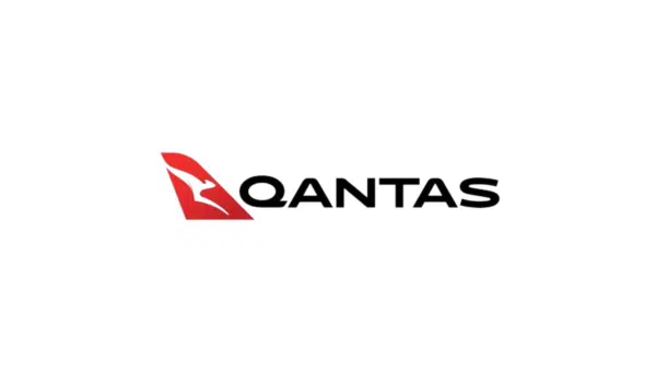
Australia’s flag carrier and the largest airline in terms of fleet size, foreign flights, and international destinations is Qantas Airways Limited, which has been in operation for almost a century.
It is important to use creativity when designing symbols, and Qantas Airways ultimately landed on a crisper, more expert typeface style in 2016. The Houston Group and the airline worked together to revamp the logo.
The key Qantas brands’ bold uppercase writing is set in an elegant, italicized sans-serif typeface with contemporary, stable character shapes. The air carrier’s font, Kinetica Bold, is probably the closest match, but, certain letters’ outlines have been changed. The Qantas visual identity’s color scheme is made up of the classic and sophisticated hues of red, white, and black, which stand for power and quality.
4. Thai Airways
Thai Airways is a fantastic example of an airline that upholds the tradition in its logo. The company’s present logo is a more sophisticated and contemporary version of the original, which was developed in 1975; but, before that, Thai Airways’ insignia looked quite different. Since its inception in 1975, the Thai Airways logo has undergone many changes.
In 2005, the logo was updated while maintaining the original concept. The previous badge was created by Walter Landor Associates. The Thai Airways logo is a lovely illustration of embellishment in various colors which was based on the country’s traditional imagery, including its gold temples, tropical orchids, and opulent silk.
The color scheme and typeface were both slightly altered to make it more contemporary and aesthetically pleasing. The purple turned deep and black, giving the appearance of more authority and self-assurance. The wordmark now features an elegant typeface with slightly lengthened and sharpened bar ends and is set in uppercase.
5. Emirates
Emirates established a reputation as a high-end, opulent airline in the field. It’s occasionally possible to design distinctive logos by utilizing multilingual wordmarks and the Emirates logo serves as the best example of this.
The company name in Arabic calligraphy took up much of the original Emirates Airline emblem and the logo also carries an English translation below. Despite being completely readable, both versions had a pretty attractive appearance. The British company Negus & Negus was in charge of creating the design.
Unlike the serifs of the present wordmark, which have just one serif and elongated sharp edges, the prior Emirates logo’s serifs had a nearly classic appearance. The glyphs’ general shape has become more extended.
The stylish and distinctive logotype for Emirates Airlines is written in the title case of a custom typeface, with the exquisite, smooth letters’ lines gently pointing to the side to evoke the appearance of delicate serifs and give the wordmark movement.
The lettering’s typeface was created specifically for the business using common typefaces like Tynne Basic and Augsburger Schrift. The Emirate’s primary color, red, stands out clearly against a white background in the logo and lends an air of strength, passion, and elegance.
6. Swiss Air
Swiss Air is an excellent example of how a simple symbol can give your logo design a more distinctive appearance. The Swiss national flag, which features a white cross inside a red cross, served as a major design inspiration for both the original and current iterations of the Swiss International Air Lines logo.
Both their previous and present logos used a red square that contained many graphic elements in white. The wordmark features clear sans and the logos feature the word “Swiss” and a cross inside a red square.
Previously, the letter “I” in the word “Swiss” was in small letters, but in 2002, the dot above the “I” vanished, creating a more minimalistic appearance without losing any of the meaning.
7. Singapore Airlines

Singapore Airlines is a fantastic example of how Singapore Airlines uses beautiful colors to create a logo that is sure to catch anyone’s eye. The Singapore Airlines logo featured a stylized bird with strong, gold lines that appeared to be quite geometric, and to be exact, there was only the bird’s upper half.
The Singapore Airlines logo’s color scheme makes use of vibrant hues that are in soothing, deep tones, relaxing the logo’s strong lines and giving the typography added character. The color yellow is also a hue of energy and movement, and blue is a well-known representation of safety, dependability, and trustworthiness.
8. Malaysia Airlines
Instead of employing well-known and national emblems, you should try to create a design that is distinctive, like Malaysia Airlines does. The extremely attractive logo of Malaysia Airlines, formerly known as the Malaysian Airline System, has a long history that dates back to the 1970s.
Since its renaming, the firm has gone through a few distinct logos. A new logo for Malaysia Airlines was unveiled in 2013 and appears to be a combination of two earlier designs. The Malaysia Airlines logo’s lowercase letters are contemporary and forward-thinking, set in a robust sans-serif typeface with letters that have some angles rounded and others sharpened.
The emblem, which depicts a Kelantan kite, is ideal for both representing the nation and for use in aviation. The Malaysia Airlines logo’s color scheme is blue and red, a traditional pairing that conjures up images of professionalism and reliability. Blue is a visual depiction of security and dependability in addition to being the color that represents the sky and flying.
9. United Airlines
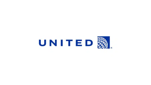
The United Airlines logo is an amazing example of why it is always better to start from scratch rather than reuse an outdated design. The company’s logo has seen more than a dozen changes before becoming something simple, and fashionable.
The visual identity of United Airlines underwent a revision in 2019 that improved and cleaned up the lines.
Its main color was also changed to a brighter, more vivid shade of blue, giving the entire logo a distinctive appearance compared to the previous design. The minimalist and memorable logo, which is brilliant blue and white, lends the business a sense of responsibility and expertise. It also represents its values of comfort, reliability, and high-quality service.
10. Delta
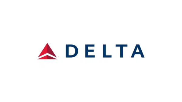
The Delta Airlines logo, used by the US-based airline, is an excellent example of how bold designs can succeed. Just five letters and a symbol make up this logo well. It’s interesting to note that the symbol’s triangle shape actually corresponds to the Greek letter for Delta.
The Greek alphabet’s fourth letter is this one. The company’s logo has undergone many changes. But, in the majority of variations, the firm name was added to a triangle in the shape of the Greek letter “delta.” The dark red triangle and laconic Delta phrase have been a part of the logo since 2007.
Blue and red colors are used in their color scheme. The sky is symbolized by the color blue, and leadership is symbolized by the color red. Perfect for the airline service, the straightforward sans-serif all-caps Whitney typeface offers outstanding legibility even at wider distances.
Frequently Asked Questions
What is a logo?
A logo is a symbol that combines text and visuals to help a user or consumer distinguish between brands and companies.
What determines a logo's success?
A successful logo is unique, pertinent, usable, graphic, and straightforward in design. An effective logo should communicate the owner's desired message.
Which airline's logo has a bird?
Iran Air chose to reflect its lengthy flights with an ancient bird in its distinctive logo, which has been in use for more than 50 years.
It’s Time for Your Airline Logos to Take Off!
You should create a logo that distinguishes your company from its competitors and gives it credibility. The best airline logos convey a sense of comfort, optimism, and reliability.
I hope this article on the most well-known airline logos, will inspire you to create your own airline logos and let you keep in mind the blunders to avoid.


