Yes, this is a controversial topic, however I hope to raise awareness of some mistakes you may be making in your graphic design pieces that are making you look like an amateur, but please keep in mind that none of these are hard and fast rules, this is only a general guide of things you should be aware of.

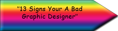
Please forgive me for the graphic and bad grammar / spelling in the picture above as I’m sure you can see it is a joke 🙂 (rainbow gradients, comic sans, bevel emboss, 13 not 15, bad grammar, off centered type – yuk)
Anyway, I have compiled 15 tell tale signs that you may still be considered a (don’t quote me) bad graphic designer. Some of these have been taken from Robin Williams great book “The Non-Designers Type Book” that I recommended in the top 5 typography resources of all time.
1. Helvetica

Do you use Helvetica in everything?
Ok, yes I know, it is the most popular font of all time – but that is the downfall of Helvetica. Just because it is there, it doesn’t mean you have to use it. Try something else next time and try break out of your habit. Just for some suggestions, maybe Trade Gothic, Formata, Futura, Antique Olive, Eurostile? And yes I know this website uses Helvetica 🙂 Also check out the post 30 fonts to last you a lifetime.
![]()
2. Straight Quotes & Wrong Quotes
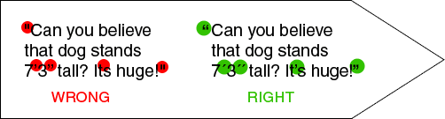
Do you use straight quotes still?
Straight quotes were for typewriters, times have changed! Look at the difference between the quotes above.
- The quotations are not hanging over the edge.
- Straight quotes have been used instead of true quotation marks.
- Quotation marks have been used instead of prime marks after the 7 and 3.
- An apostrophe has been left out in between it’s.
Learn the keystrokes to ‘real’ quotes in every application you use. Learn the MAC & PC keyboard shortcuts here.
Don’t type curly quotes when you need inch and foot marks (prime marks).
![]()
3. Quotations Not Hung
Do you NOT hang your quotation marks?
See in the picture in number 2, how the quote marks are hanging off the side of the quote, compared to the other one. Hang your quotation marks. Read your software manual (check their help files) to read how to do this or you can do it manually.
![]()
4. Double Returns.
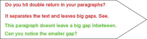
Do you hit the ‘return’ or the ‘enter’ key twice between paragraphs or after headlines?
Using two spaces makes it possible to end up with a blank line at the top of a column plus it leaves way too much space between each paragraph – it looks disconnected.
![]()
5. Two Spaces After Punctuation
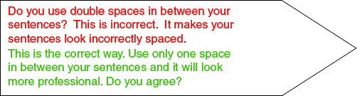
Do you add two spaces after each sentence?
This is a very bad practice and is not correct – Using only one space is the correct way.
![]()
6. Using Boxes Behind Text

Do you use plain boxes of colour behind your text?
Just because you can, doesn’t mean you have to. Try something else, use a dramatic headline, use your white space, use a different font, reverse your type, use pull quotes, etc. Can you see in the above picture how the surrounding white space makes the text stand out on its own? You can use these in the correct places however be careful not to over use it.
![]()
7. Centred Layouts

Do you use a centred layout in your graphic design pieces?
Using centred layouts is usually bad practice as it creates a deadly dull look. See how much more effective the two green verses are, they are more dynamic (one is centred & one is left aligned). Using flush left or right gives strength to your entire page and usually is a better option unless of course there are reasons to use centred text. eg. creating a formal wedding invitation.
![]()
8. Borders
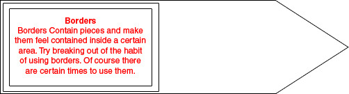
Do you use borders around everything?
This often indicates a beginner who feels unsafe with type that is uncontained. Use your white space. You can let it be there. Seriously.
![]()
9. Indents

Do you use half inch indents?
This is bad practice and is the old way (back in typewriter days). The standard is one em space which is a space as wide as the point size of the type. (what?) This is approximately two spaces, not five.
![]()
10. Hyphens For Bullets
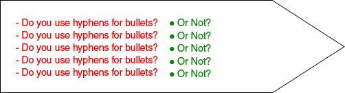
Do you use bullets for hyphens?
This is a typewriter habit and is unprofessional. Try using dots or dingbats.
![]()
11. Embossing & Drop Shadowed Type

Do you use the nifty little drop shadow or emboss tools that comes with your software?
PLEASE STOP. This is the biggest dead give away of an amateur. This goes along with forbidden; rainbow gradients, reflections, comic sans. Just don’t use them, plain simple.
![]()
12. 12 Point Type
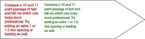
Do use the default 12 point type with auto leading?
For most typefaces, 12 point is a tiny bit too large for body copy. Compare a 10, 11 and 12 point passage of text and tell me which one looks more professional. Try adding an extra 1 or 1.5 line spacing or leading as well. Notice the difference in the two examples above. The red is the default 12 auto leading and the green is size 11 with 2 points of leading.
![]()
13. Underline
Do you underline?
Never use the underline feature, it is a law. Only for hyper links on the web is this allowed. Underlining was a way for typewriters back in the day to Italicize text because they couldn’t set italics. Underlining and italicizing text at the same time is the most redundant thing you can do in life but rules can be broken 😉
![]()
14. ALL CAPS
DO YOU USE ALL CAPS?
All caps is more difficult to read and this is because we recognise a word not by its letters, but by the shape of the whole word. When text is in all caps, every word has the same shape so we have to read every letter by itself. All caps is fine sometimes but when you are conscious of using it and why. Try using bold, using a different typeface or using reverse text.![]()
15. Bad Gramma & Speling
Not spell checking your work and not using the right grammar. One of the hardest aspects designers seem to face.
Your Score?
If you scored above 3 points, don’t worry. Creating professional level type and design is mainly a matter of becoming more aware of details and practice. If you scored less than 3, then congratulations and consider it your obligation to teach others the things you know. (Hint: Link to this post 😉 )
For more information on graphic design and typography and the things listed above check out The Top 27 Mistakes Graphic Designers Make or refer to Robin Williams book “The Non-Designers Type Book“.
What do you believe are some other signs you are a bad graphic designer?
![]()
![]() The variety of programming software is manufactured to run different programs of computers. If you want to get services of most reliable hosting service providers, godaddy is the best to provide all e-commerce tools and hosting plans. For the proper development of website design, there is a need of getting services of the professional website designers. The hosting service companies offer the e-commerce tools for the internet marketers who are much interested in online advertising. The professional website designers are working efficiently for the superb website development. If you want to be most expert website designers and developers, you should follow all web design principles to get more expertise. By following such strategic principles and tools, you may design and host your site by yourself.
The variety of programming software is manufactured to run different programs of computers. If you want to get services of most reliable hosting service providers, godaddy is the best to provide all e-commerce tools and hosting plans. For the proper development of website design, there is a need of getting services of the professional website designers. The hosting service companies offer the e-commerce tools for the internet marketers who are much interested in online advertising. The professional website designers are working efficiently for the superb website development. If you want to be most expert website designers and developers, you should follow all web design principles to get more expertise. By following such strategic principles and tools, you may design and host your site by yourself.
![]()


Typography… the hardest part of design. Definitely something I need to get better at.
That was great list.
It is interesting to see that most of these are related to typography. I think that if we get the types right, it is 75% good design in itself.
Niyaz PK’s last blog post..Orkut getting the loops wrong
Not quite sure about not using italic type.
Richard’s last blog post..My Personal Music Experience
Hilarous… not your points, they’re very valid. Just that a lot of that *seems* like common sense. But I guess there just isn’t enough of that nowadays. On a slightly different note I’ve been looking around your site (after being directed to your “22 Blatant GD Rip Offs” for my ethics essay) and I commend you for being exceptionally driven and passionate as well has having clean and professional designs. Cheerio.
Thanks, its always great to hear comments like this! Hope you stick around! 🙂
please tell me the title image “13 Signs Your a Graphic Designer” made with Comic Sans, rainbow gradients and spelling errors is an intentionally abusive application of everything you should never ever, ever do. And also, helvetica is so widely used because it’s a timeless, applicable typeface. Just because it’s not decorative like Curlz or papyrus doesn’t mean that it’s boring.
15. Using “your” when it should be ‘you’re’.
16. Using “a long” instead of “along”.
Hi Laura, of course it was… Even in the first line of this article I say “Please forgive me for the graphic as I’m sure you can see it is a joke”.
How about adding “Bad Grammar” to the list.
“a long” should be “along” — it’s one word
“your” and “you’re” are very different things. “Your” is a possessive, “you’re” means “you are”.
That mistake is awfully amateurish. All the design skills in the world mean nothing if you make such a fundamental grammatical error.
‘Your’ was done purposely in the top header image. ‘A long’ was a typo that I hadn’t noticed until just today, thanks for pointing it out.
But I agree with you, very amateurish.
Very valid list, and happy to say I obey the rules, all except rule 5. I have always been taught in traditional writing english you always put two spaces after a full stop or period.
Good. I’m not the only grammar nazi!
I agree with everything except the centered type (#7.) I think the example you have in red is actually better than the first correct example. It doesn’t flow better nor does it look better. Don’t get me wrong, I don’t center extensive amounts of copy but there is a time when it can be used effectively (other than formal applications.)
Good list nonetheless.
Thanks Jon for your comments. I suppose there is a different use for everything.
good work!!!!!!!!!!!!!!!
I agree with everything except number one.
Design is definitely about looking good, but it’s also about getting a point across. Helvetica is used the most because it does this better than any other font.
No bad-mouthing Helvetica.
Great article, though!
Hi Jordan, welcome to Just Creative Design, everyone is entitled to their own opinions I suppose 😛 Hope you stick around.
How do I tell my clients this!!!
Some things are best left unsaid, but some need to be.
Nice list!
lol if you use helvetica, then why be a hypocrite:P
I say you start using papyrus, that would rock. 🙂
Why not?
Papyrus or Comic Sans.
Now you’re making it hard on me!
Great list! One spelling correction not already noted (I think) … it’s SEPARATE, not seperate.
🙂
Roberta Rosenberg’s last blog post..Top 100 Freelancing Blogs – and Copywriting Maven is on the list
Hi Roberta, thanks for noting that out, but I can’t seem to find the typo where is it?
Great suggestions. Rules of design should be rules with rational reasons, though. Helvetica is popular because it is a great, easy to read font (probably why you used it). There’s nothing dated about it. Not liking it doesn’t mean it’s a bad font – nor is Comic Sans, if used sparingly.
Understand why two spaces after a sentence is no longer acceptable. It was used to separate sentences when we used non-proportional typewriter fonts. Now we generally use proportional fonts, and need only one space between sentences. (But use two if you are using a non-proportional font.)
Web sites lambasting bad design/grammar/spelling should be quadruple checked that there are none in it. You should correct yours. (Hint – it’s in #4.)
Hi BB.Can’t argue with helvetica. Thanks for the insights as well into the spacing. I believe my spelling and writing is pretty decent however there is always room for improvement (as in anything) as you have just pointed out with my mistake… The ‘seperate’ typo I overlooked as it was an image and I couldn’t find it by the search function but thanks for the point out. I will fix it up soon 🙂
LOL Oh no! I’m guilty of a couple of these. Using centred text for example – although I always consciously mix it up with left and/or right aligned text as well in any project. Some old habits die hard though… I also had the double-space hammered into my head as an English major in school, and occasionally find it slipping back in!
Just a couple comments though. Bevelled and embossed type with drop shadow CAN be effective when part of an overall 3D effect, in my opinion, as in a logo. Also, I still havent figured out how to get prime marks (other than to copy-paste from another document), and the link you provided was no more helpful for this. Can you clue me in?
We all are Sarah… and everyone was a beginner once 😛 I have never really had the problem of double spacing as I didn’t really grow up with it but I know a lot of people that still do it! Regarding the drop shadow and emboss, if it is down subtly then maybe. Regarding prime marks, check out this page… http://www.theworldofstuff.com/characters/ – The prime mark alt code is = Alt + 8242.
don’t mess with helvetica.
recommending eurostile as a valid alternative for helvetica,
leaves me wondering if you are a good graphic designer yourself.
next thing you know, you’re saying we should all use arial.
and for god’s sake: BAN COMIC SANS.
Hi Sebbe, well I do contradict myself don’t I… everyone is entitled to their opinions but I do despise it when I see helvetica used somewhere where there could have been a much better option. Don’t you think?
Have to admit that I am not a grammar whiz but I do quintuple check everything. Fun article!
I’m not sure I agree about #1 though I have seen many amazing designs using the typeface but it is true that those make unexpected use of the typeface.
Great fun, keep ’em coming!
Jason’s last blog post..Pick. Up. A. Pencil.
I hope you will give me tips on designing with Arabic. Because these tips are not applicable here. Great job though…Keep it up!
I have never really had any experience with Arabic so can’t really help you there. I am sure the principles of design are still similar however.
I don’t see why everyone hates helvetica these days. It’s the Levi’s or Chuck Taylors of type – always works, always looks good. Your right on the comic sans, that’s like the Hammer pants of type.
Bad grammar! Not just in the heading! On the side menu where you find the link to “13 signs YOUR a bad graphic designer”. Tsk TSK.
Dont preach if you’re not going to follow the rules yourself. Spell-check is your friend 🙂
I also don’t think all of these things make somebody a bad graphic designer, particulary number 1. A good Designer can understand why Helvetica is an important and widely used font. It’s the bad ones that don’t!
Hi Lindsay,
I did mention in the very first paragraph of the article “Please forgive me for the graphic and bad grammar as I’m sure you can see it is a joke”
Yes helvetica of course is always going to be one of those fonts however not everyone can use it correctly and this is what makes it bad in my opinion… but as I also said… I know that I am using helvetica on this site 🙂
Thanks for your comments.
Nice post – #14 can be used for subheadings?
Shibani’s last blog post..The Song Of Life
There is no hard and fast rule of doing anything but yes capitals is accepted in headings if used correctly 🙂
Well rules are made to be broken, as they say… but only once you understand HOW You’re breaking them. In that sense, this is a great list. Kudos!
Though I gotta agree with a previous commenter — Eurostile? Are you insane?! 🙂
There is a time and a place for everything 🙂
nice list, but I find it interesting that you violate #15 in #12 and the layout of this comment section violates #6. Are you trying to tell us you’re a bad graphic designer?
Excellent post. There is some great comments that separate the amateurs from the pros.
Web Design UK’s last blog post..8 ways to back up your computer files
Great site, thanks for all the useful advice!Just a comment on the forbidden reflections though (#11) – this is a staple element in the current web 2.0 craze, so what’s that about? Personally, I feel it is very effective if done right.
Yes of course, if something is done correctly 🙂
Hi,
Just noticed someone said something about the double space at the end of a sentence being there due to non-proportional typesetting. Actually, we no longer double space because it increases file size. This is much like having useless carriage returns at the end of your document. Keep it clean and keep file sizes down! No use cluttering up cyberspace more than it is already.
Haven’t heard that one before but thanks Kribby interesting to know. What is your source?
I am totally agree with point number 11. You can see a lot of this point examples in one-page-web advertising. 🙂
Didik Wicaksonos last blog post..Inspiration Overload – From One Site
Hi Dave,
Obviously you did not read the first paragraph at the top of the page.
Thanks for your comments though as you are correct.
There should be a 16th sign…
#16 – Do you give bad or generally biased advice to other designers based solely on your own preferences? If so, you might be a bad designer.
Although I do agree with you on some of these points, a lot of them are plain garbage. Just because Helvetica is ubiquitous doesn’t mean it’s a poor font choice. Tibor Kalman used Helvetica almost exclusively. Would you call Tibor a bad designer?
#’s 3,4,6,7,8,9,10 & 12 are all up for interpretation. If you’re talking about large of body copy, then no, you don’t want to use centered type or all caps, but that doesn’t mean that you NEVER use centered or all caps.
Underlining and italics have a very specific use in grammar. Use them accordingly. Hyphens aren’t great for bullets, but what if it works for your design?
I think this could be a great post if you just put a little more detail into the examples, making it more obvious when they work and when they don’t.
Dave C.s last blog post..Links for 2008-04-29 [del.icio.us]