Looking for some of the best logos of all time and their meaning?
We’ve compiled a list of the best logos of popular brands in the world today and sorted them by category, plus provided their logo design history and meaning!


When talking about brands and culture, logos are irreplaceable ways of establishing the identity of your company and what your brand stands for.
In the case of logos used in popular media, you’ll find that over time, these companies have established themselves as dominant brands in their segments and as a result quite well-known across the globe. As a matter of fact, there’s an entire study on how logos directly speak to the subconscious!
- Get 65% off Adobe software – Follow our Adobe Creative Cloud discount guide.
- Get 10 Free Stock Images from Adobe Stock — Royalty-free photos, illustrations and videos
Generally, branding and logo design is pivotal in establishing a brand presence. And regardless of what your personal reservations are, all the brands on this list are almost instantly recognizable.
For most brands, these logos are recognized ideas that market themselves. In most ways, this is what makes brand design and marketing campaigns an important tool for any profitable business.
A business with impressive branding need not spend as much on its marketing and advertising activities since its products are already recognizable and in demand by the general public.
That said, if logos are something that you’re interested in, check out our “create responsive brand logos” and “best logo design tips” articles.
If you’re after a tool to design logos, get Adobe Illustrator. Or if looking for a professional logo designer, contact us.
Stand out from the crowd with a unique custom logo design that captures your brand's essence. Boost your business's identity today! View our services or schedule a call.
- Free Brand Clarity™ Call
Now let’s take a look at these famous logos!
Top 50+ Best Logos of Popular Brands in 2022 + Their Meanings & History
Are these the best logos of all time? They are certainly some of the most popular or best logos in each category. Read on to understand the meaning and history of each of the best logos of all time.
Top 10 Best Tech Logos
- Apple
- Microsoft
- Nvidia
- Intel
- Samsung
- Dell
- IBM
- Razer
- HP
- Amazon
Top 10 Best Food and Beverage Logos
- McDonald’s
- Nestle
- Starbucks
- Coca-Cola
- Cadbury
- Red Bull
- Hershey’s
- Burger King
- Baskin Robbins
- KFC
Top 10+ Best Luxury Logos
- Versace
- Fendi
- Gucci
- Hermès
- Louis Vuitton
- Mercedes-Benz
- Porsche
- Ferrari
- Supreme
- Dior
- Prada
Top 10 Best Finance Logos
- Citibank
- TD Bank
- Visa
- PayPal
- Mastercard
- Deutsche Bank
- Bank of America
- Royal Bank of Canada
- J. P. Morgan
- Societe Generale
Top 10+ Best Fashion Logos + Retailer Logos
- H&M
- Walmart
- IKEA
- Target
- Nike
- Adidas
- Nordstrom
- Vans
- Shein
- Zara
- Ray-Ban
Top 10 Best Tech Logos
1. Apple
This iconic logo from Apple incorporation is one of the most exemplary ones to be used in popular media. Although there are certain debates concerning the inspiration behind the logo. Whether it was Isaac Newton’s inspiration for discovering gravity or Steve Jobs’s favorite fruit — this logo is associated with a simple and reliable user interface.
Founded by Steve Jobs, Steve Wozniak, and Ronald Wayne, Apple is now a multinational leader in electronics. Now one of the most sought-after brands worldwide, what makes this logo stand out is both its minimalist design and the overall playful impression it inspires.
2. Microsoft
One of the longest-used logos (the Microsoft logo) was designed in the late 1980s with many variations. This logo is modeled after a window, to help convey how technology and computers offer users an open window to different business opportunities in the market.
The Windows logo, from which the Microsoft logo is based, moved away from this in the 2000s due to advancements in the GUI and animation field. However, from the release of Windows 7 to the current Windows Azure logo used in Windows 11, Microsoft has retraced its routes with the traditional window imagery.
3. Nvidia
The Nvidia logo was first brought about in 1993. Most familiar to both graphic designers and gamers, the Nvidia logo’s key element is the ‘all-seeing eye’. The eye in the Nvidia logo is supposed to represent the company’s constant search for innovation and new technology.
The green logo was used to incorporate an element of success and growth that the company seeks in the production and use of its products. That said, some theories suggest it is an allusion to Invidia (the Roman goddess from whom the company derives its name).
Although originally a light lime green, post-2006 the company switched things up to a darker hue.
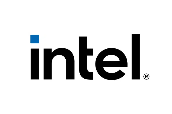
4. Intel
In 2020, Intel lost the iconic swirl around its typography for a more simple and minimalistic sans-serif typeface. This move was to make things less complicated and a lot more corporate-friendly. On that note, the new logo aims to have a clean and compact look to make things easier and simple for consumers.
The new one has typography that looks similar to the original logo designed by Robert Noyce and Gordon Moore.
5. AMD
Although used differently based on the product and segment, the AMDA logo uses two square arrowheads that form an “A”. AMD, or as it’s less commonly known Advanced Micro Devices, has maintained this logo for over 50 years.
This logo is among the most common ones we see on laptops and computers. Despite not being significantly changed over the years, the AMD logo retains the original innovation and the bold feel it aims to convey.
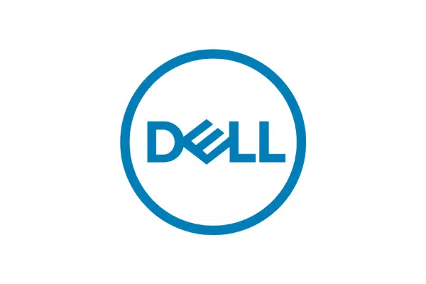
6. Dell
For its logo, Dell aims to stay true to its beginning. The Dell Logo had experienced minor changes over the years, yet it maintains the square-shaped design “E” that looked like a microchip.
The circle around the logo was added in 2010 and that helps tie everything together.
This was reportedly added to incorporate an element of evolution into the brand. Practically, however, the circle is also to promote a more “Global” image of the brand to the market
7. lBM
One of the big tech titans, IBM, has been around for a long time and incidentally, its current logo. The company became incorporated in 1972. The IBM logo was made to convey the speed and boldness with which the company expands its business.
The logo has 13 stripes as when it was designed. The logo was created to provide the users with a different overall feel to what has already been done.
8. Razer
Razer was founded to dominate the market and its competitors. Whereas, for a company that predominantly designs mice, they felt a snake was the go-to animal to dominate the market segment.
Therefore, the logo depicts three snakes that join at the middle which they used in their first product, the Razer Boomslang (Boomslang, the name of a South African snake). Why neon green? Surprisingly, that was inspired by the South African snake as well.
9. HP
HP is yet another company whose logo has seen little renovation over the years. It was designed after the name of the company and its founders, Bill Hewlett and David Packard. The HP logo aims to look simple but works with information of a marketing nature. The H and P are enclosed in a circle and usually displayed in blue that helps convey an overall feeling of trustworthiness.
HP is one of the older computer companies. It’s one of the constants in the tech field so far, and so is its logo.
10. Amazon
Jeff Bezos founded Amazon in 1995. The company aims to provide customer satisfaction in the large range of consumer-centric products it provides. Although it’s not well known by some, the amazon logo has a line from ‘a’ and extends to the ‘z,’ which signifies that they provide users with all products imaginable from A-Z. It also resembles a smile that conveys the customer satisfaction they aim to provide to their users.
Being a dot-com era company that was one of a few to outlast the crash, this big 5 tech company has been dominating the e-retail market for the past decade. And now an international household name, this brand along with its logo is recognizable in households across the globe.
Top 10 Food and Beverage Logos
1. McDonald’s
Brothers Richard and Maurice McDonald started the company in 1940. But it wasn’t until 1955 when Ray Kroc bought the company and brought about this iconic fast-food franchise logo, no one knew about the company that much.
It inspires excitement whenever one sees the logo on the highway. McDonald’s golden arches have become a cultural phenomenon for families. It’s now the largest publicly traded fast-food restaurant; the McDonald’s international symbol is part and package for if it. With it’s
2. Nestle
Henri Nestle incorporated the company in 1968 and made use of his family’s coat of arms as an inspiration for the Nestle logo.. Nestle, a word that translates to digital nest in German, uses the imagery of birds providing food for their young ones.
It wasn’t until 1938 that this best logo was combined with the lettering. Moreover, it was in 1988 that the modernized version of the Nestle logo that we know today came into existence. That said, over the years the logo had seen many renditions that simplify it and further modernized to make it more appealing to the wider audience.
3. Starbucks
Starbucks, one of the most iconic coffee brands, designed its logo around the Greek mythology figure of a siren or a twin tail mermaid. Sirens in Greek mythology lure sailors and shipmen into the sea.
The idea behind this logo was to create a brand of coffee that’d be so impressive, such that the clients and consumers wouldn’t resist it. Although originally quite complex, Starbucks simplified this into a more corporate and appropriate Starbucks coffee logo, which is more legible and appealing to the modern-day consumer.
4. Coca-Cola
Designed in 1886 using the Spencer script, the coca-cola logo is one of the most iconic beverage logos of our time. Frank Robinson coined the name as he believed two ‘C’s’ would look good in advertising the brand. The coca-cola logo became what we know it looks like today in the early 1940s.
Over the years, there have been many renditions. Over the years, there have been many renditions (colors added, and minor tweaks made) to the classic design but it still remains the most popular and best-designed logos in the food and beverage industry.
5. Cadbury
The company was started by William Cadbury in 1800, in Birmingham UK. It took a while for this iconic logo to come about. Before iteration we now know, there were several serif versions of the Cadbury logo, none of which were impressive.
However, in 1960, the company finally settled on one based on William Cadbury’s signature. After this, the logo was modified for a more modern and simplified version of the rounded Cadbury logo we know today.
6. Red Bull
Dietrich Mateschitz created the logo back in 1987 according to Thai energy drink ‘Katring Daeng’, which translates to ‘Red Bull’. This iconic logo is one of the most popular beverage logos out there. The Logo itself has two bulls which are similar to the drink it is based on, and it has red and yellow coloring that symbolizes perseverance and strength.
Whether you know Red Bull from trying to stay awake when sleepy or from a sporting event, you will find this logo along with the packaging.
7. Hershey’s
The company started in the 1800s. This popular chocolate company has a long history (filled with chocolate goodness). It is named after its founder, Milton Hershey. This company has one of the most constant logos throughout its existence.
Legible font with brown along with white or grey background is the iconic distinction of Hershey’s logo. Over the centuries (yes, you read that right), this logo has seen little modification.
8. Burger King
It was founded after being inspired by the massive success of McDonald’s Keith Kramer, along with his wife’s uncle, when they created a long chain, the wood iconic.
Although the logo for the past 20 years has been the dynamic one that most of us are familiar with. Burger King, after twenty years, has gone back to simplistic and more minimally best logo design.
Burger King has a simple logotype. It is designed with rounded and uneven edges with uppercase letters. This logo is considered as one of the best logos for its catchy design as the name of the brand is sandwiched between two buns.
9. Baskin Robbins
When it comes to the Baskin Robbins logo, it was the third main logo in the company’s history. The current Baskin Robbins dates back to 2006. The Carson/Roberts Advertising Agency came up with the logo and the 31 flavors concept.
And due to this, the logo evolved to read 31 (alluding to the 31 flavors Baskin Robins serves) which gives consumers a fun sense of adventure when getting ice cream. When designing the logo, the design agency made use of pink and polka dots in the logo to help inspire the feeling of fun. The font used is legible but also slightly childish to help retain the childish wonder that comes along with ice cream.
10. KFC
Colonel Harland David Sanders started the company in 1952 with 11 secret herbs and spices. Lippincott & Margulies created the original KFC logo in 1952. One of the most popular logos in the food and beverage industry, the KFC logo, can be recognized instantly in households across the globe.
From that time, the stylized face of Colonel Sanders, the founder of the fast-food chain, has been an essential part of the company’s branding. In 1978, the same agency, Lippincott & Margulies, refreshed the Colonel Sanders’ logo.
Top 10+ Best Luxury Logos
These are the most luxurious and best logos on the market and if you’re looking to create your own luxury logo see our post on the best luxury fonts.
1. Versace
Versace, one of the most enterprising luxury brands, is famous for its adventurous designs and luxurious image. When it comes to it’s logo, the brand chose to incorporate the head of Medusa, a mythological figure from Greek mythology.
The floor of ruins in Reggio Calabria where the Versace siblings played as children, inspired the making of the logo. Gianni Versace chose Medusa as the logo because she made people fall in love with her with no way back. Versace, as a brand, has both a cultural following and a loyal customer base that further proves this point. This beautiful logo for Versace is one of the most iconic ones around and moreover comes with a cult following.
2. Fendi
The Fendi Logo in two Fs inverted against each other to form a rectangular shape. The Fendi logo is simple minimalist however it was not always like this. Originally, the Fendi logo was formerly a squirrel holding a nut.
Although that may sound unusual at first, it’s of great significance to the Fendi family. Currently, however, the Fendi logo is a modern Sans serif typeface, and the F letters that create the unique and iconic logo for this luxury brand.
3. Gucci
The word “Gucci ‘’ represents excellence and fashion, which is currently what makes the brand so popular today. As for the logo, Guccio Gucci’s son, Aldo Gucci, was the one who had it drawn up in 1929.
Prior to 1929, the company had operated with no official logo. However, Aldo was set to put Gucci on the map. By designing a logo for the brand, Aldo combined his father’s initials into a double-G design we know today. A pillar of the fashion world, this beautiful logo is possibly the most popular for a high-end brand, even inspiring several counterfeits.
4. Hermes
Founded in 1837, Hermes only got the logo we’ve come to know today in the 1950s. This luxury French manufacturer originally produced harnesses and bridles of noblemen. And, the logo for this brand is modeled after one of their Guc carriages.
And as for the color, the iconic orange was because of color shortages that occurred during world war II. That was the time that the manufacturers had to drop their original cream-colored packing for the bright, iconic orange we know and associate with the brand today.
This luxurious brand logo is attached to some of the most expensive handbags made and although it has humble beginnings, Hermes as a brand is recognizable around the world.
5. Louis Vuitton
Louis Vuitton has been in business since 1854. Louis’s son, Georges, is credited with the creation of the logo to honor his late father. One of the most prestigious logos known in media, Louis Vuitton is an extravagant brand, that creates products that at times even appreciate in value!
The interlocking LVs became one of the most recognizable emblems on the market. Louis Vuitton and its famous “LV ” monogram is one of the most recognized brand symbols. Often considered as one of the most aspirational handbags for elite women, the logo is symbolic of power and money.
6. Mercedes-Benz
Mercedes is one of the most luxurious car companies in the market. Karl Benz and Gottlieb Daimler established the company in 1926. This German car company is associated with class and high-end lifestyles. One of the finest logos around, the Mercedes-Benz logo is a symbol of unbridled luxury and class.
The star is said to have a dual meaning for the company — it was adopted in the 1920s, as a tribute to the Daimler family whose father used a traditional five-pointed star as a signature.
The traditional contours were modified to make a three-pointed star as a representation of the family’s intentions to motorize the whole world on land, water, and in the air.
7. Porsche
Porsche is yet another German car company. It’s one of the sleekest and most classy car companies around the world. The Porsche Symbol highlights the brand’s distinct German heritage and history as it was based on the Free People’s State of Württemberg’s coat of arms. This beautiful logo has been associated with the high-end life and overall elegance a luxury car brand has to offer.
This famous logo represents the area and traditions of Stuttgart, the capital of Württemberg, and where Porsche’s headquarters were located. That said, culturally, it’s associated with an extravagant lifestyle.
8. Ferrari
Ferrari is one of the most famous brands and the creator of the dream car for many people. It’s one of the highly expensive and impressive car companies in the market.
The Ferrari’s symbol can be traced to the Italian fighter ace, Francesco Baracca, who painted the black prancing horse onto the fuselage of his plane.
Supposedly, In 1923, Enzo Ferrari met the mother and father of Baracca. Baracca’s mother told Ferrari to paint the prancing horse on his cars as it would give him good luck. And ever since, the company makes use of the symbol along with the Italian flag and the iconic yellow that is a nod to the town Enzo grew up in.
With its unique design and brand colors, Ferrari has one of the best logos for a luxury car brand.
9. Supreme
The designs of Barbara Kruger were what inspired the supreme logo design. This luxury gained traction through hype culture and through popular culture on the internet. Ironically, Barbara (whose work inspired the logo) always wanted her work to be interpreted and redone, and supreme as a brand does the exact opposite through copyright.
It was founded on Lafayette Street, Manhattan, in 1997. Supreme uses a font that resembles Futura with a simple red and white color scheme.
10. Dior
Staying true to the trope of luxury brands by using serif fonts, Dior continues to prove to trope right. Christian Dior is a French luxury brand that uses a long and thin serif typeface designed by Georges Peignot.
The texts from the prints by Nicolas Cochin guided the typographer, although he slightly changed the shape of the strokes. The Christian Dior logo has the overall look and feel of a timeless class.
11. Prada
Prada is one of the leading Italian Luxury fashion houses. It was established in 1913. Prada built its first logo with two elements of the House of Savoy’s heraldry which is the coat of arms and the rope.
The idea behind the Prada logo is minimalism and refinement. This brand has always had a white color against a black background. In most cases, gold is also part of the logo color. The brand name has the same custom font as before. The word was formed with uppercase letters, adopted back in 1919.
Top 10 Best Bank & Finance Logos
1. Citibank
Created in 2000, after Citigroup merged with Travelers insurance group in 1998 and started working on the new visual identity in collaboration with the famous Pentagram agency. Travelers Group has a very remarkable and recognizable logo — a red umbrella, symbolizing protection and security.
The logo features a lowercase “Citi” lettering with a red arch, starting above the first “I” and finishing above the last one. Letter “T” in this construction resembles the handle of an umbrella but is colored white, like all the other letters of the wordmark.
2. TD Bank
TD bank started in February 1955. It’s an iconic brand in the financial world. The bank’s “TD” initials stand for Toronto-Dominion Bank because it’s a Canadian bank that expanded to the United States in 2008.
This simple and minimalist logo uses green and white that helps put across the impression of overall well-being.
3. Visa
Started in 1958, VISA along with its logo is carried in wallets and purses across the globe. Regarding the logo, the blue stands for the sky, and the color yellow (gold) represents the dunes of California where the first Bank of America office originates.
Other than this, the first letter features a golden scratch-of-the-pen element, which is also similar to a bullion blink.
The VISA logo is one of the most prominent and well-known symbols in payments and finance.
4. PayPal
Paypal was founded in 1998. It’s a company that aims to bring the world together through payments making. It alluded to people coming together, which is a major theme of PayPal’s television campaign.
Paypal, as of late, is aiming to drive home the idea of connection through utility and payment, and the logo is showing that.
5. Mastercard
Established in 1966, Mastercard started as a company that provided credit through what was then called charge cards. However, the first Japanese partners joined later in 1969 and a new logo was introduced, comprising two overlapped circles.
The two circles represent the overlap of commerce between international powers, particularly the East and West. As of 2020, Mastercard underwent a rebranding across the board and the text that reads “Mastercard” was removed from below the logo.
6. Deutsche Bank
Deutsche is a prominent bank, internationally. This German investment bank is universally known for its financial service. Deutsche Bank is headquartered in Frankfurt, Hesse, Germany and its logo is one of the most noticeable and best logos in the finance world.
The combination of slash and square is a long-established symbol of the Western economy. The color seeks to encourage trust while the slash slanting upwards indicates profits and growth.
7. Bank of America
The Bank of America started in 1998. This is one of the best logos that go for a more vibrant indication of personality. The new concept and bright color scheme were added to the Bank of America logo in 1998.
While it resembles the American flag, the emblem of the bank also looks like a blanket, which can help drive home the idea of safety and comfort to its customers.
8. Royal Bank of Canada
Royal Bank of Canada Started in 1962. It introduced its first best logo with a heraldic motif. That said, only two design elements were retained from the 1901 seal: the lion, a symbol of strength and authority, and the crown to carry out the “royal” symbolism.
9. J.P. Morgan Chase & Co.
Although JP Morgan Chase & Co. started in 1997, the Bank recently underwent a rebranding that allows it to make use of a plain serif typeface for its logo. It’s still comparatively new when compared to most of the banks in the financial segment.
The title case letters have elegant serif typefaces with medium-weight and elongated serifs that are elegant and polished. J. P. Morgan Chase & Co.’s color scheme is built on black for the letters and blue and white for the emblems. These colors are used in the logo to convey assurance, competence, and security in addition to making it appear serious and professional.
10. Societe Generale
Started in 1864, Societe Generale is one of the most well-known and respected banks internationally. This French bank uses an elegant and modern logo, which is the trend with most banks.
When management hired Sopha, a design agency owned by the RSCG group, to design a new visual identity, the result was a highly symbolic red and black square. The square evokes solidity, strength, and rigor, while the color contrast indicates the balanced relationship between the bank and its clients.
Top 10+ Best Retailer & Fashion Logos
1. H&M
H&M is one of the most affordable brands internationally. The H&M logo adopts a casual and slightly carefree script font and embraces red which helps encourage impulsive shopping.
It’s found in metropolitan cities across the globe. As for the logo, Hennes means “Hers” in Swedish. And when Erling Persson bought the Mauritz Widforss in Stockholm, which owned an enormous collection of men’s merchandise, H&M grew to be called such.
2. Walmart
Sam Walton founded Walmart. It’s one of the most iconic retail stores across the US and now is even expanding all over the globe. That said, the Walmart logo is considered to represent 6 sparks.
Each spark is suggested to symbolize ideas, which is what makes the company as successful as it is today. A New York-based design firm, Lippincott, designed one of the best logo we know today, in 2008.
3. IKEA
IKEA is a Swedish furniture company. It’s one of the most popular destinations for furniture and furnishing in the USA and several European countries.
The logo was created in 1951, although it was originally black and white, the company in the 70s opted for a color scheme that coincidentally overlaps with the national colors of Sweden.
IKEA redesigned its brand in 2019. The font that IKEA used is called Noto. It is a Sans typeface and looks similar to open sans type. This is one of the best logos that looks simple yet elegant.
4. Target
In 1962, when settling on a name for the retail Target on brand, Target’s PR Team came up with over 200 names and Target was the one that took the cake. To be on theme with the name, the logo used was the bullseye for this iconic brand.
Today, Target is one of the most popular retailers in the USA and one of the best go-to stores for affordable clothing types.
5. Nike
The Nike Swoosh was designed by Carolyn Davidson, a student at Portland State University where Phil Knight worked at the time. This awesome logo represents the ideology of being on the move, and as such as garnered a loyal customer base and following.
The Nike name itself was based on the Roman goddess of victory, and as such, the logo is also seen to resemble a wing, as Nike (the goddess) is often known as winged victory. Other than this, Carolyn wanted to capture action and energy in the Nike logo and the ‘Nike Swoosh’ does just that.
6. Adidas
When it comes to sports brands, Adidas is one of the most recognizable lines of sportswear. The three stripes of the Adidas logo represent a mountain, pointing out challenges and goals people need to overcome. Initially, Adidas added stripes to its running shoes to make them more durable.
Several individuals say that the three lines represent the stripes on the trefoil emblem symbolizes the company’s focus on variety, while the three trefoil leaves stand for three parts of the world (North America, Europe, and Asia) where you can buy its products.
7. Nordstrom
The current Nordstrom logo is simple and timeless. This Nordstrom logo is one of the best logos that was designed using one of the fonts that are most likely from the Optima family.
The Nordstrom logo has a customized font called the Optima Pro Medium. This font gives a classy look to the design considering Nordstrom as one of the best logos worldwide.
8. Vans
Vans is a famous clothing company that’s more curated to skateboarders and hipsters. The first logo that the company used was just a printed version of the word VANS. A line extended from the top of the V with ‘ANS’ written in slightly smaller letters underneath it. One of the most popular logos when it comes to clothing and shoes, Vans is a perfect example what an excellently executed underrated logo looks like.
9. Shein
The Shein logo is one of the classic examples of the fashion industry brand’s visual identity. This logo uses a monochrome color palette, which is a perfect choice for the company working with clothing and accessories.
This sans-serif wordmark’s clear, simple lines and acute angles give it a modern appearance. It displays the organization’s dependability and professionalism, emphasizing quality while giving consumers access to trends. The Shein monochrome logo exudes professionalism and power while also conveying assurance and knowledge. It also has a modest and iconic appearance.
10. Zara
The very first logo for Zara was created in 1975 and featured classy and chic serif lettering. This brand uses a monochrome color scheme in most of its branding material. All capital letters of the brand name’s inscription are solid and perfectly balanced. Generally, this is one of the best logos that does a great job of conveying class and sophistication.
11. Ray-Ban
Ray-Ban was founded in 1937 by the American company Bausch & Lomb. Ray-Ban is a brand of sunglasses and eyeglasses. The current logo was created in 2007 that gives a retro look. The wordmark appears in white with a red background. The red color attracts attention and gives a fun vibe.
The wordmark has a crimson background and is written in white. Red draws attention and exudes a playful atmosphere. White, on the other hand, stands for elegance, refinement, and efficiency. Utilizing these two hues together, the emblem is given a positive and fresh appearance. The diagonal wordmark communicates dynamism and positive energy in addition to being dynamic and energetic.
Stand out from the crowd with a unique custom logo design that captures your brand's essence. Boost your business's identity today! View our services or schedule a call.
- Free Brand Clarity™ Call
Frequently Asked Questions
What are some tech companies with the most popular logos?
Apple, Amazon, and Windows are likely the most famous logos on this list. These three companies dominate a portion of their respective market segments, and their logos are recognizable worldwide.
What are some of the best logos that are famous for counterfeits?
Gucci, Versace, and Supreme are a few of the companies that are currently famous for counterfeits. These companies have products that are symbols of status, which often leads to consumers buying counterfeits priced nearly the same fairly often.
Can you use famous logos in your blogs or videos?
Yes! Provided these logos are used for commentary or information and commentary or information only, both your blogs and videos are protected under laws of fair use.
What are some common logo traits for luxury brands?
Most luxury brands make use of serif fonts and simple logos that comprise serif typography or initials. This is due to serif fonts being the typefaces predominantly used prior to the digitization of typefaces, and as a norm, it's associated with class and maturity. You can check out our article on the best serif typefaces for clean logo design if interested.
How do you pick the colors that go into designing a logo?
Generally, you pick the colors in your logo based on the theme and the impression you want your brand to convey. For example, blue in popular media is associated with trustworthiness, while red is associated with excitement and encourages impulsive purchases.
What are some of the best logos in the retail industry?
Nike, Walmart, Adidas and H&M have some of the best logos in the retail industry. Although technically apparel companies, these retailers have created distinct brand image and have developed some of the most loyal customers till date.
What are some of the best logos in the finance world?
Mastercard, TD Bank, Citibank and Bank of America have some of the best logos that are recognizable almost instantly.
50 Best Logos of All Time & Famous Logos Conclusion
Logos play a vital role in establishing a brand presence, and play a pivotal part in the culture and how consumers perceive brands.
In this article, we listed the most popular brands and best logos in different market segments to help you understand how many of these brands started out and what their ideas are. Plus the logo design meaning and logo design history of each featured logo.
That said, we hope you’re left feeling a little more knowledgeable about some of the best logos from some of the most popular brands out there. Some may even consider these the best logos of all time. At least they are among the most famous logos! What other logos would you add to our best logos list?


