
Are you searching for fresh alternatives to the classic Arial font that can bring a new level of sophistication and style to your designs?
Look no further, as we have curated a selection of 21+ fonts that share similarities with Arial while presenting their unique twists and nuances. This collection has got you covered from sleek and minimalistic designs to elegant and expressive options.

Much like clean and modern fonts, Arial fonts offer a bold and strong aesthetic, making them a valuable resource for graphic designers aiming to infuse an industrial touch into their projects.
However, it’s always refreshing to discover new typefaces with similar essences while presenting their distinctive nuances.
Whether you’re a graphic designer, a web developer, or an enthusiast seeking to improve your design journey, this selection will inspire and equip you with options that can elevate your creative endeavors.
10 Best Fonts Similar to Arial
Scroll on for the full list.
FONTS SIMILAR TO ARIAL – UNLIMITED DOWNLOADS: 50 Million+ Fonts & Design Assets
Download all the Fonts Similar to Arial you need and many other design elements, available for a monthly subscription by subscribing to Envato Elements. The subscription costs $16.50 per month and gives you unlimited access to a massive and growing library of over 50 million items that can be downloaded as often as you need (stock effect & element packs too)!
21+ Alternatives to Arial
1. JUST Sans® Clean Modern Minimal Geometric Typeface
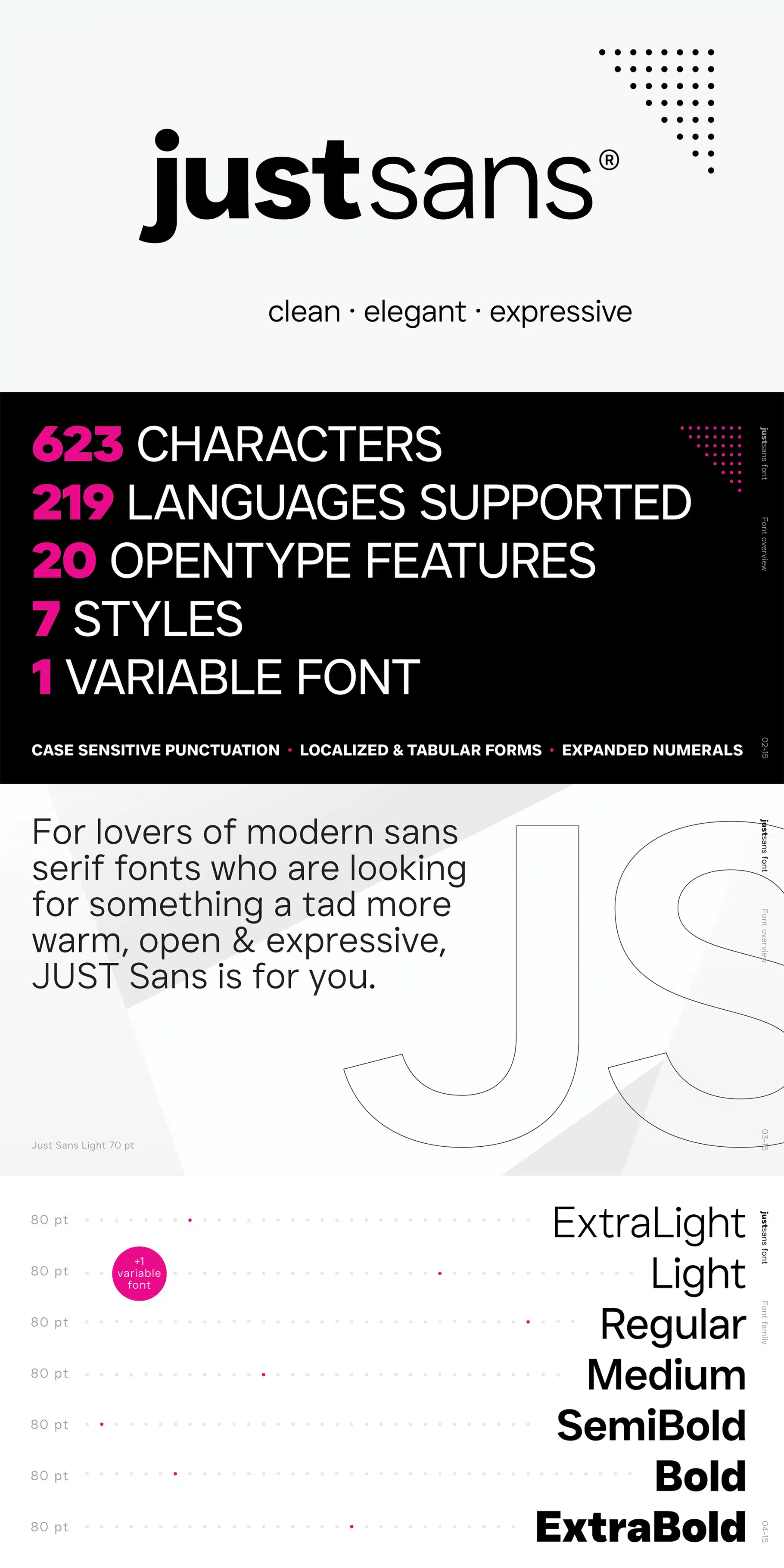
Are you looking for a versatile and modern font? Well, let us introduce you to JUST Sans. The attributes that make this font truly stand out is its adaptability and contemporary charm. It’s incredibly readable and has a friendly demeanor.
JUST Sans is a font that strikes the right balance between professionalism and approachability. Its design is clean and contemporary, featuring clear lines that give it a modern edge while maintaining a sense of familiarity.
One of its defining features is its elegant and spacious appearance. The characters are open and airy, yet they remain unique thanks to their sharp-angled terminals.
With JUST Sans, simplicity reigns supreme. It’s a reliable workhorse with seven different styles to choose from: Light, Extra Light, Regular, Medium, Semi Bold, Bold, and Extra Bold.
It offers support for multiple languages and precise letter spacing. For added flexibility, there’s even a variable version available.
Whether you need a font for your website, logo, branding, headlines, paragraphs, user interface, signs, packaging, posters, or projects related to technology, fashion, architecture, or design, JUST Sans has got you covered.
The versatility and distinctive appeal of the JUST Sans font family make it a valuable addition to your font arsenal, especially if you appreciate modern sans-serif fonts with a warm and expressive touch.
If you’re a fan of fonts that strike the perfect balance between professionalism and a welcoming style, JUST Sans is a font you don’t want to miss.
You can download JUST Sans at Envato Elements.
2. Groteska
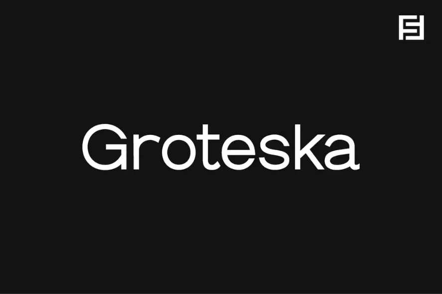
Groteska is a contemporary and minimalistic sans-serif typeface that draws inspiration from renowned Swiss designs. In our opinion, it effortlessly combines traditional grotesque characteristics with a clean and minimalist aesthetic.
This font offers a total of 14 fonts across 7 distinct weights, each accompanied by corresponding italics.
Meticulously handcrafted and designed with a focus on powerful OpenType features, Groteska goes the extra mile by providing extended language support, catering to both Western European and Central European languages.
Groteska proves to be a versatile typeface suitable for a wide range of design applications. It’s an ideal choice for social media graphic design, web design, print materials, and any display-related projects.
Whether you’re working on logo or logotype design, branding, marketing materials, banners, posters, signage, corporate identities, or editorial layouts, Groteska rises to the occasion.
Moreover, this font can be transformed into a perfect fit for minimalistic headlines and logotypes, as demonstrated in our sample graphics.
The Groteska font collection comprises 14 fonts, spanning 7 weights (Thin, Light, Book, Regular, Medium, Bold, and Heavy), with corresponding Italic versions for each weight.
This pack includes various font file formats, such as OTF, TTF, and Web Fonts (encompassing EOT, SVG, and WOFF formats), ensuring compatibility and ease of use across various design projects.
3. Syabil
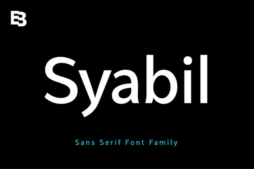
We have a special appreciation for Syabil. It’s a remarkable sans-serif font family meticulously crafted by Eko Bimantara.
This font has been designed with a clear purpose in mind: to offer a clean, highly legible, and versatile typeface that excels in both digital and print contexts.
Syabil is an all-encompassing font family suitable for a wide array of applications. Its readability shines whether it’s used on screens or in print.
It seamlessly fits into various design purposes, including text, display, headlines, print materials, corporate identities, logos, branding, product design, infographics, photography, and more.
What truly sets Syabil apart is its extensive weight selection. It boasts a total of 9 weights, Thin, Light, Book, Regular, Medium, SemiBold, Bold, ExtraBold, and Heavy with each weight thoughtfully accompanied by its own italic variation.
Syabil’s versatility is a key feature that enables it to effortlessly accommodate a wide range of design demands, creating a harmonious integration of text and display elements.
Furthermore, Syabil goes the extra mile by offering Latin Plus language support, making it accessible and functional for an even broader audience. This is a testament to the thoughtfulness and inclusivity of the font’s design.
4. Oliviar
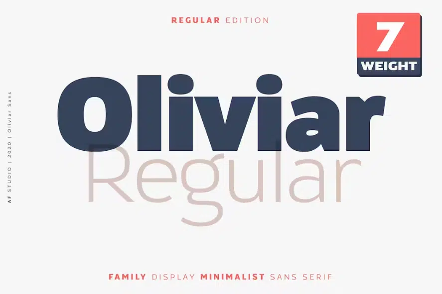
It’s worth mentioning that Oliviar Sans Regular is a modern and clean sans-serif typeface that gracefully incorporates classic elements.
We find this font to be a remarkable choice due to its ability to strike a harmonious balance between modernity and timelessness.
Whether you’re working on printed materials or digital interfaces, Oliviar Sans Regular effortlessly ensures clear and readable text. The Regular weight of Oliviar Sans Regular possesses a particularly captivating charm.
Its slightly curved letters make it approachable and elegant. The physical appearance plays a crucial role in shaping your projects, greatly contributing to their aesthetic appeal and readability.
In addition, the Oliviar Sans Regular font family, available in a range of weights from Thin (100) to Bold (900), seamlessly combines modernity with classic design, ensuring legibility across various print and digital projects.
We recommend pairing the Oliviar font family with fonts that have a similar style to Georgia for a harmonious and cohesive design.
5. Proda Sans
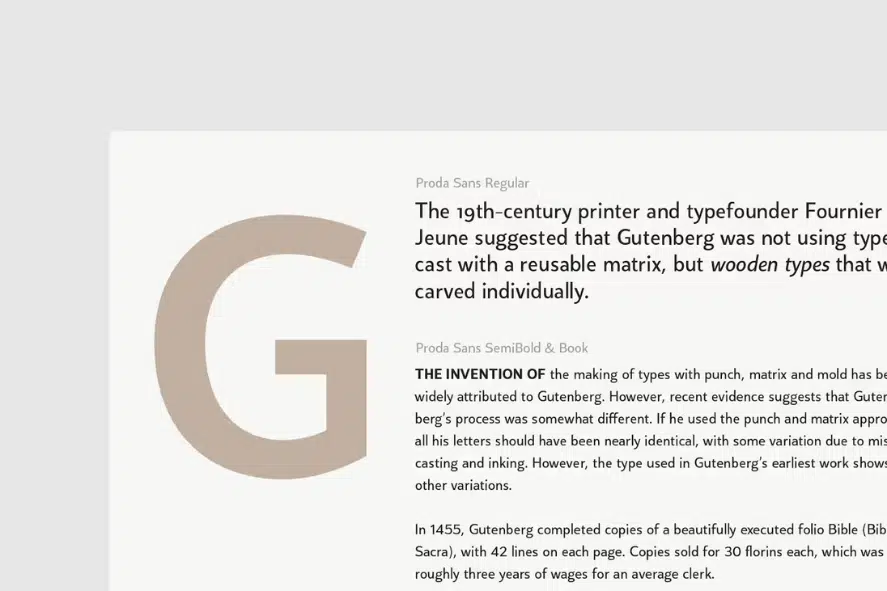
We were truly impressed by Proda Sans, a captivating humanist typeface that beautifully combines geometric construction with the charm of mid-20th-century sans-serif designs.
Its calligraphic-inspired letterforms, thoughtfully adapted with low-stroke-contrast geometry, enhance legibility while adding a touch of elegance.
With a versatile range of nine weights, complemented by matching italics, Proda Sans offers a wealth of options. The thin and black weights shine in display settings, while the light, book, and regular weights prove ideal for longer paragraphs and smaller text.
What sets Proda Sans apart is its meticulous development, catering to advanced typography needs. The OpenType fonts boast an extensive character set, ensuring seamless support for over 200 Latin-based languages.
With its versatility and inclusiveness, this font stands out as an excellent choice for typography enthusiasts and designers.
6. Normal
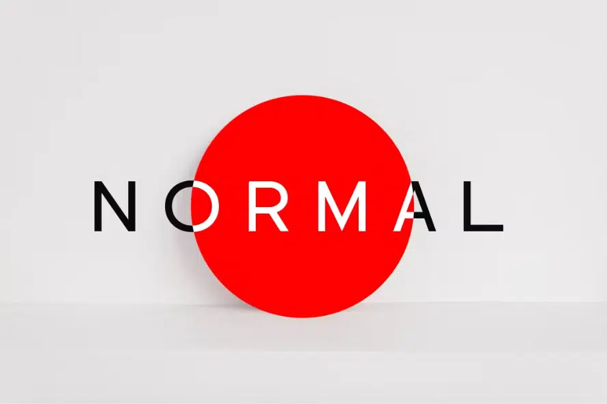
We are absolutely thrilled by Normal, a pure and minimal typeface that exudes the irresistible charm of a perfect Sans-Serif font. Just one glance is all it takes to appreciate the unique allure that sets this typeface apart.
Its versatility makes it an ideal choice for logotypes, captivating headlines, branding materials, corporate identities, and both web and print projects—truly without any limits.
Normal effortlessly combines a clean and refined aesthetic with a touch of understated elegance. It brings a timeless sophistication to every design it graces, allowing your creativity to shine in any context.
7. Barton
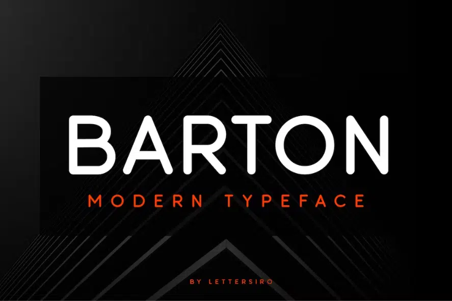
Barton is an exquisitely elegant rounded font that adds a touch of sophistication to any design. Its versatility makes it a perfect fit for a wide range of applications such as magazines, covers, posters, branding materials, and advertisements.
With its modern and robust design, Barton commands attention and brings a powerful presence to your projects. If you’re familiar with Arial, you’ll find Barton to be a fantastic alternative.
While maintaining a similar aesthetic appeal, Barton infuses a unique rounded charm that sets it apart. Its clean lines and well-defined curves lend a sense of contemporary elegance to your typography.
8. Vengeance
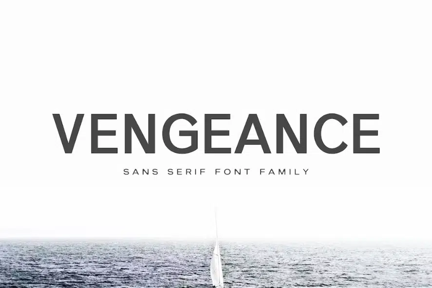
Introducing Vengeance Sans Serif Font, a stunning typeface that shares similarities with Arial. This beautiful serif font offers a range of seven different weights, providing versatility and options for your designs.
It includes a comprehensive set of basic glyphs, including non-English characters, ensuring its usability across various languages.
Vengeance Sans Serif Font stands out as a lovely and distinctive sans serif option in our collection. With its unique charm, it adds a touch of style to every word it showcases.
9. Neohead
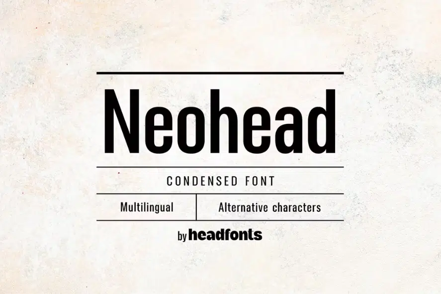
Next on our list, we proudly present Neohead. This modern and minimalist condensed font is a true gem with its neutral design and subtle decorative elements.
Neohead features meticulously crafted sans serif characters that strike a perfect balance in terms of spacing, ensuring functional and readable typography in both small and large sizes.
Its condensed proportions are designed to be space-efficient while maintaining a clean and legible appearance, making it a versatile choice for titles as well as body text.
10. Aurel
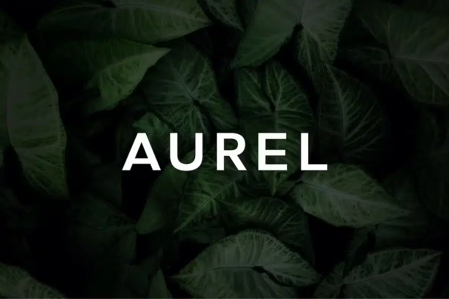
Allow us to express our admiration for Aurel, an open and modern sans serif typeface that captivates with its unique charm.
With a subtle touch of irregularity, Aurel adds a delightful dose of personality to your typography, making it a perfect choice for both headers and body copy.
This remarkable font family embraces all Latin characters, including accents, ensuring seamless integration across various languages.
It leaves no detail overlooked, offering a comprehensive collection of numbers, special characters, and punctuation marks, allowing you to fully express your creativity and convey your message effectively.
11. Reynard
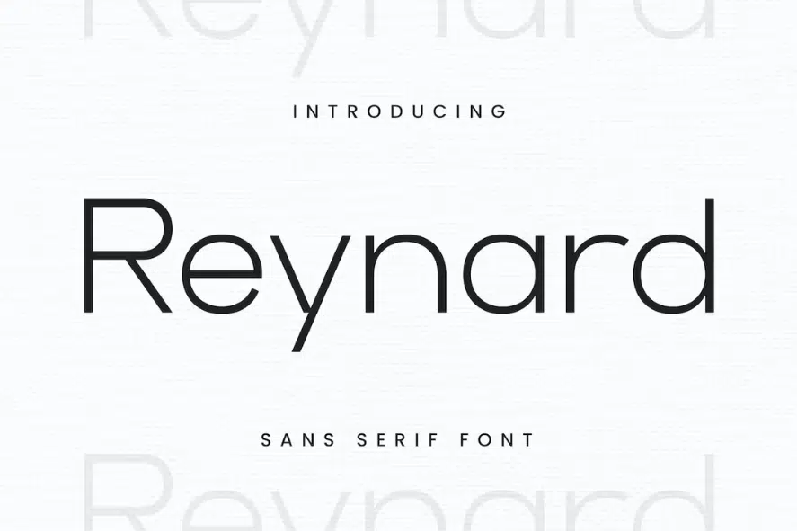
Reynard is a contemporary sans serif font that shares similarities with Arial, offering a fresh and modern look with its simple, clean lines and visually pleasing elegance. Its smooth curves and exquisite ligatures add a touch of sophistication to any design.
One of the standout features of Reynard is its versatility. Whether used in large or small sizes, this font shines brilliantly, adapting seamlessly to a wide variety of projects.
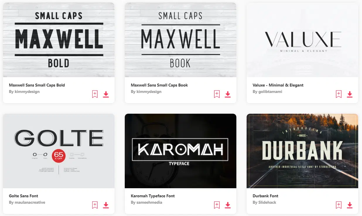
12. Golte
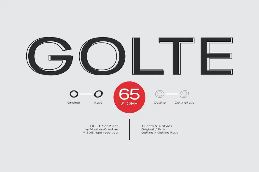
Golte is a remarkable display typeface specifically designed for creating impactful headings and titles at large sizes.
Unlike typefaces used for extended body text, display typefaces like Golte boast more eccentric and variable designs that push the boundaries of typographic expression.
Drawing inspiration from various genres of lettering, such as hand-painted signs, calligraphy, and other appropriate aesthetics, Golte exhibits a captivating range of styles, from ornamental to exotic, abstracted to reminiscent of different writing systems.
13. Valuxe
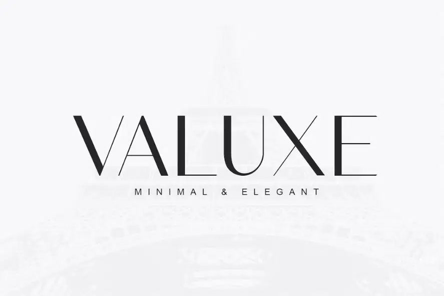
Valuxe is a stunningly modern and minimalist sans serif font that exudes contemporary sophistication.
Its sleek and clean design makes it a perfect companion to other typefaces, such as the classic Arial, creating harmonious and visually pleasing combinations.
Valuxe’s versatility allows it to effortlessly complement a wide range of design styles, making it an ideal choice for various projects.
With Valuxe as your typography choice, your designs will radiate a sense of elegance and refinement. This font beautifully harmonizes with Arial, offering a complementary contrast that adds depth and visual interest.
Whether you’re pairing it with a script font for a touch of graceful flair or using it alongside Arial for a clean and balanced composition, Valuxe brings a touch of modernity and sophistication to every typographic arrangement.
14. Nubolts
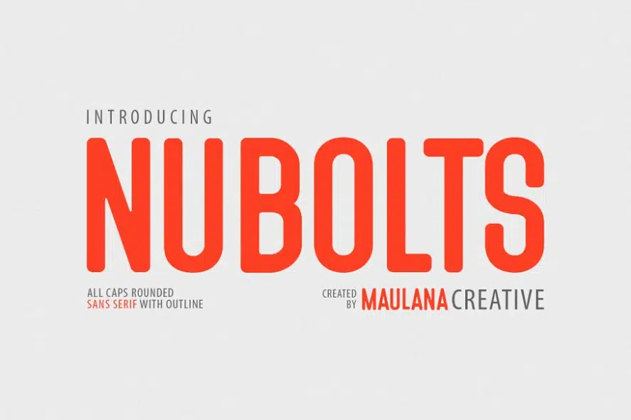
Introducing Nubolts Rounded, a bold and versatile sans serif font that offers three distinctive variations: outline, outline bold, and solid.
Building upon the success of its predecessor, the Serrona Typeface, Nubolts brings forth improvements and enhancements that take its design to new heights.
With its dynamic and eye-catching appearance, Nubolts Rounded is a perfect choice for a wide range of creative projects.
From branding and logos to magazines, films, websites, headlines, titles, captions, games, apps, posters, and even t-shirts, this font effortlessly adapts to various mediums and applications.
15. Nickels
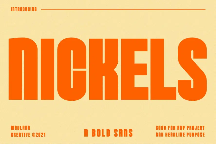
Introducing Nickels, a Fancy Bold Sans Serif font that adds a touch of excitement and playfulness to your creative endeavors.
With its fun and expressive characters, complemented by delightful ligatures, Nickels offers you an extra dose of creativity to make your work truly stand out.
Not only does Nickels bring a vibrant personality to your designs, but it also provides extensive language support, accommodating more than 100+ languages.
This ensures that you can confidently use the font for various projects, reaching a global audience with ease.
Whether you’re designing captivating headlines, crafting memorable logos, curating engaging social media content, creating eye-catching movie titles, or designing visually appealing book titles, Nickels is your go-to font.
16. Brotherton
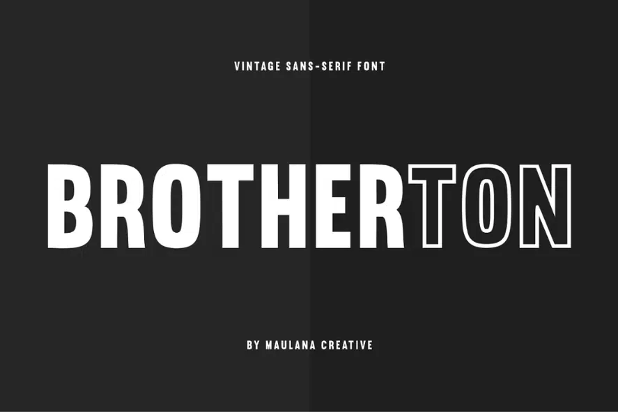
Brotherton, a vintage-inspired sans serif font with both Regular and Outline font files, takes center stage on our list.
Brotherton is specifically crafted to excel in various design applications, including branding, logos, magazines, films, websites, headlines, titles, captions, games, apps, posters, t-shirts, and more.
With its nostalgic aesthetic and timeless appeal, Brotherton adds a touch of character and sophistication to your creative projects.
Whether you’re aiming for a retro vibe or seeking to capture a classic look, Brotherton is the perfect typographic companion to bring your ideas to life.
17. Vandal Display
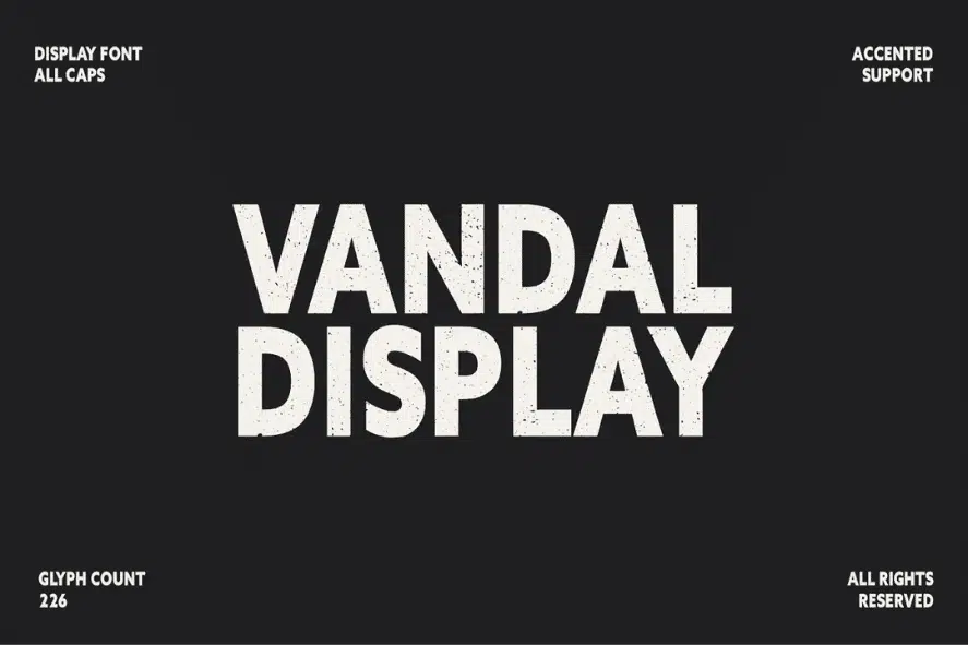
We loved exploring the captivating features of Vandal. This rough sans serif font has impressed us with its dynamic energy and versatile design.
From branding and logos to magazines, films, websites, headlines, titles, captions, games, apps, posters, t-shirts, and more, we were truly captivated by the endless possibilities offered by Vandal Sans.
Its raw and edgy charm resonates with our creative instincts, and we can’t wait to see how it enhances our projects. Vandal Sans has certainly left a lasting impression, and we’re excited to continue embracing its unique character.
18. Noiche
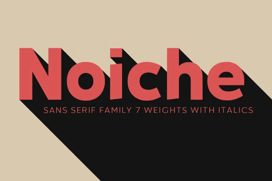
We are delighted to use Noiche Sans Serif for our design projects.
This versatile typeface seamlessly fits into a wide range of design applications, including branding, logos, magazines, films, websites, headlines, titles, captions, games, apps, posters, t-shirts, and more.
With its clean and modern design, Noiche Sans Serif lends itself beautifully to various mediums, allowing our projects to shine with professionalism and visual appeal.
Embrace the versatility of Noiche Sans Serif as it elevates your designs and captures attention in the most compelling way possible.
19. Forester
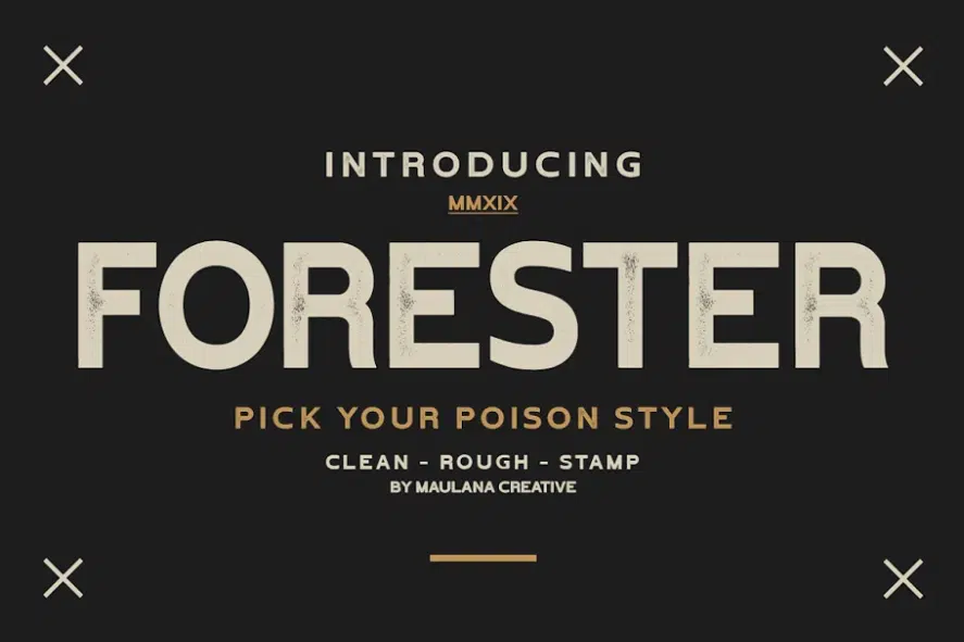
Thank you for continuing to scroll! Now, let us introduce you to the captivating world of Forester. This vintage sans serif font comes in three distinct styles: Clean, Rough, and Stamp.
Forester Vintage Font is a true gem, perfectly suited for a wide array of design projects.
Whether it’s branding, logos, magazines, films, websites, headlines, titles, captions, games, apps, posters, t-shirts, or any creative endeavor you can imagine, Forester will undoubtedly leave a lasting impression.
Its timeless appeal and versatility make it a valuable asset for any design toolkit
20. Sofia
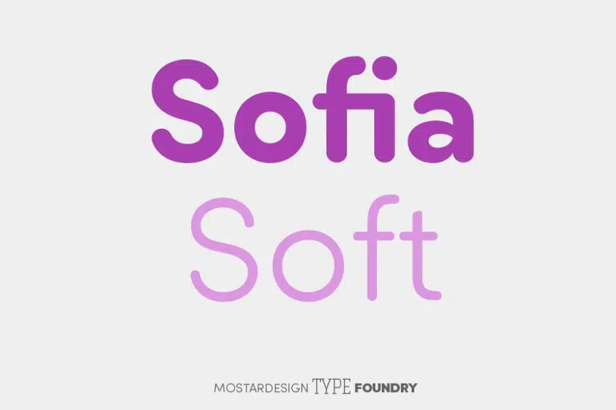
What we absolutely love about Sofia Soft is its rounded and friendly aesthetic that adds a unique touch to our designs. The softer variation of this font family, with its geometric sans aspect, brings a sense of approachability and warmth to our projects.
Whether it’s display uses, texts and headlines, branding, signage, or print and web design, Sofia Soft excels in versatility and readability. We also appreciate how it seamlessly complements Sofia Pro, enhancing the overall versatility of the font family.
21. Sadora
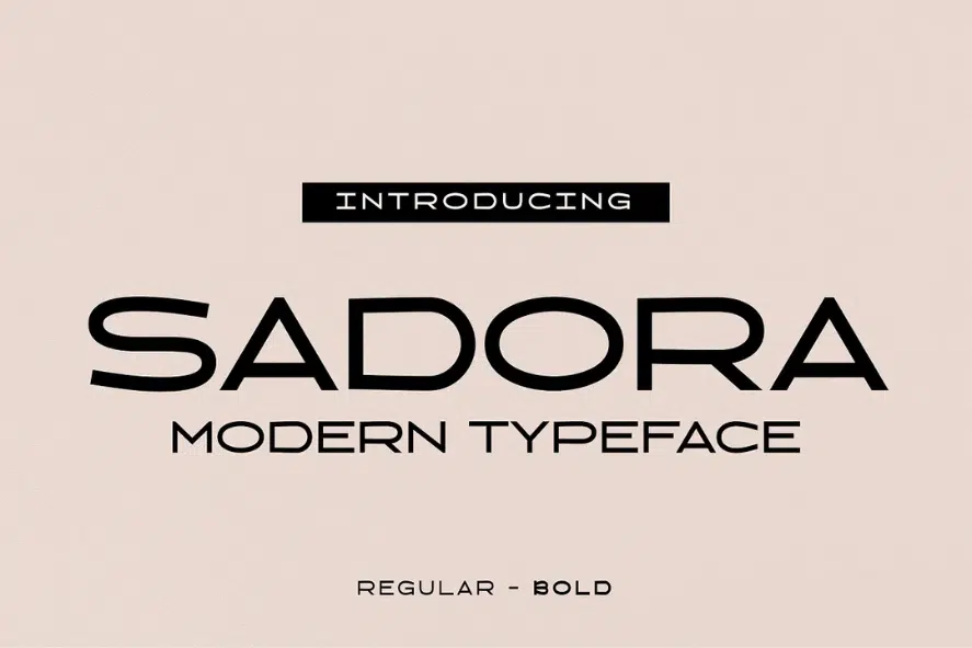
Introducing Sadora, a sleek and modern sans-serif font that effortlessly combines elegant simplicity with a touch of personality.
Its clean lines and geometric shapes exude a sense of balance and order, while the subtle pinched curves and unique vertical terminals infuse it with a touch of individuality.
The clear and legible letterforms of Sadora make it a versatile choice for a wide range of applications. From editorial design to branding and advertising, this font shines in both digital and print formats.
Its timeless design ensures that it will remain fresh and contemporary for years to come, making it a reliable choice for any project.
Whether you’re working on a website, crafting a logo, or devising a captivating marketing campaign, Sadora is here to help you leave a lasting impression.
With its sleek and modern aesthetic, this font is the perfect companion for anyone seeking to create designs that are both captivating and impactful.
22. Ethos Nova
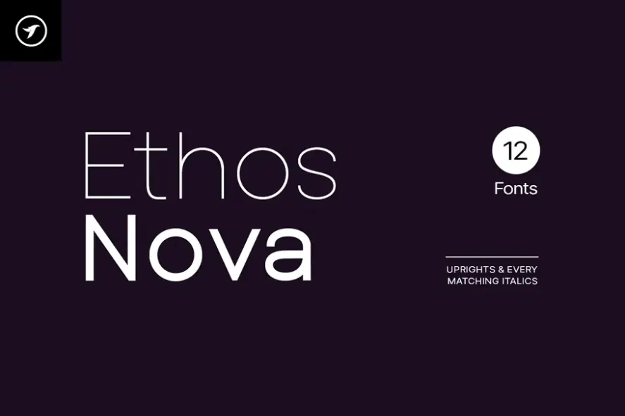
Lastly, we proudly present Ethos Nova, a remarkable minimalist neo-geometric sans-serif typeface family comprising 12 fonts. Inspired by the simple and clean design approach of the modern era, Ethos Nova encapsulates the essence of timeless aesthetics.
With a special emphasis on minimalism and simplicity in typography, this font family has the power to elevate your design projects to new heights of visual appeal.
Meticulously handcrafted and thoughtfully designed, Ethos Nova incorporates powerful OpenType features that enhance its versatility.
Each weight of the font family includes extended language support, catering to both Western European and Central European languages.
With a total of 312 meticulously designed glyphs, Ethos Nova provides a comprehensive set of characters to support your creative vision.
Frequently Asked Questions
1. How do I choose between Arial and its alternatives?
The choice between Arial and its alternatives depends on your specific project and preferences. Consider factors like readability, style, and compatibility with your design goals.
2. Are there any specific industries where Arial alternatives are commonly used?
Arial and its alternatives are widely used across different industries, usually compared to business fonts for corporate designs and academic contexts for their readability and neutrality. Their clean and straightforward design makes them an excellent choice for conveying information with clarity and professionalism.
3. How do I choose the right font pairing for Arial?
When it comes to choosing the right font pairing for Arial, it's important to consider the overall look and feel you want to achieve. One popular option is to pair Arial with a serif font, such as Times New Roman or Georgia, for a classic and elegant look. For a more modern and minimalist look, you could pair Arial with a clean and simple sans-serif font, such as Helvetica or Open Sans.
Our Favorite Fonts Similar To Arial
Related Posts:
- Fonts Similar To Helvetica
- Fonts Similar To Century Gothic
- Fonts Similar To Comic Sans
- Fonts Similar To Times New Roman
Fonts Similar to Arial
Finding the right typeface that shares similar qualities with Arial can be crucial for maintaining a consistent design aesthetic and ensuring readability.
It is also important to be equipped with typography tools and resources that facilitate the selection and implementation of these fonts. Helvetica, Calibri, Verdana, Tahoma, Univers, and Open Sans are all excellent options to consider.
Each font brings its own unique characteristics and strengths to the table. Whether you need a clean and modern look, versatility in styles, or optimal legibility on different screens, there is a font that can meet your specific needs.
Remember to carefully assess the requirements of your project and choose a font that aligns with your design goals and enhances the overall user experience.
By exploring these alternatives, you can confidently select a font that will effectively communicate your message and elevate the visual appeal of your content.


