
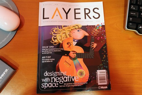
Back in November I was approached to write an article for Layers Magazine, the “How To Magazine For Everything Adobe” and luckily enough (thanks to some particular individuals) I landed the cover story for the 2009 January / February issue.

The article I wrote is titled “Designing With Negative Space” and it teaches you how to get positive results by making the best use of your negative space. Excuse the play on words.
I have a PDF version of the article for you here but if you want the rest of the mag you will have to buy it or if you want, you can trial a free issue of Layer’s too, however I think it will be a back issue.
Stay tuned for the May edition of Layer’s too, because I will be appearing in their Inspiration section with 3 full pages! And stay tuned for the Photoshop For Designers column in May too.
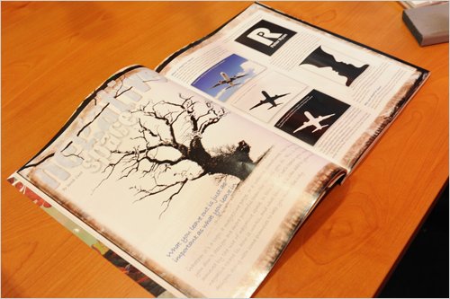
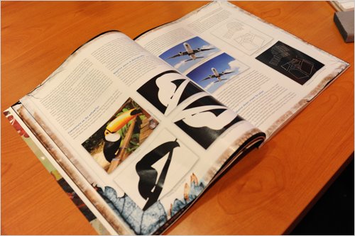
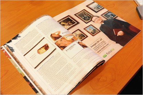
Below you can see photos of the front cover of the magazine as well as pics from inside.
Other Achievements:
You can read about my other achievements on my about page or my most recent achievements post.


RC mentioned the article in is blog post on Tuesday. That’s pretty awesome, you are tearing it up. Congrats.
This article was the first one I read when I received the magazine – I didn’t realize you were the author! Congratulations – it’s an excellent treatment of the subject. Now if only I could get those space-filling clients to read it.
This was an excellent article on a basic principle that needs repeating no matter how experienced you are. By the way, I found your website/blog because of this article. Great publicity.
my congratulations, it seems to be a real good article
Hi, congratulations on the cover article. It must be a real thrill to see your work in a magazine like that. However I sort of disagree with you about the print design example you give, I think the last one looks the least prestigious of all of them. To me the solid lines separating the image from the space make it look as if it is something to be scared of and the headline isn’t really interacting with that space (or the image). I thought I’d bring it up here to see what other people thought as white space is something I am trying to include more of in my work and I’d like to see how other people view it? Hope that’s OK!
Thank you everyone, it was a real pleasure!
Sam,
Perhaps I should have added some copy to the ads as this would have emphasised it more. The other ones would have copy placed over the rest of the flyer, which would make it more cluttered (aka less white space). The third flyer has plenty of space left over while still using the same image.
Dunlap,
I had a friend in the US take these photos as I still have not got my copy of the magazine delivered. Still using the MX 🙂
Negative space is pretty tough to pull off well – congrats on the cover – that’s pretty cool!
Well done on getting published in the Layers magazine. I am a subscriber to the weekly videos. They are very well done. Now I look forward to reading your pdf on what is a very difficult topic.
Good to see young designers like yourself taking good basic design principles to heart – and in turn, passing them on to others.
Congrats on your cover spot in Layers… Here’s to many years of success!
Congratulations, Jacob! That’s awesome. I like what you did with the tucan.
That’s awesome. I’m reading the article right now.
Congratulations!
OK, just finished reading your article, and I love it!
As far as logos using negative space, my favorite, by far, is the Formula 1 logo, where the number 1 is actually comprised entirely of negative space. Check it out at http://www.formula1.com if you aren’t familiar with it.
Congratulations on both the article and having it be the cover story!
Hey I see a mighty mouse… when did you decide to switch and what happened to your MX?
Wow! Congratulations! What a bonus to get the cover as well! 🙂
congrats on the article man … nice land …
again I must congratulate You – from Your archievements I see, that people need only to dare and they can get lucky, get featured and so on!
Wow! I’m really impressed! Now that’s one to frame for the wall!
Wow, congratulations. That’s a great achievement indeed. Reading the article now, I sure it will be great!
Great work jacob, I really think people like yourself are putting a great spin on this wonderful industry we work in.
Also nice article and presentation, I wish you many years of success and I hope to learn a few things from your successful blogging efforts.
The Pro Design
Thank you all once again!
Did you get to design the layout, too? That’s a pretty awesome achievement, Jacob! And I see from the comments that some of the readers are finding your blog because of the article. Cool!
Hi Lauren,
No, the layout wasn’t designed by me, I handed the article / images over in a HTML file and they did the layout. I’ve been quite surprised by how many readers / emails / articles / leads have come out of this one article. It’s been great!
COOL!
??? ??? ?????????, ???? ????? ? ??? ???? ??????????, ?????? ???? ????? ??????? ????? ?? ??? ?????? ????? ??? ?? ?? ??????? ????????.
Negative space is pretty tough to pull off well – congrats on the cover – that’s pretty cool!
Congratulations, Jacob! That’s awesome
I downloaded the pdf. Very nice article, I must say. Well done!