In this article I will guide you through the process of creating the identity & logo design for one of my recent clients, UKE, offering insights into not only the thought process behind creating the logo but also the creation of the logo itself.
Also keep an eye out in the May edition of Layers magazine for a feature on the UKE web site design.


The Logo Design Process
When one creates a logo, they should follow a logo design process to ensure that the final design suits the needs of the clients (not their wants)… I have written about the logo design process of professional logo designers in full here however below is the usual logo design process in short:
- Design Brief: Conduct a questionnaire or interview with the client to get the design brief.
- Research: Conduct research focused on the industry itself, on its history, and on its competitors.
- Reference: Conduct research into logo designs that have been successful and current styles and trends that may be related to the design brief.
- Sketching & Conceptualising: Develop the logo design concept(s) around the brief and research.
- Reflection: Take breaks throughout the design process. This lets your ideas mature and helps you get renewed enthusiasm. Receive feedback.
- Positioning: Position yourself as a contractor or build a long lasting relationship. ie. Client tells you what to do OR you guide the client to the best solution. The latter is usually best however personally, I try to find a happy medium.
- Presentation: Choose to present only a select few logos to the client or a whole collection. Presenting only the best is recommended.
- Celebration: Drink beer, eat chocolate, sleep, start on next logo design. Or a combination.
Getting The Job
Eugene, the business owner of UKE, contacted me earlier this year (who found me through my blog) and she wanted to rebrand & make over their old business identity starting with their logo and then the website.
After a few initial emails clarifying Eugene’s needs, I sent Eugene a four page logo design questionnaire form (PDF) which was promptly filled out. I then sent a proposal & an agreement (never call it a contract) and then received a 50% deposit via PayPal.
I also sent her a web design questionnaire for the website design but that is for another article.
The Design Brief
After Eugene had filled out the questionnaire I had most of the information that I needed to start on the logo design. There were a few other emails clarifying things but basically all the information was there.
Here is a bit of background information on UKE Chocolate Gift Baskets:
UKE.COM or UKE for short sells unique arrangements of chocolate as an alternative to gift baskets. UKE targets a more upscale market due to the time to make and cost of the product.
After reading through Eugene’s completed logo questionnaire, I found in short that she wanted a logo that portrayed her whole business model and she needed it be: “strong, bold & luxurious” She also requested to have it black or gold however was open to colour choices. Eugene also wanted to have a lion in the logo. The logo also had to be suitable for the web, business cards & t-shirts.
This was the old logo that was to re branded.
![]()
Research
Upon receiving the initial 50% deposit for the logo and signed contract agreement, I then started researching what was needed for the project. This included looking up Eugene’s competitors (that she provided & my findings), researching the industry and searching for other logos in the industry, among other things.
Research is a critical stage in the logo design process as this ensures that your logo will differ from the competitors and it also sets a benchmark.
Sketching & Development
The next stage of the project was developing the logo. Developing the logo design concept is where creativity comes into play. Based on the design brief and research conducted, this is where I let my ideas run wild. I brainstormed and sketched down my ideas and then experimented with them on the computer. I also had breaks between these sessions so I could reflect on the designs and have a fresh perspective on the job at hand which is a crucial part of the process when when designing a logo.
The challenge that I had when creating the UKE logo was trying to incorporate a lion into the logo while still making it look luxurious… I got around this problem by brainstorming and word association. My thought process went something like this: Lion > King Of The Jungle > King > Crown > UKE with Crown
Below you will find one of the original pages of sketches that I did for the Ultimate Potential logo… I know I am no Picasso but it is the end result that matters. Find in the bottom right corner where I originally got the idea for the final logo. Remember that there is no such thing as a bad idea, just bad decisions.

Computer Generation
As you can see in the sketch above I had the idea of using a crown or lion placed on top of the word UKE. After I had this general idea in my head I experimented with the concept in Adobe Illustrator and researched different types of crowns, layouts, fonts, icons, etc.
Typeface
The first thing I did when experimenting with the logo design was to find the best typeface for the logo. Below you can see just some, of many, different typefaces I tried and circled in red, the typeface chosen (Friz Quadrata, Medium).
This typeface was chosen for its luxurious, traditional looking nature. A great alternative to the much overused Trajan.

Concept Development
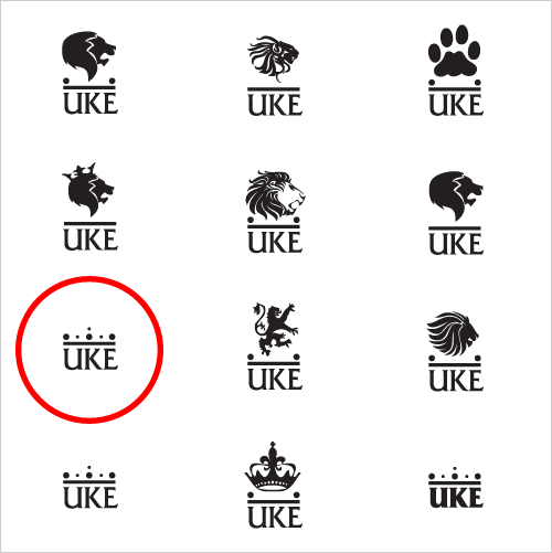
After I had found the right typeface (though it is never set in stone) I then experimented with different concepts and layouts of which you can see some below.
Please take note that no colour has been added to any of the designs. This is to ensure the design works in one colour only. This helps on printing costs and makes the logo more adaptable for use over a variety of media.
One should also remember that simplicity in logo design is the key. The simpler a logo is, the more memorable and adaptable it is. In nearly all cases, less is more.
You may interested to know some more ‘rules’ of how to design a logo.
Colour
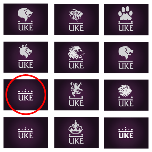
I then experimented with colour. The final dark purple colour was chosen for its royal & luxurious nature… purple is the colour of royalty after all. Do you know your colour theory?
In the image below you can see the logos from the above image with the same purple background.
Delivery
Obviously, I ended up choosing the second bottom left logo (circled) for the final concept… After some more experiments & fine tuning I was finally ready to present the logo to Eugene.
Below you can read the email that I wrote to Eugene when ‘selling’ the logo to her.
Hello Eugene,
I have been finishing off your logo today and have come down to the strongest concept, of which you will find attached in a PDF.
After all the research I carried out and concepts that I experimented with I kept coming back to this simple & effective logo… one without any animal figure. Not only this but I also found that animal figures were way overused, especially the lion due to it’s heraldic nature.
Your new UKE logo relates back to being king (much alike a lion) which is achieved by the use of a simple geometric crown. The crown has many symbolic references… the crown is a symbol of power, legitimacy, strength, righteousness, victory, triumph, resurrection, honour and glory of which can relate back to your luxurious packages, that of the highest quality. The typeface used for UKE is also one of power… strong bold serifed characters form a strong brand name that leaves a lasting impression on anyone that comes across it.
The purple, black and white colour scheme was also chosen for its luxurious nature and this can be applied across all of your marketing material such as your website, business card and so fourth. The UKE logo not only works well on a dark background but also a light background of which the white logo can turn into a dark purple logo. The logo can also be reproduced at any size and maintain readability.
I am eagerly awaiting your feedback and I will hear from you soon.
Regards,
Jacob Cass
https://justcreative.com
Approval
Eugene promptly replied:
The logo really works! I like how clean and modern it looks. I think you might be right about the overdoing of the lion stuff even though I had an obsession with it, none the less this one grows on me more each time I look at it!
Don’t you love it when the client loves the design first time around? No revisions! How about that?
After approval of the logo design and the remaining 50% payment I sent Eugene the final files in EPS, JPG, PNG and TIFF formats.
The Logo In Use
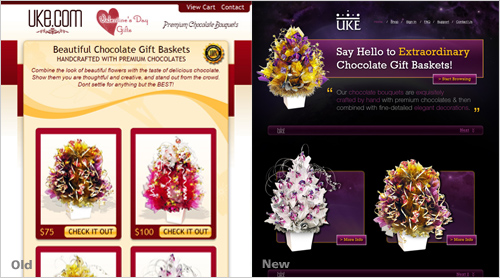
When Eugene first contacted me she also wanted her website to be redesigned. Below you can see the redesign of her old website with the new logo in use. The website is currently still in development however should be online soon.
You can see larger before & after shots of the website here: Before | After
Comments are welcome as always. If you are interested in more articles outlining my design process fly over to my featured articles page.
NB: This article was originally written for Creative Pool’s January 2009 newsletter however I have got permission to republish it here. Creative Pool.co.uk is UK’s largest creative recruitment & directory resource.


Simply brilliant! Behind the scenes stuff is the best of the best to read. You did great on this one. Love the simplicity in your design. Clever.
Keep up the great work dude!
Very lovely Jacob!
I think you made a excellent choice in picking the logo, although the other ideas have potential. I like these articles where we get a glimpse into to your workflow and decision making.
Love it. I especially like how you related their logo vision to concrete business goals. Too many business owners don’t understand the design is a consequence of business purpose. Great job on the tutorial and great job on the logo.
I don’t do logo design, but from my web design experience, I know how difficult it can be not to follow the client’s explicit wishes. I am so impressed that she liked the logo even though it didn’t contain the lion she asked for. In the end, I guess it’s true that it’s what they need and not what they want (or think they want?) that’s more important in the long term.
I have a question, though. You mentioned sending the client an agreement that she later signed. I wonder if this agreement was on paper and mailed — or was it a “virtual” agreement(sent online)? If it was the latter, how was it signed? I’m trying to learn about freelancing processes and am having difficulty understanding contracts and agreements.
Anyway, thank you for this post! It was very informative. And the run-through of the typical logo design process in the beginning was very helpful as well.
Wow. Really nice break down and explanation of the steps involved. I think will help stream line things for many new designers.
I like the process you use! Nice job on the design.
Your process is very interesting Jacob, very similar to the way I work.
However, I like to get feedback from the client at various stages throughout the process. The questionnaire and research helps, but there’s nothing worse than putting the hours in to come up with a design you like to see it knocked back the client. It would almost feel as though I was designing blind.
I’ve had a number of experiences where the client has completed my questionnaire, to then contradict the answers once I’ve sent off the first set of ideas.
Did you contact the client during the process? Or just at the beginning and at the end?
I think this is an excellent and solid account of the design and conceptual processes of this logo. The outcome is very effective, appealing, and the colors are perfect to convey what the logo is about.
Jacob – thanks for this post, it’s so great to see a process summed up into a post for all to see. I felt like I was there next to you designing the logo (which turned out great BTW). I’l certainly be reading your more regularly from now on!
@Maddy – If I’m not going to meet the client I always email through the agreement and ask them to post two signed copies of it to me. Once received I then sign both and send one version back so we both have an original signed copy.
Depending on the laws within your country you may find that you need an original or not. Either way its useful to both have signed originals so that, if it did go to court, it can’t be argued as easily that they’ve been tampered with. Equally it’s important that you both sign it because otherwise one party has no obligations.
Design for the sake of it is pointless. Design with research and a business case behind it is genius. Love the logo. Simple, effective.
Well done, Jacob! Great post and a greater logo result.
Sweet post Jacob. If for no other reason, you’ve confirmed that the method I have been using up until now is pretty much on the money! Cheers mate!
Love the logo!
In my opinion, if you go through extensive research, conceptualization etc while designing your logo you will have a rough idea of what is needed, therefore you will be bound to get it right the first time.
I didnt find the web design that great though, with the logo and the product you can do much better. The layout is a little off, try relocating the logo, I dont think it fits right. I think you have overdone the light sparkles and it would look much better if added subtly. Further more, the elements require minimalism and simplicity. Thats just my take, I am sure you must have solid reasoning for your decisions.
Lets hope the final version looks stunning 🙂
Greetings,
Kumail.H.T
Really detailed post, I learned a lot from it and will most likely use it again for reference at a later date! Thanks for taking the trouble to write it 🙂
I really enjoyed this post. So you only presented one logo design to the client? Is that what you usually do?
I really liked the writeup. You have clearly found a workflow that suits you, and you make it all sound so easy. 🙂 Besides that, the post makes interesting, yet effortless reading. Thanks!
That was a very engaging article. Thnx for that! I never sketch prior to designing the logo .. the “sketches” for me happen in either Illustrator or Photoshop. Maybe I’ll give it a go and see how that works out for me 🙂
I liked your entire thought process. Very constructive and easygoing. I have been a fan of your designs and I think your own logo is brilliant!!
This is nice Jacob, I like the way the crown has been reduced to a few circles. Nice breakdown of the design process too.
Richard,
Simplicity is (nearly) always best in logo design.
Esben, Christhian, David, Liora, Idale, Danny, Sid, Aaron, Masey, Tuomas, JohnONolan, Steve, Todd,
Thank you for your kind words and glad to share my process 🙂
Abbas,
In some logo design projects I have quite close contact with the client however in this particular case not much contact was made throughout the process apart from about half a dozen emails… I do a lot of research before the designing begins and this is what I believe makes this possible.
Though in saying that, I have had a couple of clients come back and change things, but you just work with it… Also in the agreement you should state how many changes you make before you charge more.
Maddy,
The agreement was sent via email, which was then printed, signed, scanned back in and then emailed back to me. I sometimes also get them to post it depending on the deadline date. James’s method also works however it can be quite time consuming and like he said, check your local laws.
Kumail,
Very well said, and is quite like what I said to Abbas. Thanks for your feedback on the website design.
Dorothy,
See my reply to Abbas.
Sneh,
You should certainly give sketching a go first, it certainly helps a lot and I wouldn’t do it any other way.
Beaulys,
The logo can actually be used in any colour and will be used in a variety over the different printed collateral however silver and dark purple will be the main colours.
Very cool logo!
Thanks for such an great post. I find almost all your posts useful in some way or the other.
As a beginner, i’m constantly learning and to know what goes into making a logo/the design process is of great value to me.
Keep up the good work! 🙂
Very nicely done Jacob.
Need to set up some questionaires for my next jobs. Thanx for the inspiration.
Great article Jacob.
I can’t wait to read the one about the website? When are you planning to put it online?
Congratulations,
Now your logo will have to be used only on dark purple backgrounds. Not black, not white, not red, not yellow…(besides, what would be the result with these colors ? And in black or white ?) Dark purple.
=D
Great logo! I love how you distilled the essence of your client’s needs into this simple graphic. Thanks for sharing your thought process.
Jacob, you are a rockin’ designer! This is really helpful to see someone else’s process as a person who does not feel that logos are their strong point. Thanks for sharing your work.
Jacob,
Great article and very comprehensive. Particularly the logo questionnaire – you ask the right questions.
Keep up the good work.
Greg
Great stuff, thanks for taking the time to share Jacob.
I was wondering what you (and others) think about using PayPal for payment. I’m thinking about accepting PayPal as it would be handy but do you not loose a good bit for the transaction fee?
e.g. I’m UK based. If I accept a payment for £1,500 from USA, I’m automatically losing ~£60
I see in your email you sent to the client that you describe why you decided to overlook the lion idea.
Personally, I would’ve approached the client at the development stage with this idea to see what they thought. But this approach seems to have worked for you. I suppose It all boils down to the culture of the studio and the designer.
Some studios and designers like to keep clients at an arms length while others like to keep them firmly in the loop.
I find that from experience and the designers i’ve worked with; those who keep clients at arms length seem afraid of any sort of critism. They are quite direct in there approach to a particular project and quite unwilling to deviate from the path they’ve chosen.
Would you consider involving the client more in the whole process?
Loved the design process walkthrough. I am passing this on to my readers for their Weekend Reading – http://tpgblog.com/2009/02/06/weekend-google-gears-cloud/
Jeremy Horn
The Product Guy
http://tpgblog.com
Great logo design.
Example of “less is more”
Good post. Good thought out process.
Wonderful post! I especially can so appreciate your last paragraph. Logo design is more important to attract the customers.
I just love the fact that you wrote a long note to the client explaining the process and the direction you went in towards the final result. I think you did a fantastic job with the new logo and it really works too, size wise its far more flexible than if you had a large lion symbol. The font type is perfect and really suits the overall logo and brand, its clean lines show a real dynamic to the brand.
.
Logo design is by far the hardest of design!!
I’ve designed over 15 logo’s for my website over the past year and still the final version now does nothing.
How do you say to do it?
Keep it simple, one color, less is more, have many concepts, and have an aim of relevance?
But strangely, even a level of ugly helps! Look at your logo. It’s picture of a pencil spelled out JCD. It’s simple and ugly but I remember it everytime I see it, and then I remember your happy little face on your website, and your killer design posts, and damn it, you win Jacob. You have a killer logo!
I envy your skills.
Neeti, Andris, Greg, Morgan, Multi, Pete, Stephanie, Max, Jimmy,
Glad to be of help!
Loony,
Not sure about the website article but probably mid year as it has to be published first in Layers magazine which means I can then post it on my blog.
Abbas,
I did bring up the idea during the development stage however it was never set in stone… I described how I was exploring other options and the other paths that I was following but in saying that, every project is different and there are always different levels of client involvement however in this particular case there was not as much as usual.
Lee,
You may want to read this article on PayPal fees that was discussed here:
https://justcreative.com/2008/11/13/do-you-charge-your-clients-paypal-fees/
Great job, man!
Hi jacob, i’m a very big fan of yours, and i really love the way you work specially in logo, well i have something that i want you to look into it i do hope you will give a little time to see into it and give your best choice which for you is work great.
Anyway here is the link of a logo for our teamsite and i hope you can share your own thoughts and i’m very open any critiques
http://img3.imageshack.us/img3/4977/logo2ue5.jpg
Aldrin,
Thanks and glad you like my work… in regards to feedback for your logo can you provide some background info on the project… thanks.
To be honest Aldrin, I don’t see the concept behind any of the logos and I believe you can make some better choices in regards to the typeface. Due to time restraints I can’t offer any more help however please do post on a forum for some help.
thanks for your response jacob, with regards to logo, the background with the project, is i’m trying to build a group of freelancers which we do web services, design and development, but since were lacking designers that is why i just work our site. Actually i’m a freelancer as well, and i do more on programming stuff but i also do some design stuff but not as good as you.
Actually i subscribe to your blog that is why it gives me a lot of new input and ideas in working specially for logos. So it is my honored to be see my work to you and give some critiques, and i love to hear from a professional like you.
Thanks in advance!
Great article!
thank you for your honest jacob, anyway i’ll try to create a different one but hopefully i can create a better one.. thanks for your input.
Very very brilliant article again…
Thanks for the article..
What is the proper way of writing the proposal or agreement? What to mention in it and what not?
Nikhil,
Check out this article from AIGA about design agreements:
http://www.aiga.org/content.cfm/standard-agreement
Thanks Jacob, the article was really useful.
Can you please post me a comment in my blog @ your opinion of my blog? I will be really thankful to you.
great article! For me, creating logo is the hardest part of the design because it represents the company.
May I know how long does it take to create a logo?I mean, how long does it take to do research and develop it? thanks
Hi Angel,
This depends on the project, budget and client needs so there is no set time.
Well i was asked to “make a quick logo” the other day, well its 2 days later and its not finished! i now see its not just a easy breezy proceses. Ive never made one before, and now see if you want a really good logo it takes time adn thought and expertise. Thanks for taking the time to write these up to help others, i guess you can see its apprciated as you gets lots of feedback.
Interesting read. Always nice to see the process 🙂
Did you do any modification to the logo-text to differentiate it from the typeface.
Because the problem with using a non-exclusive typeface is that you one day can see that very same typeface on something you really dont want to associate “your” brand with.
Hello Jon,
Not in this logo… this typeface is not very mainstream, plus the letter combination of UKE is quite unique so it isn’t a problem here but what you said is true in some instances. Thanks for your comments.
Always like to see follow designer brainstorming process.Thanks for the great read mate:)
Nice Article.
Great job highlighting the process. I like that you included some snippets from the client interaction as well. That way we see both sides of the process.
it’s good, but i think you can make better with those sketches, :p 🙂 ,and you just take a typeface already done? i know its easy and quicker, but where’s the “Creative Design” ,you can personalize the typefaces, imagine, what happens if another brand alike UKE uses friz quadrata medium for their logo… there’s no identity. keep reaching for the best!
Lovely … simple and easy to understand explanation. thanks.
Pete,
Certainly no Picasso that is for sure, my handwriting is worse too but these sketches are just a way to put my ideas onto paper. I can visualise something a lot better than I can illustrate it.
I don’t agree with what you said about losing identity because of a similar typeface… check out these 40 brand name logos that use Helvetica with little or no customisation at all.
Hi Jacob,
I have gone through the process and I must say it really helps!!!! I used to use this way of working long back in my college days. But due to tight schedules, I have to be quick many times. Anyways, as usual it was all very much informative. I liked the font you used. It makes the logo classy.
Very helpful seeing the interaction b/t you and the client. Definitely a strong design process that seems effective, and is so simple.
Excellent! This is just what I needed. In the other post I mentioned I have trouble with logos in a the beginning stages. Looking at your process lets me know I wasn’t too far away from completion.
I sometimes get stuck in the “Sketching & Development” stage, when I feel I haven’t sketched enough or they look like shit. I get discouraged.
This shows me I need to keep trying and pushing. A designer once told me “if you run out of ideas, you didn’t do enough research”
Thank you so much ^^
Can I translate this into my langauge??
This is very very useful.
Please reply me to [email protected]
Thank you again…
TC
Great explaination man! I’m trying to design more logos and need all the tips and advice I can get. Just a question, are the lion image and other ornaments over the UKE font created by yourself or from stock resources? Also, the font used. Did you have to ask permission from the creator before you used it?
Hello Kiren,
Some of the lion images were based off other images, some of stock, some self designed. I found even after all the experiments with lions, it just wasn’t working. Re the font, when you purchase a font, you buy the permission and license to use it. You may find interest in this article which goes in a bit more depth about fonts & copyright. All the best.
what do you think about this? http://privil3ge.com/ ? i found it via “logomoose”
Hello Alecsandru,
I’ve been told about this logo before, looks great in my opinion. From my experience both on LogoPond & Logo of the Day someone always seems to find another logo of similarity. Thanks for pointing it out.
Hi, Jacob! Very interesting and helpful article, I love your blog, and I like to study your articles, can you give your opinion about this logo design that I did? is the website version, no flat colors:
http://diangelux.deviantart.com/art/website-logo-version-130417371
Cheers.
Hello Diana,
Due to time commitments I can not offer critiques, however I suggest asking an online forum. All the best.
Hi Jacob. Some guys steeling your blog content about “Uke” logo design process : http://www.tomvilman.lt/blog/logotipo-kurimas-nuo-a-iki-z/#comment-78
Beautiful. I am wondering, what tool, software or application did you use to design the logo? Is it one of the Adobe CS4 apps? Or an online resource??
Thanks so much!!!
Adobe Illustrator 🙂
Hey Jacob. This is a great explanation. I thank you. I have just started a creative consulting company and am now on my second client. A doctor starting his new practice and wanted a logo, brochures, biz cards etc. for marketing purposes. I’ve designed everything and came up with a logo but I’m not sure how much I should charge for the logo design. It’s hard for me to charge too much because I love what I do and don’t really feel like I worked very hard on it. Does that make sense? Anyway, I’d love to hear what a good price would be in your opinion. I was thinking a flat fee like 350.00. ?
Hello Rion,
I’ll direct you to this article:
https://justcreative.com/2009/02/26/how-much-to-charge-for-design-work/
This insight into your creative process has been so interesting! You managed to make a perfect logo that symbolizes everything the client wanted and not use the ‘overused’ element. I found your clarification of the process very helpful. Thanks 🙂
Jacob,
Your article is invaluable. Logo design is one of the most challenging disciplines of design, which is what makes it so exciting. One of the biggest obstacles I come across when working on a logo is choosing the typeface. Almost always I know what I am looking for but finding it can sometimes become a week long job. Sometimes i think the time spent on looking for the right typeface can be used to simply create the logotype from scratch. So How do you deal with this? where do you look for your typefaces?
Cheers,
Narek
Thanks for your kind words Narek. As for looking for a typeface, I use my library and also check various font foundries / websites. Myfonts.com is usually where I head to first.
Hey Jacob, Love your site and posts – I’m curious what the overall timeframe was for this particular project? I’m fairly new to logo design and am trying to get a better handle on what kind of timeline to project for myself and my clients. I know time and budget vary depending on the specific work but getting an idea of other people’s process would be really helpful.
On this particular project, I can’t actually recall but probably around 2-3 weeks and then a few more for the website design. There is no linear time line for a project, every one can take a different amount of time – there are so many variables to take in to account but as a guide it’s usually around 2-5 weeks on average.
Hey Jacob, its very nice article, I like it.
and also the article ” ‘rules’ of how to design a logo” is also nice.
Thank you for the great information. Despite having designed for 8 years, your approach bring so much insight in to a more efficient, more proper method of designing.
Great article! I have always found it very difficult to design a logo (which I have done many times). This article has given me some great advice, thank you!
Great article. Very nice logo. Simple yet professional.
Thanks
Sabin
I am also a logo designer. Please check http://www.mesabin.info. It will be great to have some suggestions and feedbacks from the tycoons.
Thanks
SAbin
Good article, found it very interesting to break down the process of logo design. many people just look at it and et one with it, the way to create a quality logo is to spend some time planning.
Thanks for sharing your process. As a fashion designer, looking to branch out in other areas of design, I find a good process allows one to create anything. I’m always intrigued how creative minds go from concept to finished product
As a design beginner, these’re so useful for me.
Nice clean look blended with simple color really makes a great looking logo.. thanks for sharing your technique in coming up with a nice logo design.
Great logo design. i am a beginner and it had helped me out a lot to understand what i was looking at. Thank you.
Those tools are really helpful specially on my part. Because it really shortens the way you are working on every designs. Thanks for sharing.
Hello i have a big noob question it is legal tweak the typerfaces of a font for a logo??
Amazing post Jacob!
QUESTION: When a logo is completed and approved, do you just hand it over to the client or should first trademark the logo (or register the logo) before it’s given? Apart from the payment, are there any legal requirements for the finalized logo? I’m a fairly new designer and any help would be great!
Excellent demonstration and explanation of logo design work. Very instructive too. One may assume that real work also flies like this for every one.
Hello! I really like how simple and elegant the final solution looks like, and is even more pleasant to see how you achieve this great result. Thanks for the post and I hope you keep posting processes!
Amazing work Jacob! This will definitely help me in my quest for my own company. Definitely learned a great deal about client interaction from this post.
Hi Jacob,
Your article was really useful and totally backed up what I was taught in terms of design process.
Though when I was studying we didn’t cover what to do when you don’t have model clients! I have found myself in quite a few situations where either the client comes to me with a sketch and says that’s what they want, can I make it work? They have been clients who are either just starting up or run charities, so have a very low budget. I can see that what they’ve got isn’t that great but they can’t afford to pay me to develop other ideas to get the best result – any advice? I’ve got to the point where I kind of have two logo solutions for clients – one the full package, two I turn their ideas into vectors images that work as logos – the second doesn’t feel at all ideal and often doesn’t produce something I’d be proud to put in my folio! Short of finding richer clients, what would you suggest?
I’ve also had clients who come to me wanting stationary designed, they already have a logo, but it’s so horrendous I almost want to say I’ll start it again for them for free! But won’t do that. So then I find myself designing the most awful stationary to match the hideous logo!
Do you ever refuse clients and how do you go about doing that?
Thanks for any advice you can give!
Hello Jacob,
I am a Multimedia Design student and I recently started following your blog and I am really inspired by your works. Especially this article where you showed us your process showing your work process, simply brilliant. As a part of my assignment I will be creating a book on “Logo Design” and your blog has given me the upthrust I needed.
Thank You
Regards
Jayant A Rao
Pixel Jar
Good luck Jayant!
Hello, thanks a lot for posting this step by step walkthrough, logo design is often a tricky step for me. Your final result looks good and I guess the lion was too “old school”, yet I would have love to see the logo with typeface replacing the lion s mane. would have a bit harder though.
A very generous article on processes. Thank you
As I stated earlier, a great deal of the receptionist’s time on the product is spent on unproductive calls. Any dispute or misunderstanding is definitely threshed out. Here are a handful of with the key benefits to hiring a lawyer answering service for the law practice.
Excellent site you have here.. It’s hard to find good quality writing like yours these days. I honestly appreciate individuals like you! Take care!!
You are the only designer who conceal nothing… Love you, love your designs and love your honesty the most
Love logo case studies and I especially love this one. Thank you!
(Just a note, the link to the “After” shot of the website leads to a 404.)
Hi Jacob,
What a brilliant, down to earth, article/tut. about your back end thought and designing flow and process. Something that you do not see a lot, since there is a lot of ‘aloofness’ and some ‘snobiness’ in the design world in general nowadays. For someone like me who is starting out and really interested in what and how you do it, this article was a gem.
Subscribed to your e book about logo inspiration and needless to say, will be following you..!
Thank you again..you made my day..!!!
Thanks Tony, appreciate the feedback and enjoy the posts!