Are you looking for best fonts similar to Lato? Finding the perfect font can be a crucial aspect of design and typography, whether you’re working on a website, branding, or any creative project.
Lato, a humanist sans-serif typeface, was thoughtfully crafted by Łukasz Dziedzic and introduced to the design world in the year 2010. The name “Lato” is a nod to its Polish origins, as it translates to “summer” in Polish, invoking a sense of warmth and vibrancy.


Remarkably, Lato has gone on to become a web typography sensation. It is also celebrated for its exceptional clarity, inherent simplicity, and unparalleled legibility across a wide array of screens.
As of August 2018, it has found its digital home on more than 9.6 million websites, affirming its popularity and versatility.
In fact, it holds the distinction of being the third most served font on Google Fonts, achieving an impressive milestone of over one billion views per day.
This speaks volumes about Lato’s widespread appeal and its significant role in shaping the visual landscape of the internet.
However, sometimes you may want to explore alternatives or discover font pairings that complement Lato.
In this guide, we’ll present you with a curated selection of 15+ fonts that share similarities with Lato, and we’ll also explore some perfect font pairings to help you create stunning and harmonious typography in your design projects.
PS: Also, check out our guides on fonts similar to Helvetica, Century Gothic, and Comic Sans for more font-related insights.
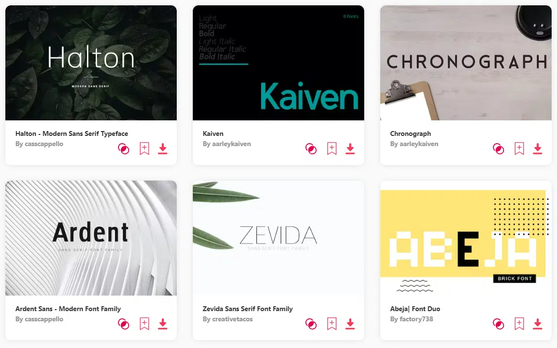
10 Best Fonts Similar To Lato – Overview
Scroll on for the full list.
FONTS SIMILAR TO LATO – UNLIMITED DOWNLOADS: 50 Million+ Fonts & Design Assets
Download all the Fonts Similar To Lato you need and many other design elements, available for a monthly subscription by subscribing to Envato Elements. The subscription costs $16.50 per month and gives you unlimited access to a massive and growing library of over 50 million items that can be downloaded as often as you need (stock effect & element packs too)!
10 Best Fonts Similar To Lato – Overview
1. Pulse
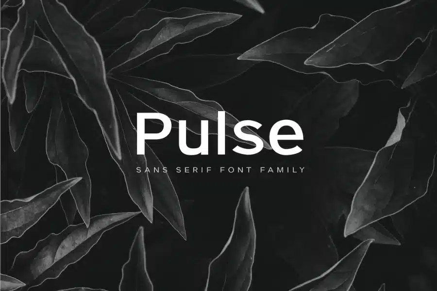
The first font in our lineup, Pulse, is a minimal yet classic sans serif typeface that holds a special place in our hearts.
It effortlessly transitions from headers to body copy, offering a touch of personality to your text.
With complete Latin character support, numbers, special characters, and punctuation, Pulse is ready to bring your designs to life.
2. Stark
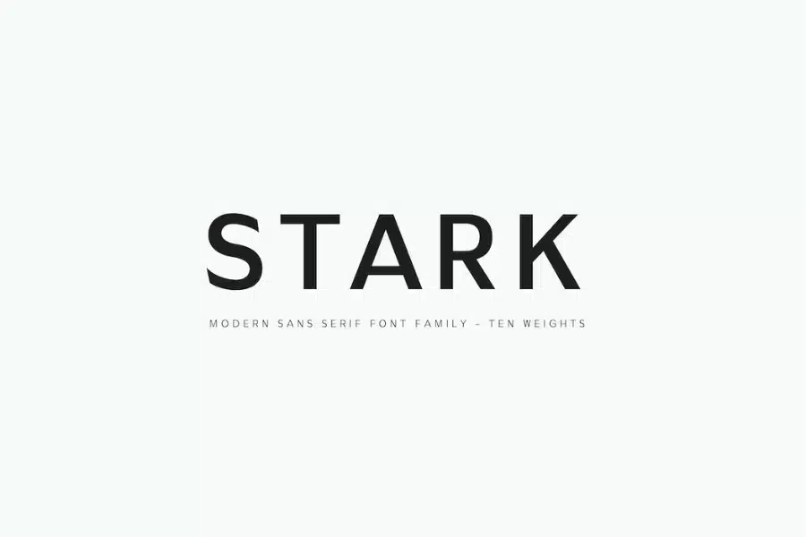
Next in line is Stark, a modern sans serif typeface that seamlessly balances the demands of headers and body copy.
Its clean lines and contemporary charm make it a font worth loving. Just like Pulse, Stark includes full Latin character support, numbers, special characters, and punctuation.
3. Metrisch
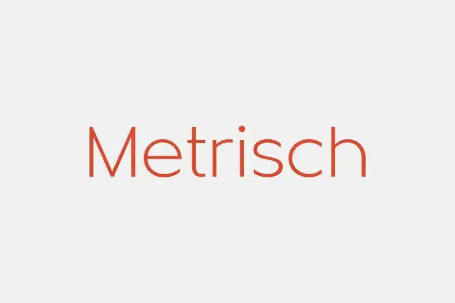
Meet Metrisch, a new sans serif typefamily that’s about to steal your heart.
With seven weights and seven italics in each, it offers versatility like no other.
Designed with traditional geometric construction, Metrisch boasts wider letter sizes, taller x-heights, and short descenders for a harmonious proportion.
The details, such as clean vertical cuts and optimized sharp corners, add a refined touch.
It’s a font that combines humanist and grotesk aesthetics, creating a style that’s truly captivating.
4. Fibon Neue
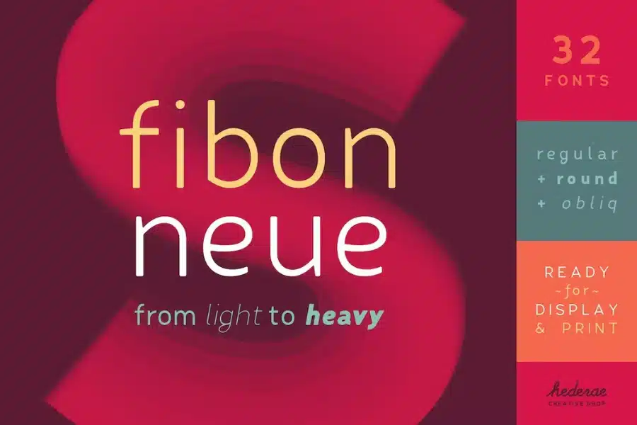
Fibon Neue takes its creative cues from the well-regarded Fibon Sans but elevates them to a whole new level, refining its essence to attain an exquisite equilibrium and heightened legibility.
What truly captures our imagination about Fibon Neue, in a manner akin to the elements that resonate with us in Lato, is its innate capacity to seamlessly fuse the realms of artistic form and utilitarian function.
This font family masterfully treads the path of minimal contrast between characters, bestowing upon it an undeniably smooth and visually pleasing aesthetic.
5. Panton
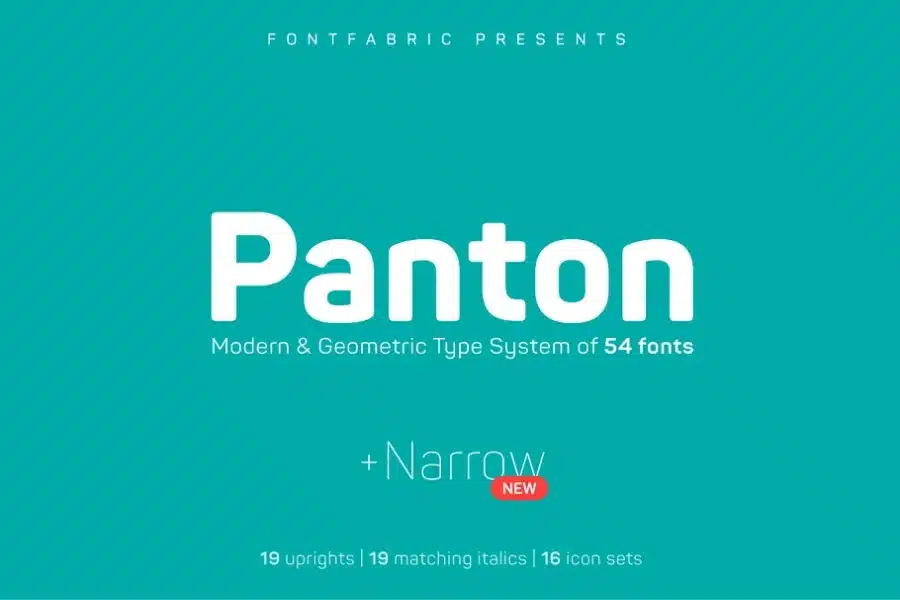
We are delighted to share our recent adoption of Panton into our design arsenal.
This addition significantly enriches our creative resources, offering a total of 18 styles to work with – 9 uprights and their matching 9 italics, spanning from the delicate Thin to the commanding Heavy.
This expansion represents a substantial enhancement to our design capabilities.
Panton Narrow’s versatile range of styles equips us to tackle a wider array of design projects with precision and finesse
6. Porlane
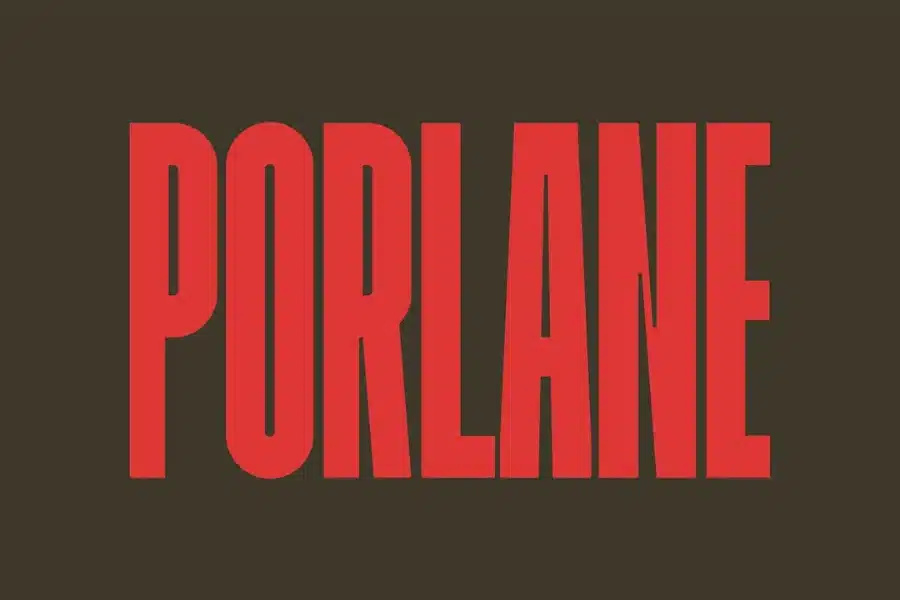
We’re delighted to introduce Porlane, a condensed sans-serif typeface purposefully designed for creating striking titles with distinctive shapes.
This typeface seamlessly transitions into a display font, ensuring legibility in contemporary applications.
With a single weight, Porlane combines readability with expressive character forms. Its extensive glyph library simplifies composition for Latin languages, boasting a generous x-height and precise line spacing.
7. Proda Sans
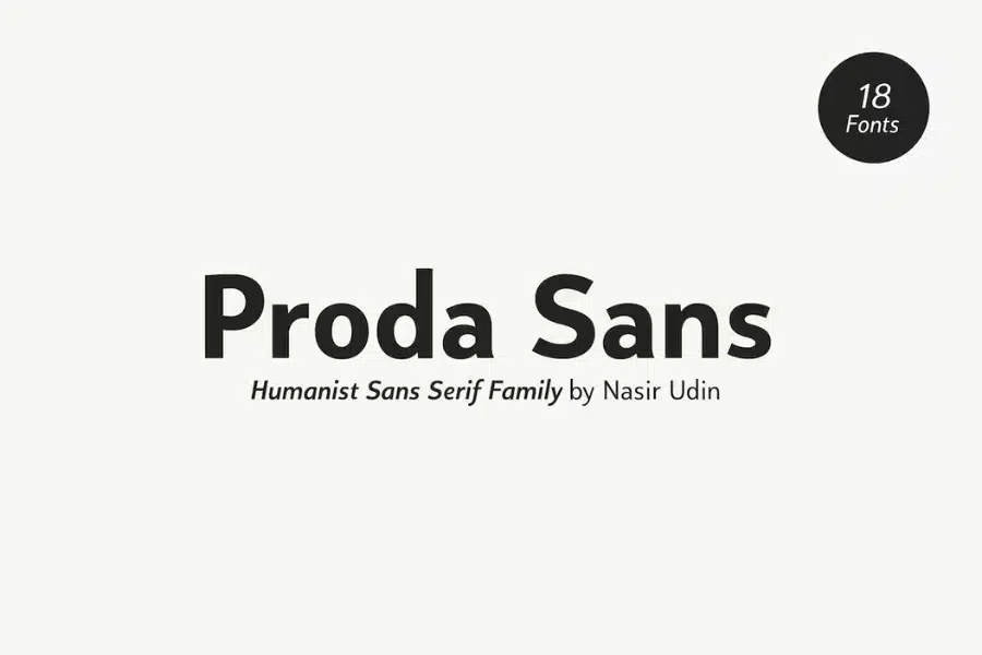
With a medium x-height, Proda Sans brilliantly ensures that your content remains luminous and approachable.
Much like Lato, this font understands the importance of balanced proportions and readability, making it an excellent choice for a wide array of applications.
In the world of typography, where legibility can sometimes compromise style, Proda Sans successfully strikes a harmonious balance, much like Lato does.
8. Orion Pro
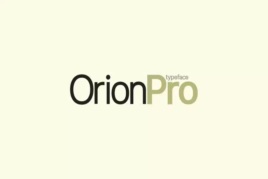
Orion Pro is a modern sans-serif typeface inspired by renowned Swiss typefaces.
It’s perfect for logotypes, headlines, and all your branding needs, blending elegance with minimalism.
9. Hamlin
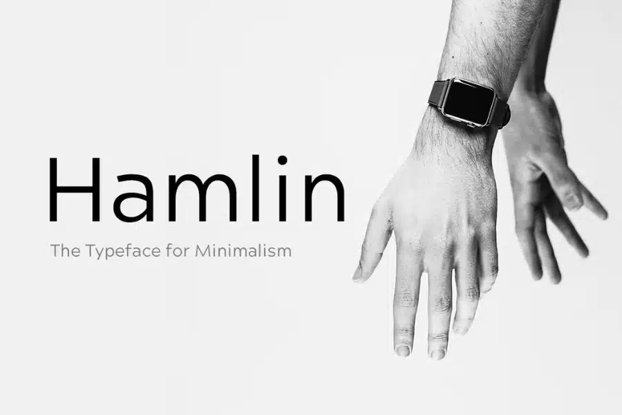
Much like the beloved Lato font, Hamlin exudes a certain charm that has captured our hearts.
Hamlin, too, is a font that has won us over for a multitude of reasons.
First and foremost, it champions the minimalist design movement with an unwavering dedication.
It’s a font that effortlessly channels the spirit of classic geometric typefaces while bringing its own distinctive flair to the typographic arena.
10. Visia Pro
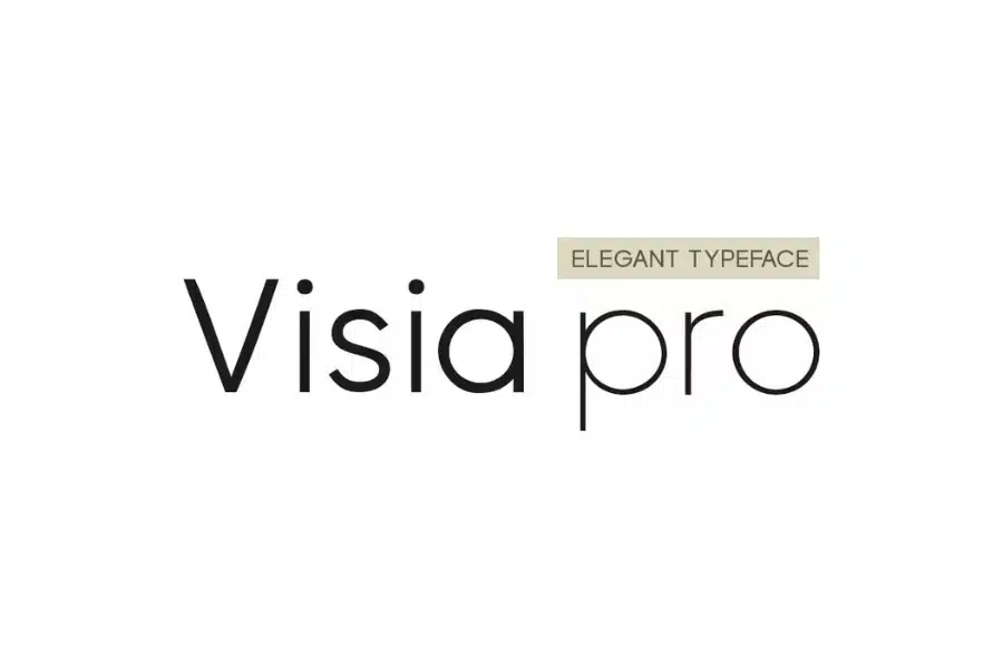
We have, Visia Pro, a flagship geometric sans-serif typeface.
Its blend of elegance and minimalism makes it ideal for logotypes, branding, and all your web and print endeavors.
In this world of fonts similar to Lato, each typeface is more than just letters on a screen; they are companions on your creative voyage.
They breathe life into your designs, adding depth, character, and a touch of personal style.
Embrace the versatility and timelessness of these fonts, and let your creativity flourish.
11. JUST Sans
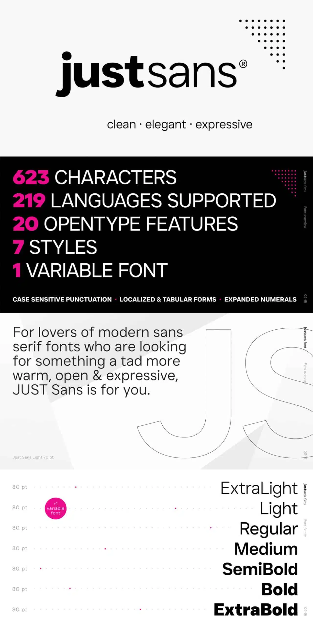
And lastly, we have, JUST Sans a highly versatile typeface exuding modernist warmth, geometric legibility, and a distinctive, friendly edge.
As a professional modern geometric sans-serif, JUST Sans achieves a delicate balance – serious yet approachable, neutral while expressing warmth, technically precise without overt formality.
Sharp angled terminals not only provide a secure grip but also infuse it with endearing expressiveness.
For modern sans-serif font enthusiasts seeking warmth, openness, and expressiveness, JUST Sans is your ideal choice.
Fonts That Pair Well With Lato
Below are some of the fonts that are best suited to complement Lato or Lato alternatives seamlessly.
Each of these fonts has been thoughtfully selected to harmonize with Lato’s versatile charm, offering a wide range of design possibilities.
Whether you’re crafting web layouts, print materials, or branding elements, these fonts provide the perfect balance and harmony, elevating your typographic choices to create visually captivating and well-balanced designs.
1. Addington
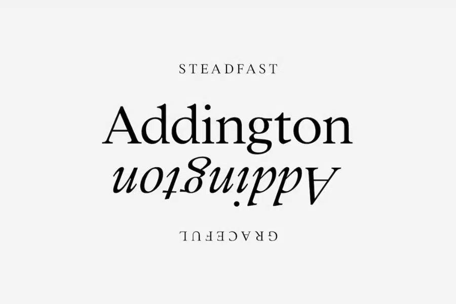
First, we have, Addington, a font that we absolutely adore.
Its character and meticulous attention to detail have us thrilled to include it in our design arsenal.
This versatile serif typeface seamlessly blends the elegance of calligraphy with traditional serifs and innovative elements.
Addington is a true gem, and when paired with fonts like Lato alternatives, it adds a touch of timeless charm and practicality to our projects.
2. Warming
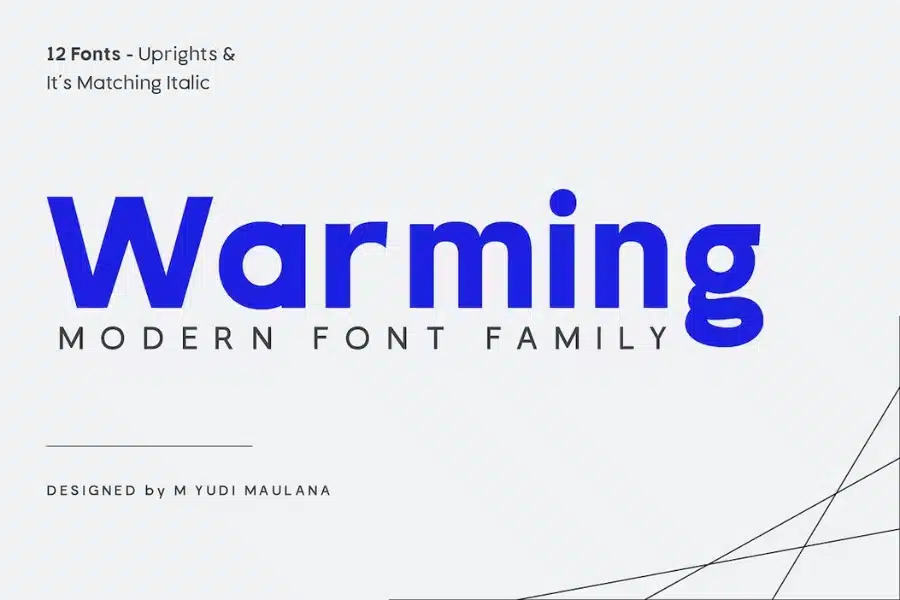
Next in line is Warming, a sans-serif font that fills us with joy every time we use it.
With over 350 glyphs, it’s an adaptable companion that elevates our designs across various platforms, from magazines and web layouts to print materials and branding.
Warming’s modernity and versatility make it a delightful partner to fonts like Lato alternatives, enhancing our creative journey with every project.
3. Bizmo
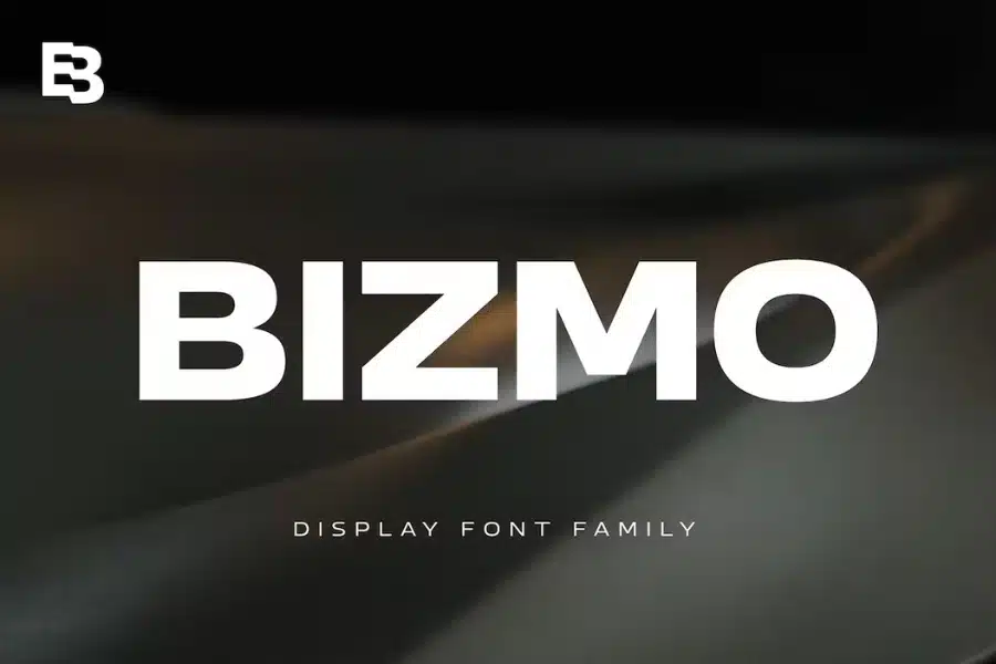
As we continue our exploration, we’re excited to introduce Bizmo.
This font family brings a sense of grandeur and allure to our designs that we’re happy to embrace.
Its wide letterforms are a standout feature, perfectly suited for use in large and expansive spaces.
When seeking fonts that harmonize with Lato alternatives, Bizmo confidently takes the stage, adding a touch of boldness and creativity to our visual narratives.
4. Mensch
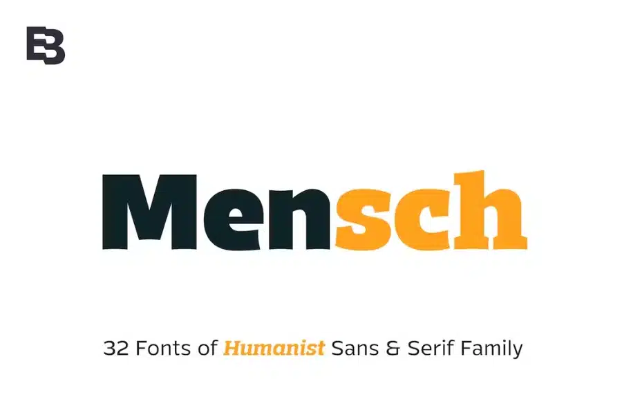
Mensch is more than just a font; it’s a creative partner that we’re thrilled to work with.
Its expressive and playful characters, large x-height, and diverse styles make it a standout choice for both bold displays and refined text.
Mensch’s 32 fonts, including matching italics, make it an invaluable addition to our typographic toolkit, and when combined with fonts like Lato alternatives, it enriches our designs with captivating versatility and personality.
5. Homade
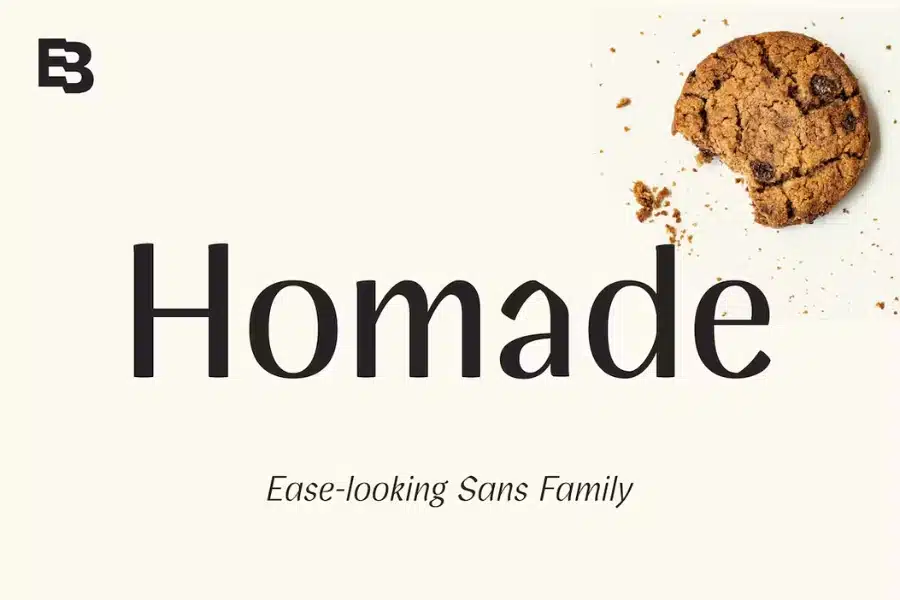
Moving along, we find comfort and inspiration in Homade.
Its inviting, casual charm blended with a touch of sophistication resonates with us.
Whether it’s branding, product design, or culinary themes, Homade’s versatility and 388 glyphs, covering a broad range of Latin languages, bring a sense of ease and informality to our projects.
Pairing it with fonts like Lato alternatives adds a layer of relaxed elegance to our design endeavors.
6. Sibre
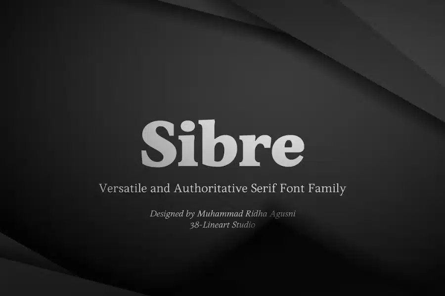
Sibre is the dependable companion we’re proud to include in our design family.
With a wide range of styles and a total of 16 fonts, it offers endless possibilities for headers, subheaders, body text, and displays.
Sibre’s versatility and meticulous design align seamlessly with fonts like Lato alternatives, helping us craft well-balanced and visually captivating layouts with confidence.
7. Svelte
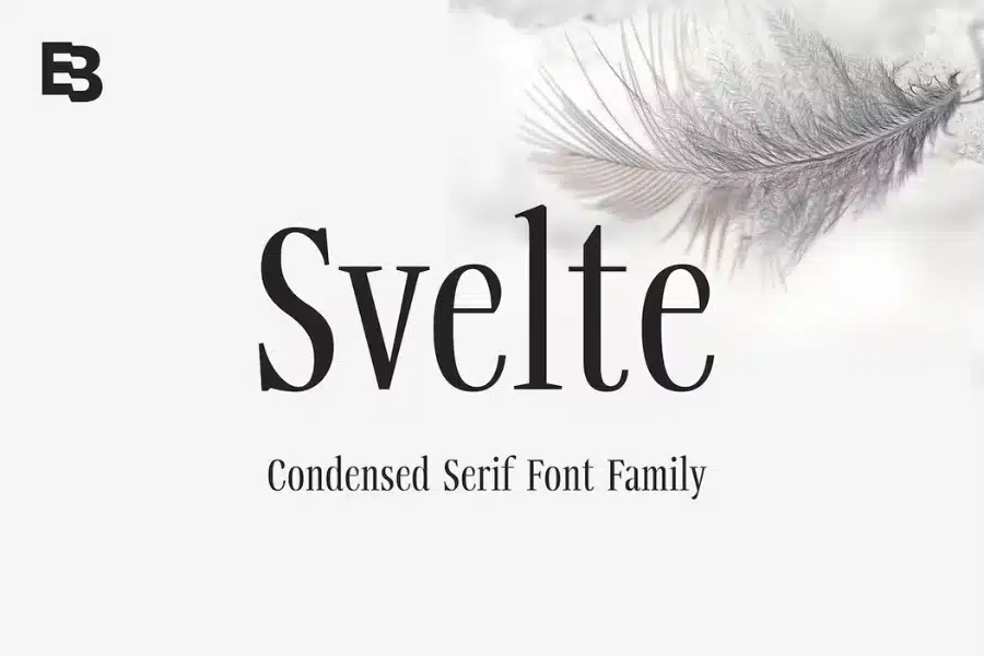
Svelte is a font that adds an element of refined elegance to our creations, and we couldn’t be happier to use it.
Its condensed serif style is perfect for display, short text, and stacked typesetting.
Boasting 394 glyphs and extensive Latin language coverage, Svelte’s grace harmonizes beautifully with fonts like Lato alternatives, allowing us to achieve captivating and concise typography effortlessly.
8. Slippery

Slippery is the font that warms our hearts with its inviting serif style, thoughtfully crafted for readability.
The soft edges, spacious counters, moderate x-height, and distinctive italics create a delightful reading experience.
When we’re looking for fonts that meld seamlessly with Lato alternatives, Slippery adds a touch of character and warmth to our text, enhancing its appeal and readability.
9. Sandor
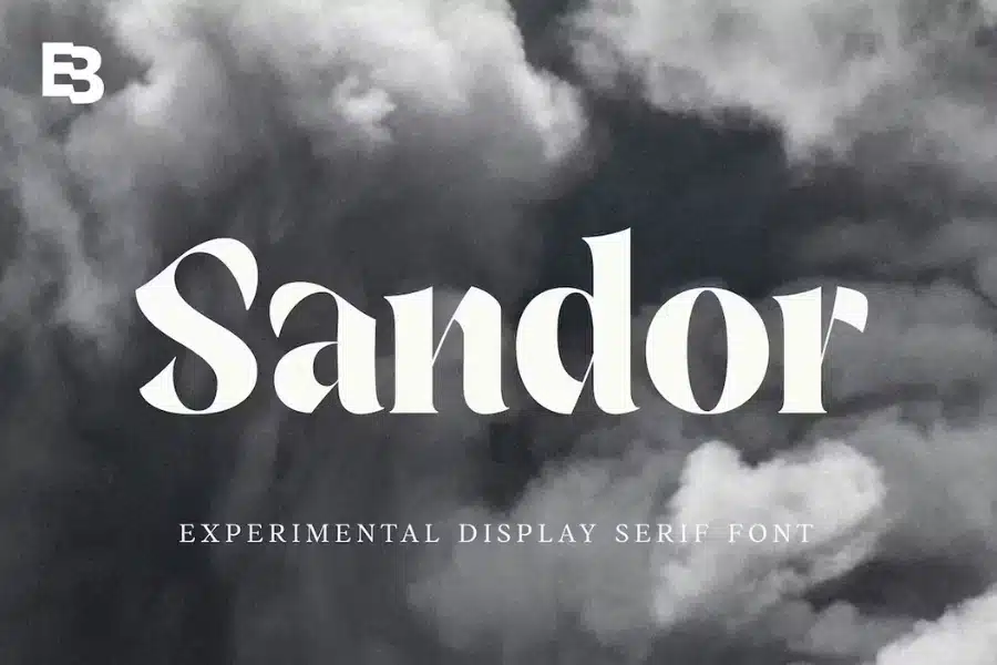
Sandor is the font that sparks our creativity and infuses a dose of artistic flair into our designs.
Its experimental serif style brings a fresh perspective to branding, titles, headings, and displays.
When combined with Lato alternatives, Sandor introduces an exciting artistic dimension, making our projects uniquely captivating and memorable.
10. Ghrist
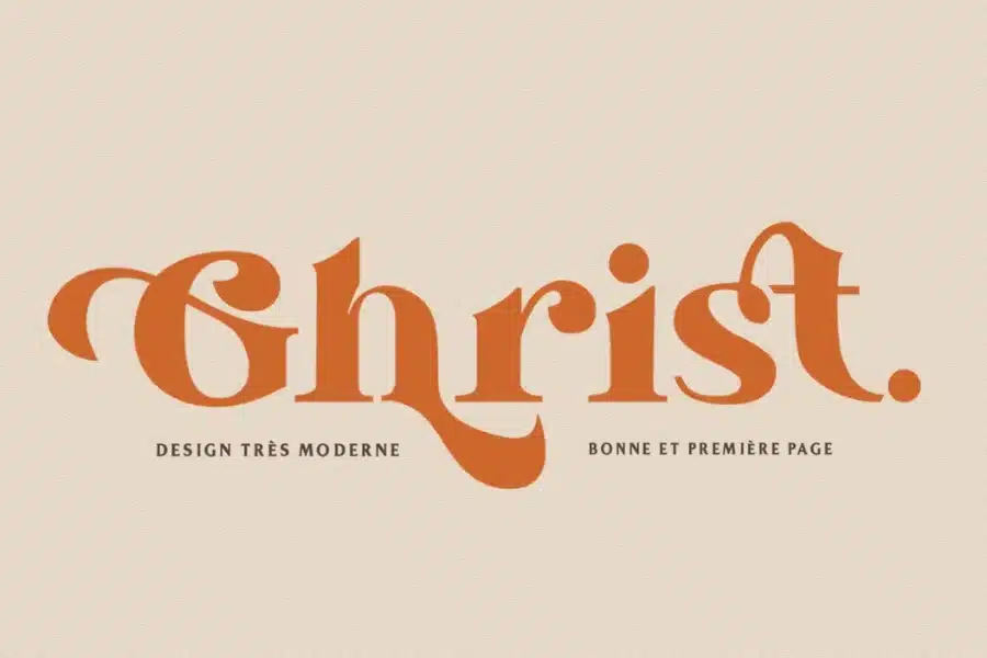
Finally, we introduce Ghrist—a font that fills us with sheer delight.
Its contemporary elegance and extensive alternative characters make it a joy to use in modern, elegant, and luxurious design projects.
Ghrist enhances our creative journey, and when paired with fonts like Lato alternatives, it infuses sophistication and refinement into our work, leaving a lasting impression on our audiences.
Our Favorite Fonts Similar To Lato
Related Posts:
- Fonts Similar To Helvetica
- Fonts Similar To Century Gothic
- Fonts Similar To Comic Sans
- Fonts Similar To Times New Roman
Fonts Similar to Lato Summary
These fonts share a common thread of harmonizing modern aesthetics with functional design principles.
They offer a wide spectrum of options, from elegant serifs to versatile sans-serifs, each with its unique personality.
These typefaces enrich the designer’s palette, providing the versatility needed to create captivating and balanced visual compositions for a wide array of design projects, from branding to web design, print materials, and beyond.
They exemplify the art of striking a harmonious equilibrium between form and function, making them valuable tools in the world of typography and design.


