Regardless of the industry, a general rule of logo design is to make it as simple as possible. The reason for this is obvious: a simple logo is much easier to memorize.
However, producing a simple yet effective logo is a challenging task. Besides simplicity, one must consider the uniqueness of the brand, colors, visual appeal, and many other factors.

You know what they say about first impressions. Well, the same rule applies in logo recognition as well. No one will know you if they don’t memorize your logo. As the result, your logo is a prominent and undeniably important part of your marketing effort.
The good news is that one does not need to spend years in design to make a killer logo. However, there are still some essential rules to follow in order to achieve this goal. Below, you will find these rules, tips for logo design as well as helpful tools to make a great logo, whether you are a designer or business owner. If interested in tools for logo design, you should check out our Best Logo Design Software article.
See here for more logo resources:
- 11 Logo Design Tips for Small Business Owners
- The Ultimate Guide to Logo Design eBook
- The Latest Logo Design Trends
Top 6 Tips for a Killer Logo Design
1. Capture the essence of your brand

To develop a brand essence for your business, you must have a firm grasp of its motto. What is the main goal of the organization? What sets it apart from its competitors? You must design successful marketing and advertising campaigns. Establishing an emotional connection with your audience is important.
Our brand has a unique history that defines its present, or soon will. All the things that were important to you while establishing your company, as well as its core values need to be conveyed in the logo, at least in its essence.
If you have to create a catchy logo for a company that sells sparkling water, you can decide to emphasize the benefits of the product, such as its energizing, hydrating, and relaxing qualities, as Vero did above.
The color has a big impact on how closely the logo relates to the spirit of the brand. For instance, the color blue may be used in the logo of a sparkling water firm to represent the power of water and the company’s commitment to improving the health of its consumers. In other words, rather than being picked at random, the color of the logo should have a specific meaning.
A logo design session commonly starts with brainstorming featuring the aspects described above. Don’t forget to write down the ideas you like. See here for how to unlock your creativity.
2. Use colors effectively
Color can be used to establish the overall tone of a design. But keep in mind that a single color could denote two different meanings. What the hue is supposed to represent is made clear by the other design elements. Red, for instance, can signify both fury and passion. A color’s value, or how light or dark it is in comparison to other colors, has a big impact on how it affects mood.
Let’s continue talking about the colors. The subject of color psychology focuses on how humans perceive and understand color. This science’s expertise is a fantastic source of inspiration for logo designs.
According to color psychologists, green symbolizes safety, nature, health, and freshness. Obviously, it is a good option for companies that produce foods. Next, yellow is commonly perceived by people as a color of innovation and optimism, so it can be utilized by high-tech companies. Blue is considered beneficial to the body because it symbolizes wisdom, confidence, and stability. Be careful with using black: in addition to elegance and power, it also implies death.
Let’s keep working on the example of a standout logo for a sparkling water manufacturer. Evidently, green and blue would be preferable in this situation rather than black and yellow.
3. Don’t be a copycat
When establishing your own logo, stay away from stealing from your competitors. This will just serve to highlight how unoriginal you are, and you might even be charged with plagiarism. Avoiding looking at your competitors’ logos when creating your own would be excellent advise.
Think about creating a memorable logo that is simple but impactful. Despite having relatively straightforward logos, prestigious companies like Nike and Microsoft send powerful messages.
One of the worst things that may happen in this scenario is to create a logo that looks remarkably identical to someone else’s. In addition to copyright concerns, the viewers can find it difficult to recognize it as your logo because it conjures up images of another logo. Confusion results as a result, and it’s extremely possible that you won’t get anything from it.
Of course, there are thousands of logos out there and some features of your own will be similar to some of them. To ensure that copyright is not an issue, you could perform an Internet or trademark search to determine if someone else has a similar idea before you even thought of producing a logo. As soon as your search does not show similar designs, proceed to the next step.
4. Simplicity is the key
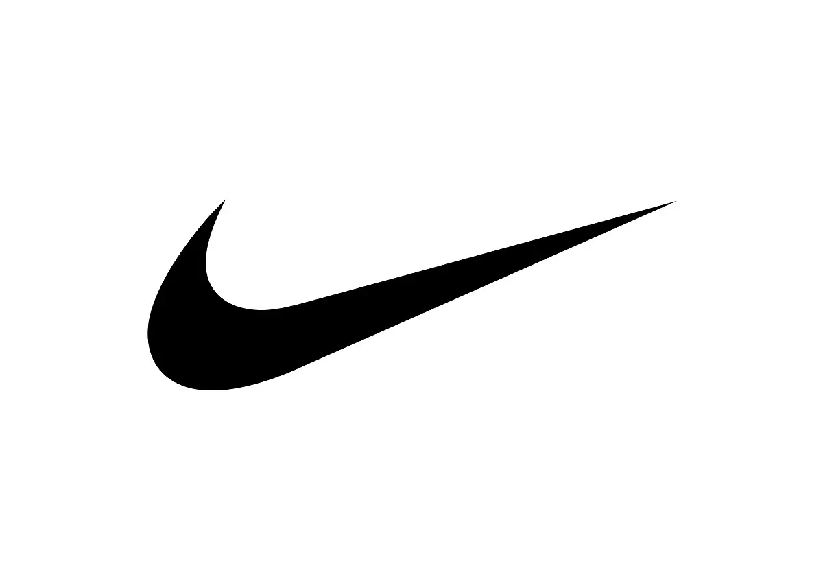
All iconic logos are simple: Apple, Nike, Microsoft, Audi and many other ones are perfect examples. You will recognize them from thousands of others because they have simple yet unique features. The main feature should be the most recognizable, like four rings in Audi logo and the tick sign in Nike.
Be aware that the design of your logo may be changed in the future as the company grows, so it must be flexible as well. Make your logo as simple as possible by using simple elements like circles, lines, rings, etc. but don’t discount creativity when doing so.
5. Use the right font(s)
There are so many fonts out there, so you will become overwhelmed very quickly, but these are the main categories. First, Serif is used for logos that need to look traditional. Second, Sans-Serif is perfect for modern-looking ones. Script is recommended if you need to make the logo more carefree or formal, depending on the typeface. Regardless of the choice of the typeface, you should also remember to make it versatile to adapt it well to the surroundings, especially pairing it correctly with other fonts.
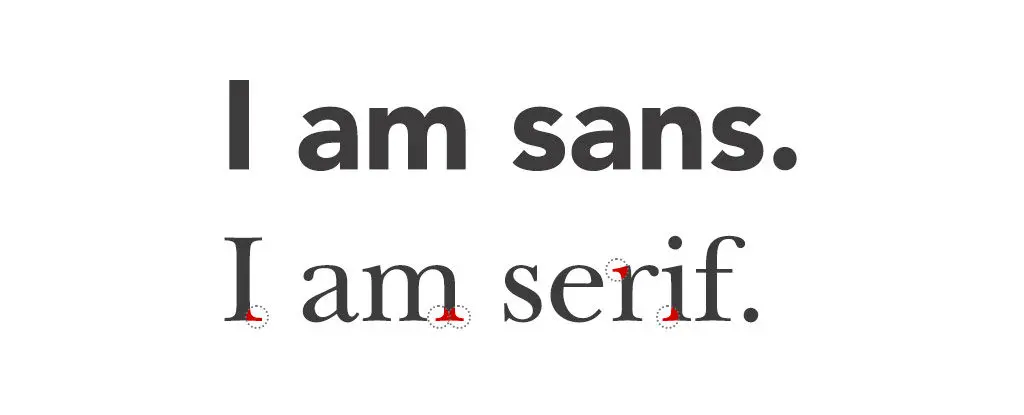
For example, if you are running a company that is related to travel (a travel blog etc.), you may want to consider using a hand written script. If you want to look traditional, Serif is the way to go. However, if your brand produces innovative products, using Sans-Serif might be a good idea. Understanding the power of typography in logo design is crucial to success.
6. Consider making an “active” logo
Having an active logo is an expert tip that has been considered by many companies. The best example of an effective active logo is the one used by Twitter. On earlier versions of the logo, the bird appeared standing, so it was a passive bird. Later, the designers of the company changed the logo: the bird became active and took flight! The latest logo of Twitter took it to another level by making the bird flying in the upward direction.
If you to include an object in your logo, consider making it active. For example, a sport equipment brand may use a spinning ball or have a line to convey motion.
Every logo should resemble the uniqueness of the brand. Make yours filled with meaning, and follow the above tips for logo design for designing a killer logo!
Frequently Asked Questions
What are some tips for a killer logo design?
When creating a killer logo, some factors to bear in mind are the business's essence, effective brand colors, avoiding plagiarism, employing a unified font, and keeping things simple. A more active logo design is something to think about since active logos are used by many iconic brands.
How do you choose the best font for your logo?
Choosing the best font for your logo depends on your brand goals and identity. For designers going for a refined look, serif and script fonts are a great fit. Conversely, for a more modern and relevant look, sans-serif fonts are more suitable.
What is an active logo design?
An active logo is one where the logo is created to look like it’s in mid-action or have motion. Active logo designs are great for a brand design that’s distinctive and appealing.
What is the best way to choose the color scheme for your logo?
The color scheme for logo design depends on the goals and desired impression you want to convey with your branding. Darker colors tend to be more serious, while lighter colors tend to be more exciting.
What are some things to avoid when creating a killer logo?
When creating a killer logo design, it’s important to avoid plagiarism and cluttering the logo with too many elements. When it comes to killer logo design, cohesive colors and fonts are also important elements to consider.
What is the difference between a Sans and Serif font?
Serif fonts tend to have tapered edges for a contrasting mix of narrow and broad strokes, and appear more serious and classy. Sans serif fonts, on the other hand, tend to be rounded and have more consistent strokes that ensure a contemporary look.
More Logo Resources
- Best Logo Design Courses
- Best Free Logo Makers
- How to Present your Logo Designs to Clients
- The Logo Design Process of Top Designers [Infographic]
- Logo Design Grid Systems Deconstructed [Video Class]
- Color Psychology in Logo Design
- Best Logo Design Software


Lucy, a great article on logo design and branding concepts! I’ve used this header reference a hand-full of times when working with clients. Thank you for sharing!
Here i learnt the importance of keeping your Logo Simple, which i used to ignore a lot. And it is liberating to know how color psychology effects our perception of the logo design.
Thanks a lot.
Logo design truly evolved the past years, just see design profiles over at Behance or Dribble to get the idea. Some brands actually kept their logo as is, which is unique imho.
I agree with 4 – “Simplicity is the key” – or, Just Do It 🙂
This is a great article, as always. Good job, Lucy, you should write a book on logo design some day.
Loved the post and tips. Thanks for sharing.
Great article that explains in detail what a proper logo should look like, with some great examples that prove the point. The first step in my opinion should be getting a proper advice from a company that has experience in making logos; this can inspire you and give you a better picture of how you want your logo to look like.
Im crazy about logo design. I follow u
Nice tips for designers. As always, offering value for us upcoming Graphic Designers. Thank you
Hey, Jacob,
Great thought and innovative writing I must say. In my point of view for a graphic designer, it’s not hard to design, but it’s hard to get the concept and visualize it. Thank you, bro, for sharing color definitions. I learned few new things from your post. Great work and keep it up.
You’re very welcome! Colour is a huge part of effective design so it is worth studying further!
These tips really are key, especially simplicity. Often people get so consumed with what is possible with logo design and simplicity gets easily lost. We have recently finished the rebranding of a project we have developed, we use a logo creator which really did manage the key points you want to always be considering when creating a logo. https://withoomph.com
yes, simplicity!!! I always spend time taking things away to see if the logo still holds up, it’s the key to a long lasting logo