Are you looking for the best diner fonts? If you are, then we’ve got you covered!
Whether in the form of a charming, whimsical script or retro bold calligraphy, the fonts used in dining venues can set your brand apart from your competitors.

Creative dining fonts characterized by the indulgences of visually appealing typography can serve as a channel to showcase the unique personality of the establishment.
From neighborhood cafes to upscale restaurants, the fonts used in your favorite eateries can make a lasting impression and create a memorable visual identity.
In line with the elegance, comfort, and sophistication of a fine dining experience, let us recommend some exquisite diner fonts perfect to reflect the refreshing aromas, scrumptious blends, and welcoming environment of restaurants, cafes, rooftops, and lounges.
We have reviewed these fonts ourselves to ensure that there is no compromise on quality. Just the crème de la crème.
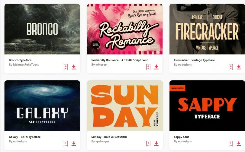
Top 10+ Diner Fonts
- Winter Is Coming
- Andre’s Diner
- Hardela
- The Sign Paintoh
- Rocky
- Retro Thunders
- Retrofunk Script
- Rubra Costa
- Rosaline
- Heidenberg
For the complete list, scroll on!
Also see our compilation on Best Food Fonts and Best Water Fonts and Best Nature Fonts
UNLIMITED DOWNLOADS: 50 Million+ Fonts & Design Assets
Download all the Diner Fonts you need and many other design elements, available for a monthly subscription by subscribing to Envato Elements. The subscription costs $16.50 per month and gives you unlimited access to a massive and growing library of over 50 million items that can be downloaded as often as you need (stock effect & element packs too)!
22 Diner Fonts for Delicious Designs
1. Winter Is Coming
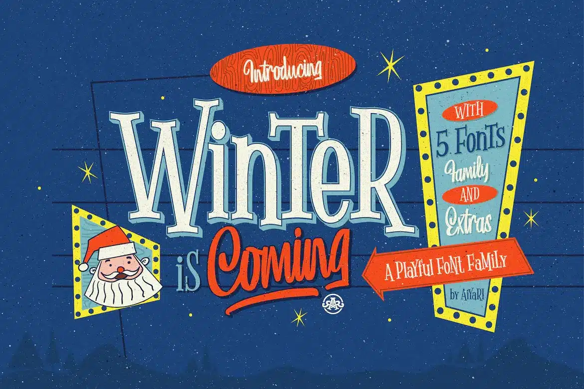
Having just the right amount of attitude, Winter Is Coming is a new font family designed to invoke feelings of nostalgia and authenticity.
Use it to sell a heart, no-nonsense bill of fare, and you’re sorted.
Inspired by hand lettering in 1950-1960, this classic diner font features graceful strokes and textured lines, making it well-suited in most eating establishments.
From breezy morning cafés to hip burger joints, Winter is all you need.
It’s also loaded with plenty of indulgent features, including stylistic and contextual alternates, ornaments, and ligatures.
The winning factor for us, however, was Winter’s 5 font variations, which were fun to play with and helped add different levels of emphasis and movement to the text.
And did we mention the bonus graphic collection that wonderfully reflected the spirit and essence of the American dining culture?
While it may have been helpful to get the font in multiple formats, it wasn’t an issue for us. And if you, too, fall under the category that doesn’t mind the regular OTF format, then Winter has got you covered.
2. Andre’s Diner
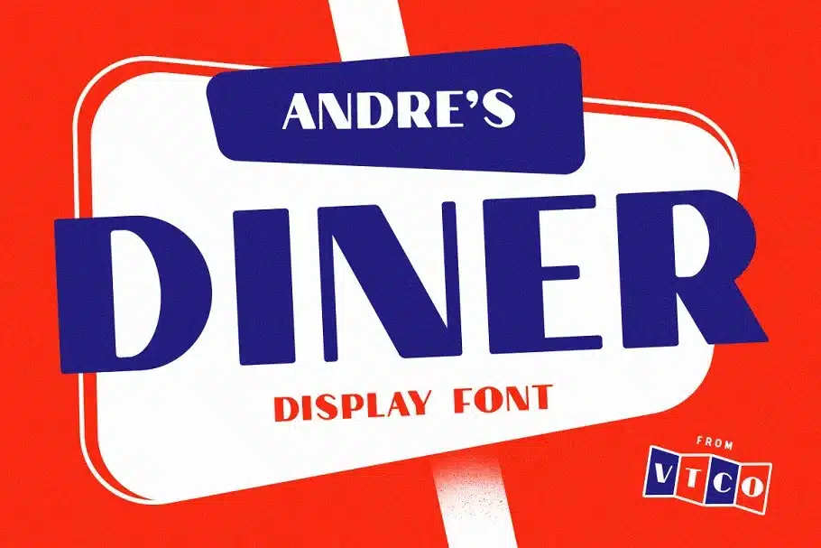
Signal your diners about the retro atmosphere inside or tell them about the quality fare they will get with Andre’s Diner.
This bold and brave sans-serif set is influenced by art-deco typefaces found all across America on billboards and old diner signs.
We were impressed with the font’s smooth corners, bulky lettering, and extreme stroke contrast, which accounted for enhanced legibility and ensured it was readable from a distance.
On top of it, Andre’s Diner includes a complete set of numbers and alphabets, as well as multilingual support for an array of Western-Euro languages that added to its flexibility, making it a must-have option with plenty of applications.
From logos and posters to pamphlets and menus, the possibilities are endless with this one.
Bear in mind that the bulkiness of Andre’s Diner can be a turnoff for more subtle or minimalist designs.
Fret not, as alternatives like Regarn are always there to assist in such scenarios.
Regardless, Andre’s Diner stays true to America’s dining experience and remains at the top of the charts for creating projects revolving around the domain.
3. Hardela
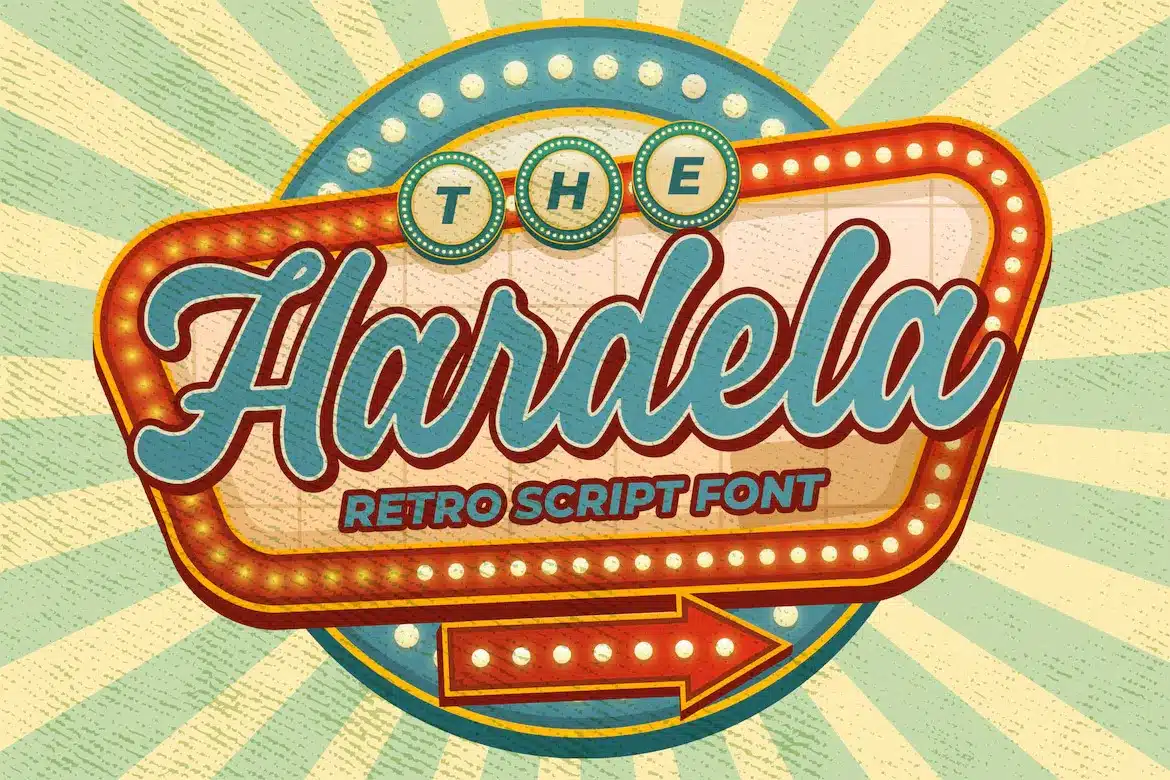
Maybe you run a breakfast speciality diner, a café, or some other kind of eatery and want a fresh script for your branding endeavor.
Hardela by Blankids may be just what you need.
This semi-connected display font is characterized by beautifully-transitioned letters that lend an organic, handwritten touch to the work.
The bold and circular strokes further amp up the aesthetics, ensuring that your designs are nothing short of perfection.
As a bonus, Hardela comes with PUA-encoded characters, meaning it can be used in any software using the operating system’s utilities, such as Photoshop, Indesign, and Illustrator.
We especially liked pairing Hardela with warm and bright colors that acted as a great complement to its grunge vibe.
With so many features, this free diner font applies to many projects, including posters, snacks, business cards, restaurant menus, and more.
Don’t hesitate and give Hardela a test drive today. The results will surely leave your customers wanting more!
4. The Sign Paintoh
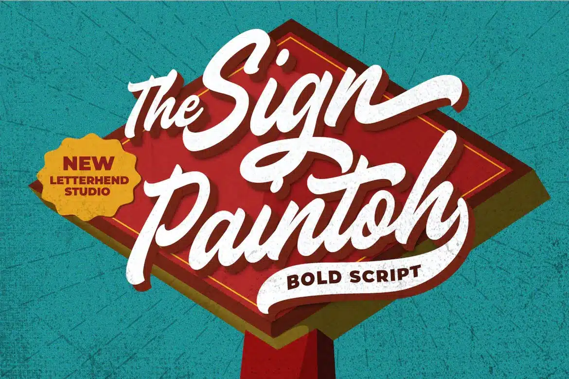
If not inferred by the name already, this pick by Letterhend Studios is a diner sign font explicitly made for attracting fun-seeking customers.
The Sign Paintoh is a bold script with a rustic charm that will take you back to the 60s feel.
The typeface’s groovy, psychedelic style lends a playful aura and prepares the diners for a good old-fashioned fiesta.
This ambitious set offers a virtually endless series of add-ons like alternates, ligatures, PUA-encoded characters, and seamless multilingual support, providing a tasty platter of ingredients for each project.
And this is what compelled us to include The Sign Paintoh in the list.
What truly thrilled us was the pack’s wide range of customization options. Aside from signboards and logotypes, it also worked with fashion, stationery, greeting cards, magazines, and advertising campaigns.
On the flip side, you’ll need to use a program that supports OTF format, like Corel Draw and many Adobe apps, to see and access all of its glyph variations.
But once you come across such tools, what awaits ahead is a world full of art and craftiness!
5. Rocky
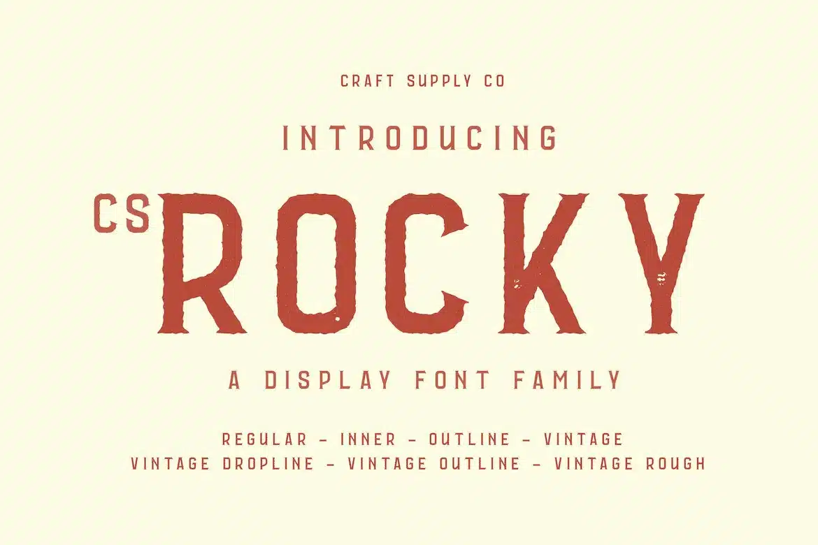
Designed by Craft Supply Co, Rocky is one of the most versatile diner fonts in the bunch.
It is adapted for greeting cards, product packaging, DIY projects, restaurant menus, signboards, and much more.
This serif font contains thick, symmetrical hand-drawn characters, numerals, and punctuation with a textured surface.
Rocky also features unique extras like patterns and shapes to bring life into your artwork and give them a personalized, distinctive feel.
This generous stylistic set left our creative team awe-struck.
Rocky offers up to 7 different styles to choose from, depending on the theme of your project.
Whether you want a regular inner outline or a rough, vintage one, it can accommodate.
Conversely, it is important to note that Rocky is only available in OTF file format and, therefore, incompatible with certain software.
But if you are willing to compromise on this in return for a more retro, organic, and letterpress feel, then it’s worth giving Rocky a shot.
After all, how can anyone go wrong with a diner font like this one?
6. Retro Thunders
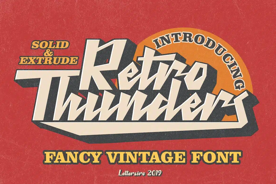
Attractive, bold, and classy- Retro Thunders is the perfect example of a diner font done right by the designers.
It features a fancy typography style heavily inspired by the 90s era with a modern touch to it.
We loved how Retro Thunders managed to look good on a variety of different projects, including album covers, clothing, labels, logos, and posters that otherwise seemed mundane and dry.
Our favorite part about it, however, was its support for OpenType features.
Be it for ligatures, swashes, or alternates, Retro Thunders has got you covered and is there to help your designs stand out anywhere you go.
And let’s not forget about the two stunning variations of Retro Thunders.
You can pick between a solid or extrude design depending on the theme of your project.
The font has basic Latin support and front and end tails for a versatile, aesthetic outlook.
On the other hand, we would have appreciated it if the font came with multilingual support and in more than one file format.
Regardless, Retro Thunders stays true to its promise of being the best 1940s diner font out there.
7. Retrofunk Script
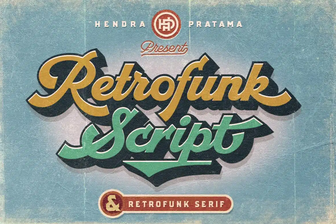
Are you a fan of retro pop culture and want to give off similar energy to your newly opened diner?
If yes, then you are in dire need of a font like this one!
Retrofunk is the classic blend of 70’s typography with some extra grooviness.
It contains sporty, cursive letters that look impressive on athletic apparel, restaurant menus, logos, and social media ads.
Our creative team instantly became huge fans of this font, all thanks to its three stylistic sets.
The pack includes a script, extrude, and serif versions that pair well with contrasting design themes, ranging from a simple wordmark to a catchy signboard.
Still in doubt about the versatility of Retrofunk script? Don’t be because Retrofunk contains PUA unicode characters, providing hundreds of alternates for a more creative, detailed, and artistic outlook.
Just remember that Retrofunk is an all-caps font and, therefore, best used as the display text on your projects.
If you want a more subtle font for the body paragraph, try using the Minerva typeface instead.
8. Rubra Costa
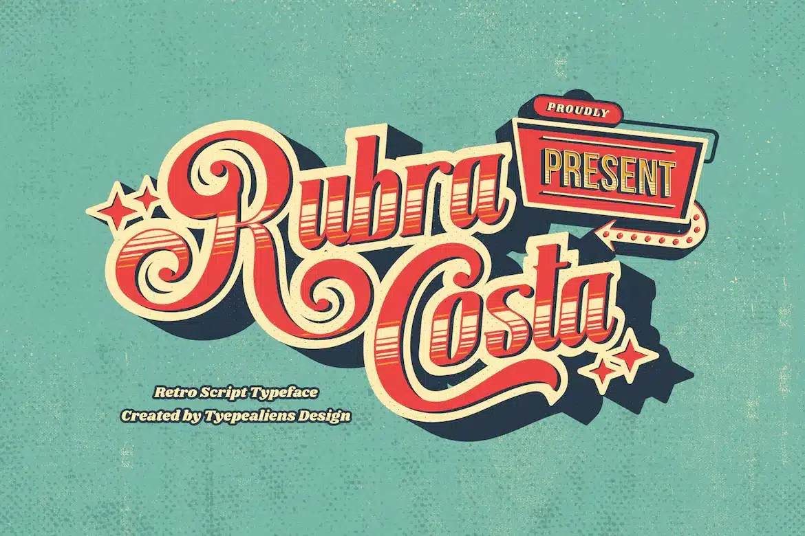
Want the best 1950s diner font to spice up your artwork instantaneously? If yes, then this Envato gem is your best bet.
Rubra Costa pays homage to the vintage ornamental lettering style with large, fancy letters and decorative edges.
Its beautiful, eye-catching design also makes it a good choice for invitation cards, social media posts, and magazine headlines.
We tried using it for packaging, advertising, logo, and badge designing and found the results impressive.
For better ease and versatility, Rubra Costa is available in OTF and TTF file formats.
Apart from the standard characters, numerals, and punctuation, we were thrilled to see its wide collection of alternates, glyphs, and cool illustrations.
These bonus features instantly enhanced the visuals of our designs and made them appealing to a wider audience.
However, in order to access Rubra Costa’s glyph panel, you must have Adobe Illustrator CS, InDesign, or CorelDraw installed on your computer.
So, what’s the wait? Try Rubra Costa today and take the quality of your artwork to a whole new level!
9. Rosaline

Like its name, Rosaline is the epitome of elegance, class, and vintage times.
Inspired by the magnificent art deco era of the 1920s, Rosaline features sleek, minimalistic characters with curved edges.
We particularly liked the unique touch of thin line borders that gave the characters a more sophisticated aura.
In contrast to most diner fonts, we were thrilled to find out that Rosaline included both upper and lowercase characters that rendered it fit for use as both heading and body text.
Aside from the usual dining-themed templates, it looked equally flawless on wedding cards, printed t-shirts, product packaging, and business cards.
However, we understand that Rosaline might not be retro enough for certain artworks and may look out of place on designs with a total grunge aesthetic.
In such cases, we suggest going for something similar to the Cowboys 2.0 instead.
But if you can work your way around this minor limitation, get your hands on Rosaline right now and watch it mesmerize all your customers with its majestic beauty!
10. Heidenberg
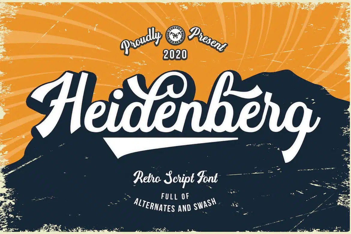
Get ready to throw the biggest 80s-themed party with our next retro script font.
Heidenberg takes after the letterpress typography style from the 1960s to the 1980s.
It features ornamental yet cool, playful characters that accurately represent the traditional style of diners.
Apart from standard upper and lowercase letters, we absolutely loved Heidenberg’s vast collection of alternates and swashes.
These bonus elements, combined with OpenType features, provided us with just the right platform to unleash our true potential.
Another admirable aspect of Heidenberg was its support for multiple accents, ensuring a more global user experience.
We were also pleased to discover the font’s availability in three file formats.
While Heidenberg worked well with lots of design templates, it looked particularly ravishing on signages, logos, movie covers, and sports tournaments.
One thing that would have made this font even better was if it included more stylistic options.
Unfortunately, as for now, Heidenberg is only available in a single, regular style.
But, if you can work through this minor limitation, download Heidenberg right away to make the most of its outclass charm.
11. Sunday
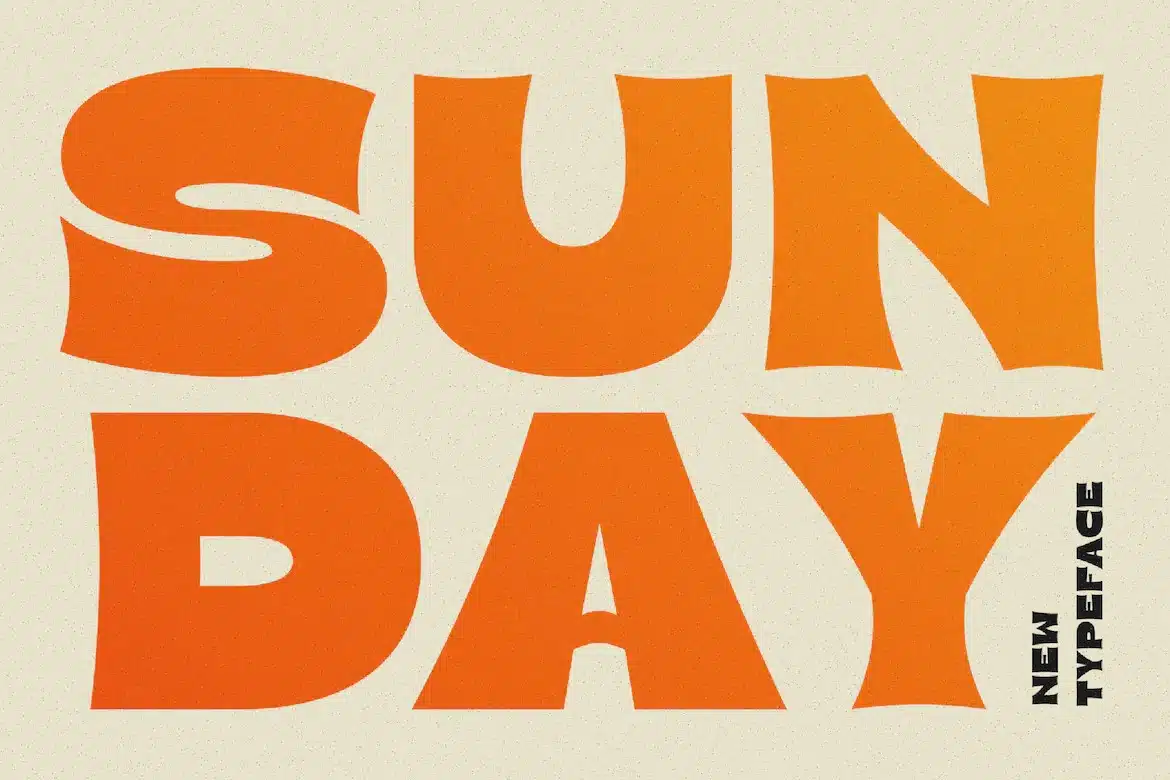
When thinking of Sunday, the first thing that comes to mind is a comfortable, pleasant evening.
And just like that, the Sunday typeface is designed to offer this and so much more through its uniquely-crafted design.
The font comprises massive, chunky characters that strike the right balance between a chic and retro theme.
Its slightly quirky sans-serif script makes it suitable for designing diner menus and signboards.
We are huge fans of the easy readability of Sunday, all thanks to its thick typography.
Despite being best used as a display font, Sunday contains both upper and lowercase characters for use as both main and body text.
What we didn’t like about this font was its limited language fluidity.
Moreover, it also looked a little “crumbled” in some instances because of the minimal in-letter spacing.
But fret not, as this problem can easily be solved by opting for a more stencil option like the Rodge script.
12. Flashy
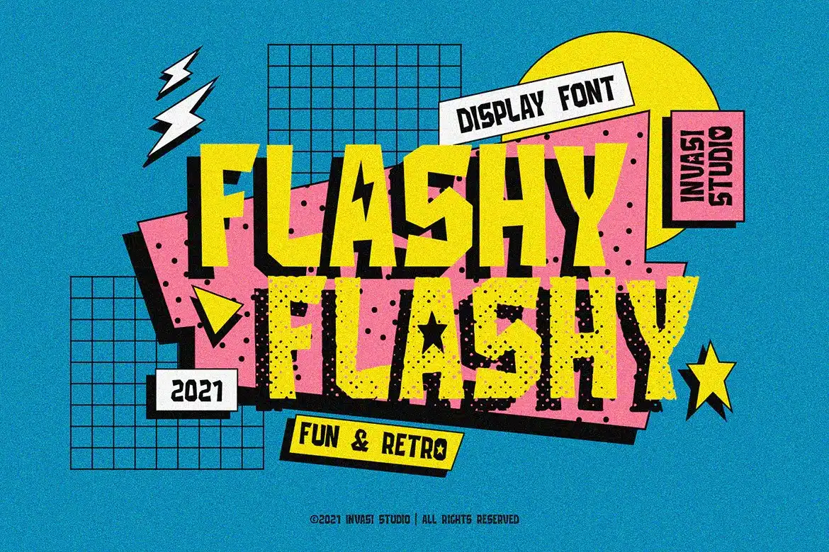
Who says the best diner fonts must always be muted and formal?
Our next font redefines the standard for what it means to truly be a top-tier vintage menu font in today’s time.
Like its name, Flashy is composed of fun and playful monoline characters.
It is an adorable handwritten display font that comes with support for multiple accents.
Our creative team absolutely adored the PUA encoding of the characters in this font.
With the help of this, Flashy provided access to hundreds of glyphs and swashes to add a personalized touch to all our artistic ventures.
Still, think Flashy lacks in terms of customizability?
We promise that this dual style family, featuring a regular and rough style, will remove all your doubts and look good on numerous projects, including cartoons, children’s books, restaurant menus, signboards, logos, etc.
We were also impressed to find that Flashy supported up to three different file formats for compatibility with most design softwares.
But bear in mind that it consists of only all-caps letters and is therefore unsuitable as the body text on any project.
Besides this tiny drawback, Flashy always understands the assignment and delivers the best!
13. Boldiva
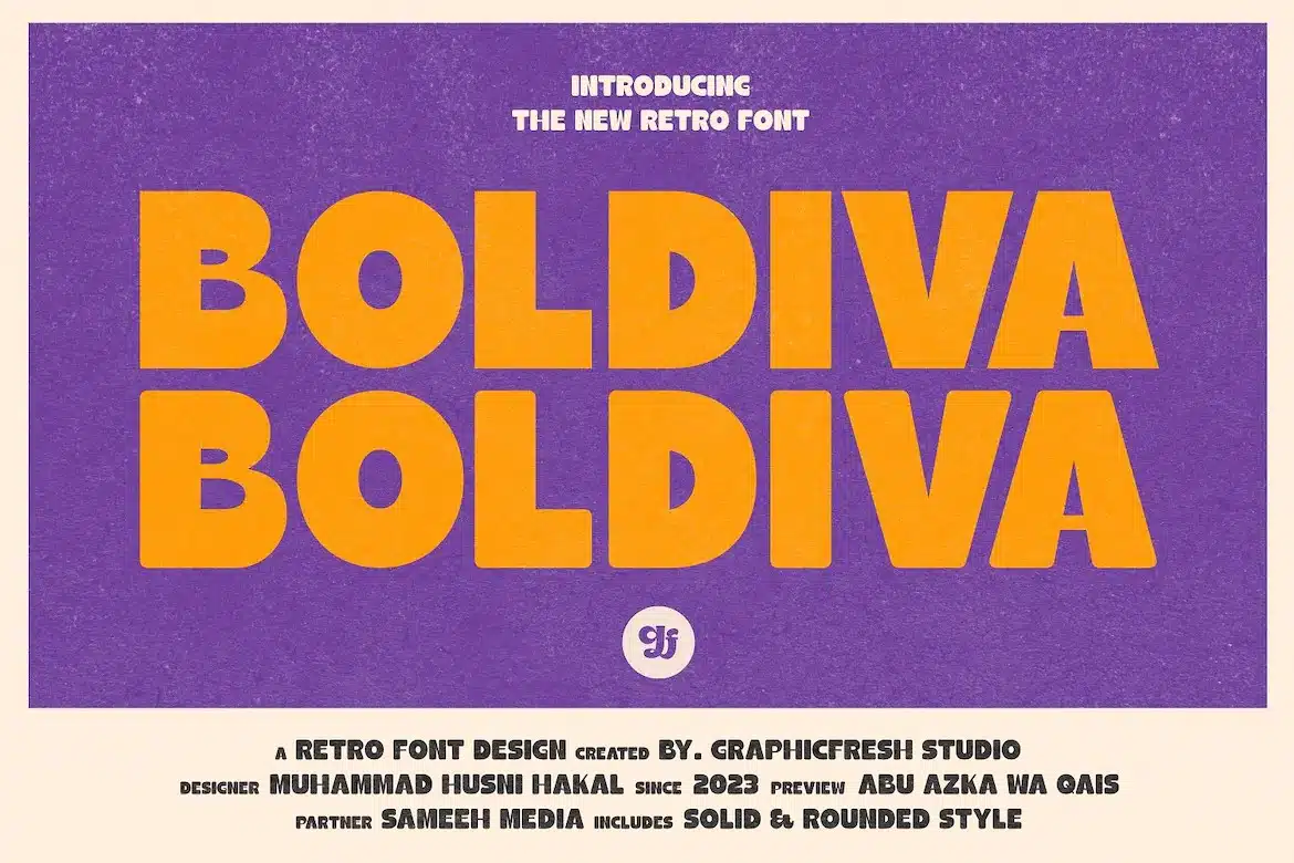
Are you looking for a typeface that magically captures the 70s, 80s, and 90s decade altogether?
If yes, then Boldiva, designed by the GraphicFresh studios, is your best bet.
This sans-serif font features chunky, bold letters with rounded, curved corners. Boldiva accurately portrays the old-school, beachy essence with a fresh new twist.
We used this font with various projects such as posters, logos, scrapbooks, and headlines that need the finishing touches of a funky, cheerful, retro energy.
We also liked how Boldiva offered support for multiple languages for a more diverse, worldwide experience.
Another admirable part about it was its easy-to-install interface, making it an ideal choice for designers just starting their artistic journey.
This user-friendly installation process, combined with three supported file formats, makes Boldiva a stellar option for amateurs as well as professional designers.
On the contrary, Boldiva may sometimes look too primitive on certain projects.
In such scenarios, try going with the Geckoy typeface instead for a more sophisticated, modern feel to your diner signboards and menus.
14. Palm Canyon
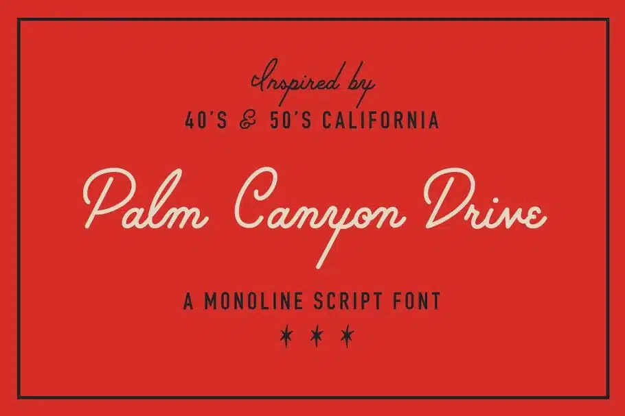
Our next font is heavily inspired by the 40s and 50s California, guaranteeing to leave the reader reminiscing about the good times spent there.
Palm Canyon Drive is a monoline American-style diner typeface with elegant cursive letters.
The font contains all standard upper and lower case characters, numerals, and punctuation. But its inclusion of popular catchphrases particularly made it stand out compared to its other competitors.
We also admired how the typeface is available in three different weights for better flexibility.
Choose between a light, regular or heavy style, and watch Palm Canyon bring life to your projects right away.
The classy yet relaxed font is ideal for Hollywood-related signages, retro matchbook covers, travel postcards, scrapbooks, and any other creative retro idea that comes to your mind.
Our only concern when it comes to this remarkable font was regarding readability.
The decorative typography of Palm Canyon can sometimes be hard to read at first glance.
Aside from this, Palm Canyon does a commendable job at boosting the visual appeal of your designs and is rightfully regarded as the best 50s diner font in here!
15. Roadside Diner
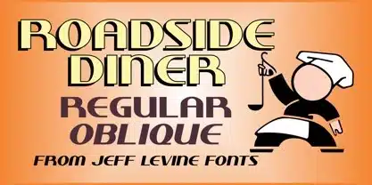
Introducing Roadside Diner – a typeface crafted with just the right amount of retro grooviness and modern bold to design the most mouth-watering diner breakfast, lunch, and dinner menus!
With condensed, thick typography and sharp edges, Roadside Diner portrays a relatively relaxed yet charming aura that’s bound to draw any reader towards it.
This workhorse is also designed to support multiple languages apart from English and has a generous glyph count for enhanced customization.
Roadside Diner instantly became our go-to pick, all thanks to its art deco style that managed to add a nostalgic look wherever it was applied on.
We tried using Roadside Diner on various projects, such as industrial signboards, logos, menus, headlines, and flyers and found the results amazing.
The only thing that didn’t satisfy our creative buds was the font’s lack of lowercase letters.
This, combined with the condensed spacing between the characters, rendered it unsuitable for use as the primary and secondary text.
In such instances, don’t shy away from switching it with a more subtle, lowercase-equipped diner font like our all-time favorite Cherry Soda.
16. Bronco
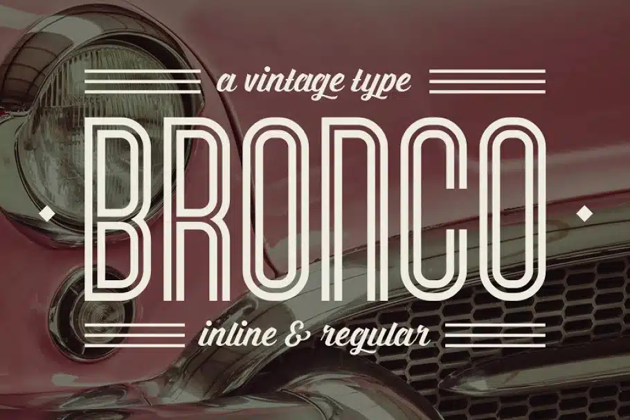
Vintage diner fonts are a great go-to option for a vast number of applications, and this creation by Tugcu Design Co. is no different.
Bronco is an inline display typeface that takes aesthetics to a new artistic level by preserving the mid-century lettering style and optimizing the beautiful proportions to impart a classic look.
Pure indulgence – that’s what we are talking about.
We were impressed by how well it adapted to fine dining establishments and lower-end cocktail joints, giving people a quick idea about what they can expect.
And that’s not it! Bronco also includes two styles: inline and regular, alternate letters, numbers, currency figures, and much more.
You can easily toggle between the versions using caps lock to create unique, visually-striking designs.
The only thing to look out for is the font’s unavailability of lowercase letters, which makes it a big no for larger chunks of text.
But for those looking for a font solely for a diner’s logo or menu card, there certainly is no better option than Bronco.
17. Sappy Retro Diner Font
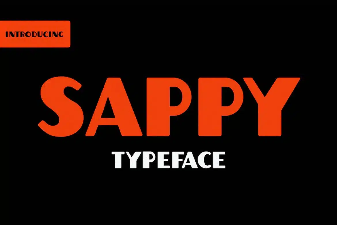
Want your designs to ooze with passion and energy? Sappy is the way to go.
Created by EP Designs, Sappy is a thick and juicy sans-serif based on the general layout of popular typefaces.
When retro fonts aren’t the need of the day, this workhorse makes an excellent choice without plumping the obvious serifs.
Sappy checks all the boxes when it comes to diner-style fonts. It’s friendly and approachable, helping you put your customer at ease, and nice and clean, making it ideal for dish descriptions.
We also appreciated how it maintained readability at all size points and fit right in with all sorts of design projects like branding, apparel, magazines, headlines, and more.
A special mention to the font’s whooping 93 characters and square letterforms.
You can take advantage of the letters by stacking them over one another like patties for more depth and dimension.
The download comes in OTF and TTF formats.
Since Sappy only caters to one language, it’s not a good match for international projects.
But that’s alright because several other versatile picks like Benito are out there to help in such instances.
18. Drive-In
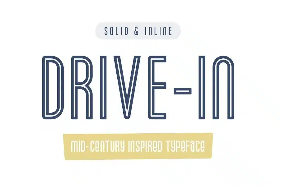
Whether you are a designer with a café design project or a restaurateur, the appetizing visuals of this Creative Market offering are exactly what you need.
Drive-In is a 50s diner font that takes heavy inspiration from the mid-century design movement.
It sports tall condensed sans-serifs and rounded curves, accurately depicting the character and style of the mid century era.
We were big fans of Drive-in’s pseudo-lowercase letters and all their smart variations that marry casual dining with sophistication, bringing in more customers to try your many food offerings!
It also comes with normal spacing and can be optimized to any size, depending on your need.
However, the style of Drive-in particularly translates well on paper, making it a reliable choice for food packaging, logotypes, insignia, menu boards, and more.
The only thing that didn’t tickle our fancy was Drive-in’s limited OpenType features that narrowed down the design possibilities and made the font fall behind in terms of fluidity.
Ultimately, it comes down to personal preference, and if you’re fine using a font with basic functionality, this one is surely the best pick for you.
19. Atomic DooDads
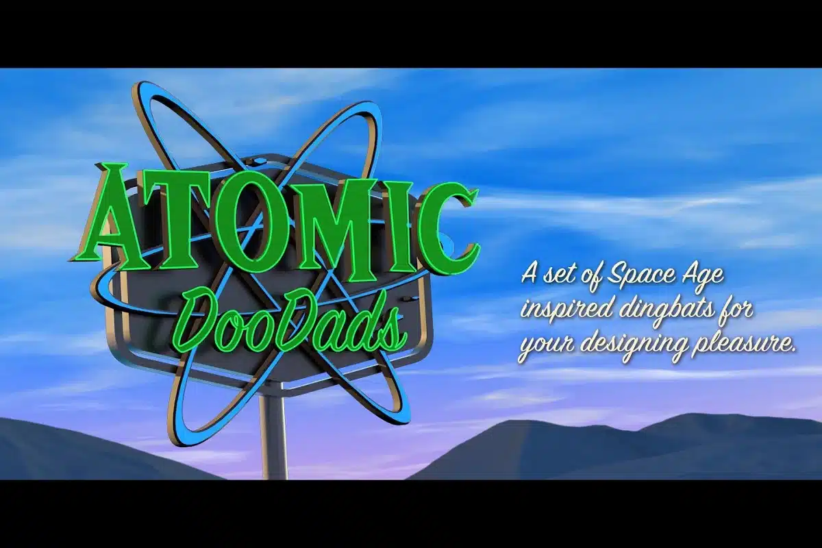
Blast into the past with the Atomic DooDads!
Not a font but a set of Space Age-inspired dingbats, Atomic DooDads is a dream come true for designers who wish to lend a bit of a laidback vibe to their work and make it more engaging yet easy-to-understand.
Atomic DooDads was created with an open, rounded style.
This functional set also includes normal spacing, allowing you to beef up the size without hassle.
The set’s wide range of symbols, from the usual stars and arrows to UFOs and vintage frames, make it perfect for a variety of designs.
Use them as standalone or in pairs to keep yourself busy crafting an outwardly retro project.
Our creative experts found Atomic DooDads super easy to use.
They were particularly impressed with its dual access options.
Each pictogram in the pack can be found by either typing out the name or through its glyph placement.
And with its extensive applications, it’s sure to cover all your hungry design needs.
Don’t forget to download compatible software like Adobe Illustrator to enjoy all the OpenType features Atomic DooDads has to offer.
20. Hamburger Hop
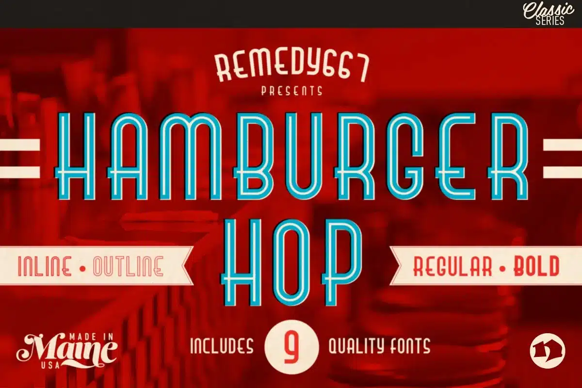
What’s a better diner font than one named after the greatest non-breakfast foods?
Created as a display typeface, this Remedy667 product has all the traits of a serious serif font but with a little grunge.
We fell in love at first sight with
Hamburger Hop’s unique design. With tall sausage-resembling letters, it sports a look explicitly made for food and restaurant-related designs.
The font is also suitable for lots of other designs, including stationery, YouTube titles, comic book texts, education presentation, and any project with a casual concept.
The best part? Unlike other regular options, Hamburger Hop is not only style over substance.
This family features 9 individual OpenType files comprised of 4 italic and 5 regular alternate versions, allowing for clear and varied composition in display and text settings.
For an added twist, you can layer them over one another and see how the combinations allow the surprising substitution to elevate your designs.
While the limited language support and single file format of Hamburger Hop may render it unfit for some projects, worry not, as swapping it with a more global typeface like Record Label will get the job done in no time!
21. Retro Diner
Engaging, passionate, and retro – our next pick represents the hustle and bustle of a diner in the morning.
Fresh with the smell of newspapers, coffee, and pancakes, Retro Diner is one of those gems that knows how to deliver.
It consists of striking, big, and bold characters that are made to stand out.
We liked how they immediately grabbed the audience’s attention and looked equally stunning on indoor and outdoor decor.
The font provided easy installation on MAC and PC devices and was a delight.
It helped quickly switch between variants and was even applicable on web pages.
Retro Diner’s support for a single OTF format was the only drawback for us, which made it incompatible with some software.
But aside from this, the font is an excellent all-purpose visual solution and makes a perfect addition to any designer’s toolkit.
Don’t believe us? Well, download it today and see for yourself!
22. Midnight Diner
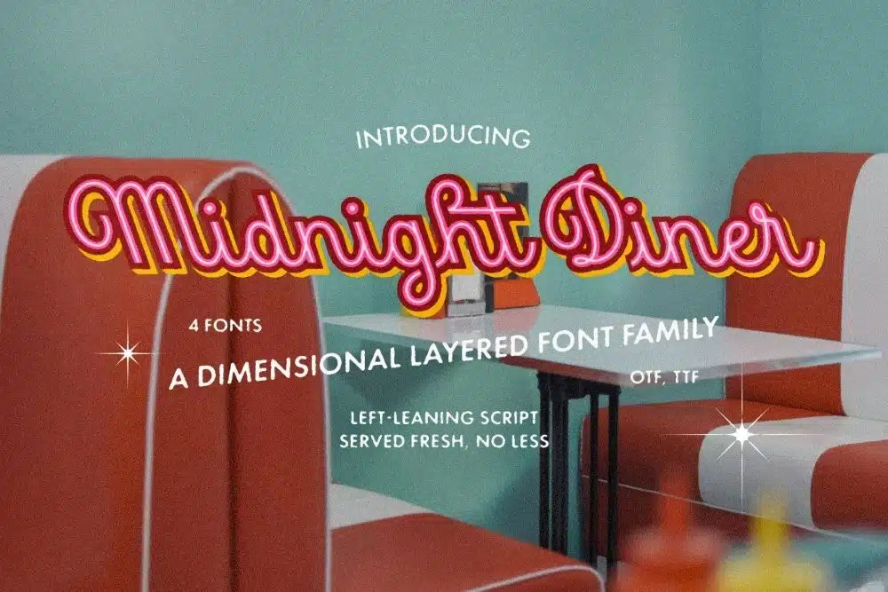
Meet Midnight Diner – an all-rounder vintage diner font that sells a vibe rather than cuisine.
Want to increase the flow of customers at your eatery?
Then, this pick will invite the passers-by by promising a good time with great food.
Midnight Diner is a multi-layered dimensional script headlining bold, thin, shadow, and outline capabilities, with a left-leaning boot to slant.
You can experiment with these combinations, as well as various color options! How fun is that?
Being effortlessly elegant, casual, and grunge all in one, you can play it up or down to your liking.
We also appreciated the diverse range of contextual alternates, stylistic alternates, and standard ligatures that presented us with countless options for our design work.
Midnight Diner is well thought out and delicately crafted with every little detail in mind to ensure its versatility and ease when used.
Unfortunately, the font still lacks in terms of readability and may cause visual crowding in smaller size points.
In such cases, replacing it with a more legible typeface such as Retromark might do the trick.
Keeping that aside, Midnight Diner secures the first position for creating designs as bold and unforgettable as the grandeur of American dining tradition.
Best Diner Fonts Summary
The best diner fonts beautifully encapsulate the essence of warm, cozy ambiance, scrumptious food, and delightful hospitality offered at dining venues ranging from restaurants and cafes to casual shops and carnivals.
For a theme as versatile as dining, you have countless options and diverse varieties to pick from.
However, the optimal choice will be the one which takes into account your target audience, location where the font is to be used, the level of casualness, formality, luxury, or romance you target to maintain.
Our list will surely help you choose the perfect fit for your brand.
Until then, satisfy your sweet tooth and don’t forget to enjoy little things in life!


