When it comes to creating content for digital platforms, the choice of font plays a crucial role in enhancing readability and accessibility. So, if you’re looking for all of the best legible fonts, then this post is for you!
Selecting a font that is easy to read for a diverse range of users is essential for effective communication.

In this article, we will explore the key factors to consider when choosing a font for optimal legibility and accessibility.
The Top 5 Easiest to Read Fonts
- Georgia — Best serif, great for screens
- Helvetica — Best sans serif, great for print and display sizes
- JUST Sans — Bold and friendly alternative to Helvetica (Get 2 free weights)
- Lucida Grande — Best for small sizes
- Verdana — Best for ebooks
For the complete list, scroll on!
Also see our compilation the best fonts for dyslexia, the best modern serif fonts, Top Fonts Used By Professionals, and the Best Aesthetic Fonts.
Why Clear & Legible Fonts Matter
Before delving into font selection, it’s important to understand why legible fonts are crucial. Unclear or confusing fonts can hinder comprehension and create difficulties for readers.
For instance, certain letter combinations or similar-looking characters can cause confusion, especially for individuals with dyslexia or visual impairments.
To ensure clarity, it is essential to choose fonts that provide distinct letter shapes and avoid characters that are easily confused.
What is the easiest font to read?
- Georgia is the easiest serif font to read as it was specifically crafted for the digital screens, ensuring legibility even at reduced sizes. For a print version, consider Garamond.
- Helvetica is the easiest sans serif font to read as Helvetica’s tall x-height enhances legibility, particularly at a distance. For a digital version consider Helvetica eText.
Factors to Consider When Choosing Legible Fonts
1. Serif vs. Sans Serif Fonts
Contrary to popular belief, there is no definitive answer as to whether serif or sans serif fonts are more readable. Both font types can be equally legible, depending on the specific font choice. The key is to select fonts that offer clear letter shapes and maintain readability across different sizes and contexts.
2. Letter Differentiation
Fonts that provide easy differentiation between similar letters and characters enhance legibility. For example, distinguishing between uppercase “I” and lowercase “l” is crucial. Similarly, characters like “o,” “e,” and “c” should have distinct shapes to avoid confusion.
3. Font Weight and Shape
Font weight and shape significantly impact legibility, especially at smaller sizes. Thin or narrow-width fonts can be challenging to read, particularly for individuals with visual impairments.
Choosing fonts with adequate letter spacing and a reasonable x-height (the height of lowercase letters) can enhance readability.
4. Audience
By understanding how users interact with your content, you can identify the fonts that best suit their needs and preferences.
What makes a font easy to read?
- Letterforms: Clear and distinct letterforms are crucial for readability. The individual characters should be well-defined, with easily recognizable shapes. Fonts with overly decorative or intricate letterforms may hinder legibility.
- Spacing: Proper spacing between letters (tracking) and words (kerning) is essential. Sufficient space between characters helps prevent them from blending together and ensures each letter is distinguishable.
- Size: Font size plays a significant role in readability. Fonts that are too small strain the eyes, while excessively large fonts may disrupt the flow of reading. Choosing an appropriate size that suits the medium and context is important.
- Contrast: The contrast between the text and the background is crucial for legibility. High contrast, such as black text on a white background, generally provides optimal readability. Avoid low contrast combinations that make the text appear faint or blend into the background.
- Typeface: Serif and sans-serif typefaces have different characteristics. Sans-serif fonts, which lack the small decorative strokes at the ends of letters, are often considered more readable on screens, while serif fonts can enhance readability in print and longer texts.
- Clarity: Fonts that maintain a consistent and uniform stroke width throughout the characters tend to be more legible. Inconsistent stroke widths or irregular shapes can make reading difficult, especially at smaller sizes.
- Readability at various distances: Fonts used in different contexts, such as signage or digital interfaces, should be legible from various distances. Fonts with good readability at a distance ensure that the information can be easily perceived.
Recommended System Fonts for Readability and Accessibility:
While font preferences can vary, several fonts are known for their legibility and widespread availability. Here are some recommended options that come default on most operating systems. For more unique options, scroll down.
- Georgia: Georgia is a serif font specifically crafted for the web, ensuring legibility even at reduced sizes.
- Helvetica: A traditional print font available on various operating systems, Helvetica’s tall x-height enhances legibility, particularly at a distance.
- Times New Roman: This classic serif font is widely used and renowned for its legibility, making it an excellent choice for print and web documents.
- Verdana: Developed by Microsoft, Verdana is a popular sans-serif font with distinctive letter shapes and open counters, ensuring readability on digital platforms.
- Arial: Another widely used sans-serif typeface, Arial, features natural strokes and open counters that contribute to its organic look, making it suitable for both print and web design.
- Tahoma: Similar to Verdana but with a narrower body and tighter spacing, Tahoma is another accessible sans-serif font created by Microsoft.
- Calibri: Designed for Microsoft, Calibri is a popular choice for accessibility due to its open counters and distinctive letterforms that minimize confusion.
- Lucida Sans (PC) or Lucida Grande (Mac): These sans-serif fonts were specifically designed to be legible in small sizes and low-resolution displays, making them ideal for mobile devices.
UNLIMITED DOWNLOADS: 50 Million+ Fonts & Design Assets
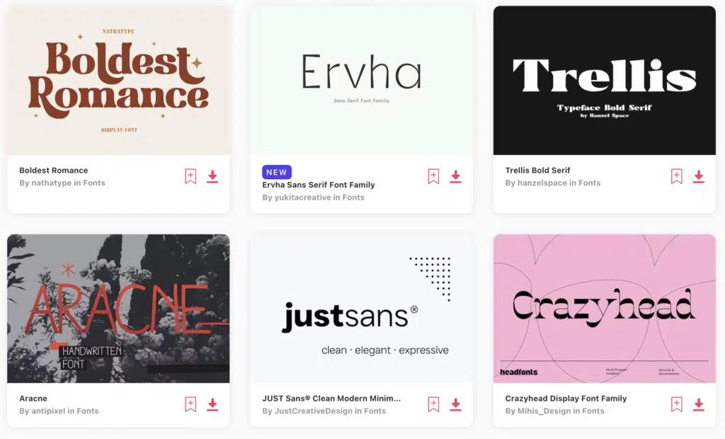
Download all the Legible fonts you need and many other design elements, available for a monthly subscription by subscribing to Envato Elements. The subscription costs $16.50 per month and gives you unlimited access to a massive and growing library of over 50 million items that can be downloaded as often as you need (stock effect & element packs too)!
20+ Legible Fonts for Easy Reading
Looking for more easy to read fonts? We’ve hand-selected a variety of the most readable fonts below.
1. Georgia
First on the rundown is a font we’re certain you’re all acquainted with.
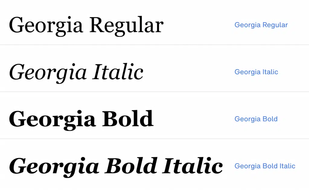
Designed in 1993 by British creative Matthew Carter, Georgia is a stellar serif that’s incredibly legible in both large and small sizes.
Furthermore, the typeface is motivated by Scotch Roman designs popular in an earlier century.
Today, this pick comes in multiple variants, allowing you to select which thickness best suits your projects.
All things considered, this is arguably one of our favorites in the category as it works well in both headlines and paragraphs, and is one of the easiest fonts to read.
2. Helvetica
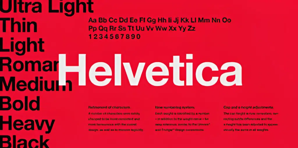
Helvetica, originally known as Neue Haas Grotesk, is a popular sans-serif typeface that was created in 1957.
Created by the Haas Type Foundry of Switzerland, its delivery was intended to ride the trend numerous European graphic designers began: to create a functional serif that was easy to read, could be applied to a variety of reading materials, and lacked any inherent meaning.
Today, the Helvetica is among the most popular fonts for both designers and non-creatives.
If you’re looking for a widely celebrated serif that’s tested and proven, you can’t go wrong with this one.
Do consider Helvetica eText for digital applications.
3. JUST Sans® Clean Modern Minimal Geometric Typeface
JUST Sans (get 2 free weights here) is a highly legible typeface with endearing, modernist warmth, geometric legibility, and a distinctive friendly bite.
Designed as a professional modern geometric sans serif, JUST Sans is both serious and friendly, neutral but warmly expressive, technical but not overt, and familiar but unique enough to stand on its own.
With open-airy characters and a generous width, JUST Sans has an elegant contemporary feel, with sharp angled terminals that give it grip and make it so expressively endearing.
For lovers of modern sans serif fonts who are looking for something a tad more warm, open & expressive, JUST Sans is for you.
4. Lucida Grande
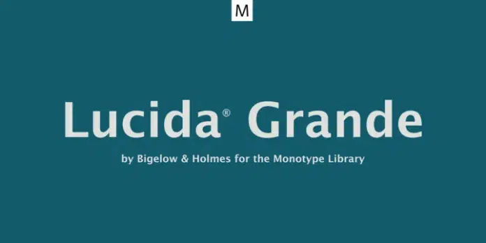
Elegant, refined, and reliable – this Monotype creation is indeed one-of-a-kind.
With its distinctive modern and contemporary flair, Lucida Grande breaks the mold of traditional sans-serif typefaces.
This incredible humanist font is crafted with a passion for innovation and an eye for detail, resulting in a visually stunning lettering style.
Featuring razor-sharp edges, large x-height, and space-saving economy, Lucida Grande truly fits the post’s theme.
Its easy reading qualities make it legible for screen and printing displays even down to small sizes.
From branding and logos to blog designs, stationery, books – even greeting cards – this gem will add a touch of class no matter where it is displayed.
We particularly appreciated the font’s extensive range of weights from Black to Thin with matching italics. Each style supported the W1G character set and had 500+ glyphs.
And let’s not forget about the included Greek, Latin, and Cyrillic alphabets, ensuring compatibility with local and international designs.
The only drawback for us was Lucida’s availability in a single OTF format.
But if you can work around that, then this superfamily is perfect for you.
5. Gilmer
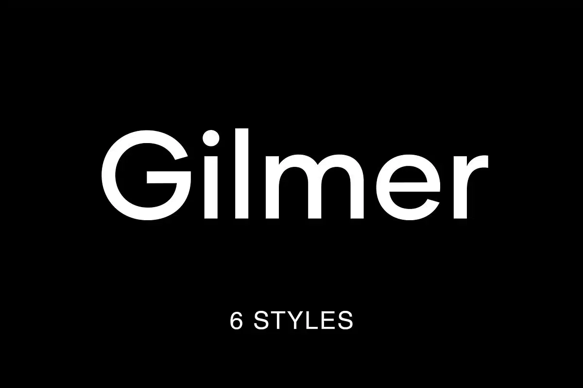
Gilmer is a sans-serif font characterized by a fresh style of typography combined with symmetrical letterforms and smooth edges.
We liked how it accurately mimics the 20th-century neo-grotesk fonts while being incredibly easy on the eyes, all thanks to its condensed spacing.
Our favorite part was its generous collection of six fonts.
These flexible styles, Opentype features, and precise kerning made Gilmer fit for forward-thinking and innovative projects.
Gilmer works best when paired with magazines, posters, websites, and business documents.
The font promises to get the job done and keep your project readable while allowing your creativity to shine through.
We were also glad to find out about the font’s availability in OTF and Webfont format, along with a remarkable 432 glyph set and multilingual support.
These features enhanced the font’s versatility and made it an excellent choice for long-form content in all languages.
The only concern we have about Gilmer is how it looks out of place on works related to the fashion and cosmetic industry.
But, if you are okay with a typeface that aligns more towards the mundane side, give Gilmer a shot.
6. Addington
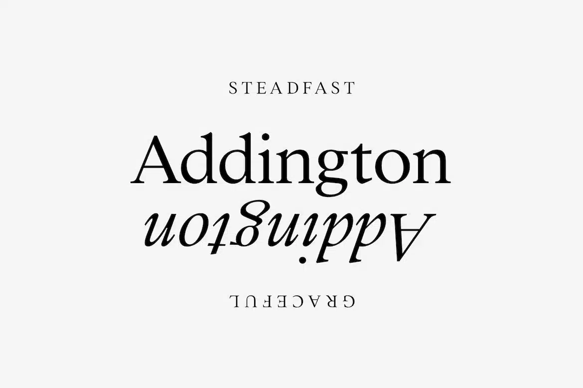
At first glance, Addingtonmay seem a little too serious, but dig deeper, and you’ll discover a world full of detail and character that brings it to life.
With its thoughtful and attentive design, this font proves that practicality can be beautiful. It’s nice and clear, with consistent stroke weight, width, and spacing.
Simultaneously, its high height allows one to read it more easily on small screens. Despite its intricate detailing, Addington remains functional and versatile, perfect for various projects.
Whether you are creating a text-heavy brochure or an on-the-face poster, this font works just fine.
You can rest assured knowing that it’ll quickly adapt to suit any needs, and that too without compromising style.
What’s more, Addington is loaded with plenty of OpenType features, from alternates and fractions to stylistic sets, giving designers greater flexibility in their work.
We were particularly fond of its seven weights, which were straightforward to use and allowed us to create unique, custom designs.
Free updates, additions, and fixes are also included. So, what’s the wait? Download Addington and watch it take your creations to new heights.
7. Augustine
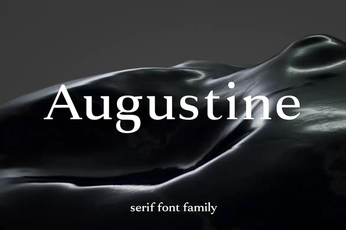
Augustineis more than just an average serif typeface – it’s a masterpiece designed by expert designers with their utmost creativity and skill.
Every letter is carefully crafted to ensure your text looks extraordinary and leaves a solid impression. Augustine possesses meticulous strokes, elegant curves, and unique charm for optimum aesthetic appeal.
The beauty of this font lies in its ability to exude sophistication through each letter. This makes it a trusty go-to for fashion magazines, jewelry, and any other high-end branding project that requires a touch of class.
What’s impressive about Augustine is its perfect balance of spacing and proportion that ensures maximum readability and clarity, satisfying the highest standards of excellence.
This legible font will ensure consistency throughout every sentence you write, and that’s what compelled us to include it in our line-up.
Augustine’s features include dual-case letters, Latin characters, accents, punctuation, numbers, and special symbols.
The pack comes with six fonts that are available in OTF format.
So, if you’re a business owner or a designer looking for a font to take your branding to the next level, Augustine is the way to go!
8. Bergen Sans
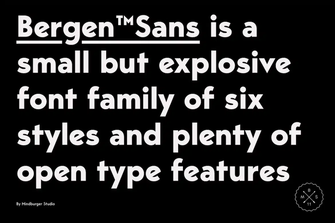
If you’re looking for a sleek and contemporary-style sans-serif to give your designs an edge, Berger Sans fits the bill.
Carrying stylized Scandinavian geometry, partnered with explosive Bauhaus-type aesthetics, this piece will make a trustworthy companion in any designer’s arsenal.
This “small but mighty” font family has unlimited capabilities, and OpenType features to help bring your dream layouts into reality.
It includes six different styles, alternates, ligatures, and support for multiple languages.
As professional creatives, we admired Berger Sans’s clean lines that looked equally eye-catching and legible at all size points, providing the audience with a seamless reading experience and a better appreciation of your content.
This workhorse is one of the best for general-purpose reading online, in books, posters, banners, and anything in the digital space.
Our only complaint about the font is that it’s finicky to use and may require some practice to get the complete hang of it.
Fret not, as user-friendly alternatives like Osande TXT are there to save the day in such situations.
To sum up, Berger Sans is a great visual solution that will impress your guests and leave them wanting to reread your content again and again.
Go forth and use it today!
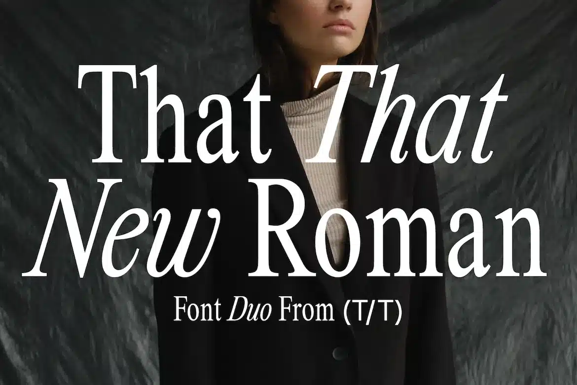
9. That That New Roman – Legible Display Font
That That New Roman is a modern 90’s inspired font with an elegant spin.
It hits all the right notes of retro vibes and nostalgia while remaining contemporary.
We are big fans of this font’s condensed nature, which makes it perfect for saying a lot without taking up any extra space.
Throw it on posters, magazines, branding, blogs, and anywhere your heart desires to introduce more personality while minimizing eye strain.
From the sleek look of the characters to its triangular edges and points, That That New Roman is all about harmonious blending.
Each letter complements the other, creating a polished, cohesive look that speaks volumes about your design expertise.
And luckily, this one is not just a pretty face; it’s also incredibly versatile. The font’s features include upper and lower cases, numbers, and punctuation.
This multilingual font functions on both Mac and PC and comes with free updates.
However, we understand that the attenuated letterforms of That That New Roman may not be a good match for primary, attention-demanding texts.
But if you’re not bothered by this slight restriction, this powerhouse is your best choice.
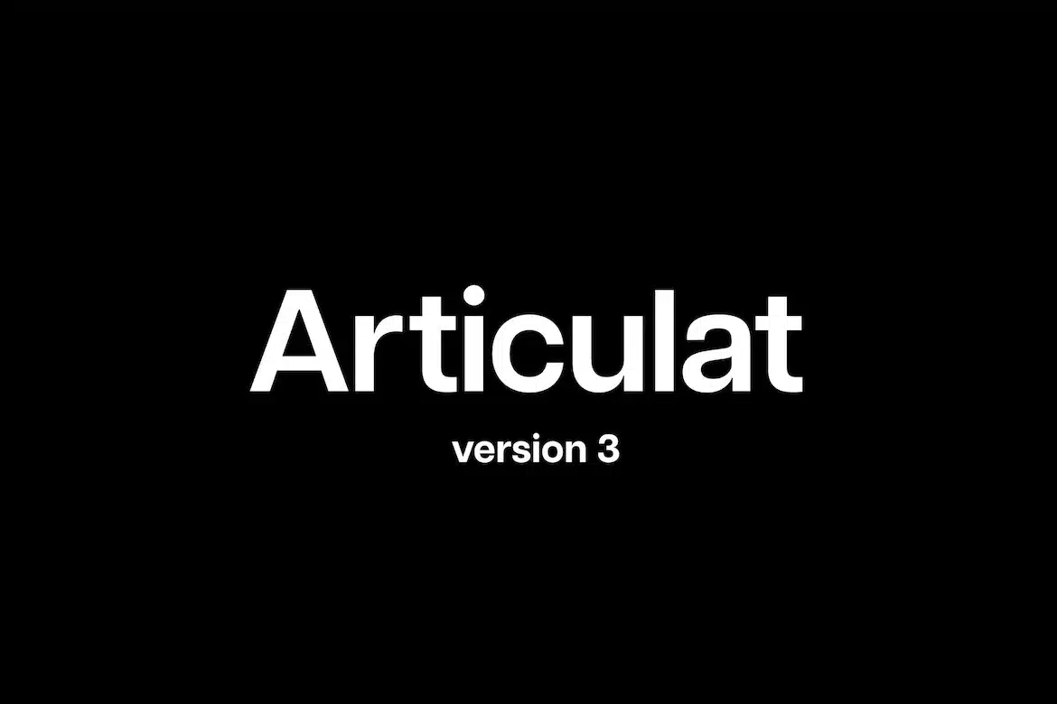
10. Articulat
Articulat by Connary is a new take on the modernist Swiss style.
Oozing with strength and charisma, it is built from scratch to be strong, impactful, and well-spoken.
The bold letterforms and delicate curves account for the font’s timeless position.
When the regular sans-serif or script does not feel relevant, Articulat still remains fresh and cutting-edge.
Use it for a hit of mid-century clarity – reimagined for today.
Articulat’s “no-frill” attitude makes it suitable for many applications, including logos, insignia, jumbo screens, or any project where you wish to deliver your message loud and clear.
Also included are ten weights and obliques and numerous OpenType features, such as ligatures and alternate letterforms, that make the font equally functional.
Free updates and free additions are also available. Bear in mind that Articulat does not come in TTF or WOFF format, making it fall back in terms of versatility.
Worry not; swapping it with a similar typeface like Proda Sans will do the trick.
All in all, Articulat is a must-have legible font to showcase your expertise and creativity in your design projects.
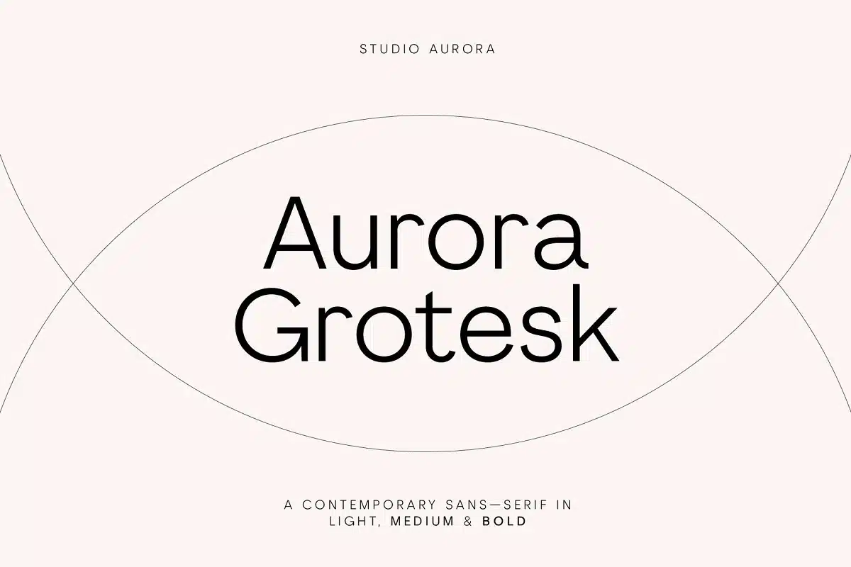
11. Aurora Grotesk
Meet Aurora Grotesk – a gorgeous typeface for captivating your viewer’s attention and evoking strong admiration and awe.
This Creative Market offering is crafted with the utmost finesse to amplify its beauty while maintaining readability.
Every line, every stroke, and every curve is etched with the same level of artistry and precision to ensure it’s unobtrusive, providing easy-to-read body text that won’t detract from other aspects of your design.
We liked the font’s three weights (light, medium, and bold), which were super fun to layer over one another and allowed us to tailor each project just how we wanted.
Credited to its ability to create an image of exclusivity and luxury, Aurora Grotesk is ideal for stamping onto high-end projects such as advertising, fashion, blog headers, and branding to make a lasting impression.
This font supports several languages. Its other prominent features are dual-case letters, standard and discretionary ligatures, and alternate glyphs.
You can run this typeface on Mac as well as PC, and it’s also available as a web font.
So whether you’re working on a print or digital project, you can rely on Aurora Grotesk to look great in today’s multiplatform design landscape.
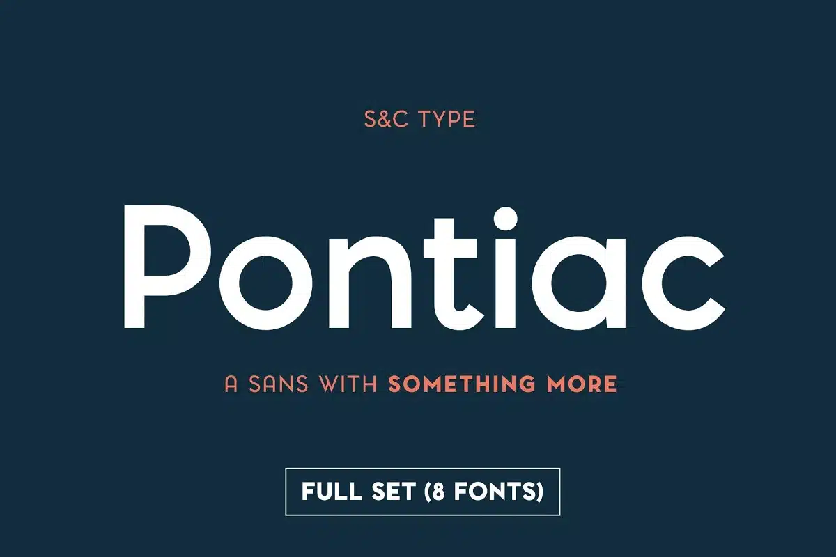
12. Pontiac
Who says that the most readable fonts must always be formal and no-nonsense? Meet Pontiac– a sans-serif script that’s loaded with creative, distinctive features.
Designed by French artists, Pontiac is the perfect image of a warm, welcoming, and functional typeface.
It contains handsome, sleek, and geometric letters that draw the readers in and leave a lasting impression on their minds.
We also liked how the font supported standard OpenType features, giving us greater creative control over our projects.
Additionally, our design team was left awe-struck by the generous eight-stylistic sets, which managed to look good on everything!
Whether working on a book cover, magazine layout, or social media advertising, you can always trust Pontiac to convey the right emotions at the right time.
The font is also available in an innovative inline Art Deco version. While there is much to like about Pontiac, our only problem is the lack of multilingual support for international users.
Alternatives like Novaletra Sans will surely help in such instances.
But, as long as you are looking for an English-based legible font, Pontiac will never disappoint.
Use it anywhere to reveal your imagination and express your artistic flair.
13. Sofia Pro
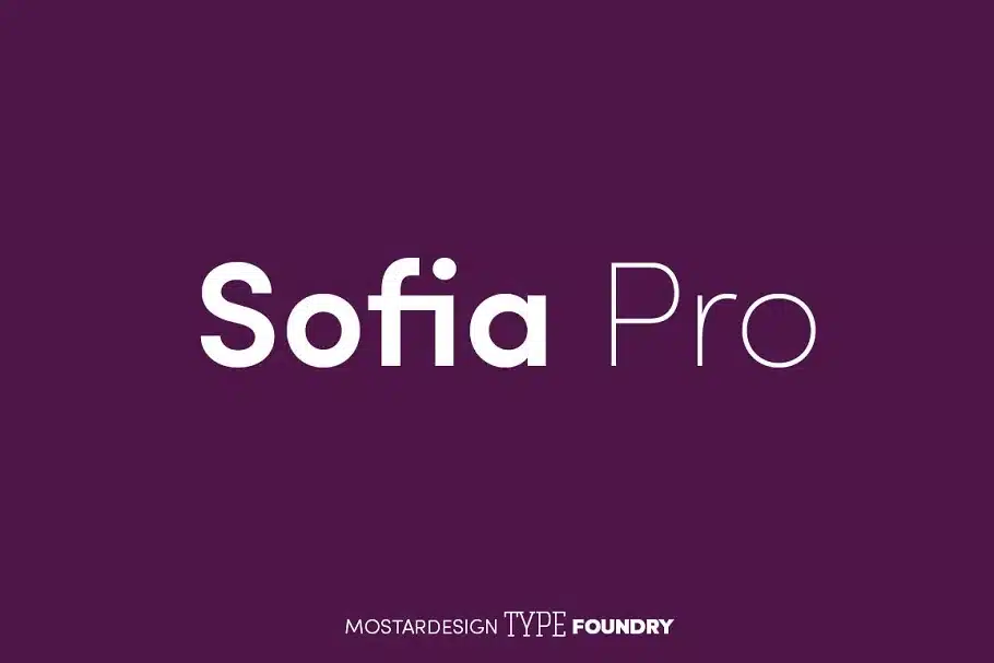
Introducing Sofia Pro, the perfect solution for designers who like the look of serif fonts but want to make sure that their small prints remain neat and readable.
Sofia Pro was initially crafted in 2009 but then redesigned with an enhanced touch of modernism and elegance in 2012.
It features slim, tall, geometric letters with rounded corners for a friendly and approachable look. The most admirable aspect of Sofia Pro for us was its generous 2500 glyph panels and support for more than 130 languages.
The font also has powerful OpenType features, including old-style figures, tabular figures, case sensitivity, and everything else you need to create a discriminating typography.
We particularly enjoyed trying out its eight styles on multiple design templates.
The font also comes in soft, condensed, and rough versions for better compatibility with different themes.
Whether it is for marketing material, signage, letterhead, business cards, or blog websites, Sofia Pro promises to make your brand stand out wherever you go.
Just make sure to download an OpenType-savvy program since this is the only format it is available in.
14. Quatera
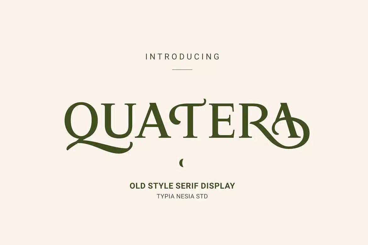
Quaterais an old-school serif typeface providing easy-to-read body text that won’t overshadow other components of your project.
The font features luxurious, formal lettering with ornamental edges.
We particularly liked how Quatera included basic as well as title-sized characters, numerals, and punctuations that worked well as both display and secondary text.
Another thing we adored about Quatera was how it’s purposefully crafted to infuse personality in your work, all thanks to its diverse collection of ligatures and alternates.
The font also supports various accents for a better user experience.
We used Quatera for designing logos, boutique branding, invitation cards, cosmetic packaging, home decor, and everything else that needed classic feminine energy.
Suffice it to say; the results turned out amazing every time. However, we understand that this font might not go well with certain business-related projects.
In such cases, keep an eye on unobtrusive typefaces like Arizona.
But if you are looking for the easiest font to read for the elderly and kids alike, there’s no better option than Quatera.
Endearing, sweet, and incredibly flexible, what’s more to ask for?
15. TT Norms Pro
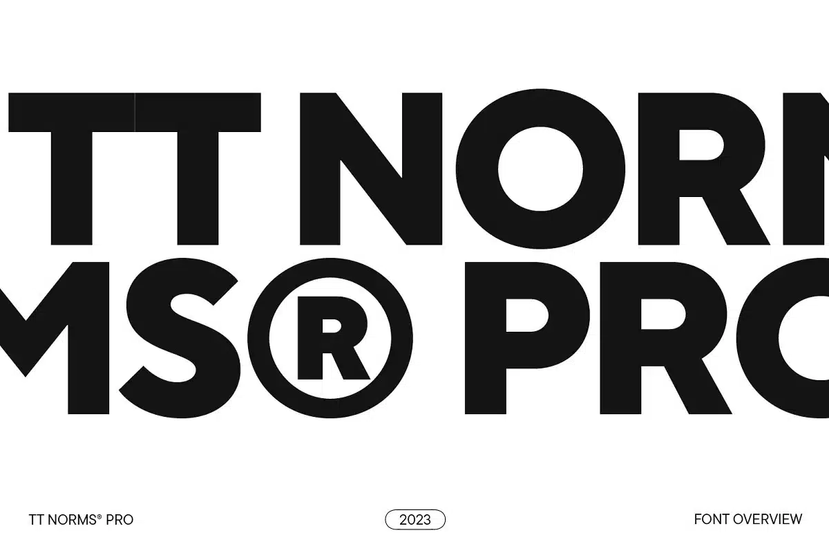
Next up, we have the TypeType studio bestseller, TT Norms Pro typeface.
It is a highly functional, basic, yet friendly font that has been incorporated by giants such as Cartoon Network, CSN, CBSN, and many other big names.
This sans-serif font has a bold and dominating typography style that will make your designs jump right off the page.
We also appreciated how it is available in up to 22 compact styles and five widths, making it the easiest font to read in small print and on screen.
We loved using it for projects related to the automotive industry, banking systems, clothing brands, and social media advertising.
Another aspect that left us starstruck was TT Norms Pro’s extraordinary OpenType features, including 1600+ glyphs and support for more than 275 languages.
Although some may find TT Norms Pro slightly tricky to use at first, yet it stays at the top of our list of the best legible fonts, especially for long reads.
Download it right now and give it a shot yourself!
16. Maine
Are you a classic literature enthusiast who’s on the hunt for a bookish, antique typeface?
If yes, then we have got just the right product for you!
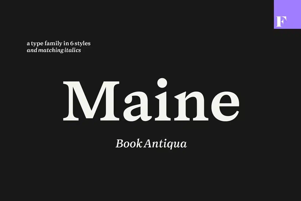
Meet Maine, inspired by ancient times and belted with a polished, gloomy outlook. The font consists of straightforward, distinct characters with a high x-height for easy readability even from a distance afar.
Our creative team was pleased to learn about Maine’s availability in six different styles and matching italics for each set.
Choose between variations of light, regular and bold outlooks depending on what goes best with the theme of your artwork.
We experimented with Maine in editorials, books, newspapers, blog posts, business cards, and product descriptions and found it to be highly adaptable in most contexts.
However, what could have made Maine even better was if it came with support for more than one file format and OpenType features.
Regardless, Maine does a commendable job at portraying a dignified, no-nonsense look in various designs without looking too crowded or incomprehensible.
Get your hands on this font and let it transform your mediocre projects into literal masterpieces.
17. Kontora
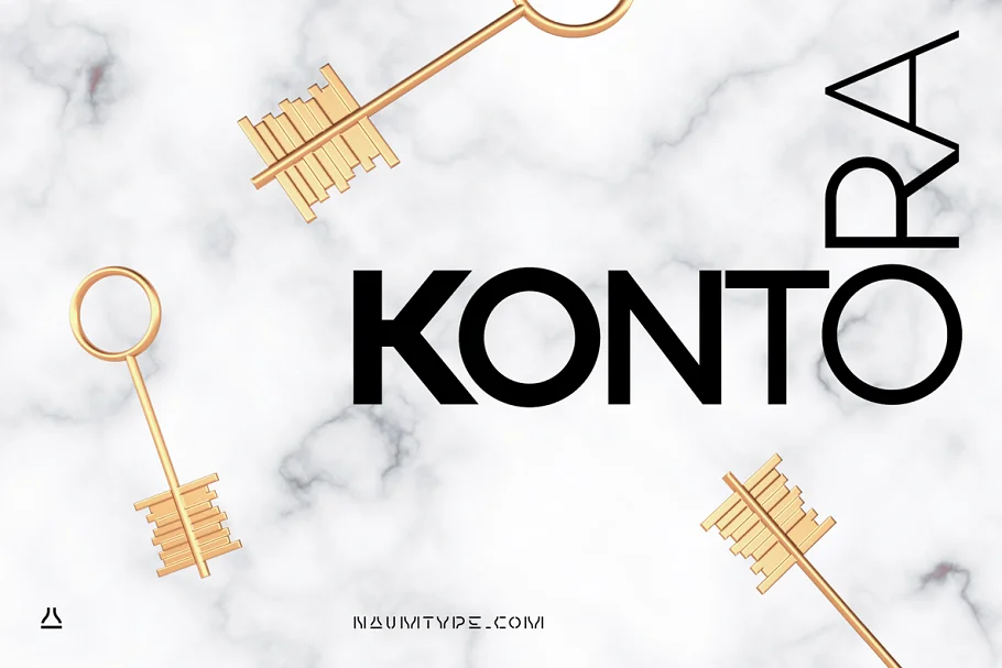
Kontora is an elegant and universal geometric sans font. Its design is inspired by early 20th-Century fonts like Futura or Akzidenz Grotesk.
This typeface has a minimum decoration, and it’s in proper proportions that make it easy-to-read on any device while also having some retro constructivist aesthetic strokes on letters like A and G with high shoulders that make them square in shape with rounded tops, which give them balance.
The first version of Kontora had a set of stylistic changes; however, the second version contains 9 weights, 590 glyphs, 7528 kerning pairs, ligatures, multilingual support, and availability in OTF, and WOFF file format.
Legible Fonts FAQ
What is the best font to read online?
Helvetica is a reliable option for online reading. This is because of its clean appearance and defined shape that lines up evenly with the pixels. As a plus, it doesn’t have any confusing embellishments and, therefore, prevents any distraction, making it much easier for the reader to follow along the line.
What is the best font for reading on paper?
Garamond is a strong candidate for books, magazines, and other printed materials. It’s because it has a large x-height, meaning the lowercase characters are taller than typical fonts, making it much easier to distinguish between them. Moreover, the strokes of each letter are relatively thin, which minimizes the chances of them blurring together when printed in small sizes.
What is the best font for mobile reading?
Times New Roman has been one of the most favored typefaces on Windows devices. It is also a popular choice for mobile reading due to its open apertures, tall corpus size, and ample kerning that helps the readers speed up and comprehend the words as they go over them.
What is the best font for websites?
Georgia is a classic serif font that has been designed explicitly for use on blogs and websites. Its crisp appearance and professional undertones make it capable of easily conveying information while looking sharp on the screen. Therefore, if you aim to convey reliability through your website and leave a solid impression on the audience, Georgia is the way to go.
What is the easiest font to read for dyslexia?
Open Dyslexic is a free font designed to mitigate some of the common reading errors caused by dyslexia. Each letter is individually shaped, with subtle changes to its appearance, to avoid confusion. Also included are longer ascenders and descenders, large openings, and higher x-height to ensure a smooth reading pace.
What is the easiest font to read for speech?
Times New Roman is the ideal choice for all sorts of speeches and presentations. Its open letterforms and moderately large x-height help ensure that your content is visible from the podium and is easy to skim through, supporting smooth and successful delivery.
What is the best font for memorization?
Specialists at a Melbourne university have crafted Sans Forgetica to assist in the memorization of any text specifically. Its backwards-slanted and wide-spaced style of lettering is quick to read and memorize and recall at later times. The font’s distinctive nature helps enhance students’ ability to retain critical information.
What is the easiest font to read on screen?
The best font to read on screen is one that is simple, clean, and discreet.Georgia checks all these boxes and has the ability to stay legible even in low-resolution displays and when scaled down. It is the perfect font for prolonged reading without any distorted, blurry vision.
What are the best fonts for ebooks?
Verdana‘s smooth and straightforward characters are comfortable for the eye and, therefore, the best choice for ebooks. Its sans-serif lettering looks clear and promising on small displays, all thanks to the carefully crafted pixel patterns. Additionally, the font has larger lowercase letters that boost the readability even more.
Easiest to Read Fonts Summary
Selecting the right font for readability and accessibility is a crucial aspect of content design.
By considering factors such as user research, letter differentiation, font weight, and shape, you can make informed decisions to enhance legibility and improve the overall user experience. Remember to test and evaluate fonts with your target audience to ensure optimal readability for all users.
With careful font selection, you can create content that is accessible and easy to read, allowing your message to resonate effectively with your audience.
