
Are you on the lookout for all of the best fonts for apps? If so, then we’ve got you covered!
App fonts have a significant impact on the user experience. Fonts are without a doubt one of the most important aspects of user experience. The UI design may or may not be affected by it.

You can immediately say goodbye to your users if they are unable to read your content. Because of this, even if you only have a basic understanding of typography, you can choose the best fonts for apps on your own.
The selection of the appropriate font will have a significant impact on the overall user experience of your mobile applications.
Legibility is everything.
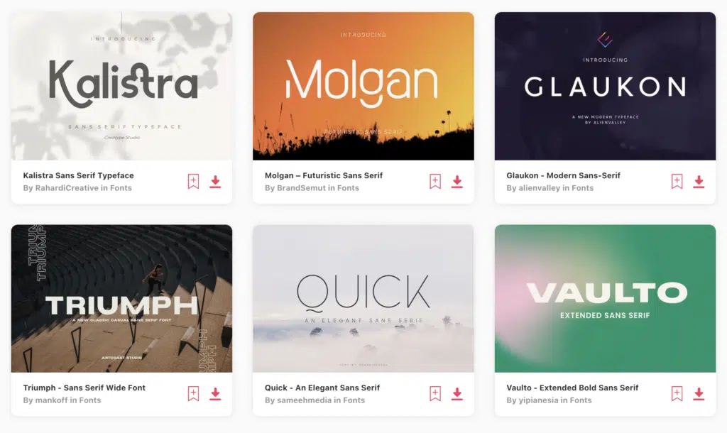
Top 10+ Best Fonts for Apps (Mobile & Web UX/UI) in 2024
- JUST Sans
- Grotesco
- TT Wellingtons
- Ageo
- Visby
- Davish
- Gabiant Sans Serif Font Family
- Albori Sans-Serif
- Vancouver – Gothic Typeface + WebFonts
- Shubbak
For the complete list, scroll on!
BEST FONTS FOR APPS – UNLIMITED DOWNLOADS: 50 Million+ Fonts & Design Assets
Download all the best fonts for apps you need and many other design elements, available for a monthly subscription by subscribing to Envato Elements. The subscription costs $16.50 per month and gives you unlimited access to a massive and growing library of over 50 million items that can be downloaded as often as you need (stock effect & element packs too)!
Top Tips for Choosing Fonts for Apps
1. Why some fonts are better than others for app fonts
There are a variety of reasons why some fonts are better than others for app fonts. First things first, some fonts are easier to read than others, which makes them better for apps that help users easily use and navigate the app’s features.
Another reason is that a font has good spacing between the letters, simple shapes, and overall resolution. Because of this, they work better on a variety of screen sizes, so no matter what device the app is used on, the fonts remain clear, neat, and easy to read.
Most importantly, some fonts just naturally match the overall theme and design of certain apps. For example, a game might use a fun and playful font, while a professional app might use a more conventional font. In a nutshell, some fonts simply outperform others when it comes to app fonts because they both look good and are simple to use.
2. How to choose a font for an App
There are a few things that can make a font better for one app than another. Some of the most crucial things to think about are as follows:
Legibility: Select a family of fonts that is simple to read on a screen. It is necessary for the design of the app. Typically, fonts with good spacing between letters and words and clear, straightforward shapes are easier to read.
Size: App fonts must be legible at all sizes, even the smallest ones. While some fonts become less legible as their size decreases, others remain clear and readable.
Display resolution: On screens with low resolution, some fonts may appear pixelated or blurry, making them less suitable for app design.
Style: The font’s style ought to complement the app’s overall design. A fun and playful app, for instance, might use a font that is more whimsical, whereas a professional app might use a font that is more conventional.
Stacking time: An app’s loading time may be impacted by the font file size. While smaller fonts can help the app load more quickly, fonts that are too large may slow the app down.
3. Serif versus Sans Serif
The selection of a serif or sans-serif font for an application is determined by a variety of factors, including the app’s content and overall design style. The following factors should be taken into account when designing apps for both serif and sans-serif fonts:
Serifs:
- Serif fonts give the impression of being more formal and traditional because they have small lines at the end of each letter’s stroke.
- They are typically used in print materials like “spapers and books because they are easy to read and produce a classic, elegant appearance.
- Serif fonts can be used in app design for headlines, subheadings, and body copy, especially for apps that deal with formal or serious topics like finance or “s.
Sans Serif Fonts:
- Sans-serif fonts lack the tiny lines at the end of each letter’s stroke, giving them a more minimalist and contemporary appearance.
- They are typically used in digital materials like apps and websites because they are easier to read on screens and produce a clean, simple appearance.
- Sans-serif fonts can be used in app design for headlines, subheadings, and body copy, especially for apps that talk about casual or fun topics like gaming or social media.
In general, both serif and sans-serif fonts can be used effectively in app design, depending on the overall style and tone of the app.
However, sans-serif fonts are often preferred for digital materials, as they are easier to read on screens and create a modern, streamlined look. Ultimately, the choice between serif and sans-serif fonts should be based on the specific needs and goals of the app design.
28+ Best Fonts for Apps (Mobile & Web UX/UI) in 2023
1. JUST Sans
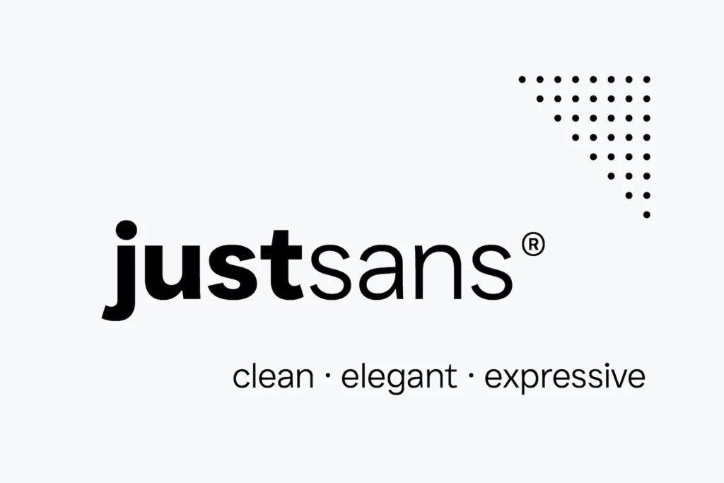
JUST Sans is a font that can do it all! It’s a modern, geometric sans-serif that strikes the perfect balance between being serious and friendly. It has a simple, minimal design that is still warm and expressive, making it unique and stand out from the crowd. One of the things that makes JUST Sans so special is its versatile nature.
With 7 different weights and complete Latin extended language support, it’s perfect for anything from logos and branding to UI, signage, packaging, and more. What’s more, JUST Sans has been specifically designed for the web, with hand-hinted web fonts that ensure clear and legible text on screens. And if you’re a lover of beautiful stylistic numbers, JUST Sans won’t disappoint.
2. Grotesco
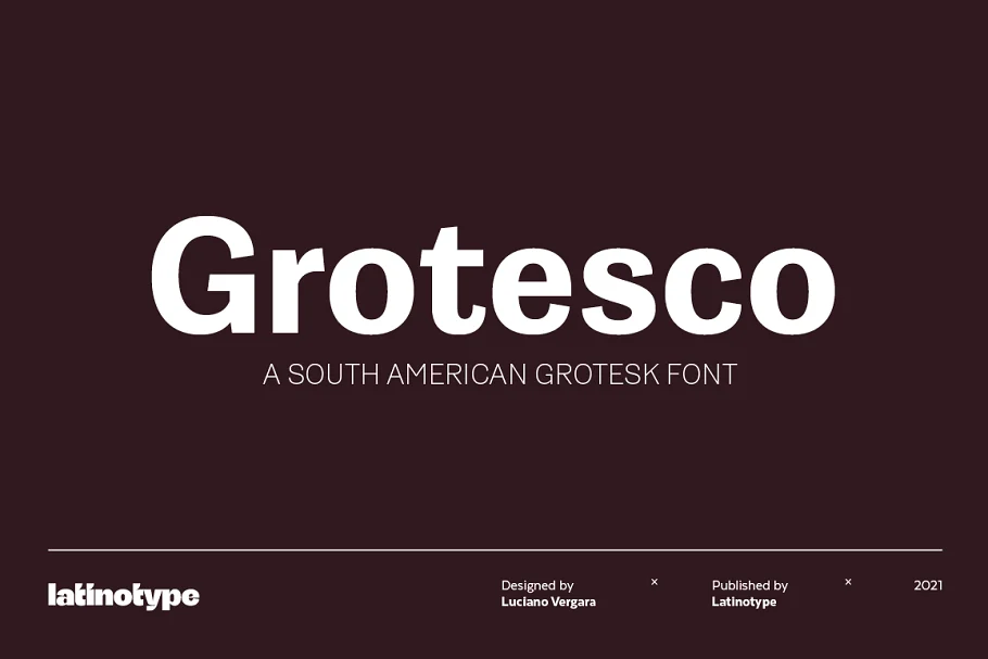
This South American grotesk font is a perfect fusion of functionality and style. It combines the classic design of an American grotesk typeface with the unique Latino rhythm and flair, resulting in a font that’s both modern and expressive.
While it can be used in serious applications, what really sets Grotesco apart are its two alternate sets, which allow you to bring a touch of personality and flavor to your logos, brands, and advertising designs.
Whether you’re looking to create a bold statement or add a subtle touch of character, this versatile font is the perfect choice for your next design project.
3. TT Wellingtons
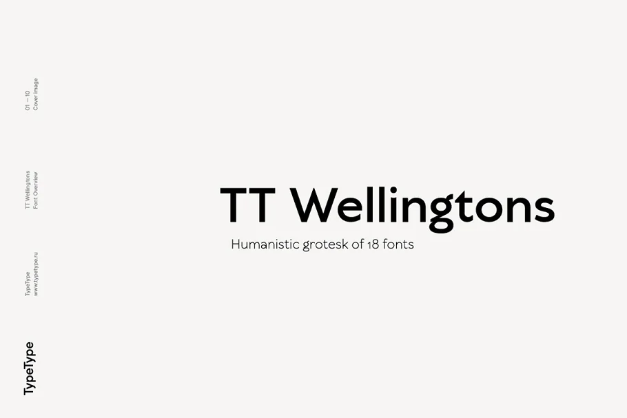
TT Wellingtons is a font that blends the style of English humanist sans-serifs from the early 1900s with modern geometric grotesques.
The goal was to keep the hand-written feel of the letters while simplifying the design to make it functional for today’s needs. With 9 weights and 9 true Italics, you have plenty of options to choose from.
The font even includes more than 20 ligatures, stylistic alternates, and other features to help you create a truly unique look.
Whether you prefer old style or lining figures, TT Wellingtons have got you covered, making it a great choice for your next design project!
4. Ageo
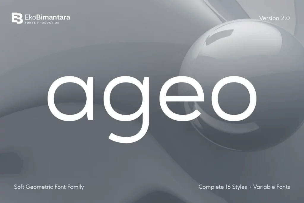
If you’re on the hunt for a soft and versatile font family, look no further than Ageo!
With 8 different weights ranging from Thin to Heavy, each with matching Italics, this font strikes the perfect balance between bauhaus and modern styles.
Ageo is both minimalist and elegant, with just the right amount of quirky charm to make it stand out from the crowd.
Whether you’re looking to create text or display content, Ageo is compatible with both. It’s perfect for headers, titles, posters, websites, brands, apps, and so much more.
No matter what type of design or creative project you’re working on, Ageo is sure to deliver a reading experience that is both easy and enjoyable!
5. Visby
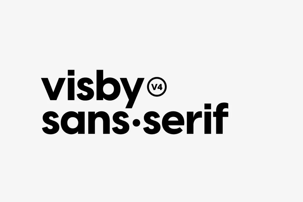
Visby® CF is a geometric typeface that draws inspiration from the stunning natural beauty of the Arctic.
With its mix of hard lines and smooth, rounded letterforms, this font strikes the perfect balance between friendly and authoritative. Its humanist nuances add a touch of warmth that will make your designs feel more inviting.
No matter what your project entails, Visby® CF is sure to help you create designs that are both sophisticated and charismatic.
6. Davish
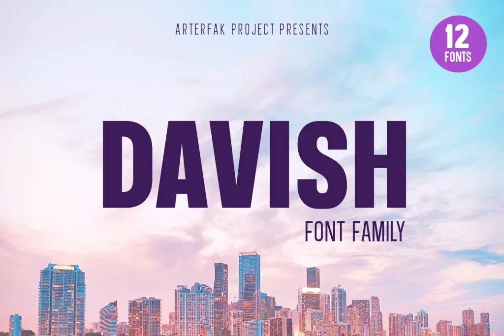
Davish Sans is a minimalist monoline font family that is sure to take your designs to the next level! This font family is carefully designed based on condensed height, and it has 7 different weights and 5 styles.
The Thin, Light, Normal, Medium and Bold styles are perfect for editorial design projects, including headlines, subheadlines, body copy, footnotes, and document layouts.
And don’t forget about the italic styles, which give you even more design options to choose from! But that’s not all—there are also Bold-Inline, Extra-Bold, Black, and Black Rounded styles, which are perfect for posters, brochures, magazines, branding projects, motion graphics, infographics, app design, and so much more.
7. Gabiant Sans Serif Font Family
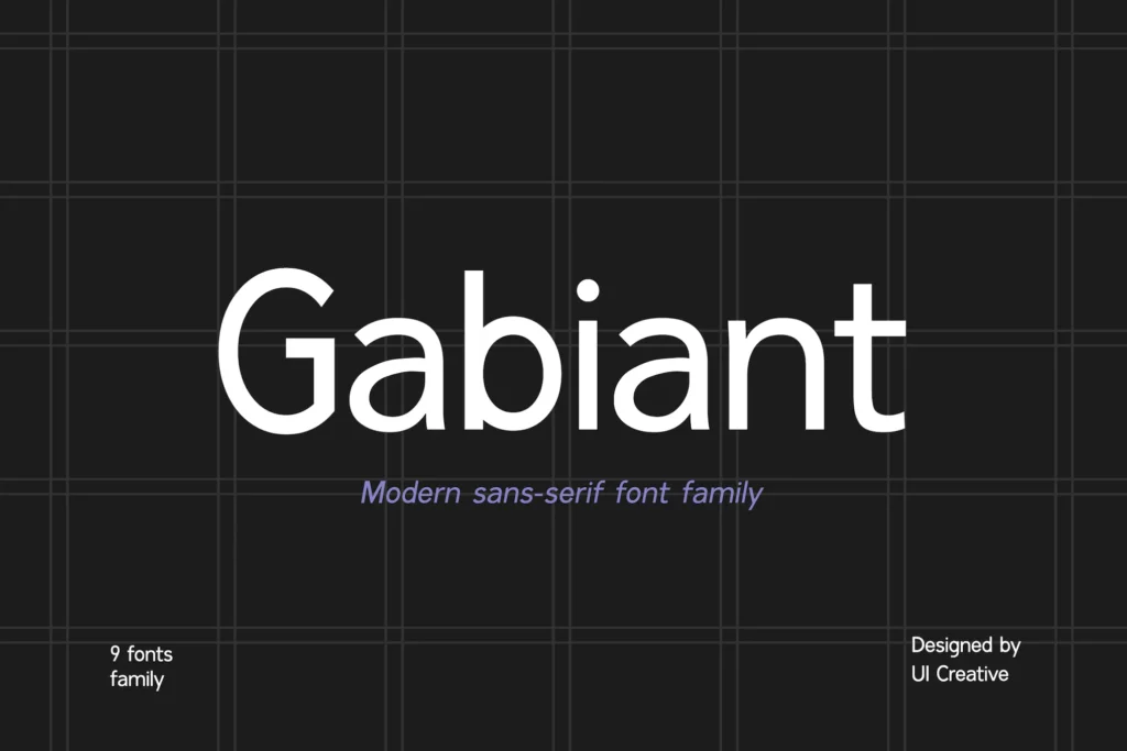
Gabiant Sans Serif Font Family is a stunning and contemporary font that exudes sophistication, elegance, and a modern touch.
With 9 different weights to choose from, this font is perfect for a diverse range of projects, including signatures, stationery, logos, weddings, typography quotes, magazine or book covers, website headers, clothing, branding, packaging design, and more.
It’s also a great choice for fashion-related branding or editorial design, as it effortlessly balances both masculine and feminine qualities.
8. Albori Sans-Serif
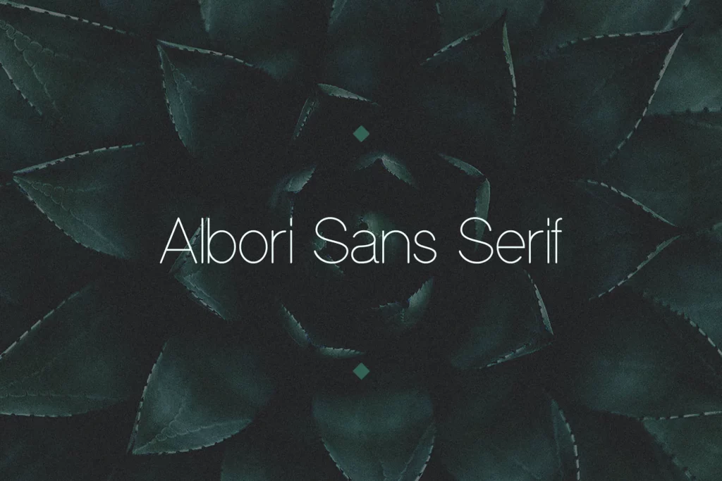
Albori is a 2015-designed family of contemporary OpenType fonts created with versatility and modernity in mind. This bundle packs a lot of personalities, mostly achieved by smooth curves and round corners. As a result, this font will do justice as an app font.
9. Vancouver – Gothic Typeface + WebFonts
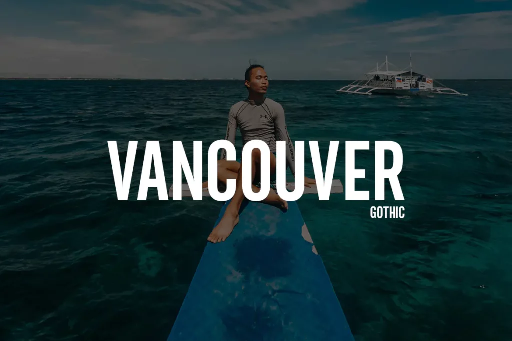
Designed by Webhance studio, the Vancouver typeface is a beautiful sans serif font that features legible uppercase and lowercase letters. Each character takes up equal space from the others, allowing your text to sport a cleaner and more cohesive look.
10. Shubbak
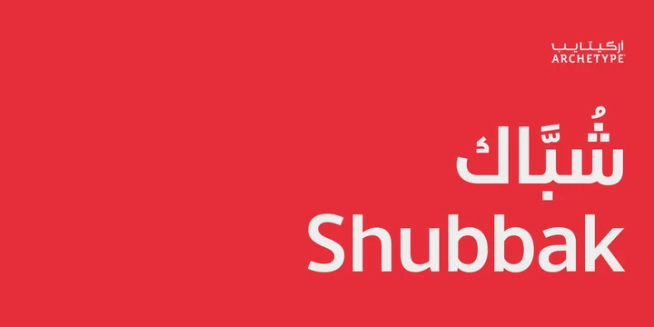
Shubbak, which means “window” in Arabic, is a typeface made of Arabic Sans (Kufic) that can be used with a wide range of Latin counterparts. In general, this bundle has a friendly appearance and is very adaptable when used with other well-known fonts.
11. ITC Avant Garde Gothic®
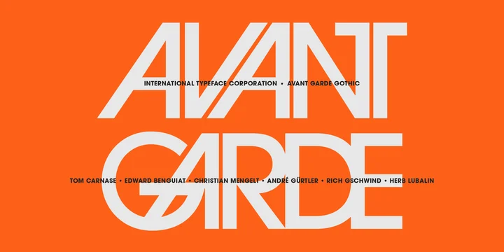
The Avant Garde magazine’s logo font serves as the basis for the ITC Avant Garde Gothic font family. An amusing fact: The idea for the logo and its companion headline typeface were created by Herb Lubalin. Tom Carnase, a partner in Lubalin’s design firm, collaborated with him to turn the concept into a full-fledged typeface.
12. Axiforma

Axiforma is loaded with Opentype features like old-style numbers, fractions, case-sensitive alternates, localized forms, stylistic sets, and Cyrillic alphabets (Bulgarian and Russian). Apart from fonts, use them for posters, social media marketing materials, advertising efforts, and so much more!
13. Neue Haas Unica™
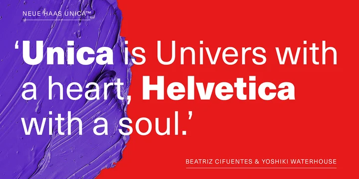
The Neue Haas UnicaTM family is a longer, rethought version of the Haas Unica® design, a Helvetica® alternative that nearly became a myth before it almost vanished. The design, which was created by an elite team of designers for the phototypesetting technology of the time and released by the Haas Type Foundry in 1980, has never been successfully updated for digital environments today.
14. Bergen Text
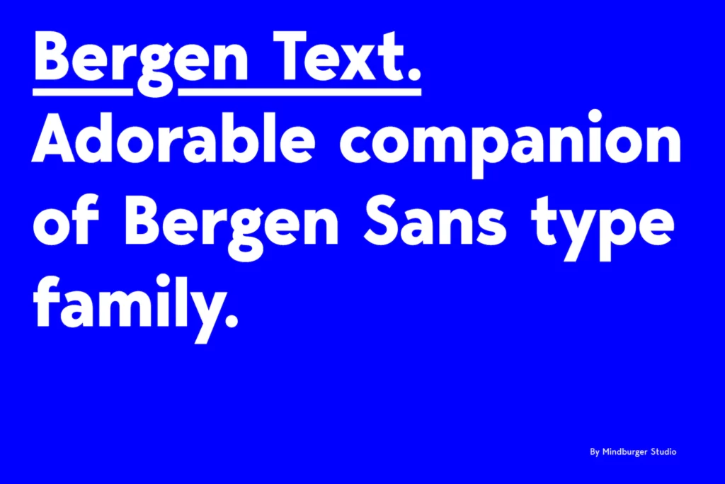
Bergen Text is Bergen Sans’ younger onscreen brother. This pick has perfect legibility and packs a sweet aesthetic personality. It’s been carefully designed to make reading easier, especially for smaller text sizes. The Bergen Text family includes six fonts, making it even more apt for applications.
15. Gotham®
The Gotham typeface takes its inspiration from the bold capital letters used in lithographed posters, enamel signs, and commercial facades throughout ” York City. Gotham is a sans serif font that shares many attributes of typography’s “geometric” genus.
In 2001, the typeface made its debut in GQ magazine, and it gained international attention in 2007 when it was used in Barack Obama’s presidential campaign. Gotham has become one of the most popular and influential typefaces of our time, even earning a place in the permanent collection of the Museum of Modern Art in ” York.
16. FF Meta®
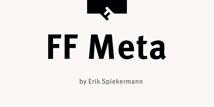
A versatile typeface family with 28 weights, FF Meta is available from Hairline to Black in both Condensed and Normal styles (including italics).
This font is perfect for a wide range of projects such as advertising, packaging, book text, editorial and publishing, logos, branding, and creative industries, as well as web and screen design.
With advanced typographical support, FF Meta offers ligatures, small capitals, alternate characters, case-sensitive forms, fractions, and super- and subscript characters.
It also includes a range of figure set options, including old-style and lining figures in both tabular and proportional widths. In addition to Latin-based languages, FF Meta also supports the Cyrillic, Greek, and Hebrew writing systems.
17. Avenir®
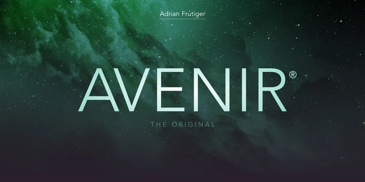
Avenir® is a font that takes inspiration from both the past and the future. It was created to be a modern take on the geometric sans serif fonts of the early 1900s while adding a touch of organic humanism.
Avenir is so versatile that it’s even used in airport signage at Dallas Fort Worth and Hong Kong international airports!
In fact, the city of Amsterdam even chose Avenir as its corporate typeface back in 2003. The original Avenir family has different weights to suit specific text needs. The book weight is great for body text, while the lightweight is perfect for captions and subheadings.
18. Brandon Grotesque
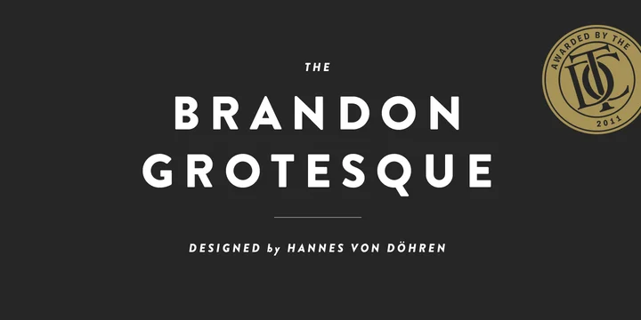
Brandon Grotesque is a sans-serif font family with six weights and matching italics. It’s based on geometric shapes that were all the rage in the 1920s and 30s, but with a modern twist for better legibility.
What’s cool about it is that it has a functional look but also a warm touch, making it perfect for a variety of design projects.
Whether you need something bold for display or something more subtle for longer text, Brandon Grotesque has got you covered. Plus, it’s equipped with an extended character set to support multiple languages.
19. Nexa

Nexa, the well-known geometric sans serif font, just got even better with an upgraded version that includes a brand ” weight (Extra Light) with matching italics, and a ” subfamily called Nexa Text that’s optimized for longer text.
In total, you’ll now have 9 weights and 36 fonts to choose from! And that’s not all—the glyph case now covers not just an improved Extended Latin but also a ” set of Cyrillic with adequate language localization.
Plus, you’ll have access to multiple OpenType features like case-sensitive forms and contextual and stylistic alternates to make your typography stand out.
Nexa also offers tabular figures and symbols, superiors and inferiors, numerators, and denominators, plus fractions. With its unique appearance and rich variety, Nexa is perfect for designs of all kinds and sizes!
20. Open Sans
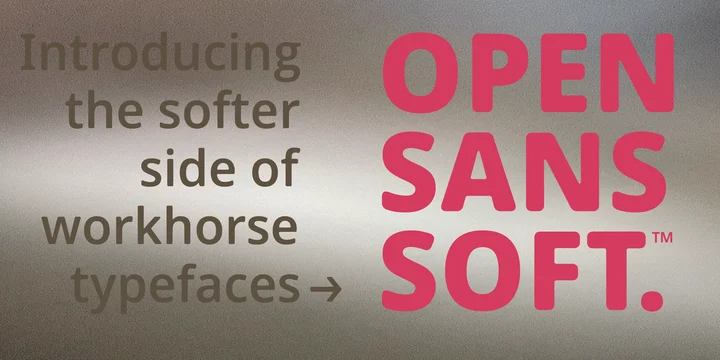
Open Sans is a charming and approachable font. With its smooth and rounded letter corners, Open Sans Soft brings a warm and welcoming touch to your written communications.
This design technique is also seen in other beloved fonts like Microsoft’s Calibri and Linotype’s DIN Next.
Open Sans Soft maintains the same tried and true letterforms and spacing as Open Sans, making it a perfect partner for all kinds of projects—from correspondence and headlines to branding, packaging, and interface design.
21. Sabon
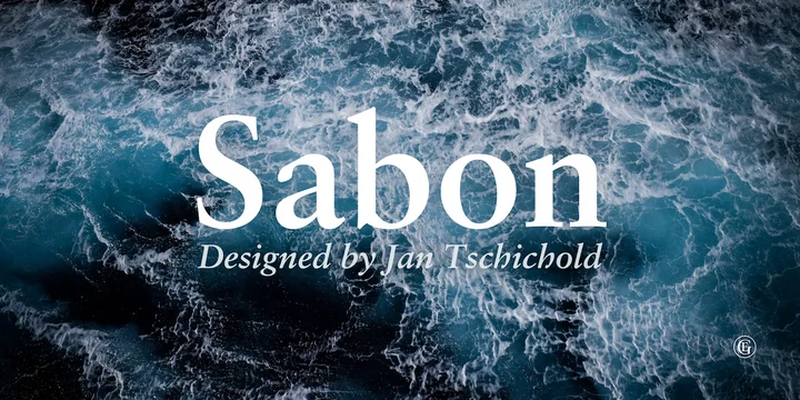
Sabon is known for its smooth texture and narrow italic style due to Linotype casting machines’ limitations.
It has become a favorite among typographers for setting book text, and Tschichold’s book typography is still world-famous today.
This font was designed to have a modern take on Claude Garamond’s classic Roman, with the goal of achieving text and technical composition uniformity.
22. VISIA Pro – Elegant Geometric Typeface + Web Fonts
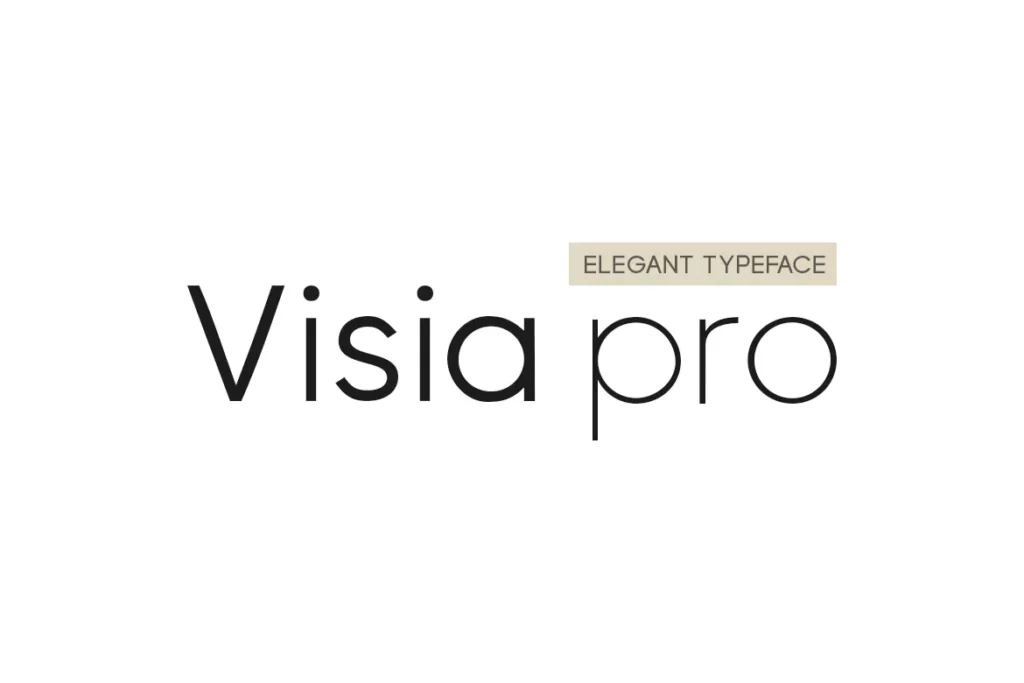
VISIA Pro is a Geometric sans serif typeface that is ideal for use in headlines, logos, branding, marketing graphics, corporate identities, web apps, and more! In addition, it comes with seven weights, each of which may be shown in italics.
23. Hank Rounded
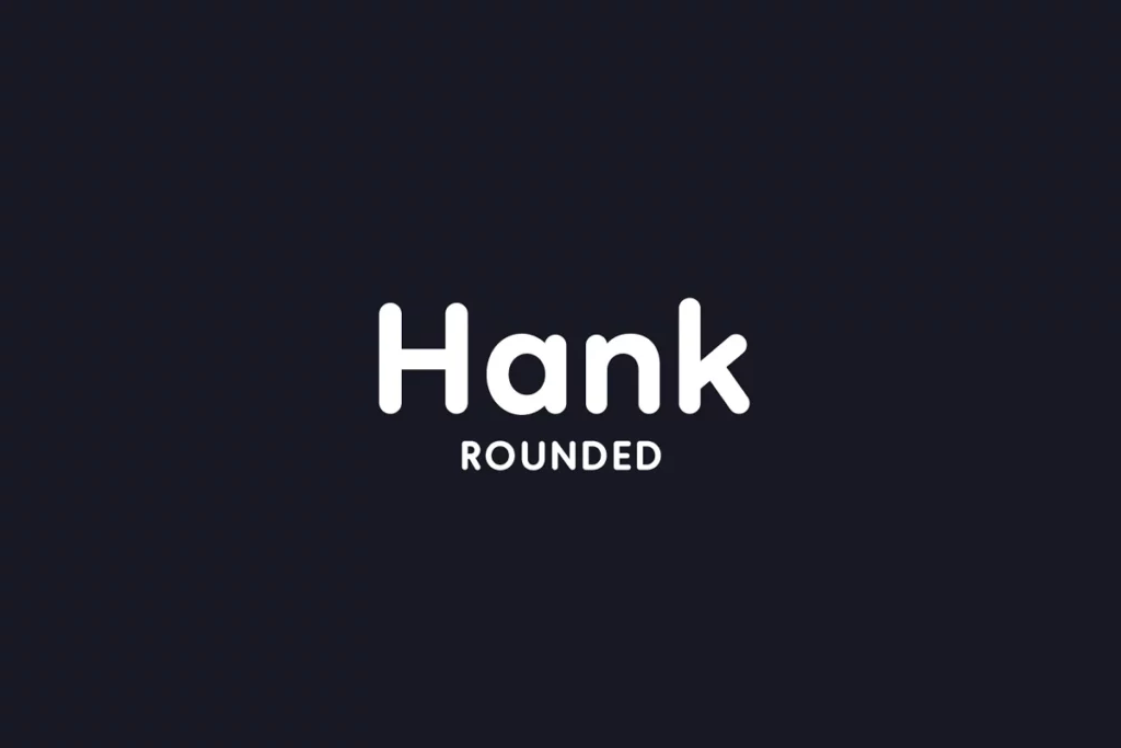
The semi-condensed sans serif Hank Rounded comes in four weights and is made of geometric shapes. Great for headlines, posters, and web applications, there are plenty of designs you can complete with this aesthetic.
24. Radian | A Geometric Sans Serif
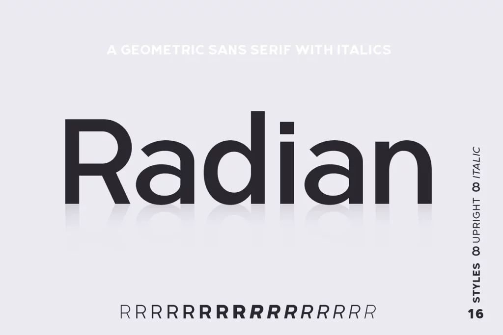
The geometric sans serif typeface Radian is available in 16 weights; Eight upright fonts and italics that match. Taking all of this into consideration, this bundle functions well as a display typeface and in smaller sizes for any graphic design project.
25. Gogh Font Family
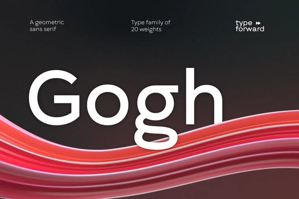
Without being overly distracting to the reader, Gogh blends evenly throughout a paragraph. However, it maintains its distinctive and rich character.
Open terminals, a generous x-height, easily recognizable glyph forms, and smooth text perception are all designed to make a block of text easily legible.
26. HAMLIN – Minimal Typeface + Web Font
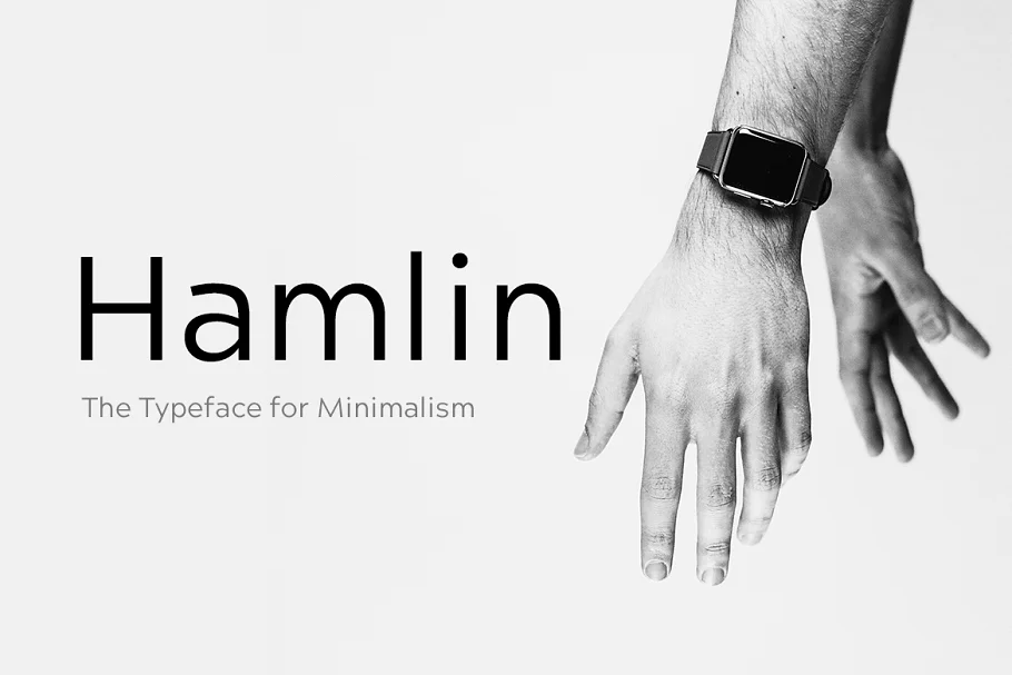
The modern Sans Serif typeface HAMLIN is devoted to the emerging design trend of minimalism. Its idea is based on some classic geometric fonts, but it has its own distinctiveness, depth, and personality. There are now four HAMLIN weights: Light, regular, bold, and extra bold.
27. Magallanes Condensed Font Family
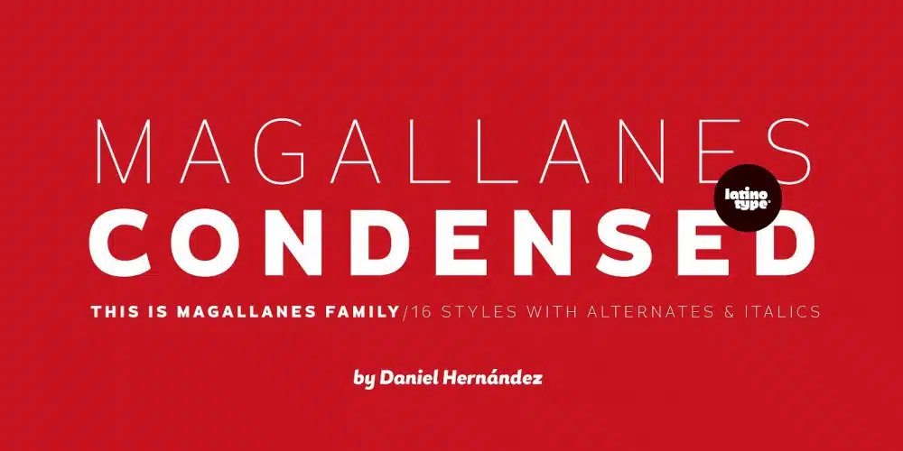
The calligraphic strokes of humanist typefaces can be seen in Magallanes‘ strokes and terminals. It comes in eight different styles, ranging from ultra-light to black, each of which has genuine italics. Additionally, alternative glyphs for more dynamic use are included with each weight.
28. Uniform Font Family
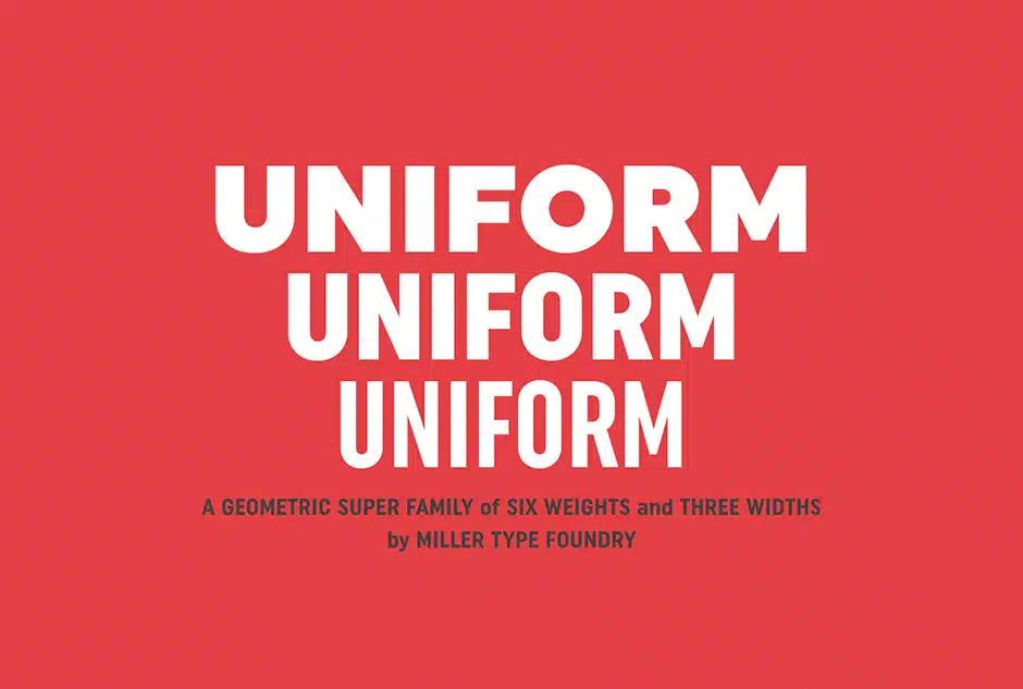
The black weight was the first Uniform that was drawn. Each character’s appearance is consistent and balanced across all weights thanks to this meticulous process. In other words, Uniform is a multi-width, geometric-type family designed around a circle.
Related Posts:
- Most Iconic Fonts for Professional Design
- Best Geometric Fonts for Graphic Design
- Best Simple Fonts
- Best Mid-Century Modern Fonts
- Best Fonts for Books
28+ Best Fonts for Apps (Mobile & Web UX/UI) in 2024
All in all, the best fonts for apps are spectacular visual finds, each created to help make legibility accessible.
Whatever app it is you’re working on, we hope our summary of all of the top picks in the category helps you streamline your search and allows you to be a more efficient designer.
What’s your favorite font bundle from the list? Let us know in the comment section!


