
Thanks to the generosity and help from Mobify, Just Creative Design now has a mobile version. This means you can read JCD’s articles on your iPhone or mobile device while having the pages & images load up to 7 times faster. See some of the screenshots below if you haven’t got an internet enabled phone or use this site for a rough emulation (type http://m.justcreativedesign.com as the address).

It was really easy to set up the mobile version of JCD through Mobify’s dashboard… the interface behind the scenes of Mobify is quite easy to use and I had the mobile version of JCD customised within 20 minutes of signing in to their site.
The only real problem I had was trying to create my own domain name (http://m.justcreativedesign.com rather than http://jcd.mobify.com) as I had to change my DNS CNAME records which I had to contact my hosts for.
However in saying that, the support of Mobify was very helpful – in many cases I had a response to my questions within a few minutes or if not, a few hours.
Mobify also offer a variety of CMS plugins that automatically directs users on a phone / mobile device to the mobile version of the site rather than the full site which is pretty handy (if not essential).
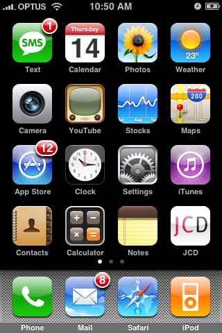
Oh, and you get your own icon too which is useful if people want to create an icon shortcut to your website on their phone homescreen (see screenshot below). You can also track the mobile traffic stats through Google Analytics.
Anyway, the good news is that Mobify are currently offering this service for free, so maybe you want a mobile version for your site?
For those who want a do-it-yourself alternative, there are also a number free WordPress plugins out there (that I haven’t tested) ie. Mobile Press & dotMobi (not associated with Mobify).
When I asked Mobify how they differed from plugins such as these, this was their reply:
Mobify is a universal mobile design environment… Plug-ins like this one aren’t bad, but they look very simple and make your site look like any other site with that plugin. Usually they only support the very basic functionality (posts, comments) so any 3rd party modules you have are unusable.
With Mobify our intention was to build a tool with the simplicity of Photoshop, that allows you to literally do anything for mobile. In the future we will see if we can migrate more of our features down into the plugin space, right now our plugin is for redirection only.
So yeah, we’re just a different approach to the mobile problem!
So yeah, up to you which route you go, but I recommend Mobify.
iPhone Screenshot

iPhone Homescreen Screenshot
(Thanks to @retinart for the screenshot below)
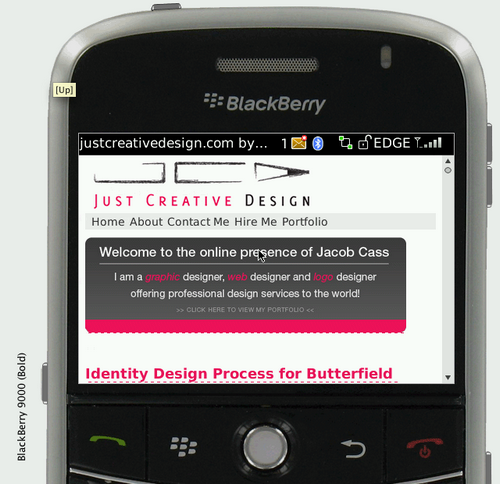
Blackberry Screenshot
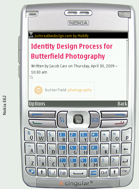
Nokia Screenshot
Have you made your website mobile friendly? If so, how did you go about doing it?


Hey Jacob, I have been looking for a post like this! I’m going to give it a shot on my new website.
I tried using the “iphone simulator” but the pages still look normal, just overflowed in a box with an iphone background. Will it actually detect an iphone layout on a live website? or is it just showing the size of the iphone screen?
– Alex
In the iPhone simulator try typing http://m.justcreativedesign.com (that is the mobile version). When viewing from a mobile device the WordPress plugin picks up on that and then directs https://justcreative.com to http://m.justcreativedesign.com
Have you considered looking into a way to do a browser detection redirect? That way it will identify if it is a mobile browser and automatically send them to the new mobile version.
I haven’t done so with my website yet, as I thought it would basically involve setting up a whole new CSS. This sounds like a pretty efficient solution, so I’ll give it a whirl.
It would be pretty safe to assume that in the not-to-distant future, every site will need a mobile version.
Aaron,
That is what the plugin does that I mention in the article, it does the redirection for you 🙂
Abrishca,
I agree, quite soon (if not now). The amount of people with iPhones / mobile devices (with net) is ridiculous.
I’m actually posting this via my iPhone now!
thanks Jacob for sharing this very useful information 🙂 keep going!!!
Great news, even if I had seen your site in my Iphone two weeks ago with the m.version, and i was surprised, but i like it is really faster. is a great consideration of you to have in mind the mobile visitors like my.
This is awesome. Love reading your articles, keep up the great work. Your a great inspiration.
Rolam,
That’s not very good for your visitors, can see why you deleted it. How did Mobify go for you?
Nice work with the mobile version Jacob, clean and simple. I used Mobile press once, but got rid of it a few days later, I don’t know if it was my coding or something but it’d load the mobile version even in FF every now and then. Mobify looks great though, I just signed up 🙂
I’m using Mobify too. I had to do a bit more CSS than I thought — maybe because of my CSS stacks — but otherwise it is going well. It’s good not have to contend with sidebars and fixed content widths in mobile versions!
Can you share how frequently you used x-paths to delete extra content? I’m running my site on Expression Engine and it just makes more sense to set up alternate templates/css as opposed to hacking my say through the existing homepage. Is there a way to make Mobify redirect to templates I set up? Example: http://www.amystoddard.com/m
Nice summary of your experiences.
Its true that a mobile website is essential. More than ever for small businesses who need new customers to be able to find them. 45.5 million people own smartphones in the US alone, so imagine how many of these are searching for businesses while they are on the move.
A mobile website should be even easier to design and publish than a regular website, but few hosting services seem to make this a simple task. I can recommend this one (I’ll be honest, its my company’s service): http://consected.com/mobile-site-free-trial for the non-technical folks who just want to get some pages published so that customers don’t find their competitors instead.
Thanks, Phil