A company logo is something that should be treated with the utmost importance.
A logo gives a corporation, business, product, or service an identity which is a crucial part of the marketing mix. But over time, these so-called trademarks need to adapt to external changes and thus, must evolve to fit with the modern age of advertising.

Popular logos serve as timestamps for the history and evolution of design as these brands persist through the ages. Hence, these logos become one of the best sources to understand design elements and their trends. Not only that, but we also witness the development of technology and the era’s zeitgeist.
People say that studying history prevents us from making the same mistakes as our ancestors. However, it also inspires us to be more innovative and understand how human nature always craves change.
With the history of these popular logos, we’ll understand why companies and brands undergo redesigns. Was it the social climate of their time or a need for aesthetic improvement?
Let’s check out these logo design evolutions to see what triggered their development.
How Did Popular Logos Evolve?
Every logo has its story, whether it’s something they wanted to convey or the history of how they came to be. You might be surprised by what inspired or who made them because it’s quite unexpected.
Logo Evolutions of Famous Brands
1. Chupa Chups
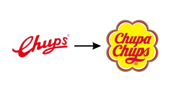
Currently, Chupa Chups is owned by the Italian-Dutch corporation Perfetti Van Melle, but its previous owner was a Spaniard. It originated in Spain as a confectionery company owned by Enric Bernat.
The first version of the logo was released in 1958 with only “Chups” stylized in a red handwritten script. It was derived from the Spanish word “chupar,” which meant “to suck.” If you look at it from the perspective of contemporary times, it’s definitely not eye-catching.
However, it wasn’t until 1961 that they added “Chupa” above “Chups” and a yellow background. We discovered its motto at the time was “Es rodo i dura molt, Chupa Chups.” Translated from Catalan, it means “It is round and very long.”
Fast forward to 1969, Bernat invited his friend Salvador Dali to design their version of the logo. Yes, the one and only Salvador Dali who created the iconic melting clock painting “The Persistence of Memory” in 1931.
Dali put the brand name inside a chamomile-shaped flower which was simple but unique. He also advised Bernat to place the logos on top of the candy wrappers, not on the side, to catch the customer’s attention.
Dali’s logo was trendy, but the company changed it later to modernize it. They surrounded the yellow flower with three gray-green, red, and white contours. They also updated the font of “Chupa Chups” to the current logo.
2. BMW
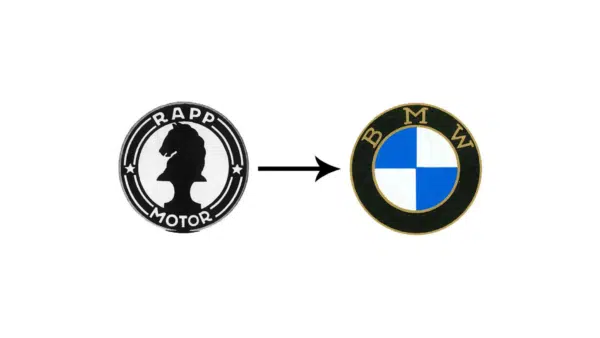
BMW is the abbreviation for “Bayerische Motoren Werke AG” and is currently known as a popular car brand. But before, its first logo was a horse in the center of a circle with the text “RAPP MOTOR” around it. This is where it all started when it was founded by Camillo Castiglioni, Franz Josef Popp, and Karl Rapp.
In 1917, the BMW logo debuted similarly to the previous one without the horse. Replacing the improvised airplane blades with the colors of the Bavarian flag so it looked like it was in the sky. And the text around it became “BMW” instead of “RAPP MOTOR.” This design persisted with minor changes.
The logo took after airplane blades because the German company’s range included aircraft engines. However, Germany was banned from creating aircraft after the First World War, which led to the re-training of the company.
In 1923, they released their first motorcycle with a blue and white BMW logo, sparking the beginning of an era. BWM bought a car factory in Eisenach five years later and launched its first car, “Dixi.” By the mid-1930s, BMW had grown into one of the industrial giants of Bavaria. The logo is a symbol of prestige and high status amongst vehicle owners.
3. McDonald’s
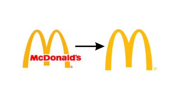
Rome wasn’t built in a day, nor was the great McDonald’s Empire. In the 1940s, the McDonald’s signboard was an unattractive monochrome of different fonts. It simply said: McDonald’s Famous Barbecue.
In 1953, the logo went through another major transformation under Ray Croc. He was the first franchise owner of McDonald’s and submitted a new logo design. It had the name “McDonald’s” in red, and the font was jagged and slanted.
But 1961 was the true golden era of McDonald’s when they used the iconic golden arches on their logo. The central legs overlap, and an inclined line crosses the arches.
From 1968 to the present, you still see the logo of the golden arches forming the letter “M.” The name “McDonald’s” is inscribed in black, a little to the bottom of the arch. This has another version in 1975 that the company still uses. Instead of black, “McDonald’s” is inscribed in white, with a red square background.
Because the brand was well-recognized worldwide, the company took a modern approach in 1993. They turned the logo into only the golden arches resembling an “M” but with a black shadow that made it stand out.
From there, it’s been a series of changes using the golden arches as the logo. Some removed the black outline and emboldened the arches. Meanwhile, another version was more minimalist and chose a brighter yellow palette.
To further support our claim that trends influence logo design, McDonald’s employed a different logo during the pandemic. They divided the golden arches to promote social distancing and avoid further virus infection.
4. Siemens
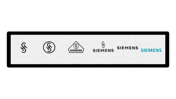
Siemens is a large German company manufacturing various equipment. You might have noticed their logo when you visited a hospital. They also create electronic, transport, and energy equipment, making them one of the most trusted brands in the world.
Their logo changed over the years depending on the fashion trends of its era. Of course, changes also occurred based on what happened to the company internally.
Before 1914, the Telegraphen-Bauanstalt von Siemens & Halske logo was an “S” inside an “H.” They expanded the H so the S doesn’t intersect with its right and left sides. Meanwhile, the two sides are curved, each one looking like a “more” (>) and “less” (<) sign.
This refers to telegraphic communication where > is the message’s end and < is the beginning. While they don’t hold as much meaning nowadays, those were important to keep the transmission accurate.
In 1925, the head of Siemens decided to form the House of Siemens. It was a large holding that consisted of several firms, which prompted a logo change. The “S” and “H” intersected as a monogram inside a circle. Being inside the circle meant “unity,” as they are all part of the House of Siemens.
In 1928, they took it a step further by putting the logo inside a diamond-shaped hexagon. They placed the inscription “SIEMENS” at the bottom. Overall, it looked like a house where everything of the House of Siemens was under one “roof.”
However, they did away with that in 1936, when they only kept the monogram and the inscription. They also changed the font, making the lines look thinner and smoother. Simultaneously, they released a version that only had the inscription.
Fast forward to 1991, we now have the logo that we see in the present. The color has been changed to blue-green, and the font strokes are unevenly thick.
5. Shell
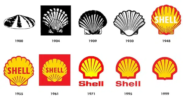
Did you know that Shell was originally a place that sold boxes of sea mollusk shells? It’s a far cry from the oil and gas industry that we know today. However, here it is with the iconic Shell logo that we recognize wherever we go.
If there’s anything to note about its logo’s evolution, they’re all very similar. Minor differences were made throughout the years until it became the logo we know.
It debuted in 1900 with a logo of a single clamshell, oval with a protruding middle. The designers played with black and white, using uneven dots to convey a rough texture. But in 1904, the designers approached it differently by using a scallop instead. It was a fan-shaped sash with visible ribbing due to the alternating dark and light lines.
In 1909, they redesigned the shell to look clearer while keeping it monochromatic. They also emphasized the fan-shaped form of the scallop valve by expanding it in both directions.
However, the logo changed in 1948 when it became red and yellow. It conveys energy, light, and warmth from oil and fuel usage. The designers also removed the ribs in the middle and kept them at the edges. Instead, the company name “Shell” fits in the logo’s center.
Fast forward to 1955-1961, the company moved away from realism to a clear shell drawing. Gone were the irregularities from the previous designs, and only straight stripes remained. The current design was made in 1971, with stripes covering the shell from all sides. Then, the inner lines fan out again, and the company name is located at the bottom, outside the shell.
6. Barbie
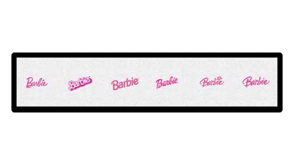
Barbie is an icon every child encounters as they grow up. Regardless of your gender, you’ve seen her on TV, in toy stores, and in movie theaters. The pink “Barbie” logo is everywhere, and almost everyone knows who Barbie is.
Did you know that Barbie’s full name is Barbara Millicent Roberts, created by the wife of Mattel’s owner? Barbie was developed in 1959, and it was so popular among girls worldwide that it became a real brand.
Its debut logo was the word “Barbie” in glamorous pink handwritten font with a capital “B.” The letters aren’t exactly aligned, but they seem like they’re jumping. This conveys playfulness, naivety, and charm found in the toy.
In 1975, the designers opted for a more 3D approach to the logo by giving the name a shadowy effect. Unlike the previous logo, the letters here are diagonally aligned to lift the customer’s spirits. The font is also very different compared to the old Barbie logo.
However, in 1991, they returned to the design that made children feel more cheerful and at ease. Most of the letters stayed the same as before, but the color is a more pastel pink than the previous hot pink.
It doesn’t stop there because, in 1999, they changed the logo again, going for an italic inscription. It looked like it was done in a single pink stroke in cursive without interrupting any of the characters.
In 2004, the logo was adjusted again to write the letters without connection. The “B” became sweeping and bold while the letters were arranged differently, looking playful. The ” i ” dot also turned into a flower, making the new logo very childlike.
But it all came full circle in 2009 because, from that point on, the company used the first Barbie logo. No changes were made to the original, and the company is still using it.
Logo Evolution of Famous Brands Summary
When you read the history of the popular logos we know today, it’s mindboggling. Who knew that Shell didn’t start as an oil company? Or that BMW was involved with almost every vehicle known to man? And the most surprising part was Barbie actually has a full name! The point is that all these companies went through major changes.
Those internal changes and trends influenced how they redesigned their logos. BMW’s logo was inspired by aircraft because it made engines for planes. However, they tweaked it when they focused on manufacturing cars. Barbie kept redesigning its logo to look more playful and cater to kids.
Meanwhile, McDonald’s changed their logo according to the company’s experience. When the golden arches became iconic, they incorporated them without hesitation. Now, there’s no McDonald’s logo without the golden arches. Logos are more than the companies’ faces; they speak volumes about their histories.


Simply awesome!! Thank you for Sharing such great Evolution of Popular Logos.
Awesome Post!
I am agreed with the point that you mentioned ” logo gives a corporation, business, product or service an identity “
nice article, thanks to sharing this logo…logo is important for our business identity. I like it