In today’s fast-paced digital landscape, where technology reigns supreme, the visual representation of a brand plays a pivotal role in capturing attention and leaving a lasting impression.
Logos are the face of companies, serving as powerful symbols that convey a brand’s identity, values, and innovative spirit. When it comes to the tech industry, where innovation and cutting-edge advancements are the norms, creating a logo that stands out from the crowd requires a special blend of creativity and ingenuity.

In this article, we delve into the realm of tech logos and showcase the 15 best examples of innovative and captivating designs that have made a significant impact in the industry.
These logos not only encapsulate the essence of their respective brands but also exemplify the imaginative prowess and forward-thinking nature of their creators.
From sleek and minimalist designs to bold and dynamic visuals, we will explore the diverse range of logo styles that have set these tech companies apart.
Also see our guide to the best tech fonts for logos and if you’re after a tech logo design of your own, contact us.
15+ Best Tech Logos & Their Symbolism
1. Apple
Apple‘s journey began in 1976 when it was founded by Steve Wozniak. Since its inception, Apple has continuously evolved, leaving an indelible mark on the computing and telecommunications landscape. As one of the most influential tech companies in history, Apple has embraced innovation and revolutionized the way we interact with technology.
The name “Apple” itself carries a symbolic weight, representing growth, nourishment, and a commitment to pushing boundaries. It draws inspiration from various sources, including the biblical stories of Adam and Eve and the scientific genius of Isaac Newton.
The company’s logo, a simple yet captivating image of an apple with a bite mark, symbolizes engagement and encourages individuals to seize opportunities and take a bite out of life.
2. Amazon
Amazon, known for its easily recognizable logo, has established itself as one of the most prominent tech companies in the world. Originally named “Cadabra,” the tech company underwent a transformation to become the influential economic and cultural powerhouse it is today.
The name “Amazon” was carefully chosen to reflect the company’s grandeur and extensive product offerings. It symbolizes the vastness and scale of the Amazon rainforest, implying that the company aims to provide a similarly diverse range of products to its customers.
While Amazon’s logo appears simple at first glance, it carries rich symbolism and meaning. The arrow connecting the letters “a” and “z” not only represents the alphabet but also conveys the message that Amazon offers a comprehensive selection of products “From a to z.” Additionally, the subtle curvature at the bottom of the letter “z” resembles a dimpled cheek, creating a subtle and welcoming visual element that can be interpreted as a friendly smile.
3. Ebay
When it first launched in 1995 under the name “AuctionWeb,” eBay revolutionized the concept of online shopping, forever changing the way we engage in buying and selling goods. By pioneering a peer-to-peer marketplace, eBay connected individuals from all corners of the world, enabling them to engage in transactions directly.
Today, eBay has evolved into a multi-million-dollar enterprise with a global presence in over 32 countries. Its success and widespread popularity are a testament to the company’s ability to facilitate commerce on a massive scale.
The name “eBay” was derived from “Echo Bay Technology Group,” the consulting firm of founder Pierre Omidyar. The choice of the eBay logo reflects the brand’s distinctive and innovative nature. The vibrant and eye-catching emblem captures attention, symbolizing the dynamic and diverse marketplace that eBay offers. Additionally, the logo’s simplistic wordmark conveys a sense of modernity and approachability, emphasizing that eBay is a contemporary and down-to-earth organization that caters to a wide range of users.
4. Google
No list of renowned tech logos would be complete without mentioning Google, whose logo has become one of the most recognizable symbols worldwide. Furthermore, the name “Google” itself has gained significant familiarity.
The selection of the name “Google” stemmed from a misspelling of the original suggestion, “Googol,” which referred to the immense scale of the company’s search engine capabilities. The term “Googol” represents the number 1 followed by 100 zeros, signifying Google’s ambition to organize and make sense of vast amounts of information.
The current Google logo is a striking wordmark, featuring a clean and straightforward sans-serif font. Each color utilized in the logo represents a distinct facet of the Google ecosystem, emphasizing the company’s diverse range of products and services.
Another noteworthy aspect of Google’s logo is its adaptability. The company allows artists to continuously create variations of the logo, particularly to commemorate major events or national celebrations. This approach reflects Google’s commitment to embracing creativity and providing a personalized touch to its brand identity.
5. Spotify
For music enthusiasts, Spotify is a familiar name that has significantly impacted the way we consume audio content. Since its introduction in 2006, Spotify has experienced remarkable growth, becoming one of the leading providers of streaming services.
With nearly 500 million active users, Spotify has solidified its position as one of the largest streaming platforms worldwide. The company’s name is a clever amalgamation of “Spot” and “Identify,” reflecting its core purpose of helping users discover and identify new music.
The Spotify logo is a visually captivating combination mark. The company’s name appears on the right side, utilizing a clean and simple sans-serif font. On the left side, a vibrant green circle grabs attention, accompanied by three white, curved lines within it. These lines are intended to represent sound waves, symbolizing the essence of audio and the platform’s commitment to delivering a rich musical experience. The bright-green color scheme adds vibrancy and energy to the logo, further enhancing its visual appeal.
6. Square
Next on our list, Square, a financial services platform developed by Block Inc, deserves our attention.
Square was specifically designed to aid small and mid-sized businesses in efficiently managing credit card payments and various transactions. While the company primarily focuses on selling point-of-sale solutions, it also offers a range of other services and software solutions, including a website builder, to cater to diverse business needs.
The name “Square” was purposefully chosen to evoke associations with simplicity, strength, and stability. It reflects the company’s commitment to providing straightforward and reliable financial solutions. The Square logo’s design aligns with its name, featuring a multi-layered structure composed of three squares. This imagery not only reinforces the brand’s name but also resembles the chip found on credit cards, subtly emphasizing its connection to financial transactions.
7. Yahoo
Over the years, the Yahoo logo has undergone simplification while still retaining the distinct qualities that define the company. As an American web services provider, Yahoo is renowned for its search engine, email services, and advertising platforms.
Yahoo deliberately aimed to establish itself as a fun and playful tech brand, which is reflected in its unique name. Some speculate that Yahoo is an acronym for “Yet Another Hierarchical Officious Oracle,” adding to its intriguing nature.
Today, the Yahoo logo features a vibrant purple wordmark. The use of a sans-serif font gives the company a fun and modern appearance, further accentuated by the inclusion of an exclamation mark in italicized form. This combination conveys a sense of liveliness and contemporary flair. Additionally, the color purple evokes associations with compassion, community, and luxury, contributing to the brand’s identity and appeal.
8. Microsoft
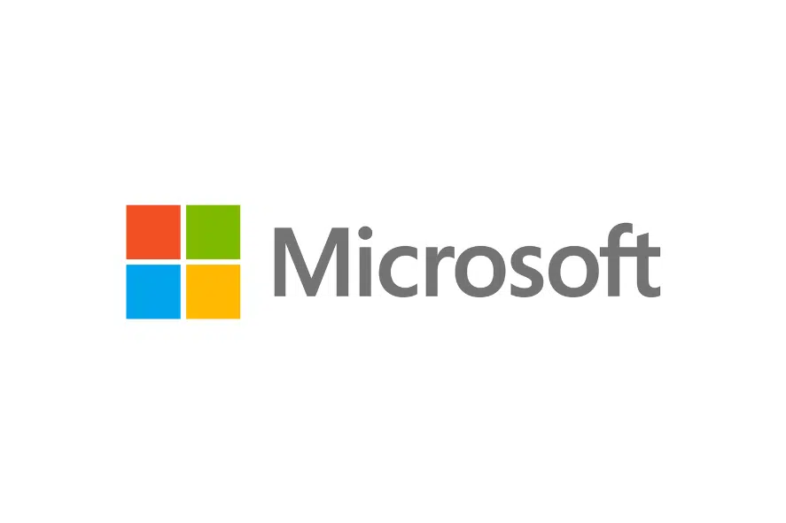
Microsoft, like Google, stands as one of the cornerstone technology companies that enjoys widespread recognition today. With a track record of delivering popular tools and technologies, ranging from operating systems to game consoles, Microsoft has made a significant impact on the market.
The name “Microsoft” was derived from a letter written by Bill Gates to Paul Allen, the company’s co-founders, where Gates referred to their partnership as “Micro-Soft.”
Following the trend of many tech logos, the Microsoft emblem exhibits simplicity and modernity. It consists of a visually appealing sans-serif wordmark in a soft grey shade, accompanied by the image of a square. The square not only represents the company’s flagship product, Windows, but also symbolizes the foundational elements of its diverse business ventures today.
Moreover, each color utilized in the Microsoft logo signifies a distinct aspect of the company’s ecosystem, emphasizing the breadth and depth of its offerings in various technological domains.
9. Firefox

Mozilla Firefox, commonly known as “Firefox,” is an open-source web browser developed by the Mozilla Foundation. Since its introduction in 2004 as an alternative to the Windows browser, Firefox has swiftly gained prominence in the technology landscape.
Originally, the company was named “Phoenix,” but due to trade name conflicts, it was changed to “Firebird.” However, in order to avoid further potential issues, the founders ultimately settled on the name “Firefox.” This name choice was inspired by the Chinese name for a red panda, referencing its attributes of agility and intelligence.
The Firefox logo, as seen today, incorporates the image of a fox along with a circular element symbolizing the world. The shape of the fox’s figure resembles that of a flame, adding a dynamic and energetic touch to the overall design. With its evocative and vibrant composition, the logo is memorable and visually appealing, leaving a lasting impression on users.
10. Evernote
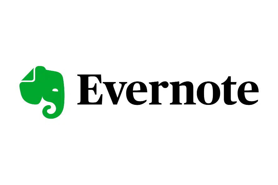
On our tenth list, we have Evernote, a leading note-taking and task management application that has gained significant recognition in the technology industry in recent years. With its software compatible across various operating systems, Evernote has become a popular choice for a wide range of consumers.
The name “Evernote” itself embodies the company’s central focus on assisting users in organizing and tracking information seamlessly, emphasizing the enduring nature of their note-taking capabilities.
The Evernote logo is both captivating and refined, featuring a harmonious combination of an elephant image and an attractive serif-style wordmark. The use of serif typography imparts a sense of professionalism and sophistication, reflecting the brand’s commitment to providing a reliable and polished user experience. Moreover, the inclusion of a green elephant in the logo evokes associations with creativity and memory, aligning with Evernote’s mission to inspire innovative thinking and facilitate effective information retention.
An intriguing detail lies in the slight crease on the elephant’s ear, reminiscent of a page in a book. This subtle element further reinforces Evernote’s connection to the world of note-taking and serves as a visual reminder of the platform’s ability to capture and preserve ideas like turning pages in a book.
11. Grammarly
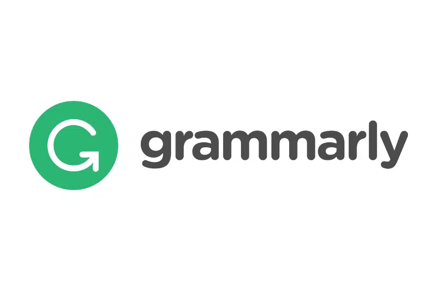
Grammarly, an American cloud-based writing assistant, has emerged as a valuable tool for creatives, offering comprehensive reviews of spelling, grammar, punctuation, and other writing elements. Beyond its editing capabilities, Grammarly also aids in detecting plagiarism in content and provides helpful suggestions to enhance the quality of the text.
The company’s name, Grammarly, was intentionally chosen to emphasize its core mission of simplifying and improving “Grammar” mastery. The name exudes a sense of playfulness and approachability, while remaining instantly memorable.
The Grammarly logo features a timeless design, represented by a green circle with a prominent uppercase “G” at its center. The upward arrow incorporated into the bottom serif of the “G” symbolizes progress and growth, underscoring Grammarly’s commitment to continuous improvement. Adjacent to the green circle, the company’s name is displayed in a lowercase, sans-serif font, further contributing to the logo’s modern and sleek appearance.
Together, the elements of the logo capture Grammarly’s essence: a tool that embraces clarity, evolution, and accessibility in the realm of writing assistance.
12. Adobe
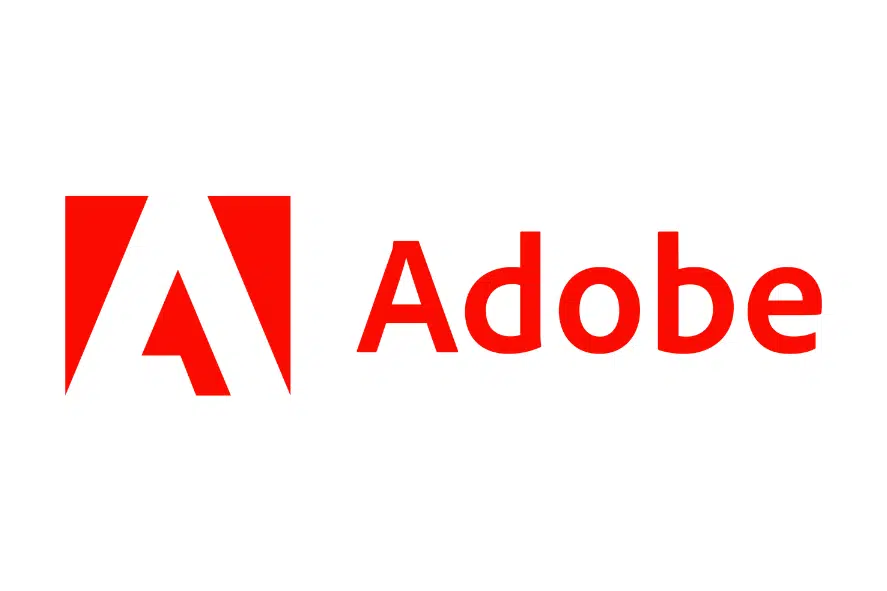
Next on our list is Adobe, a name that holds significant recognition in the graphic design landscape. Established in 1982 as Adobe Systems Incorporated, the company has made remarkable contributions to software development for content creation and publication.
The inspiration behind the company’s name can be traced back to Adobe Creek, a watercourse located in Los Altos that flowed behind the house of one of the founders, John Warnock.
The Adobe logo is designed to be vibrant and captivating, evoking a sense of passion and creativity associated with the brand. Accompanied by a sleek sans-serif wordmark, the logo prominently features a red box enclosing the shape of an “A.” This distinctive design resembles a computer screen cursor, serving as a deliberate nod to the brand’s digital nature and technological innovation.
The Adobe logo, with its striking visuals and modern aesthetics, embodies the company’s commitment to empowering creative individuals and providing cutting-edge software solutions for content creation and design.
13. Slack
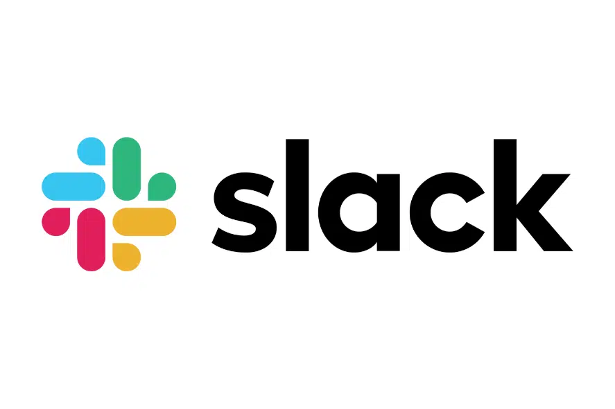
As an avid user of project management tools, I can’t help but express my happiness and satisfaction with Slack, one of the most popular platforms available today. From its unique technology to its captivating logo, Slack has truly become an integral part of my daily workflow.
Since its launch in 2013, Slack has caught my attention with its clever name, which stands for “Searchable Log of All Conversation and Knowledge.” It’s not only an acronym that highlights the tool’s functionality but also a term that is easy to remember and use in casual conversations.
The Slack logo, like many tech company logos, is a perfect blend of simplicity and innovation. With a clean sans-serif wordmark alongside a distinct graphic, it effortlessly captures attention. The geometric symbol within the logo resembles dashes and quotation marks, evoking the essence of speech and communication.
Moreover, the use of multiple colors in the logo signifies the power of Slack’s technology in bringing professionals from various backgrounds together. It symbolizes the platform’s ability to foster collaboration, creativity, and seamless teamwork.
Using Slack has not only enhanced my project management capabilities but has also added a touch of excitement and efficiency to my daily routines. It’s truly a testament to the incredible impact that well-designed technology and thoughtful branding can have on our work lives.
14. Salesfore
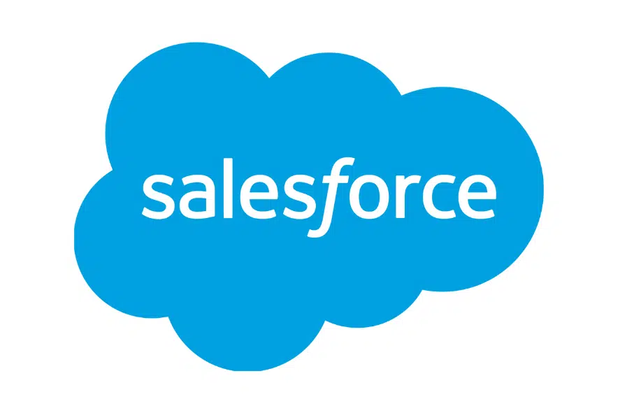
As an enthusiast of cutting-edge software solutions, I can’t help but appreciate the significant impact Salesforce has made in the technology landscape, particularly with its renowned CRM tools.
Since its inception in 1999, Salesforce has emerged as one of the foremost names in the industry, solidifying its position as a leading technology brand. Remarkably, it became the first-ever cloud computing company to achieve an annual revenue milestone of $1 billion, a testament to its widespread success.
The choice of the name “Salesforce” perfectly encapsulates the company’s core mission of empowering sales teams with advanced technology. It highlights the brand’s commitment to providing innovative solutions that enhance sales processes and drive growth.
The Salesforce logo, a true embodiment of the brand’s identity, features the company’s name with a subtly italicized “f.” This design element signifies forward motion and progress, aligning with Salesforce’s dedication to driving positive change and helping businesses thrive.
Surrounding the name is a captivating blue cloud, symbolizing the organization’s expertise and focus on cloud technologies. It serves as a visual representation of Salesforce’s commitment to delivering cutting-edge innovations and paving the way for advancements in the digital realm.
Salesforce’s impact on the software landscape and its dedication to revolutionizing customer relationship management are undeniable. It continues to be a driving force in shaping the future of technology, empowering businesses of all sizes to achieve success in the digital age.
15. Paypal
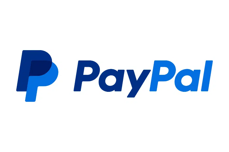
As we conclude our list, we cannot overlook the tremendous impact and influence of PayPal, a financial technology company that has revolutionized the payment system for businesses and individuals worldwide. Today, PayPal has become a household name, resonating with virtually everyone in the digital realm.
While the company initially operated under the name Confinity, it eventually embraced the moniker “PayPal” to emphasize its approachable nature and dedication to facilitating peer-to-peer transactions.
The PayPal logo carries profound symbolism, evoking a sense of community, reliability, and trust. The choice of blue as the dominant color is no coincidence, as it is widely associated with authority and credibility, instilling confidence in users.
Moreover, the overlapping “P’s” in the logo serves as a visual representation of PayPal’s core mission: bringing people together for seamless and convenient transactions. It underscores the company’s commitment to fostering connections and simplifying financial interactions in an increasingly interconnected world.
PayPal’s powerful presence in the financial technology landscape is a testament to its unwavering commitment to providing secure, efficient, and user-friendly payment solutions. Whether it’s for personal or business transactions, PayPal has undeniably left an indelible mark, transforming the way we exchange value and fostering a global community of digital commerce.
Quick Tech Logo Tips
Designing a tech logo requires careful consideration:
- Choose shapes wisely: Shapes convey meaning and impact perception.
- Experiment with color: Stand out with bold colors, but consider their psychological associations.
- Pick legible fonts: Sans-serif is popular for tech logos, ensuring readability.
- Convey meaning: Reflect your brand’s identity, values, and vision.
- Stay simple: Embrace minimalism for versatility and scalability.
Follow these steps to create a compelling and effective logo.
Related Posts:
Best Tech Logos Summary
In conclusion, the world of technology is filled with iconic logos that have become instantly recognizable symbols of innovation and excellence. The best tech logos are not only visually appealing but also encapsulate the core values and essence of the brands they represent.
These logos evoke emotions, establish trust, and create a sense of familiarity among consumers, ultimately becoming powerful marketing tools.
From the sleek and minimalistic Apple logo to the bold and dynamic Windows logo, each tech logo has its own unique identity that reflects the company’s mission and vision.
The simplicity of Google’s colorful logo, the interlocking rings of the Olympic-inspired Audi logo, and the abstract yet unmistakable shape of the Intel logo are all testaments to the power of effective design.
Tech logos also play a vital role in shaping brand perception and influencing consumer behavior. The iconic Nike swoosh conveys a sense of athleticism and empowerment, while the bitten apple of Apple signifies creativity and cutting-edge technology.
These logos have transcended their initial purpose and have become cultural icons, representing not just the companies they represent but also entire movements and lifestyles.


