The banking industry is a trillion-dollar space. On that note, how do the best bank logos hold up? For this feature, we’re talking about exactly that!
More than anything, bank logos have to demonstrate professionalism, reliability, and commitment—after all, people’s finances are on the line here. For those very reasons, a bank’s logo should immediately convey that it is a reputable business.

Familiarity breeds trust, and this is especially true when it comes to banks.
10+ Best Bank Logos (Ranked & Explained)
10+ Best Bank Logos (Ranked & Explained)
1. Citi
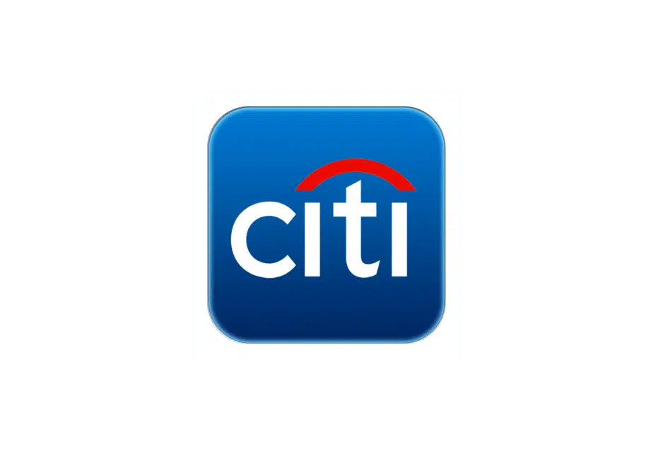
The 1999 Citigroup logo, which emerged following Citicorp’s 1998 merger with Travelers Group., served as the model for this design.
This logo was planned by Paula Scher from Pentagram, who made the logo for Citibank initially on a napkin in 10 minutes or less.
The bank went through a lot of mergers and consolidations before it got the name and logo it has now. Its graphic symbol changed frequently: it has evolved a long way from a four-pointed star to an umbrella-like red arc.
Two multicolored components are combined in the Citibank logo: an inscription in dark blue and a red arch. The red color is a nod to the red umbrella on the Travelers Group emblem.
Talk about a marriage of designs!
2. Mastercard

Mastercard isn’t a bank per se; it’s a payment network processor! But we’re making an exception for this one.
MasterCard’s logo consists of two solid orange and red circles that overlap to form a bright geometric composition. The color scheme of the symbol stands for growth, energy, and motion, while the circles stand for cooperation and unity.
However, just recently, Mastercard dropped its name from its logo. As the future of payments is digital, the fin-tech brand believes in taking a step toward a card-free future.
3. Bank of America

At first, the Bank of America logo had blue letters for the bank’s name and a pattern of blue and red stripes on the right. The colors were chosen to draw attention to the bank’s significance to the nation because they are reminiscent of the colors used in the US flag.
Even then, it developed a fresh approach to its brand identity in 2018. The flag image became cleaner as it shed some details. The space between the stripes got wider to make the design easier to read and adapt to different sizes. The color blue took on a darker hue. The lowercase letters of the brand name were now written sans serif.
The new logo is optimized for digital use and has a new, edgy look. When it comes to its brand identity, Bank of America is a great example of how a company keeps up with the latest trends. The financial institution keeps its position as a market leader in financial services by making smart changes to its logo.
4. Deutsche Bank
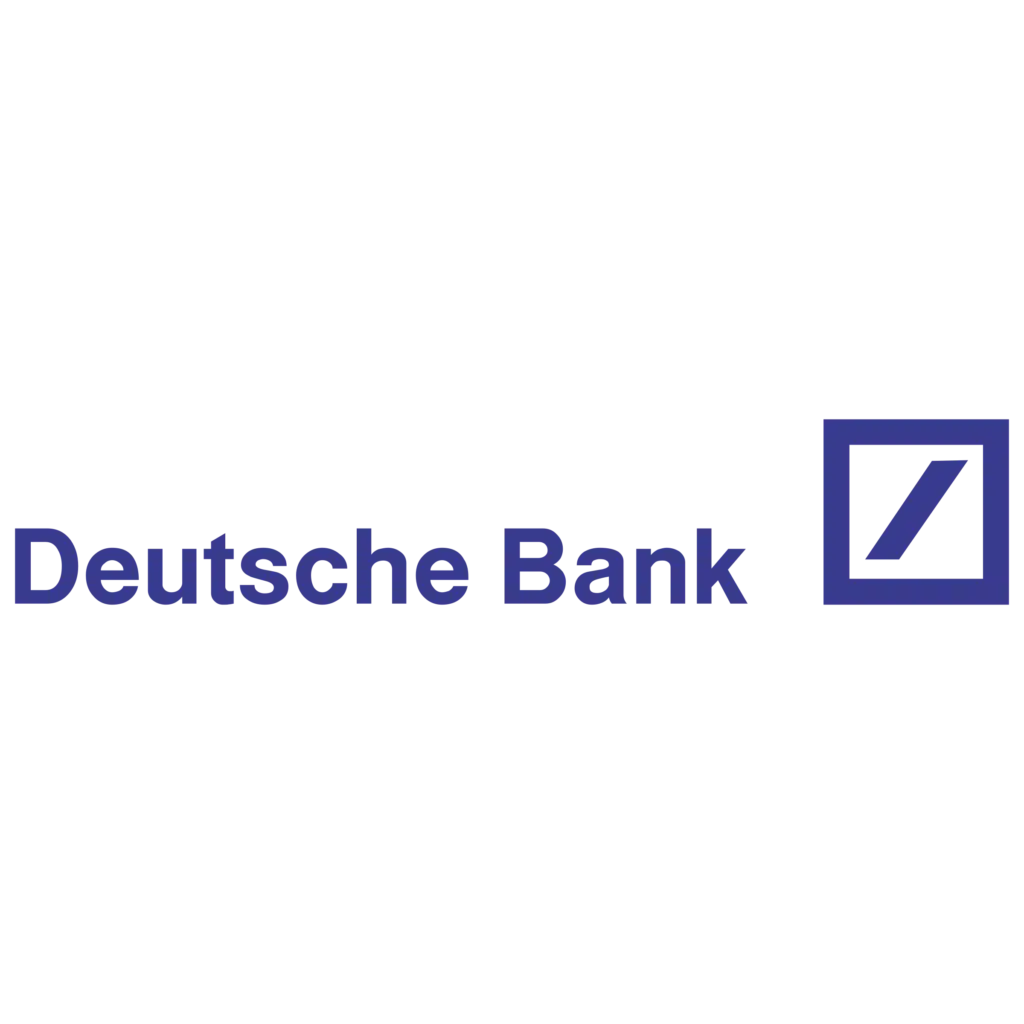
Like a lot of brands, Deutsche Bank has gone through a number of iterations before coming to what it is today.
The 2010 version of the Deutschland Bank logo is identical to the previous version, which was created in 2010, but it is more subdued and bright. The logo is made up of a square emblem with a thick blue outline and an inside diagonal line made of the same blue.
The emblem, which has already established itself as an iconic symbol, does not even require any lettering to become recognizable.
The bank’s strongest attributes are represented by the blue and white color scheme in its logo, which stands for dependability and loyalty.
5. Chase
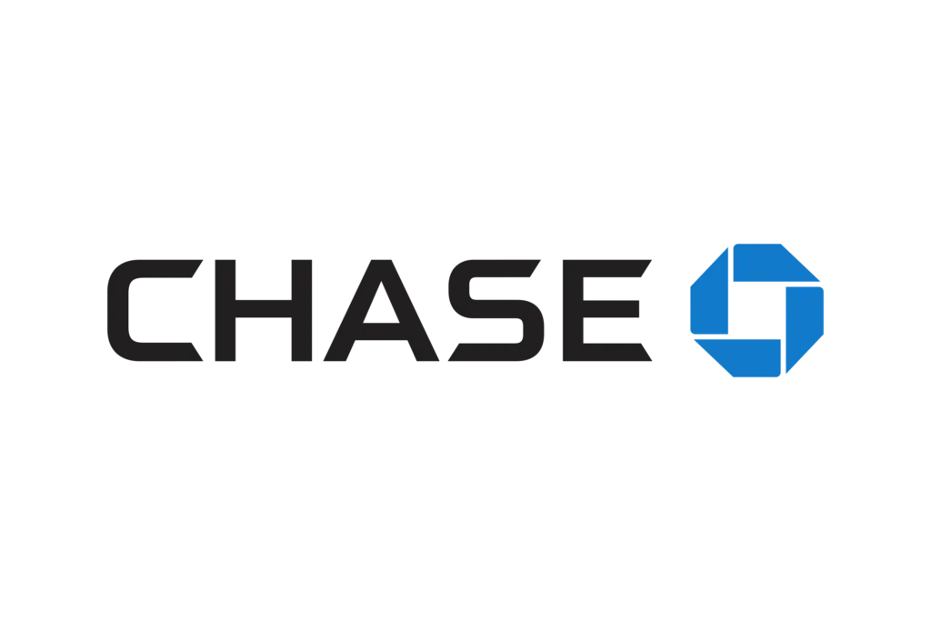
America’s Chase has also had its fair share of design revisions.
The four original black, brown, green, and blue parts of the octagon represent forward motion, and the white square in the middle suggests that progress originates in the middle. The symbol is a single unit made up of various parts, just like the bank itself.
In general, the turnover of cash deposits can be seen in The Chase logo. The symbol refers to the financial organization of depositors that oversees the flow of money.
6. HSBC

Since its debut in 1983, HSBC’s visual identity has not changed much. The company’s only redesign in 2018 focused more on improving, strengthening, and elevating the existing structure to meet contemporary requirements. The first HSBC logo featured a sophisticated vintage design with ornaments and heraldic symbols.
The logo was not entirely new. It depended on the bank’s home banner—a red hexagon with a white hourglass inside was the flag. If you examine the shapes in greater detail, you might notice a passing resemblance to the Scottish flag’s cross of St. Andrew.
This is intentional! Sir Thomas Sutherland, who laid out The Hongkong and Shanghai Banking Enterprise, came from Scotland and maintained that this reality should be reflected in the banner.
7. UnionBank
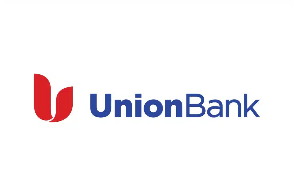
It changed its name to Union Bank of California in 1996, from the Bank of California in 1864. Even though it was hard to read, it initially sported a logo that was bright and stood out. The words “Union Bank of California” were white-written on a red box.
The fairly legible sans-serif type did not suffer from the contrast between the lettering and the background. However, the box’s proportions forced the designers to reduce the letters’ size. The issue with intelligibility was settled by the design upgrade in 2008.
The absence of red boxes reflected the new name of the financial institution, UnionBank. On the white background, the bank’s name instead appeared in blue.
8. TD Bank
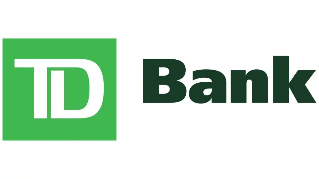
TD Bank is a bank in North America that was founded in the middle of the 19th century in the United States. Today, Toronto Dominion Bank owns the bank, which ranks among the top 10 American banks in terms of deposits and assets.
The bank was given the new name TD Bank in 2009, and the new logo was designed in the same year. Initially, the color scheme was altered to include two white and green tones.
The white and bright green emblem was positioned to the left of the dark moss green “Bank” and typeface in the title case using extra-bold sans-serif. The logo consisted of a vibrant green square with smooth lines of stylized white “TD” letters.
The letters on the emblem are connected and appear soft while simultaneously progressive and contemporary. In 2019, the bank’s logo was updated without the word mark, just the green emblem from the previous design.
9. ING
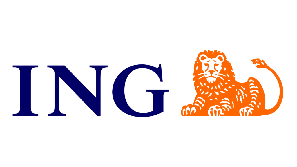
ING is a multinational banking and financial services corporation based in Amsterdam. It is the result of the merger of several businesses. Given that they originate from the Netherlands, where the lion is the state symbol, it should come as no surprise that the lion that appears in the current ING logo was also present in the emblems of those other businesses.
The Times New Roman typeface appears on the most recent version of the ING insignia. And all characters are in capital letters.
In addition, the orange color of the emblem is a nod to the Dutch heritage of the company and its emergence during the House of Orange-Nassau era.The ING insignia is made of a blue-violet color that stands out.
10. Westpac

The company’s 1931 logo consisted of a monochromatic heraldic crest with three birds, a traditional ribbon, and the wordmark under it.
The bank still uses the red stylized “W” as its official emblem, and the company can use it in a variety of ways. It was introduced in 1982. The emblem can be seen in red, black, or white.
There is also a three-dimensional version that is done in gradient red and placed in a quarter, reflecting off the shiny white surface it is standing on. The typeface utilized for “Westpac” on the 1982 logo was equivalent to the one highlighted on the past seal.A font that was more generic took its place in 2003.
Related Posts:
- Best Fashion Logos
- Best Power Banks for Graphic Designers
- Best Logo Templates
- 101+ Best Logo Design Resources
- Best Illustrator Logo Templates
10+ Best Bank Logos (Ranked & Explained)

All in all, the best bank logos are stellar reminders that each business venture has a story to tell. Financial institutions are here to stay, and with evolving currencies in the woodwork, you can expect these entities—and the visuals that accompany their tangible transformations—to evolve as well.
What’s your favorite bank logo and why? Let us know in the comment section!


