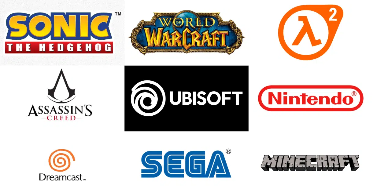
Video games have become an integral part of modern entertainment, and with the rise of gaming culture, the logos of these games have become iconic symbols that represent entire franchises.
From the classic arcade games of the 80s to the latest releases, gaming logos have evolved to reflect the personality and style of the games they represent.

In this blog post, we’ll take a look at the top 10 video game logos that have left a lasting impression and inspiration on gamers around the world. Whether you’re a hardcore gamer or a casual player, these logos are sure to bring back fond memories and inspire you to unleash your inner gamer.
So, get ready to immerse yourself in the world of gaming as we explore some of the most best gaming logos of all time, including gamng companies and video game logos.
Top 10 Gaming Companies Logos
1. Atari
The Atari gaming logo, also referred to as the “Atari Fuji” or simply the “Atari game,” is not a game itself but rather a stylized representation of Mount Fuji, the Japanese mountain. The logo was designed by George Opperman, Atari’s first in-house graphic designer, and drawn by Evelyn Seto. It became closely associated with Atari and prominently featured on their arcade cabinets, home consoles, and game cartridges.
Introduced in 1972 alongside the release of the arcade game “Pong,” the Atari logo quickly gained recognition.
“Pong” was a straightforward table tennis simulation that achieved tremendous success and laid the foundation for Atari’s future achievements.
While the logo underwent slight modifications over the years, it maintained its original design until 2002. At that time, it was enclosed within a red rectangle, and the font of the wordmark was altered. In 2009, Atari reintroduced the classic 1972 logo, although it incorporated the modified typeface used in the 2002 version. Then, in 2012, the 2009 logo was replaced by the unmodified 1972 logo enclosed in a red box.
The Atari logo holds significant cultural value as a symbol of retro gaming and nostalgia.
It represents an era when video games were still in their infancy, and Atari played a pioneering role in shaping the gaming industry. The logo serves as a reminder of the profound impact Atari had on the history of video games and continues to be celebrated by enthusiasts worldwide.
2. Nintendo
Easily one of the most recognizable symbols in the entertainment industry, the Nintendo logo remains an integral part of the gaming landscape today. Renowned for its handheld game consoles and iconic titles like Super Mario and Donkey Kong, Nintendo has left a lasting impact on the gaming world.
The Nintendo logo consists of a vibrant red wordmark encased in a red border. The designers behind the logo intended for the surrounding border to resemble a racetrack, symbolizing the spirit of enjoyment and exhilaration commonly associated with Nintendo’s games.
3. Sega
The name “Sega” was derived from the first two letters of each word in its predecessor’s name, Service Games of Japan. It first appeared in 1954 on their Diamond Star slot machines. However, Sega did not officially adopt it as its corporate name until 1960.
Contrary to previous statements, the Sega logo has not undergone multiple transformations throughout the company’s history. The current logo, featuring the word “Sega” in a stylized script font with blue and white lettering, was introduced in 1975 and has remained virtually unchanged since then. The logo was designed using a modified version of the Yagi Double typeface. It was initially used on arcade games and later extended to home consoles and game cartridges.
It is important to note that the other logos mentioned, such as the Sonic logo and the Wii logo, are not the official Sega logos but rather logos associated with specific products or divisions of the company. For example, the Sonic logo was used exclusively for the Sonic the Hedgehog franchise and its games, while the Wii logo represented the Wii console and its games.
The Sega logo, in its consistent form, is widely recognized in the gaming industry. It serves as a representation of the brand itself and its iconic characters, including Sonic and Virtua Fighter. The logo symbolizes Sega’s pioneering and innovative contributions to the arcade and console gaming market, solidifying its legacy in the industry.
4. Capcom
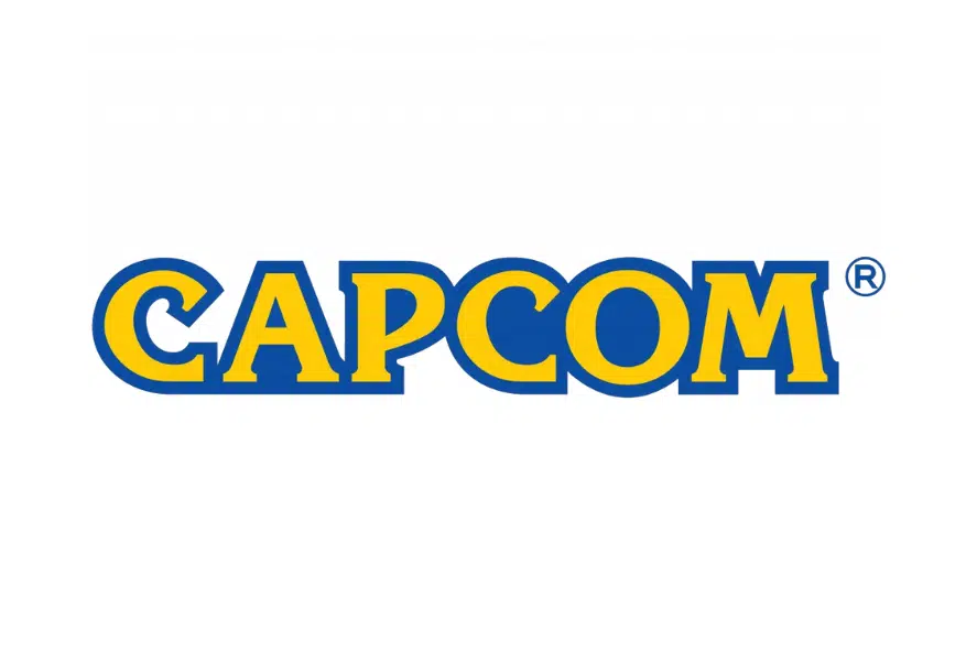
Capcom is a leading gaming company with branches in Japan, Asia, Europe, and North America.
The company name, written in uppercase letters, has a bold and vintage look, created by using the modern serif font Korinna. The letter “C” is notable for its curved upper parts that form sharp and strong serifs.
The logo’s yellow and blue colors convey Capcom’s enthusiasm and aspiration. The design’s simplicity and originality effectively showcase the company’s uniqueness, distinguishing it from its rivals.
5. Valve
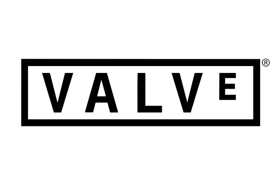
Valve Corporation, renowned for its notable game titles, has also made a mark with its distinctive branding. Founded in 1996 by game developers Gabe Newell and Mike Harrington, Valve gained recognition for groundbreaking games like the first-person shooter Half-Life, as well as other popular titles including Counter-Strike and Portal.
The initial Valve logo was introduced in 1996 and remained in use until 2005. It featured a powerful monochrome design, with the uppercase sans-serif logotype set in white against a black rectangular frame. The letters were generously spaced, creating a solid yet airy and fresh appearance.
The current Valve logo, introduced in 2005 and still in use today, exhibits a minimalist and contemporary style. It consists of white lettering on a red background, projecting a sense of professionalism and strength. The Valve wordmark is set in a narrow sans-serif typeface, resembling Arial Bold, with a distinctive detail—a smaller last “E” compared to the other letters.
Notably, Valve’s visual identity extends beyond its logo. The company is known for its creative advertising campaigns and the utilization of a recognizable mascot known as “The Valve Guy.” The mascot, featuring a big bald character with a red valve on his head, embodies the brand’s “Open Your Mind” concept. These iconic elements—the clean and refined Valve logotype alongside the creative and distinctive mascot emblem—contribute to Valve’s stylish and meaningful visual identity.
6. Rockstar Games
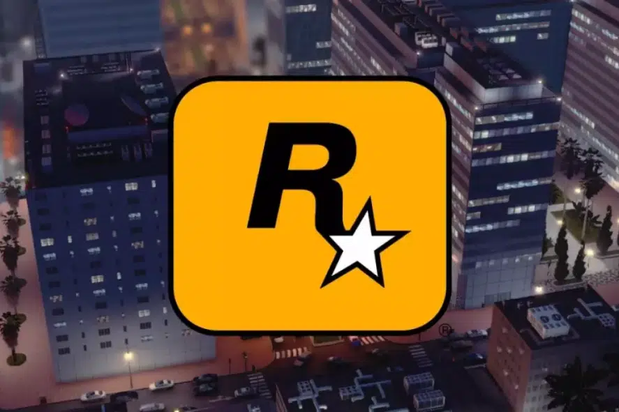
Rockstar Games, a renowned US-based company, has gained fame for its creation and publication of the highly popular Grand Theft Auto series, which has achieved significant success in the Western world. Additionally, the company develops and produces other notable video games like Red Dead Redemption.
Rockstar Games boasts a distinct and visually striking visual identity. It resembles the emblem of a champion sports team, exuding brightness, minimalism, and dynamism.
The logo features a bold letter “R” with a thick black border, positioned inside a white five-pointed star enclosed within a thick black rectangle.
Written in an elegant serif typeface, the Rockstar Games logo showcases a pointed star at the end of the “R,” with a balanced contrast provided by the thick black border. The logo’s color palette predominantly consists of yellow and black, reflecting the company’s energetic, positive, and innovative personality.
7. Ubisoft
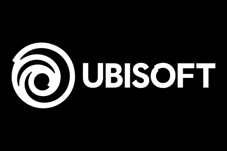
The logo of Ubisoft Entertainment SA, a French video game company, has undergone six major changes since its inception in 1986. These changes were not subtle or gradual, but rather drastic and bold.
For instance, one change involved replacing the blue gradient with a black-and-white swirl. This created a good gaming logo that was more simple, modern, and versatile for different games.
The logo also featured an “eye” and an “O” that appeared to be hand-drawn. These elements reflected the human touch and the originality that Ubisoft prides itself on.
8. Playstation
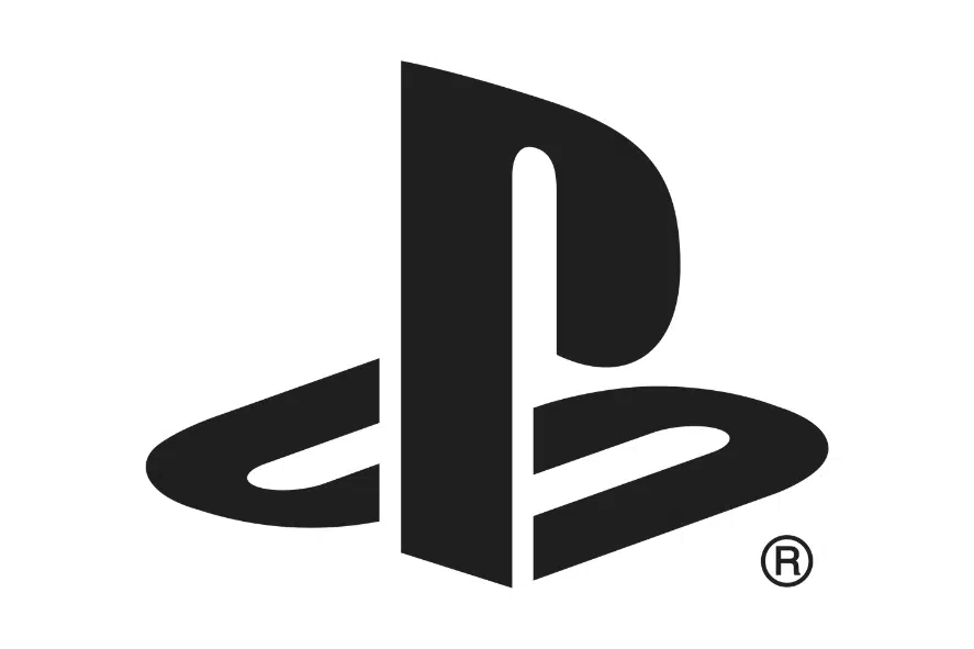
The PlayStation logo expresses the brand’s playful and modern character. It consists of a smooth black wordmark with attractive letters. Along with the wordmark is a distinctive symbol, which displays a “P” for PlayStation, with an “S” cleverly hidden in its shadow.
This symbol is imaginative and appealing, and it demonstrates how PlayStation is always coming up with new and amazing ideas in the video game industry. PlayStation has a variety of devices, such as the new PlayStation 5, but the logo is still a strong symbol of the brand’s success and popularity.
9. Xbox
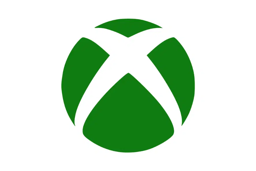
Xbox is a gaming brand owned by Microsoft that competes with PlayStation. It includes five video game consoles, streaming services, and applications. Xbox has attracted many fans around the world.
The Xbox logo comes from the original name of the console, “DirectX Box,” which was based on Microsoft’s gaming system. The logo has two parts: a wordmark and a symbol.
The “X” placed over the circle now appears all over the world, including on Xbox devices and controllers.
The logo is an important part of Xbox’s identity. It helps people to remember and trust the brand. Microsoft keeps improving and adding new features to its gaming products. The Xbox logo shows the brand’s strength in the gaming industry.
10. Dreamcast
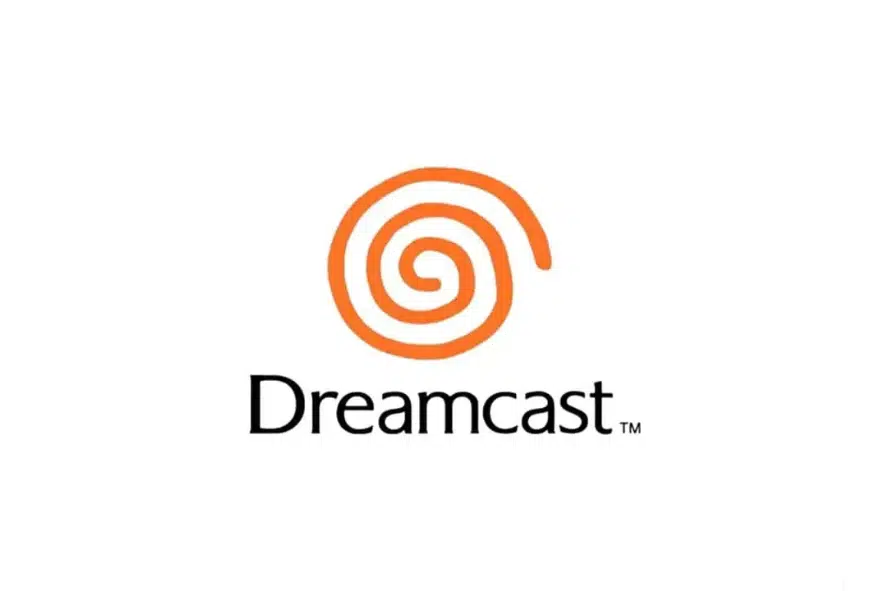
Dreamcast, a video game console released by Sega in 1999, holds a remarkable place in gaming history due to its impressive library of games. Sadly, the brand was discontinued in 2001.
The Dreamcast logo is iconic within the industry, characterized by a distinctive design. The wordmark features a light typeface in black, accompanied by a bold orange spiral positioned on top.
The Dreamcast logotype showcases a simple yet modern aesthetic, utilizing a custom typeface resembling Alexon RR Light Regular and Arpona Light. The rounded letters with flared ends on the bars add a playful touch to the logo’s design.
The primary color scheme execution for the Dreamcast logo is black or dark grey, symbolizing confidence, strength, and competence. The graphical element of the logo incorporates two shades of orange, with the classic bright hue evoking feelings of happiness and pleasantness, while the darker shade closer to red represents passion and power.
Top 9 Video Game Logos
1. World of Warcraft
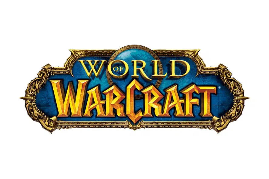
World of Warcraft is a hugely popular MMORPG video game that came out in 2004. The logo features a striking blue emblem with a gold border that has rough details and a two-level gold text over it. The top level of the text, “World”, is placed on top of a globe image that has a blue and green gradient and a dark gold outline. The bottom level of the text, “Warcraft”, is written in a bold and fancy font with sharp edges and gradient shades that give it depth and dynamism.
The text in the World of Warcraft logo uses two different fonts that both look elegant, mystical, and artistic. The upper “World” text uses a classy and refined serif font that resembles Stempel Garamond Pro Roman, but with a longer leg on the letter “R”.
The main “Warcraft” text uses a custom 3D gothic font with thick lines, pointed tips, and smooth curves. The main colours of the logo, blue and gold, look bright and inviting, making the gamer curious, interested, and thrilled. This contrast of vivid and dark colours reflects the nature of the game and makes the logo stand out among its rivals.
2. Minecraft
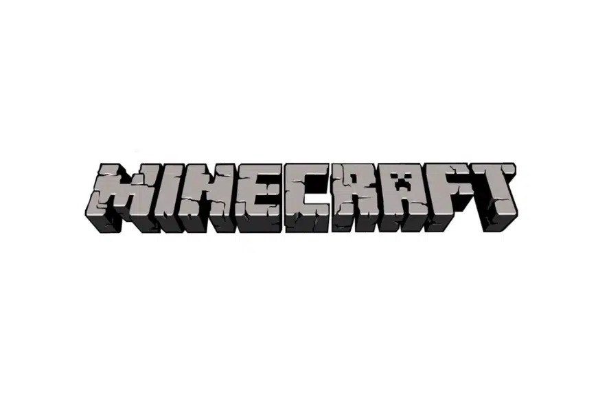
Minecraft is a game that lets players build various structures using 3D blocks. Minecraft first came out in Java in November of 2011, and it was a big hit, attracting many fans when it launched.
The Creeper was introduced to the Minecraft world in 2011 during a fan-based event called Minecon.
The Creeper was a bit scarier than the usual Zombie or Skeleton. They were adorable little creatures, but they were too adorable, and people couldn’t stop giggling at them. The Creeper has since become one of the most popular Minecraft creatures, even becoming the official symbol of the game.
3. Gran Turismo Gaming Logo
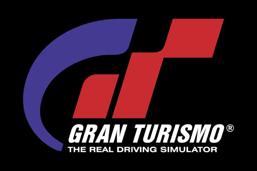
Gran Turismo is a racing game and a sports franchise. It is based on a realistic simulation of many famous cars’ appearance and technical features, which are licensed copies of real sports cars. The racing series was first launched in December 1997. Since then, over 80 million races of Gran Turismo have been sold worldwide, making it the most popular gaming franchise.
The first logo consists of the stylized GT symbols, which stand for the full name of the video game, Gran Turismo. The letters are made of different strokes of various shapes – from wide straight lines to curved thin ones. On the left, the designers put a blue “G” and on the right, a bright red “T”.
Below them, the authors wrote the full name of the franchise in black. Even below, they added the phrase “the real driving simulator” in small sans-serif font. The logo also has a shortened version that does not have graphic symbols.
4. Grand Theft Auto
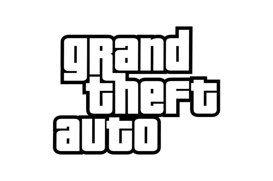
One of the most popular logos of the video game series dates back to 1997. Before that, the original GTA logo was made in 1997 and was used by the game for only two years. This logo was a yellow gradient text in a thick black outline, surrounded by a five-pointed star with a border and an orange and yellow flame from the middle line of the text. The text was arranged in three levels and was written in an italicized extra-bold sans-serif font with large letters.
The logo was changed in 2001, combining two previous versions into one. It was a three-leveled text in white lowercase letters, outlined in black and stuck to each other. The solid black outline of the text made it look strong and professional.
In 2013, they changed the logo again. It was flat, but the outlines were smoothed and improved. The new logo looks lighter and more elegant than the previous ones. This shows the expertise of the game’s creators, who care about every detail.
5. Half-Life
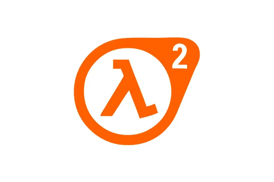
Half-Life is well-known for its Lambda logo. It is a symbol that is frequently used in the Half-Life universe.
The simple use of orange makes it stand out among many elaborate logos used by other companies. Experts advise avoiding creating and using too complicated logos; instead, they suggest using simple colours and shapes with a suitable colour scheme to get the most out of your branding efforts.
In real life, the Lambda logo represents the constant decay used in the half-life or the rate of decay of a radioactive element. Additionally, Lambda stands for the wavelength of light or sound emission.
6. Super Mario Bros.
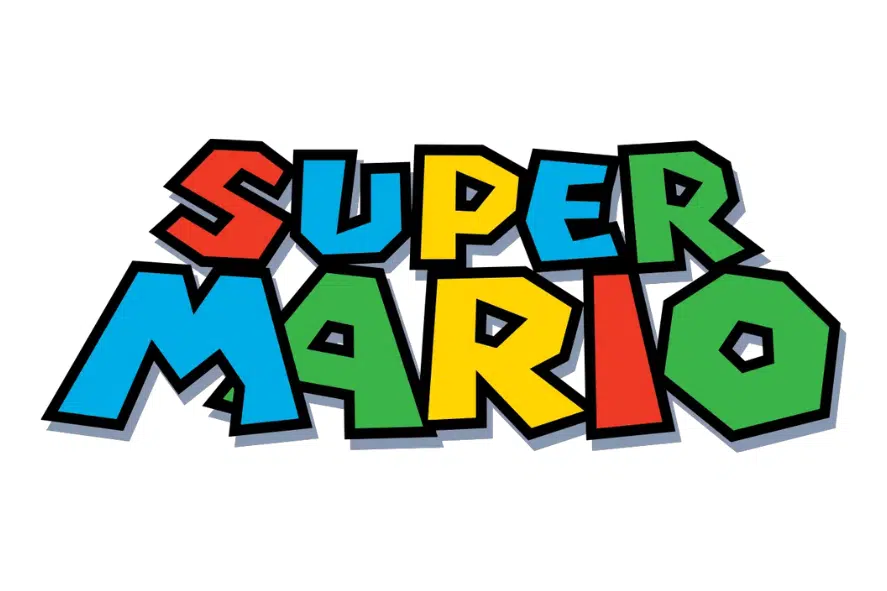
Super Mario is a widely acclaimed game franchise that has captivated millions of fans around the world. The main character of the series is a red-capped man named Mario, who is the iconic mascot of the franchise. He has the ability to jump high and use his head to smash bricks, which may contain various bonuses such as coins, mushrooms, and stars.
He also has to face various enemies such as goombas, koopas, and piranha plants, which he can neutralize by jumping on them or throwing fireballs. His ultimate goal in most of the games is to save Princess Peach, who has been kidnapped by Bowser, a fearsome turtle-like monster who rules over his own kingdom.
The first official logo of the series was closely related to the lettering on the cover of Super Mario 64, which was one of the most influential games in the franchise. The lettering on the cover was based on the example of the Super Mario World title (1990), which was the first game to introduce Yoshi, Mario’s dinosaur companion.
The logo underwent a major redesign by making the letters bold and giving them a precise geometric shape. The angular font made the “O” look like an octagonal nut, which added a sense of mechanical and industrial design. The words did not look written but were drawn by hand because they did not respect the proportions and alignments. The “A” was slanted and partially obscured by the diagonal stroke of the “M”, which created a dynamic effect. The left and right sides of the “U” did not match in height, which gave a playful impression. The R in SUPER fell back as if it was pushed by the weight of the letters. The E seemed flattened as if it was squeezed by the pressure of the letters.
7. Pac-Man
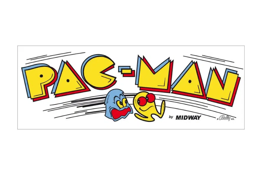
Pac-Man’s origins are a mystery. Some people think he was born from a pizza with a slice missing, others think he was a simple version of the Japanese word for mouth. His name sounds like the noise he makes when he eats and the shape of his pizza-like body.
The creator of Pac-Man, Iwatani, has two different stories about how he made him. He says he imagined a pizza coming to life and eating dots with its mouth slice. He also says he made him look like the Japanese word for mouth, “kuchi”, but rounder and simpler. Namco changed his name to Pac-Man when they brought him to the English-speaking world.
Pac-Man was supposed to be a naughty little creature, but he became a lucky charm for many people.
8. Assassin’s Creed
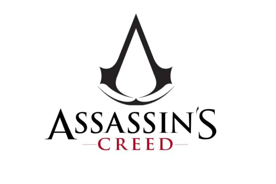
Assassin’s Creed is a cultural phenomenon that encompasses nine games, some of which are exclusive to consoles and most of which are available on PCs.
The logo depicts an eagle skull seen from behind, which symbolizes courage and freedom in the Assassin’s Creed lore. The game’s designers state that the eagle is a bird of prey that reflects the aerial and predatory nature of the assassins.
9. Sonic The Hedgehog
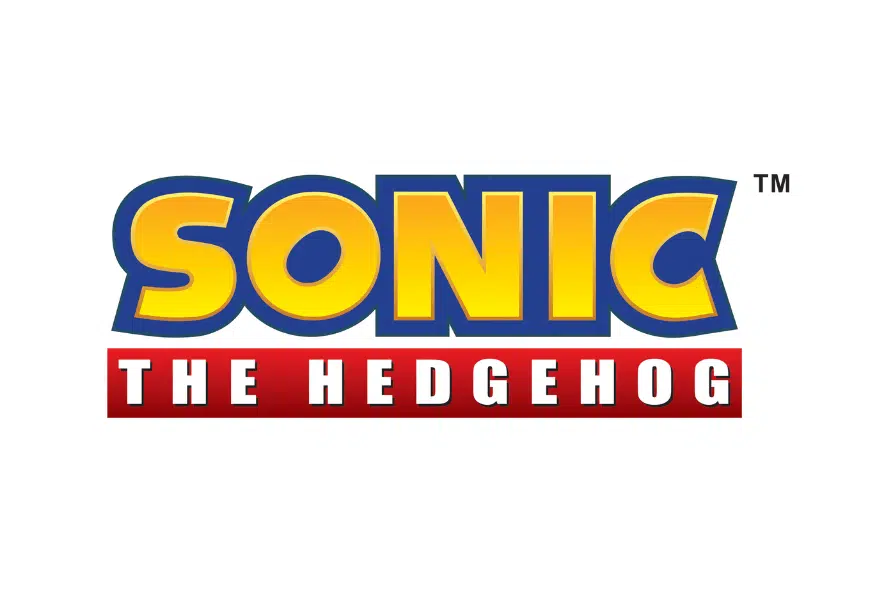
Sonic the Hedgehog is one of the video game logos that will always be remembered by many gamers.
Sonic was Sega’s answer to Mario, and he became a huge hit around the world.
Now, there are new Sonic cartoons, games, and movies.
The company had a hard time finding the right logo at first, but it found it in 1999, using Sonic’s signature colors (blue, with red and white for the shoes), and gold.
The chunky font is fun and quirky, with a tilted “O” to show speed.
Related Posts:
Best Gaming Logos Summary
the world of gaming is home to a plethora of captivating logos that have become synonymous with renowned gaming franchises and have left an indelible mark on the industry. These logos serve as powerful symbols, evoking excitement, nostalgia, and recognition among gaming enthusiasts worldwide.
Awesome gaming logos are those that effectively capture the essence of the game or the brand they represent. They combine creativity, symbolism, and aesthetic appeal to create a visual identity that resonates with the target audience. These logos often feature iconic characters, bold typography, and eye-catching color schemes, all working together to create a lasting impression.
From timeless classics like Nintendo’s red-and-white emblem or the instantly recognizable PlayStation’s iconic button symbols to modern designs like the sleek and minimalist logo of Valve Corporation’s Steam platform, each gaming logo tells a unique story and contributes to the overall gaming experience.
Moreover, these logos transcend the digital realm and have become cultural phenomena, gracing merchandise, apparel, and even tattoos, further solidifying their status as powerful brand symbols. They serve as a rallying point for fans, fostering a sense of belonging and identity within the gaming community.
As technology advances and new gaming franchises emerge, the world of gaming logos continues to evolve. With the advent of virtual reality, augmented reality, and the ever-expanding esports industry, we can expect to see innovative and boundary-pushing logo designs that push the boundaries of creativity and captivate gamers in new and exciting ways.


